harmony 鸿蒙Image
Image
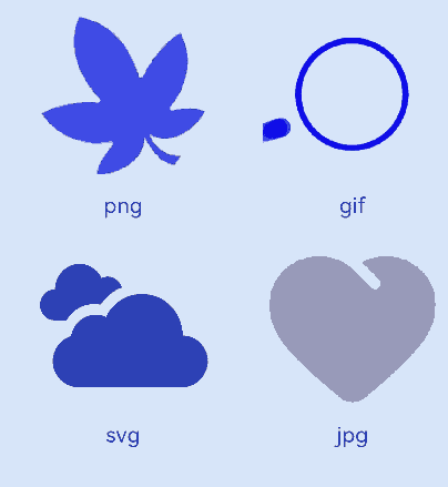
Image为图片组件,常用于在应用中显示图片。Image支持加载PixelMap、ResourceStr和DrawableDescriptor类型的数据源,支持png、jpg、jpeg、bmp、svg、webp、gif和heif类型的图片格式,不支持apng和svga格式。
说明:
该组件从API version 7开始支持。后续版本如有新增内容,则采用上角标单独标记该内容的起始版本。
使用快捷组合键对Image组件复制时,Image组件必须处于获焦状态。Image组件默认不获焦,需将focusable属性设置为true,即可使用TAB键将焦点切换到组件上,再将focusOnTouch属性设置为true,即可实现点击获焦。
图片格式支持SVG图源,SVG标签文档请参考SVG标签说明。
动图的播放依赖于Image节点的可见性变化,其默认行为是不播放的。当节点可见时,通过回调启动动画,当节点不可见时,停止动画。可见性状态的判断是通过onVisibleAreaChange事件触发的,当可见阈值ratios大于0时,表明Image处于可见状态。
如果图片加载过程中出现白色块,请参考Image白块问题解决方案。如果图片加载时间过长,请参考优化应用预置图片资源加载耗时问题。
需要权限
使用网络图片时,需要申请权限ohos.permission.INTERNET。具体申请方式请参考声明权限。
子组件
无
接口
Image
Image(src: PixelMap|ResourceStr|DrawableDescriptor)
通过图片数据源获取图片,用于后续渲染展示。
Image组件加载图片失败或图片尺寸为0时,图片组件大小自动为0,不跟随父组件的布局约束。
Image组件默认按照居中裁剪,例如组件宽高设置相同,原图长宽不等,此时按照中间区域进行裁剪。
Image加载成功且组件不设置宽高时,其显示大小自适应父组件。
卡片能力: 从API version 9开始,该接口支持在ArkTS卡片中使用。
原子化服务API: 从API version 11开始,该接口支持在原子化服务中使用。
系统能力: SystemCapability.ArkUI.ArkUI.Full
参数:
| 参数名 | 类型 | 必填 | 说明 |
|---|---|---|---|
| src | PixelMap | ResourceStr| DrawableDescriptor | 是 | 图片的数据源,支持本地图片和网络图片,引用方式请参考加载图片资源。 1. PixelMap格式为像素图,常用于图片编辑的场景。 2. ResourceStr包含Resource和string格式。 string格式可用于加载网络图片和本地图片,常用于加载网络图片。当使用相对路径引用本地图片时,例如Image(“common/test.jpg”),不支持跨包/跨模块调用该Image组件,建议使用Resource格式来管理需全局使用的图片资源。 - 支持 Base64字符串。- 支持file://路径前缀的字符串,应用沙箱URI:file://<bundleName>/<sandboxPath>。当访问的路径中包含特殊符号时,需要使用fileUri.getUriFromPath(path)去做转换。同时需要保证目录包路径下的文件有可读权限。 Resource格式可以跨包/跨模块访问资源文件,是访问本地图片的推荐方式。 3. 当传入资源id或name为普通图片时,生成DrawableDescriptor对象。传入AnimatedDrawableDescriptor类型可播放PixelMap数组动画。 说明: - ArkTS卡片上支持gif图片格式动效,但仅在显示时播放一次。 - ArkTS卡片上不支持http:/\/等网络相关路径前缀和file:/\/路径前缀的字符串。 |
说明:
Image直接传入URL可能会带来的潜在性能问题,例如:(1) 大图加载时无法提前下载,白块显示的时间较长;(2) 小图设置同步加载,在弱网环境下,可能会阻塞UI线程造成冻屏问题;(3) 在快速滑动的瀑布流中,无法提前对即将要显示的图片进行下载,导致滑动白块较多。不同场景下,性能问题会有不同的表现,建议将网络下载部分与Image的显示剥离,可提前下载或者异步下载。如果图片加载过程中出现白色块,请参考Image白块问题解决方案。如果图片加载时间过长,请参考按照步骤优化应用预置图片资源加载耗时问题。
src由有效值(可正常解析并加载的图片资源)切换为无效值(无法解析或加载的图片路径)时,组件应保持显示此前成功加载的图片内容,不进行清除或重置操作。
当Image组件入参为PixelMap类型时,只有当PixelMap对象的引用发生变化(即指向一个新的PixelMap实例),Image组件才能感知到数据的变化。仅修改PixelMap对象的内容(如像素值)而不更换对象引用,无法触发数据变化的感知。
Image12+
Image(src: PixelMap|ResourceStr|DrawableDescriptor|ImageContent)
src新增ImageContent类型,可指定对应的图形内容。
卡片能力: 从API version 12开始,该接口支持在ArkTS卡片中使用。
原子化服务API: 从API version 12开始,该接口支持在原子化服务中使用。
系统能力: SystemCapability.ArkUI.ArkUI.Full
参数:
| 参数名 | 类型 | 必填 | 说明 |
|---|---|---|---|
| src | PixelMap | ResourceStr| DrawableDescriptor| ImageContent | 是 | 图片的数据源,支持本地图片和网络图片,引用方式请参考加载图片资源。 PixelMap、ResourceStr和DrawableDescriptor的使用请参考Image的scr参数说明。 传入ImageContent类型,指定图像内容。 说明: - ArkTS卡片上支持gif图片格式动效,但仅在显示时播放一次。 - ArkTS卡片上不支持http:/\/等网络相关路径前缀和file:/\/路径前缀的字符串。 |
Image12+
Image(src: PixelMap|ResourceStr|DrawableDescriptor, imageAIOptions: ImageAIOptions)
Image新增imageAIOptions参数,为组件设置AI分析选项。
原子化服务API: 从API version 12开始,该接口支持在原子化服务中使用。
系统能力: SystemCapability.ArkUI.ArkUI.Full
参数:
| 参数名 | 类型 | 必填 | 说明 |
|---|---|---|---|
| src | PixelMap | ResourceStr| DrawableDescriptor | 是 | 图片的数据源,支持本地图片和网络图片,引用方式请参考加载图片资源。 PixelMap、ResourceStr和DrawableDescriptor的使用请参考Image的scr参数说明。 说明: - ArkTS卡片上支持gif图片格式动效,但仅在显示时播放一次。 - ArkTS卡片上不支持http:/\/等网络相关路径前缀和file:/\/路径前缀的字符串。 |
| imageAIOptions | ImageAIOptions | 是 | 给组件设置一个AI分析选项,通过此项可配置分析类型或绑定一个分析控制器。 |
属性
属性的详细使用指导请参考添加属性。除支持通用属性外,还支持以下属性:
说明:
Image组件不支持设置通用属性foregroundColor,可以通过Image组件的fillColor属性设置填充颜色。
alt
alt(value: string | Resource | PixelMap)
设置图片加载时显示的占位图。
占位图支持使用objectFit设置填充效果,与图片的填充效果一致。
当组件的参数类型为AnimatedDrawableDescriptor时设置该属性不生效。
卡片能力: 从API version 9开始,该接口支持在ArkTS卡片中使用。
原子化服务API: 从API version 11开始,该接口支持在原子化服务中使用。
系统能力: SystemCapability.ArkUI.ArkUI.Full
参数:
| 参数名 | 类型 | 必填 | 说明 |
|---|---|---|---|
| value | string | Resource | PixelMap12+ | 是 | 加载时显示的占位图,支持本地图片(png、jpg、bmp、svg、gif和heif类型),支持PixelMap类型图片,不支持网络图片。 默认值:null |
objectFit
objectFit(value: ImageFit)
设置图片的填充效果。
卡片能力: 从API version 9开始,该接口支持在ArkTS卡片中使用。
原子化服务API: 从API version 11开始,该接口支持在原子化服务中使用。
系统能力: SystemCapability.ArkUI.ArkUI.Full
参数:
| 参数名 | 类型 | 必填 | 说明 |
|---|---|---|---|
| value | ImageFit | 是 | 图片的填充效果。 默认值:ImageFit.Cover |
imageMatrix15+
imageMatrix(matrix: ImageMatrix)
设置图片的变换矩阵。通过ImageMatrix对象使用平移、旋转、缩放等函数,实现宫格缩略图的最佳呈现。svg类型图源不支持该属性。
设置resizable、objectRepeat属性时,该属性设置不生效。该属性只针对图源做处理,不会触发Image组件的回调事件。
该属性与objectFit属性强关联,仅在objectFit属性设置为ImageFit.MATRIX时生效。
原子化服务API: 从API version 15开始,该接口支持在原子化服务中使用。
系统能力: SystemCapability.ArkUI.ArkUI.Full
参数:
| 参数名 | 类型 | 必填 | 说明 |
|---|---|---|---|
| matrix | ImageMatrix | 是 | 图片的变换矩阵。 |
objectRepeat
objectRepeat(value: ImageRepeat)
设置图片的重复样式,从中心点向两边重复,剩余空间不足放下一张图片时会截断。svg类型图源不支持该属性。
当组件的参数类型为AnimatedDrawableDescriptor时设置该属性不生效。
卡片能力: 从API version 9开始,该接口支持在ArkTS卡片中使用。
原子化服务API: 从API version 11开始,该接口支持在原子化服务中使用。
系统能力: SystemCapability.ArkUI.ArkUI.Full
参数:
| 参数名 | 类型 | 必填 | 说明 |
|---|---|---|---|
| value | ImageRepeat | 是 | 图片的重复样式。 默认值:ImageRepeat.NoRepeat |
interpolation
interpolation(value: ImageInterpolation)
设置图片的插值效果,即缓解图片在缩放时的锯齿问题。svg类型图源不支持该属性。
当组件的参数类型为AnimatedDrawableDescriptor时设置该属性不生效。
卡片能力: 从API version 9开始,该接口支持在ArkTS卡片中使用。
原子化服务API: 从API version 11开始,该接口支持在原子化服务中使用。
系统能力: SystemCapability.ArkUI.ArkUI.Full
参数:
| 参数名 | 类型 | 必填 | 说明 |
|---|---|---|---|
| value | ImageInterpolation | 是 | 图片的插值效果。 默认值:ImageInterpolation.Low |
renderMode
renderMode(value: ImageRenderMode)
设置图片的渲染模式。svg类型图源不支持该属性。
设置 ColorFilter 时,该属性设置不生效。
当组件的参数类型为AnimatedDrawableDescriptor时设置该属性不生效。
卡片能力: 从API version 9开始,该接口支持在ArkTS卡片中使用。
原子化服务API: 从API version 11开始,该接口支持在原子化服务中使用。
系统能力: SystemCapability.ArkUI.ArkUI.Full
参数:
| 参数名 | 类型 | 必填 | 说明 |
|---|---|---|---|
| value | ImageRenderMode | 是 | 图片的渲染模式为原色或黑白。 默认值:ImageRenderMode.Original |
sourceSize
sourceSize(value: ImageSourceSize)
设置图片解码尺寸。仅在目标尺寸小于图源尺寸时生效。svg类型图源和PixelMap资源不支持该属性。
当组件的参数类型为AnimatedDrawableDescriptor时设置该属性不生效。
卡片能力: 从API version 9开始,该接口支持在ArkTS卡片中使用。
原子化服务API: 从API version 11开始,该接口支持在原子化服务中使用。
系统能力: SystemCapability.ArkUI.ArkUI.Full
参数:
| 参数名 | 类型 | 必填 | 说明 |
|---|---|---|---|
| value | ImageSourceSize | 是 | 图片解码尺寸参数,降低图片的分辨率,常用于需要让图片显示尺寸比组件尺寸更小的场景。和ImageFit.None配合使用时可在组件内显示小图。 |
matchTextDirection
matchTextDirection(value: boolean)
设置图片是否跟随系统语言方向,在RTL语言环境下显示镜像翻转显示效果。
当组件的参数类型为AnimatedDrawableDescriptor时设置该属性不生效。
卡片能力: 从API version 9开始,该接口支持在ArkTS卡片中使用。
原子化服务API: 从API version 11开始,该接口支持在原子化服务中使用。
系统能力: SystemCapability.ArkUI.ArkUI.Full
参数:
| 参数名 | 类型 | 必填 | 说明 |
|---|---|---|---|
| value | boolean | 是 | 图片是否跟随系统语言方向。 默认值:false,false表示图片不跟随系统语言方向,true表示图片跟随系统语言方向,在RTL语言环境下显示镜像翻转显示效果。 |
fitOriginalSize
fitOriginalSize(value: boolean)
设置图片的显示尺寸是否跟随图源尺寸。
图片组件已设置width、height属性时,fitOriginalSize属性不生效。
当组件的参数类型为AnimatedDrawableDescriptor时设置该属性不生效。
卡片能力: 从API version 9开始,该接口支持在ArkTS卡片中使用。
原子化服务API: 从API version 11开始,该接口支持在原子化服务中使用。
系统能力: SystemCapability.ArkUI.ArkUI.Full
参数:
| 参数名 | 类型 | 必填 | 说明 |
|---|---|---|---|
| value | boolean | 是 | 图片的显示尺寸是否跟随图源尺寸。 默认值:false 说明: 当不设置fitOriginalSize或者设置fitOriginalSize为false时,组件显示大小不跟随图源大小。 当设置fitOriginalSize为true时,组件显示大小跟随图源大小。 |
fillColor
fillColor(value: ResourceColor)
设置填充颜色,设置后填充颜色会覆盖在图片上。仅对svg图源生效,设置后会替换svg图片中所有可绘制元素的填充颜色。如需对png图片进行修改颜色,可以使用colorFilter。
当组件的参数类型为AnimatedDrawableDescriptor时设置该属性不生效。
卡片能力: 从API version 9开始,该接口支持在ArkTS卡片中使用。
原子化服务API: 从API version 11开始,该接口支持在原子化服务中使用。
系统能力: SystemCapability.ArkUI.ArkUI.Full
参数:
| 参数名 | 类型 | 必填 | 说明 |
|---|---|---|---|
| value | ResourceColor | 是 | 设置填充颜色。 说明: 默认不对组件进行填充。当传入异常值时,系统将使用默认的主题色:浅色模式下为黑色,深色模式下为白色。 |
fillColor15+
fillColor(color: ResourceColor|ColorContent)
设置填充颜色,设置后填充颜色会覆盖在图片上。仅对svg图源生效,设置后会替换svg图片中所有可绘制元素的填充颜色。如需对png图片进行修改颜色,可以使用colorFilter。如果想重置填充颜色可以传入ColorContent类型。
当组件的参数类型为AnimatedDrawableDescriptor时设置该属性不生效。
原子化服务API: 从API version 15开始,该接口支持在原子化服务中使用。
系统能力: SystemCapability.ArkUI.ArkUI.Full
参数:
| 参数名 | 类型 | 必填 | 说明 |
|---|---|---|---|
| color | ResourceColor|ColorContent | 是 | 设置填充颜色。 说明: 默认不对组件进行填充。当传入异常值时,系统将使用默认的主题色:浅色模式下为黑色,深色模式下为白色。 |
autoResize
autoResize(value: boolean)
设置图片解码过程中是否对图源自动缩放。降采样解码时图片的部分信息丢失,因此可能会导致图片质量的下降(如:出现锯齿),这时可以选择把autoResize设为false,按原图尺寸解码,提升显示效果,但会增加内存占用。
原图尺寸和显示尺寸不匹配时,图片都会出现些许的失真、模糊。最佳清晰度配置建议:
图片缩小显示时:.autoResize(false) + .interpolation(.Medium)
图片放大显示时:.interpolation(.High)
当组件的参数类型为AnimatedDrawableDescriptor和svg时设置该属性不生效。
卡片能力: 从API version 9开始,该接口支持在ArkTS卡片中使用。
原子化服务API: 从API version 11开始,该接口支持在原子化服务中使用。
系统能力: SystemCapability.ArkUI.ArkUI.Full
参数:
| 参数名 | 类型 | 必填 | 说明 |
|---|---|---|---|
| value | boolean | 是 | 图片解码过程中是否对图源自动缩放。设置为true时,组件会根据显示区域的尺寸决定用于绘制的图源尺寸,有利于减少内存占用。如原图大小为1920x1080,而显示区域大小为200x200,则图片会降采样解码到200x200的尺寸,大幅度节省图片占用的内存。 默认值:false,false表示关闭图源自动缩放,true表示开启图源自动缩放。 |
syncLoad8+
syncLoad(value: boolean)
设置是否同步加载图片。建议加载尺寸较小的本地图片时将syncLoad设为true,因为耗时较短,在主线程上执行即可。
当组件的参数类型为AnimatedDrawableDescriptor时设置该属性不生效。
如果加载图片时出现闪烁,设置syncLoad为true。详情请参见并发优化。
卡片能力: 从API version 9开始,该接口支持在ArkTS卡片中使用。
原子化服务API: 从API version 11开始,该接口支持在原子化服务中使用。
系统能力: SystemCapability.ArkUI.ArkUI.Full
参数:
| 参数名 | 类型 | 必填 | 说明 |
|---|---|---|---|
| value | boolean | 是 | 是否同步加载图片,默认是异步加载。同步加载时阻塞UI线程,不会显示占位图。 默认值:false,false表示异步加载图片,true表示同步加载图片。 |
copyOption9+
copyOption(value: CopyOptions)
设置图片是否可复制。当copyOption设置为非CopyOptions.None时,支持使用长按、鼠标右击、快捷组合键’CTRL+C’等方式进行复制。svg图片不支持复制。
当组件的参数类型为AnimatedDrawableDescriptor时设置该属性不生效。
卡片能力: 从API version 9开始,该接口支持在ArkTS卡片中使用。
原子化服务API: 从API version 11开始,该接口支持在原子化服务中使用。
系统能力: SystemCapability.ArkUI.ArkUI.Full
参数:
| 参数名 | 类型 | 必填 | 说明 |
|---|---|---|---|
| value | CopyOptions | 是 | 图片是否可复制。 默认值:CopyOptions.None |
colorFilter9+
colorFilter(value: ColorFilter|DrawingColorFilter)
为图像设置颜色滤镜效果。
设置该属性时,renderMode属性设置不生效。
卡片能力: 从API version 9开始,该接口支持在ArkTS卡片中使用。
原子化服务API: 从API version 11开始,该接口支持在原子化服务中使用。
系统能力: SystemCapability.ArkUI.ArkUI.Full
参数:
| 参数名 | 类型 | 必填 | 说明 |
|---|---|---|---|
| value | ColorFilter |DrawingColorFilter | 是 | 1. 给图像设置颜色滤镜效果,入参为一个的4x5的RGBA转换矩阵。 矩阵第一行表示R(红色)的向量值,第二行表示G(绿色)的向量值,第三行表示B(蓝色)的向量值,第四行表示A(透明度)的向量值,4行分别代表不同的RGBA的向量值。 当矩阵对角线值为1,其余值为0时,保持图片原有色彩。 计算规则: 如果输入的滤镜矩阵如下(其中矩阵值的范围[0, 1]): 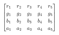 像素点为[R, G, B, A],色值的范围[0, 255] 则过滤后的颜色为 [R’, G’, B’, A’] 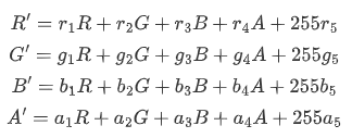 2. 从API version12开始支持@ohos.graphics.drawing的ColorFilter类型作为入参。 说明: API version 11及之前,svg类型图源不支持该属性。 从API version 12开始,该接口中的DrawingColorfilter类型支持在原子化服务中使用。其中,svg类型的图源只有设置了stroke属性(无论是否有值)才会生效。 |
draggable9+
draggable(value: boolean)
设置组件默认拖拽效果。不能和onDragStart事件、bindPopup同时使用。
原子化服务API: 从API version 11开始,该接口支持在原子化服务中使用。
系统能力: SystemCapability.ArkUI.ArkUI.Full
参数:
| 参数名 | 类型 | 必填 | 说明 |
|---|---|---|---|
| value | boolean | 是 | 组件默认拖拽效果,设置为true时,组件可拖拽,绑定的长按手势不生效。 API version 9及之前,默认值为false。API version 10及之后,默认值为true。 若用户需要设置自定义手势,则需要将draggable设置为false。 |
enableAnalyzer11+
enableAnalyzer(enable: boolean)
设置组件支持AI分析,当前支持主体识别、文字识别和对象查找等功能。
不能和overlay属性同时使用,两者同时设置时overlay中CustomBuilder属性将失效。该特性依赖设备能力。
分析图像要求是静态非矢量图,即svg、gif等图像类型不支持分析,支持传入PixelMap进行分析,目前仅支持RGBA_8888类型,使用方式见示例4。
alt占位图不支持分析,objectRepeat属性仅在ImageRepeat.NoRepeat下支持分析,隐私遮罩属性obscured打开时不支持分析。
基于完整原始图像进行分析,设置clip、margin、borderRadius、position和objectFit属性导致图像显示不完整,或使用renderMode设置蒙层,仍基于完整原始图像进行分析。 copyOption属性不影响AI分析功能。
当组件的参数类型为AnimatedDrawableDescriptor时设置该属性不生效。
说明:
需要配置权限:ohos.permission.INTERNET。
原子化服务API: 从API version 12开始,该接口支持在原子化服务中使用。
系统能力: SystemCapability.ArkUI.ArkUI.Full
参数:
| 参数名 | 类型 | 必填 | 说明 |
|---|---|---|---|
| enable | boolean | 是 | 组件支持AI分析,设置为true时,组件可进行AI分析。 默认值:false,表示不开启AI分析。 |
resizable11+
resizable(value: ResizableOptions)
设置图像拉伸时可调整大小的图像选项。拉伸对拖拽缩略图以及占位图有效。
设置合法的 ResizableOptions 时,objectRepeat属性和orientation属性设置不生效。
当设置 top +bottom 大于原图的高或者 left + right 大于原图的宽时 ResizableOptions 属性设置不生效。
当组件的参数类型为AnimatedDrawableDescriptor和svg时设置该属性不生效。
原子化服务API: 从API version 12开始,该接口支持在原子化服务中使用。
系统能力: SystemCapability.ArkUI.ArkUI.Full
参数:
| 参数名 | 类型 | 必填 | 说明 |
|---|---|---|---|
| value | ResizableOptions | 是 | 图像拉伸时可调整大小的图像选项。 |
privacySensitive12+
privacySensitive(supported: boolean)
设置是否支持卡片敏感隐私信息。
卡片能力: 从API version 12开始,该接口支持在ArkTS卡片中使用。
原子化服务API: 从API version 12开始,该接口支持在原子化服务中使用。
系统能力: SystemCapability.ArkUI.ArkUI.Full
参数:
| 参数名 | 类型 | 必填 | 说明 |
|---|---|---|---|
| supported | boolean | 是 | 是否支持卡片敏感隐私信息。 默认值为false,表示不支持卡片敏感隐私信息,当设置为true时,隐私模式下图片将显示为半透明底板样式。 说明: 设置null则不敏感。 进入隐私模式需要卡片框架支持。 |
dynamicRangeMode12+
dynamicRangeMode(value: DynamicRangeMode)
设置期望展示的图像动态范围。svg类型图源不支持该属性。
原子化服务API: 从API version 12开始,该接口支持在原子化服务中使用。
系统能力: SystemCapability.ArkUI.ArkUI.Full
参数:
| 参数名 | 类型 | 必填 | 说明 |
|---|---|---|---|
| value | DynamicRangeMode | 是 | 图像显示的动态范围。 默认值:DynamicRangeMode.STANDARD |
orientation14+
orientation(orientation: ImageRotateOrientation)
设置图像内容的显示方向。
原子化服务API: 从API version 14开始,该接口支持在原子化服务中使用。
系统能力: SystemCapability.ArkUI.ArkUI.Full
参数:
| 参数名 | 类型 | 必填 | 说明 |
|---|---|---|---|
| orientation | ImageRotateOrientation | 是 | 图像内容的显示方向。 不支持gif和svg类型的图片。 如果需要显示携带旋转角度信息或翻转信息的图片,建议使用ImageRotateOrientation.AUTO进行设置。 默认值:ImageRotateOrientation.UP |
hdrBrightness19+
hdrBrightness(brightness: number)
设置组件在显示HDR图片时的亮度。
svg类型图源不支持该属性。
该属性与dynamicRangeMode属性同时设置时,dynamicRangeMode属性不生效。
原子化服务API: 从API version 19开始,该接口支持在原子化服务中使用。
系统能力: SystemCapability.ArkUI.ArkUI.Full
参数:
| 参数名 | 类型 | 必填 | 说明 |
|---|---|---|---|
| brightness | number | 是 | 用于调整组件展示HDR图片的亮度,该接口仅对HDR图源生效。 默认值:1.0 取值范围:[0.0,1.0],小于0和大于1.0时取1。0表示图片按照SDR亮度显示,1表示图片按照当前允许的最高HDR亮度显示。 |
ImageContent12+
指定图像内容。
卡片能力: 从API version 12开始,该接口支持在ArkTS卡片中使用。
原子化服务API: 从API version 12开始,该接口支持在原子化服务中使用。
系统能力: SystemCapability.ArkUI.ArkUI.Full
| 名称 | 值 | 说明 |
|---|---|---|
| EMPTY | 0 | 空图像。 |
ImageInterpolation
卡片能力: 从API version 9开始,该接口支持在ArkTS卡片中使用。
原子化服务API: 从API version 11开始,该接口支持在原子化服务中使用。
系统能力: SystemCapability.ArkUI.ArkUI.Full
| 名称 | 说明 |
|---|---|
| None | 最近邻插值。 |
| High | Cubic插值,插值质量最高,可能会影响图片渲染的速度。 |
| Medium | MipMap插值。 |
| Low | 双线性插值。 |
ImageRenderMode
卡片能力: 从API version 9开始,该接口支持在ArkTS卡片中使用。
原子化服务API: 从API version 11开始,该接口支持在原子化服务中使用。
系统能力: SystemCapability.ArkUI.ArkUI.Full
| 名称 | 说明 |
|---|---|
| Original | 原色渲染模式。 |
| Template | 黑白渲染模式。 |
ResizableOptions11+
图像拉伸时可调整大小的图像选项。
原子化服务API: 从API version 12开始,该接口支持在原子化服务中使用。
系统能力: SystemCapability.ArkUI.ArkUI.Full
| 名称 | 类型 | 必填 | 说明 |
|---|---|---|---|
| slice | EdgeWidths | 否 | 边框宽度类型,用于描述组件边框不同方向的宽度。 说明: 只有当bottom和right同时大于0时,该属性生效。 传入数字时默认单位为vp。 |
| lattice12+ | DrawingLattice | 否 | 矩形网格对象。 说明: 通过@ohos.graphics.drawing的createImageLattice接口创建Lattice类型作为入参。将图像划分为矩形网格,同时处于偶数列和偶数行上的网格图像是固定的,不会被拉伸。 该参数对backgroundImageResizable接口不生效。 传入数字时默认单位为px。 |
EdgeWidths参数说明
原子化服务API: 从API version 11开始,该接口支持在原子化服务中使用。
系统能力: SystemCapability.ArkUI.ArkUI.Full
| 名称 | 类型 | 必填 | 说明 |
|---|---|---|---|
| top | Length | 否 | 图片顶部拉伸时,图片的像素值保持不变。 默认值:0 单位:vp |
| right | Length | 否 | 图片右部拉伸时,图片的像素值保持不变。 默认值:0 单位:vp |
| bottom | Length | 否 | 图片底部拉伸时,图片的像素值保持不变。 默认值:0 单位:vp |
| left | Length | 否 | 图片左部拉伸时,图片的像素值保持不变。 默认值:0 单位:vp |
DynamicRangeMode12+枚举说明
期望展示的图像动态范围。
原子化服务API: 从API version 12开始,该接口支持在原子化服务中使用。
系统能力: SystemCapability.ArkUI.ArkUI.Full
| 名称 | 值 | 说明 |
|---|---|---|
| HIGH | 0 | 不受限动态范围,最大限度进行图片提亮。 |
| CONSTRAINT | 1 | 受限动态范围,受限进行图片提亮。 |
| STANDARD | 2 | 标准动态范围,不进行图片提亮。 |
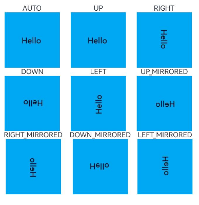
ImageRotateOrientation14+
期望的图像内容显示方向。
系统能力: SystemCapability.ArkUI.ArkUI.Full
| 名称 | 值 | 说明 |
|---|---|---|
| AUTO | 0 | 读取图片携带的EXIF元数据作为显示方向,支持旋转和镜像。 原子化服务API: 从API version 14开始,该接口支持在原子化服务中使用。 |
| UP | 1 | 默认按照当前图片的像素数据进行显示,不做任何处理。 原子化服务API: 从API version 14开始,该接口支持在原子化服务中使用。 |
| RIGHT | 2 | 将当前图片顺时针旋转90度后显示。 原子化服务API: 从API version 14开始,该接口支持在原子化服务中使用。 |
| DOWN | 3 | 将当前图片顺时针旋转180度后显示。 原子化服务API: 从API version 14开始,该接口支持在原子化服务中使用。 |
| LEFT | 4 | 将当前图片顺时针旋转270度后显示。 原子化服务API: 从API version 14开始,该接口支持在原子化服务中使用。 |
| UP_MIRRORED20+ | 5 | 将当前图片水平翻转后显示。 原子化服务API: 从API version 20开始,该接口支持在原子化服务中使用。 |
| RIGHT_MIRRORED20+ | 6 | 将当前图片水平翻转再顺时针旋转90度后显示。 原子化服务API: 从API version 20开始,该接口支持在原子化服务中使用。 |
| DOWN_MIRRORED20+ | 7 | 将当前图片垂直翻转后显示。 原子化服务API: 从API version 20开始,该接口支持在原子化服务中使用。 |
| LEFT_MIRRORED20+ | 8 | 将当前图片水平翻转再顺时针旋转270度后显示。 原子化服务API: 从API version 20开始,该接口支持在原子化服务中使用。 |
ImageSourceSize18+对象说明
卡片能力: 从API version 18开始,该接口支持在ArkTS卡片中使用。
原子化服务API: 从API version 18开始,该接口支持在原子化服务中使用。
系统能力: SystemCapability.ArkUI.ArkUI.Full
| 名称 | 类型 | 必填 | 说明 |
|---|---|---|---|
| width7+ | number | 是 | 图片解码尺寸宽度。 单位:vp 卡片能力: 从API version 9开始,该接口支持在ArkTS卡片中使用。 原子化服务API: 从API version 11开始,该接口支持在原子化服务中使用。 |
| height7+ | number | 是 | 图片解码尺寸高度。 单位:vp 卡片能力: 从API version 9开始,该接口支持在ArkTS卡片中使用。 原子化服务API: 从API version 11开始,该接口支持在原子化服务中使用。 |
DrawableDescriptor10+
type DrawableDescriptor = DrawableDescriptor
作为Image组件的入参对象。
原子化服务API: 从API version 11开始,该接口支持在原子化服务中使用。
系统能力: SystemCapability.ArkUI.ArkUI.Full
| 类型 | 说明 |
|---|---|
| DrawableDescriptor | 返回一个DrawableDescriptor对象。 |
DrawingColorFilter12+
type DrawingColorFilter = ColorFilter
颜色滤波器对象。
原子化服务API: 从API version 12开始,该接口支持在原子化服务中使用。
系统能力: SystemCapability.ArkUI.ArkUI.Full
| 类型 | 说明 |
|---|---|
| ColorFilter | 返回一个颜色滤波器。 |
DrawingLattice12+
type DrawingLattice = Lattice
将图片按照矩形网格进行划分。
原子化服务API: 从API version 12开始,该接口支持在原子化服务中使用。
系统能力: SystemCapability.ArkUI.ArkUI.Full
| 类型 | 说明 |
|---|---|
| Lattice | 返回一个矩阵网格对象。 |
ImageMatrix15+对象说明
type ImageMatrix = Matrix4Transit
当前的矩阵对象。
原子化服务API: 从API version 15开始,该接口支持在原子化服务中使用。
系统能力: SystemCapability.ArkUI.ArkUI.Full
| 类型 | 说明 |
|---|---|
| Matrix4Transit | 返回当前的矩阵对象。 |
ColorContent15+
指定颜色填充内容。
原子化服务API: 从API version 15开始,该接口支持在原子化服务中使用。
系统能力: SystemCapability.ArkUI.ArkUI.Full
| 名称 | 类型 | 只读 | 可选 | 说明 |
|---|---|---|---|---|
| ORIGIN | ColorContent | 是 | 否 | 重置fillColor接口,效果上与不设置fillColor一致。 |
事件
除支持通用事件外,还支持以下事件:
onComplete
onComplete(callback: (event?: { width: number, height: number, componentWidth: number, componentHeight: number, loadingStatus: number,contentWidth: number, contentHeight: number, contentOffsetX: number, contentOffsetY: number }) => void)
图片数据加载成功和解码成功时均触发该回调,返回成功加载的图片尺寸。
当组件的参数类型为AnimatedDrawableDescriptor时该事件不触发。
卡片能力: 从API version 9开始,该接口支持在ArkTS卡片中使用。
原子化服务API: 从API version 11开始,该接口支持在原子化服务中使用。
系统能力: SystemCapability.ArkUI.ArkUI.Full
参数:
| 参数名 | 类型 | 必填 | 说明 |
|---|---|---|---|
| width | number | 是 | 图片的宽。 单位:像素 |
| height | number | 是 | 图片的高。 单位:像素 |
| componentWidth | number | 是 | 组件的宽。 单位:像素 |
| componentHeight | number | 是 | 组件的高。 单位:像素 |
| loadingStatus | number | 是 | 图片加载成功的状态值。 说明: 返回的状态值为0时,表示图片数据加载成功。返回的状态值为1时,表示图片解码成功。 |
| contentWidth10+ | number | 是 | 图片实际绘制的宽度。 单位:像素 说明: 仅在loadingStatus返回1时有效。 |
| contentHeight10+ | number | 是 | 图片实际绘制的高度。 单位:像素 说明: 仅在loadingStatus返回1时有效。 |
| contentOffsetX10+ | number | 是 | 实际绘制内容相对于组件自身的x轴偏移。 单位:像素 说明: 仅在loadingStatus返回1时有效。 |
| contentOffsetY10+ | number | 是 | 实际绘制内容相对于组件自身的y轴偏移。 单位:像素 说明: 仅在loadingStatus返回1时有效。 |
onError9+
onError(callback: ImageErrorCallback)
图片加载异常时触发该回调。
当组件的参数类型为AnimatedDrawableDescriptor时该事件不触发。
卡片能力: 从API version 9开始,该接口支持在ArkTS卡片中使用。
原子化服务API: 从API version 11开始,该接口支持在原子化服务中使用。
系统能力: SystemCapability.ArkUI.ArkUI.Full
参数:
| 参数名 | 类型 | 必填 | 说明 |
|---|---|---|---|
| callback | ImageErrorCallback | 是 | 图片加载异常时触发的回调。 说明: 建议开发者使用此回调,可快速确认图片加载失败时的具体原因,参见ImageError的错误信息详细介绍。 |
onFinish
onFinish(event: () => void)
当加载的源文件为带动效的svg格式图片时,svg动效播放完成时会触发这个回调。如果动效为无限循环动效,则不会触发这个回调。
仅支持svg格式的图片。当组件的参数类型为AnimatedDrawableDescriptor时该事件不触发。
卡片能力: 从API version 9开始,该接口支持在ArkTS卡片中使用。
原子化服务API: 从API version 11开始,该接口支持在原子化服务中使用。
系统能力: SystemCapability.ArkUI.ArkUI.Full
ImageErrorCallback9+
type ImageErrorCallback = (error: ImageError) => void
图片加载异常时触发此回调。
当组件的参数类型为AnimatedDrawableDescriptor时该事件不触发。
卡片能力: 从API version 9开始,该接口支持在ArkTS卡片中使用。
原子化服务API: 从API version 11开始,该接口支持在原子化服务中使用。
系统能力: SystemCapability.ArkUI.ArkUI.Full
| 参数名 | 类型 | 必填 | 说明 |
|---|---|---|---|
| error | ImageError | 是 | 图片加载异常时触发回调的返回对象。 |
ImageError9+
图片加载异常时触发回调的返回对象。
当组件的参数类型为AnimatedDrawableDescriptor时该事件不触发。
卡片能力: 从API version 9开始,该接口支持在ArkTS卡片中使用。
系统能力: SystemCapability.ArkUI.ArkUI.Full
| 名称 | 类型 | 必填 | 说明 |
|---|---|---|---|
| componentWidth | number | 是 | 组件的宽。 单位:像素 卡片能力: 从API version 9开始,该接口支持在ArkTS卡片中使用。 原子化服务API: 从API version 11开始,该接口支持在原子化服务中使用。 |
| componentHeight | number | 是 | 组件的高。 单位:像素 卡片能力: 从API version 9开始,该接口支持在ArkTS卡片中使用。 原子化服务API: 从API version 11开始,该接口支持在原子化服务中使用。 |
| message10+ | string | 是 | 报错信息。 卡片能力: 从API version 10开始,该接口支持在ArkTS卡片中使用。 原子化服务API: 从API version 11开始,该接口支持在原子化服务中使用。 |
| error20+ | BusinessError<void> | 否 | 图片加载异常返回的报错信息,其中code为错误码,message为错误信息。报错信息请参考以下错误信息的详细介绍。 默认值:{ code : -1, message : “” } 卡片能力: 从API version 20开始,该接口支持在ArkTS卡片中使用。 原子化服务API: 从API version 20开始,该接口支持在原子化服务中使用。 |
BusinessError20+
type BusinessError<T> = BusinessError<T>
图片加载异常返回的错误信息。
卡片能力: 从API version 20开始,该接口支持在ArkTS卡片中使用。
原子化服务API: 从API version 20开始,该接口支持在原子化服务中使用。
系统能力: SystemCapability.ArkUI.ArkUI.Full
| 类型 | 说明 |
|---|---|
| BusinessError<T> | 图片加载异常返回的错误信息。 |
以下是错误信息的详细介绍:ImageError的error属性为错误信息对象,其中code为错误码,message为错误信息。
| 错误码ID | 错误信息 | 错误信息发生阶段 | 图片加载类型 |
|---|---|---|---|
| 101000 | unknown source type. | 数据加载 | 未知类型 |
| 102010 | sync http task of uri cancelled. | 数据加载 | 网络文件 |
| 102011 | sync http task of uri failed. | 数据加载 | 网络文件 |
| 102012 | async http task of uri cancelled. | 数据加载 | 网络文件 |
| 102013 | async http task of uri failed. | 数据加载 | 网络文件 |
| 102030 | wrong code format. | 数据加载 | base64字符串文件 |
| 102031 | decode base64 image failed. | 数据加载 | base64字符串文件 |
| 102050 | path is too long. | 数据加载 | base64字符串文件 |
| 102051 | read data failed. | 数据加载 | 沙箱文件 |
| 102070 | get image data by name failed. | 数据加载 | 沙箱文件 |
| 102071 | get image data by id failed. | 数据加载 | 资源文件 |
| 102072 | uri is invalid. | 数据加载 | 资源文件 |
| 102090 | uri is invalid. | 数据加载 | 包内文件 |
| 102091 | get asset failed. | 数据加载 | 包内文件 |
| 102110 | open file failed. | 数据加载 | 媒体库文件 |
| 102111 | get file stat failed. | 数据加载 | 媒体库文件 |
| 102112 | read file failed. | 数据加载 | 媒体库文件 |
| 102130 | decoded data is empty. | 数据加载 | 媒体库缩略图文件 |
| 102131 | load shared memory image data timeout. | 数据加载 | 共享内存文件 |
| 103100 | make svg dom failed. | 数据加载 | 矢量图文件 |
| 103200 | image data size is invalid. | 数据加载 | 位图文件 |
| 111000 | image source create failed. | 数据解码 | 位图文件 |
| 111001 | pixelmap create failed. | 数据解码 | 位图文件 |
示例
示例1(加载基本类型图片)
该示例通过传入Resource资源,加载png、gif、svg和jpg等基本类型的图片。
@Entry
@Component
struct ImageExample1 {
  build() {
    Column() {
      Flex({ direction: FlexDirection.Column, alignItems: ItemAlign.Start }) {
        Row() {
          // 加载png格式图片
          Image($r('app.media.ic_camera_master_ai_leaf'))
            .width(110).height(110).margin(15)
            .overlay('png', { align: Alignment.Bottom, offset: { x: 0, y: 20 } })
          // 加载gif格式图片
          Image($r('app.media.loading'))
            .width(110).height(110).margin(15)
            .overlay('gif', { align: Alignment.Bottom, offset: { x: 0, y: 20 } })
        }
        Row() {
          // 加载svg格式图片
          Image($r('app.media.ic_camera_master_ai_clouded'))
            .width(110).height(110).margin(15)
            .overlay('svg', { align: Alignment.Bottom, offset: { x: 0, y: 20 } })
          // 加载jpg格式图片
          Image($r('app.media.ic_public_favor_filled'))
            .width(110).height(110).margin(15)
            .overlay('jpg', { align: Alignment.Bottom, offset: { x: 0, y: 20 } })
        }
      }
    }.height(320).width(360).padding({ right: 10, top: 10 })
  }
}
示例2(下载与显示网络图片)
加载网络图片时,默认网络超时是5分钟,建议使用alt配置加载时的占位图。使用HTTP工具包发送网络请求,接着将返回的数据解码为Image组件中的PixelMap,图片开发可参考图片处理。
使用网络图片时,需要申请权限ohos.permission.INTERNET。具体申请方式请参考声明权限。
import { http } from '@kit.NetworkKit';
import { BusinessError } from '@kit.BasicServicesKit';
import { image } from '@kit.ImageKit';

@Entry
@Component
struct ImageExample2 {
  @State pixelMapImg: PixelMap|undefined = undefined;

  aboutToAppear() {
    this.requestImageUrl('https://www.example.com/xxx.png'); // 请填写一个具体的网络图片地址
  }

  requestImageUrl(url: string) {
    http.createHttp().request(url, (error: BusinessError, data: http.HttpResponse)=> {
      if (error) {
        console.error(`request image failed: url: ${url}, code: ${error.code}, message: ${error.message}`);
      } else {
        let imgData: ArrayBuffer = data.result as ArrayBuffer;
        console.info(`request image success, size: ${imgData.byteLength}`);
        let imgSource: image.ImageSource = image.createImageSource(imgData);
        class sizeTmp {
          height: number = 100;
          width: number = 100;
        }
        let options: Record<string, number|boolean|sizeTmp> = {
          'alphaType': 0,
          'editable': false,
          'pixelFormat': 3,
          'scaleMode': 1,
          'size': { height: 100, width: 100 }
        }
        imgSource.createPixelMap(options).then((pixelMap: PixelMap) => {
          console.error('image createPixelMap success');
          this.pixelMapImg = pixelMap;
        })
        imgSource.release()
      }
    })
  }

  build() {
    Column() {
      Image(this.pixelMapImg)
        .alt($r('app.media.img'))
        .objectFit(ImageFit.None)
        .width('100%')
        .height('100%')
    }
  }
}

示例3(为图片添加事件)
@Entry
@Component
struct ImageExample3 {
  private imageOne: Resource = $r('app.media.earth');
  private imageTwo: Resource = $r('app.media.star');
  private imageThree: Resource = $r('app.media.moveStar');
  @State src: Resource = this.imageOne;
  @State src2: Resource = this.imageThree;
  build(){
    Column(){
      // 为图片添加点击事件,点击完成后加载特定图片
      Image(this.src)
        .width(100)
        .height(100)
        .onClick(() => {
          this.src = this.imageTwo;
        })

      // 当加载图片为SVG格式时
      Image(this.src2)
        .width(100)
        .height(100)
        .onFinish(() => {
          // SVG动效播放完成时加载另一张图片
          this.src2 = this.imageOne;
        })
    }.width('100%').height('100%')
  }
}
示例4(开启图像AI分析)
该示例使用enableAnalyzer接口开启图像AI分析。
import { image } from '@kit.ImageKit';

@Entry
@Component
struct ImageExample4 {
  @State imagePixelMap: image.PixelMap|undefined = undefined;
  private aiController: ImageAnalyzerController = new ImageAnalyzerController();
  private options: ImageAIOptions = {
    types: [ImageAnalyzerType.SUBJECT, ImageAnalyzerType.TEXT],
    aiController: this.aiController
  };

  async aboutToAppear() {
    this.imagePixelMap = await this.getPixmapFromMedia($r('app.media.app_icon'));
  }

  build() {
    Column() {
      Image(this.imagePixelMap, this.options)
        .enableAnalyzer(true)
        .width(200)
        .height(200)
        .margin({bottom:10})
      Button('getTypes')
        .width(80)
        .height(80)
        .onClick(() => {
          this.aiController.getImageAnalyzerSupportTypes();
        })
    }
  }
  private async getPixmapFromMedia(resource: Resource) {
    let unit8Array = await this.getUIContext().getHostContext()?.resourceManager?.getMediaContent({
      bundleName: resource.bundleName,
      moduleName: resource.moduleName,
      id: resource.id
    });
    let imageSource = image.createImageSource(unit8Array?.buffer.slice(0, unit8Array.buffer.byteLength));
    let createPixelMap: image.PixelMap = await imageSource.createPixelMap({
      desiredPixelFormat: image.PixelMapFormat.RGBA_8888
    });
    await imageSource.release();
    return createPixelMap;
  }
}

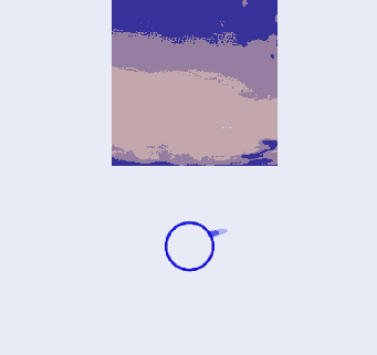
示例5(通过slice拉伸图片)
该示例通过resizable属性的slice选项,调整不同方向对图片进行拉伸。
@Entry
@Component
struct Index {
  @State top: number = 10;
  @State bottom: number = 10;
  @State left: number = 10;
  @State right: number = 10;

  build() {
    Column({ space: 5 }) {
      // 原图效果
      Image($r("app.media.landscape"))
        .width(200).height(200)
        .border({ width: 2, color: Color.Pink })
        .objectFit(ImageFit.Contain)

      // 图像拉伸效果,设置resizable属性,对图片不同方向进行拉伸
      Image($r("app.media.landscape"))
        .resizable({
          slice: {
            //传入数字时默认为vp单位,但在不同设备上vp单位会被解析成不同大小的px单位,可以根据需要选择传入的单位
            left: `${this.left}px`,
            right: `${this.right}px`,
            top: `${this.top}px`,
            bottom: `${this.bottom}px`
          }
        })
        .width(200)
        .height(200)
        .border({ width: 2, color: Color.Pink })
        .objectFit(ImageFit.Contain)

      Row() {
        Button("add top to " + this.top).fontSize(10)
          .onClick(() => {
            this.top += 10;
          })
        Button("add bottom to " + this.bottom).fontSize(10)
          .onClick(() => {
            this.bottom += 10;
          })
      }

      Row() {
        Button("add left to " + this.left).fontSize(10)
          .onClick(() => {
            this.left += 10;
          })
        Button("add right to " + this.right).fontSize(10)
          .onClick(() => {
            this.right += 10;
          })
      }

    }
    .justifyContent(FlexAlign.Start).width('100%').height('100%')
  }
}
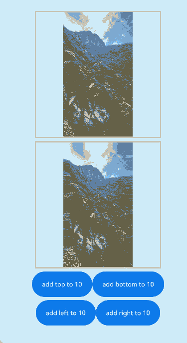
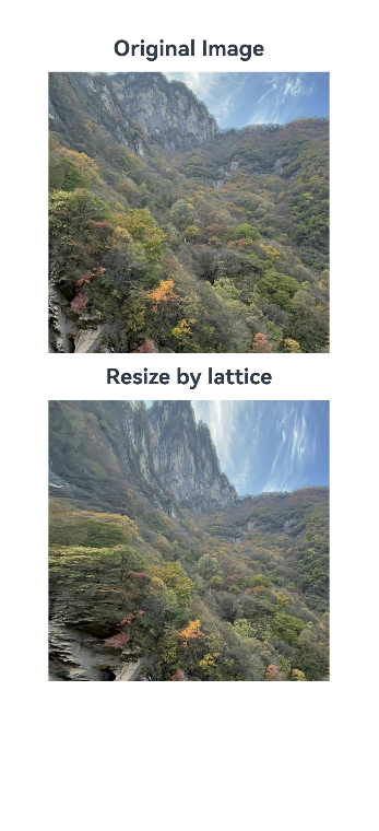
示例6(通过lattice拉伸图片)
该示例使用resizable属性的lattice选项,使用矩形网格对象对图片进行拉伸。
import { drawing } from '@kit.ArkGraphics2D';

@Entry
@Component
struct drawingLatticeTest {
  private xDivs: Array<number> = [1, 2, 200];
  private yDivs: Array<number> = [1, 2, 200];
  private fXCount: number = 3;
  private fYCount: number = 3;
  private DrawingLatticeFirst: DrawingLattice =
    drawing.Lattice.createImageLattice(this.xDivs, this.yDivs, this.fXCount, this.fYCount);

  build() {
    Scroll() {
      Column({ space: 10 }) {
        Text('Original Image').fontSize(20).fontWeight(700)
        Column({ space: 10 }) {
          Image($r('app.media.mountain'))
            .width(260).height(260)
        }.width('100%')

        Text('Resize by lattice').fontSize(20).fontWeight(700)
        Column({ space: 10 }) {
          Image($r('app.media.mountain'))
            .objectRepeat(ImageRepeat.X)
            .width(260)
            .height(260)
            .resizable({
              lattice: this.DrawingLatticeFirst
            })
        }.width('100%')
      }.width('100%')
    }
  }
}
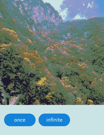
示例7(播放PixelMap数组动画)
该示例通过AnimatedDrawableDescriptor对象播放PixelMap数组动画。
import {AnimationOptions, AnimatedDrawableDescriptor} from '@kit.ArkUI';
import { image } from '@kit.ImageKit';

@Entry
@Component
struct ImageExample {
  pixelMaps: Array<PixelMap>  = [];
  options: AnimationOptions = { iterations: 1 };
  @State animated: AnimatedDrawableDescriptor|undefined = undefined;

  async aboutToAppear() {
    this.pixelMaps = await this.getPixelMaps();
    this.animated = new AnimatedDrawableDescriptor(this.pixelMaps, this.options);
  }

  build() {
    Column() {
      Row() {
        Image(this.animated)
          .width('500px').height('500px')
          .onFinish(() => {
            console.info("finish");
          })
      }.height('50%')
      Row() {
        Button('once').width(100).padding(5).onClick(() => {
          this.options = { iterations: 1 };
          this.animated = new AnimatedDrawableDescriptor(this.pixelMaps, this.options);
        }).margin(5)
        Button('infinite').width(100).padding(5).onClick(() => {
          this.options = { iterations: -1 };
          this.animated = new AnimatedDrawableDescriptor(this.pixelMaps, this.options);
        }).margin(5)
      }
    }.width('50%')
  }

  private async getPixmapListFromMedia(resource: Resource) {
    let unit8Array = await this.getUIContext().getHostContext()?.resourceManager?.getMediaContent({
      bundleName: resource.bundleName,
      moduleName: resource.moduleName,
      id: resource.id
    });
    let imageSource = image.createImageSource(unit8Array?.buffer.slice(0, unit8Array.buffer.byteLength));
    let createPixelMap: Array<image.PixelMap> = await imageSource.createPixelMapList({
      desiredPixelFormat: image.PixelMapFormat.RGBA_8888
    });
    await imageSource.release();
    return createPixelMap;
  }

  private async getPixmapFromMedia(resource: Resource) {
    let unit8Array = await this.getUIContext().getHostContext()?.resourceManager?.getMediaContent({
      bundleName: resource.bundleName,
      moduleName: resource.moduleName,
      id: resource.id
    });
    let imageSource = image.createImageSource(unit8Array?.buffer.slice(0, unit8Array.buffer.byteLength));
    let createPixelMap: image.PixelMap = await imageSource.createPixelMap({
      desiredPixelFormat: image.PixelMapFormat.RGBA_8888
    });
    await imageSource.release();
    return createPixelMap;
  }

  private async getPixelMaps() {
    let myPixelMaps:Array<PixelMap> = await this.getPixmapListFromMedia($r('app.media.mountain')); //添加图片
    myPixelMaps.push(await this.getPixmapFromMedia($r('app.media.sky')));
    myPixelMaps.push(await this.getPixmapFromMedia($r('app.media.clouds')));
    myPixelMaps.push(await this.getPixmapFromMedia($r('app.media.landscape')));
    return myPixelMaps;
  }
}
示例8(为图像设置颜色滤镜效果)
该示例通过colorFilter属性实现了给图像设置颜色滤镜效果。
import { drawing, common2D } from '@kit.ArkGraphics2D';

@Entry
@Component
struct ImageExample3 {
  private imageOne: Resource = $r('app.media.1');
  private imageTwo: Resource = $r('app.media.2');
  @State src: Resource = this.imageOne;
  @State src2: Resource = this.imageTwo;
  private ColorFilterMatrix: number[] = [1, 0, 1, 0, 1, 0, 0, 0, 1, 0, 1, 0, 1, 0, 0, 0, 1, 0, 1, 0];
  private color: common2D.Color = { alpha: 255, red: 255, green: 0, blue: 0 };
  @State DrawingColorFilterFirst: ColorFilter|undefined = undefined;
  @State DrawingColorFilterSecond: ColorFilter|undefined = undefined;
  @State DrawingColorFilterThird: ColorFilter|undefined = undefined;

  build() {
    Column() {
      Image(this.src)
        .width(100)
        .height(100)
        .colorFilter(this.DrawingColorFilterFirst)
        .onClick(()=>{
          this.DrawingColorFilterFirst = drawing.ColorFilter.createBlendModeColorFilter(this.color, drawing.BlendMode.SRC_IN);
        })

      Image(this.src2)
        .width(100)
        .height(100)
        .colorFilter(this.DrawingColorFilterSecond)
        .onClick(()=>{
          this.DrawingColorFilterSecond = new ColorFilter(this.ColorFilterMatrix);
        })

      //当加载图片为SVG格式时
      Image($r('app.media.test_self'))
        .width(110).height(110).margin(15)
        .colorFilter(this.DrawingColorFilterThird)
        .onClick(()=>{
          this.DrawingColorFilterThird = drawing.ColorFilter.createBlendModeColorFilter(this.color, drawing.BlendMode.SRC_IN);
        })
    }
  }
}
示例9(为图像设置填充效果)
该示例通过objectFit属性为图像设置填充效果。
@Entry
@Component
struct ImageExample{
  build() {
    Column() {
      Flex({ direction: FlexDirection.Column, alignItems: ItemAlign.Start }) {
        Row() {
          // 加载png格式图片
          Image($r('app.media.sky'))
            .width(110).height(110).margin(15)
            .overlay('png', { align: Alignment.Bottom, offset: { x: 0, y: 20 } })
            .border({ width: 2, color: Color.Pink })
            .objectFit(ImageFit.TOP_START)
          // 加载gif格式图片
          Image($r('app.media.loading'))
            .width(110).height(110).margin(15)
            .overlay('gif', { align: Alignment.Bottom, offset: { x: 0, y: 20 } })
            .border({ width: 2, color: Color.Pink })
            .objectFit(ImageFit.BOTTOM_START)
        }
        Row() {
          // 加载svg格式图片
          Image($r('app.media.svg'))
            .width(110).height(110).margin(15)
            .overlay('svg', { align: Alignment.Bottom, offset: { x: 0, y: 20 } })
            .border({ width: 2, color: Color.Pink })
            .objectFit(ImageFit.TOP_END)
          // 加载jpg格式图片
          Image($r('app.media.jpg'))
            .width(110).height(110).margin(15)
            .overlay('jpg', { align: Alignment.Bottom, offset: { x: 0, y: 20 } })
            .border({ width: 2, color: Color.Pink })
            .objectFit(ImageFit.CENTER)
        }
      }
    }.height(320).width(360).padding({ right: 10, top: 10 })
  }
}

示例10(切换显示不同类型图片)
该示例展示了ResourceStr类型与ImageContent类型作为数据源的显示图片效果。
@Entry
@Component
struct ImageContentExample {
  @State imageSrcIndex: number = 0;
  @State imageSrcList: (ResourceStr|ImageContent)[] = [$r('app.media.app_icon'), ImageContent.EMPTY];

  build() {
    Column({ space: 10 }) {
      Image(this.imageSrcList[this.imageSrcIndex])
        .width(100)
        .height(100)
      Button('点击切换Image的src')
        .padding(20)
        .onClick(() => {
          this.imageSrcIndex = (this.imageSrcIndex + 1) % this.imageSrcList.length;
        })
    }.width('100%')
    .padding(20)
  }
}

示例11(配置隐私隐藏)
该示例通过privacySensitive属性展示了如何配置隐私隐藏,效果展示需要卡片框架支持。
@Entry
@Component
struct ImageExample {
  build() {
    Column({ space: 10 }) {
      Image($r("app.media.startIcon"))
        .width(50)
        .height(50)
        .margin({top :30})
        .privacySensitive(true)
    }
    .alignItems(HorizontalAlign.Center)
    .width("100%")
  }
}

示例12(为图片设置扫光效果)
该示例通过linearGradient接口和animateTo()接口实现了给图片设置扫光效果。
import { curves } from '@kit.ArkUI';

@Entry
@Component
struct ImageExample11 {
  private curve = curves.cubicBezierCurve(0.33, 0, 0.67, 1);
  @State moveImg: string[] = ['imageScanEffect'];
  @State moveImgVisible: Visibility = Visibility.Visible;
  @State durationTime: number = 1500;
  @State iterationsTimes: number = -1;
  @State private opacityValue: number = 0.5;
  @State imageWidth: number = 450;
  @State visible: Visibility = Visibility.Hidden;
  @State stackBackgroundColor: string = '#E1E4E9';
  @State linePositionX: number = 0 - this.imageWidth;
  @State linePositionY: number = 0;
  @State imgResource: Resource|undefined = undefined;

  startupAnimate() {
    this.moveImg.pop();
    this.moveImg.push('imageScanEffect');
    setTimeout(() => {
      this.imgResource = $r('app.media.img');
    }, 3000);
    this.getUIContext()?.animateTo({
      duration: this.durationTime,
      curve: this.curve,
      tempo: 1,
      iterations: this.iterationsTimes,
      delay: 0
    }, () => {
      this.linePositionX = this.imageWidth;
    })
  }

  build() {
    Column() {
      Row() {
        Stack() {
          Image(this.imgResource)
            .width(this.imageWidth)
            .height(200)
            .objectFit(ImageFit.Contain)
            .visibility(this.visible)
            .onComplete(() => {
              this.visible = Visibility.Visible;
              this.moveImg.pop();
            })
            .onError(() =>{
              setTimeout(() => {
                this.visible = Visibility.Visible;
                this.moveImg.pop();
              }, 2600)
            })
          ForEach(this.moveImg, (item: string) => {
            Row()
              .width(this.imageWidth)
              .height(200)
              .visibility(this.moveImgVisible)
              .position({ x: this.linePositionX, y: this.linePositionY })
              .linearGradient({
                direction: GradientDirection.Right,
                repeating: false,
                colors: [[0xE1E4E9, 0], [0xFFFFFF, 0.75], [0xE1E4E9, 1]]
              })
              .opacity(this.opacityValue)
          })
        }
        .backgroundColor(this.visible ? this.stackBackgroundColor : undefined)
        .margin({top: 20, left: 20, right: 20})
        .borderRadius(20)
        .clip(true)
        .onAppear(() => {
          this.startupAnimate();
        })
      }
    }
  }
}

示例13(为图片添加变换效果)
该示例通过imageMatrix和objectFit属性,为图片添加旋转和平移的效果。
import { matrix4 } from '@kit.ArkUI';
@Entry
@Component
struct Test {
private matrix1 = matrix4.identity()
.translate({ x: -400, y: -750 })
.scale({ x: 0.5, y: 0.5 })
.rotate({
x: 2,
y: 0.5,
z: 3,
centerX: 10,
centerY: 10,
angle: -10
})
build() {
Row() {
Column({ space: 50 }) {
Column({ space: 5 }) {
Image($r("app.media.example"))
.border({ width:2, color: Color.Black })
.objectFit(ImageFit.Contain)
.width(150)
.height(150)
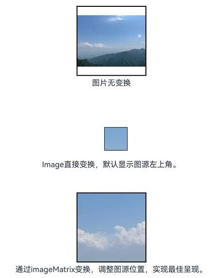
Text("图片无变换")
.fontSize('25px')
}
Column({ space: 5 }) {
Image($r("app.media.example"))
.border({ width:2, color: Color.Black })
.objectFit(ImageFit.None)
.translate({ x: 10, y: 10 })
.scale({ x: 0.5, y: 0.5 })
.width(100)
.height(100)
Text("Image直接变换,默认显示图源左上角。")
.fontSize('25px')
}
Column({ space: 5 }) {
Image($r("app.media.example"))
.objectFit(ImageFit.MATRIX)
.imageMatrix(this.matrix1)
.border({ width:2, color: Color.Black })
.width(150)
.height(150)
Text("通过imageMatrix变换,调整图源位置,实现最佳呈现。")
.fontSize('25px')
}
}
.width('100%')
}
}
}
示例14(通过sourceSize设置图片解码尺寸)
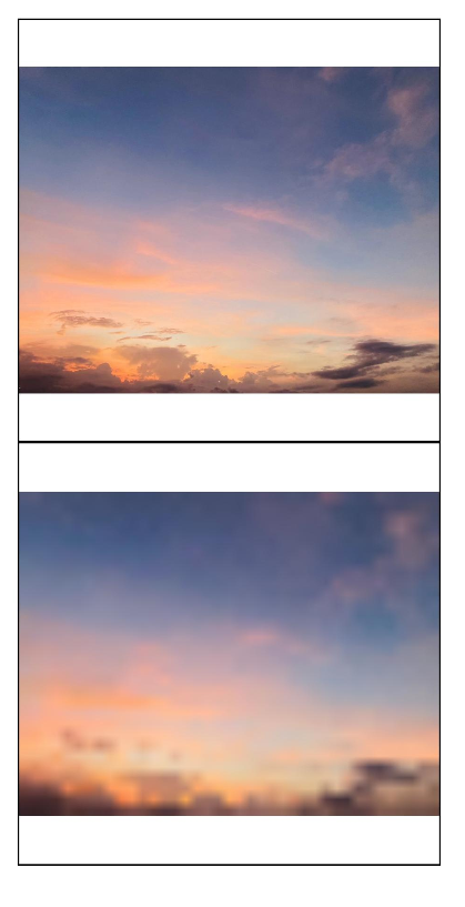
该示例通过sourceSize接口自定义图片的解码尺寸。
@Entry
@Component
struct Index {
  @State borderRadiusValue: number = 10;
  build() {
    Column() {
      Image($r("app.media.sky"))
        .sourceSize({width:1393, height:1080})
        .height(300)
        .width(300)
        .objectFit(ImageFit.Contain)
        .borderWidth(1)
      Image($r("app.media.sky"))
        .sourceSize({width:13, height:10})
        .height(300)
        .width(300)
        .objectFit(ImageFit.Contain)
        .borderWidth(1)
    }
    .height('100%')
    .width('100%')
  }
}
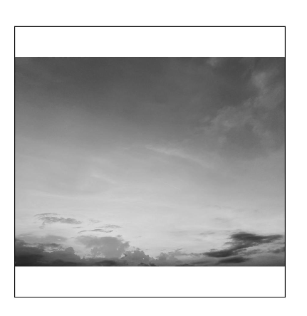
示例15(通过renderMode设置图片的渲染模式)
该示例通过renderMode接口设置图片渲染模式为黑白模式。
@Entry
@Component
struct Index {
  @State borderRadiusValue: number = 10;
  build() {
    Column() {
      Image($r("app.media.sky"))
        .renderMode(ImageRenderMode.Template)
        .height(300)
        .width(300)
        .objectFit(ImageFit.Contain)
        .borderWidth(1)
    }
    .height('100%')
    .width('100%')
  }
}
示例16(通过objectRepeat设置图片的重复样式)
该示例通过objectRepeat接口在竖直轴上重复绘制图片。
@Entry
@Component
struct Index {
  @State borderRadiusValue: number = 10;
  build() {
    Column() {
      Image($r("app.media.sky"))
        .objectRepeat(ImageRepeat.Y)
        .height('90%')
        .width('90%')
        .objectFit(ImageFit.Contain)
        .borderWidth(1)
    }
    .height('100%')
    .width('100%')
  }
}
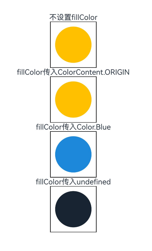
示例17(设置SVG图片的填充颜色)
该示例通过fillColor属性为SVG图片设置不同颜色的填充效果。
@Entry
@Component
struct Index {
  build() {
    Column() {
      Text("不设置fillColor")
      Image($r("app.media.svgExample"))
        .height(100)
        .width(100)
        .objectFit(ImageFit.Contain)
        .borderWidth(1)
      Text("fillColor传入ColorContent.ORIGIN")
      Image($r("app.media.svgExample"))
        .height(100)
        .width(100)
        .objectFit(ImageFit.Contain)
        .borderWidth(1)
        .fillColor(ColorContent.ORIGIN)
      Text("fillColor传入Color.Blue")
      Image($r("app.media.svgExample"))
        .height(100)
        .width(100)
        .objectFit(ImageFit.Contain)
        .borderWidth(1)
        .fillColor(Color.Blue)
      Text("fillColor传入undefined")
      Image($r("app.media.svgExample"))
        .height(100)
        .width(100)
        .objectFit(ImageFit.Contain)
        .borderWidth(1)
        .fillColor(undefined)
    }
    .height('100%')
    .width('100%')
  }
}
示例18(设置HDR图源动态提亮)
该示例通过hdrBrightness属性调整HDR图源的亮度,将hdrBrightness从0调整到1。
import { image } from '@kit.ImageKit';

const TAG = 'AceImage';

@Entry
@Component
struct Index {
  @State imgUrl: string = 'img_1';
  @State bright: number = 0; // 默认亮度为0
  aboutToAppear(): void {
    // 获取资源管理器中的媒体资源
    let img = this.getUIContext().getHostContext()?.resourceManager.getMediaByNameSync(this.imgUrl);
    // 创建图片源并获取图片信息
    let imageSource = image.createImageSource(img?.buffer.slice(0));
    let imageInfo = imageSource.getImageInfoSync();
    // 检查图片信息是否获取成功
    if (imageInfo == undefined) {
      console.error(TAG, 'Failed to obtain the image information.');
    } else {
      // 成功获取到图片信息,打印HDR状态
      console.info(TAG, 'imageInfo.isHdr:' + imageInfo.isHdr);
    }
  }

  build() {
    Column() {
      Image($r('app.media.img_1')).width('50%')
        .height('auto')
        .margin({top:160})
        .hdrBrightness(this.bright) // 设置图片的HDR亮度,值由bright状态控制
      Button("图片动态提亮 0->1")
        .onClick(() => {
          // 动画过渡,切换亮度值
          this.getUIContext()?.animateTo({}, () => {
            this.bright = 1.0 - this.bright;
          });
        })
    }
    .height('100%')
    .width('100%')
  }
}
示例19(设置图片是否跟随系统语言方向)
该示例通过matchTextDirection接口,设置手机语言为维语时图片是否显示镜像翻转显示效果。
@Entry
@Component
struct Index {
  build() {
    Column() {
      Flex({ direction: FlexDirection.Column, alignItems: ItemAlign.Start }) {
        Row() {
          // 图片不跟随系统语言方向
          Image($r('app.media.ocean'))
            .width(110).height(110).margin(15)
            .matchTextDirection(false)
        }
        Row() {
          // 图片跟随系统语言方向
          Image($r('app.media.ocean'))
            .width(110).height(110).margin(15)
            .matchTextDirection(true)
        }
      }
    }.height(320).width(360).padding({ right: 10, top: 10 })
  }
}

示例20(设置图像内容的显示方向)
该示例通过orientation属性,设置图像内容的显示方向。
@Entry
@Component
struct OrientationExample {
  build() {
    Column() {
      Row({ space: 25 }) {
        Column() {
          Text('AUTO')
          Image($r('app.media.hello'))
            .width(125).height(125)
            .orientation(ImageRotateOrientation.AUTO)
        }

        Column() {
          Text('UP')
          Image($r('app.media.hello'))
            .width(125).height(125)
            .orientation(ImageRotateOrientation.UP)
        }

        Column() {
          Text('RIGHT')
          Image($r('app.media.hello'))
            .width(125).height(125)
            .orientation(ImageRotateOrientation.RIGHT)
        }
      }

      Row({ space: 25 }) {
        Column() {
          Text('DOWN')
          Image($r('app.media.hello'))
            .width(125).height(125)
            .orientation(ImageRotateOrientation.DOWN)
        }

        Column() {
          Text('LEFT')
          Image($r('app.media.hello'))
            .width(125).height(125)
            .orientation(ImageRotateOrientation.LEFT)
        }

        Column() {
          Text('UP_MIRRORED')
          Image($r('app.media.hello'))
            .width(125).height(125)
            .orientation(ImageRotateOrientation.UP_MIRRORED)
        }
      }

      Row({ space: 15 }) {
        Column() {
          Text('RIGHT_MIRRORED')
          Image($r('app.media.hello'))
            .width(125).height(125)
            .orientation(ImageRotateOrientation.RIGHT_MIRRORED)
        }

        Column() {
          Text('DOWN_MIRRORED')
          Image($r('app.media.hello'))
            .width(125).height(125)
            .orientation(ImageRotateOrientation.DOWN_MIRRORED)
        }

        Column() {
          Text('LEFT_MIRRORED')
          Image($r('app.media.hello'))
            .width(125).height(125)
            .orientation(ImageRotateOrientation.LEFT_MIRRORED)
        }
      }
    }
  }
}
你可能感兴趣的鸿蒙文章
- 所属分类: 后端技术
- 本文标签:
热门推荐
-
2、 优质文章
-
3、 gt
-
7、 openharmony
-
9、 golang
-
10、 Vue中input框自动聚焦