harmony 鸿蒙ComposeTitleBar
ComposeTitleBar
一种普通标题栏,支持设置标题、头像(可选)和副标题(可选),可用于一级页面、二级及其以上界面配置返回键。
说明:
该组件从API version 10开始支持。后续版本如有新增内容,则采用上角标单独标记该内容的起始版本。
该组件不支持在Wearable设备上使用。
导入模块
import { ComposeTitleBar } from '@kit.ArkUI';
子组件
无
属性
不支持通用属性。
ComposeTitleBar
ComposeTitleBar({item?: ComposeTitleBarMenuItem, title: ResourceStr, subtitle?: ResourceStr, menuItems?: Array<ComposeTitleBarMenuItem>})
装饰器类型:\@Component
原子化服务API: 从API version 11开始,该接口支持在原子化服务中使用。
系统能力: SystemCapability.ArkUI.ArkUI.Full
| 名称 | 类型 | 必填 | 说明 |
|---|---|---|---|
| item | ComposeTitleBarMenuItem | 否 | 用于左侧头像的单个菜单项目。 |
| title | ResourceStr | 是 | 标题。 |
| subtitle | ResourceStr | 否 | 副标题。 |
| menuItems | Array<ComposeTitleBarMenuItem> | 否 | 右侧菜单项目列表。 |
说明:
入参对象不可为undefined,即
ComposeTitleBar(undefined)。
ComposeTitleBarMenuItem
系统能力: SystemCapability.ArkUI.ArkUI.Full
| 名称 | 类型 | 必填 | 说明 |
|---|---|---|---|
| value | ResourceStr | 是 | 图标资源。 原子化服务API: 从API version 11开始,该接口支持在原子化服务中使用。 |
| symbolStyle18+ | SymbolGlyphModifier | 否 | Symbol图标资源,优先级大于value,item左侧头像不支持设置该属性。 原子化服务API: 从API version 18开始,该接口支持在原子化服务中使用。 |
| label13+ | ResourceStr | 否 | 图标标签描述。 原子化服务API: 从API version 13开始,该接口支持在原子化服务中使用。 |
| isEnabled | boolean | 否 | 是否启用,默认禁用。 isEnabled为true时,表示为启用。 isEnabled为false时,表示为禁用。 item属性不支持触发isEnabled属性。 原子化服务API: 从API version 11开始,该接口支持在原子化服务中使用。 |
| action | () => void | 否 | 触发时的动作闭包,item属性不支持触发action事件。 原子化服务API: 从API version 11开始,该接口支持在原子化服务中使用。 |
| accessibilityLevel18+ | string | 否 | 标题栏右侧自定义按钮无障碍重要性。用于控制当前项是否可被无障碍辅助服务所识别。 支持的值为: “auto”:当前组件会转换’yes’。 “yes”:当前组件可被无障碍辅助服务所识别。 “no”:当前组件不可被无障碍辅助服务所识别。 “no-hide-descendants”:当前组件及其所有子组件不可被无障碍辅助服务所识别。 默认值:”auto”。 原子化服务API: 从API version 18开始,该接口支持在原子化服务中使用。 |
| accessibilityText18+ | ResourceStr | 否 | 标题栏右侧自定义按钮的无障碍文本属性。当组件不包含文本属性时,屏幕朗读选中此组件时不播报,使用者无法清楚地知道当前选中了什么组件。为了解决此场景,开发人员可为不包含文字信息的组件设置无障碍文本,当屏幕朗读选中此组件时播报无障碍文本的内容,帮助屏幕朗读的使用者清楚地知道自己选中了什么组件。 默认值:有label默认值为当前项label属性内容,没有设置label时,默认值为“ ”。 原子化服务API: 从API version 18开始,该接口支持在原子化服务中使用。 |
| accessibilityDescription18+ | ResourceStr | 否 | 标题栏右侧自定义按钮的无障碍描述。此描述用于向用户详细解释当前组件,开发人员应为组件的这一属性提供较为详尽的文本说明,以协助用户理解即将执行的操作及其可能产生的后果。特别是当这些后果无法仅从组件的属性和无障碍文本中直接获知时。如果组件同时具备文本属性和无障碍说明属性,当组件被选中时,系统将首先播报组件的文本属性,随后播报无障碍说明属性的内容。 默认值为“单指双击即可执行”。 原子化服务API: 从API version 18开始,该接口支持在原子化服务中使用。 |
事件
不支持通用事件。
示例
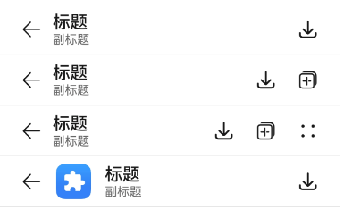
示例1(简单的标题栏)
该示例实现了简单的标题栏,带有返回箭头的标题栏和带有右侧菜单项目列表的标题栏。
import { ComposeTitleBar, Prompt, ComposeTitleBarMenuItem } from '@kit.ArkUI';

@Entry
@Component
struct Index {
  //定义右侧菜单项目列表
  private menuItems: Array<ComposeTitleBarMenuItem> = [
    {
      //菜单图片资源
      value: $r('sys.media.ohos_save_button_filled'),
      //启用图标
      isEnabled: true,
      //点击菜单时触发事件
      action: () => Prompt.showToast({ message: "show toast index 1" })
    },
    {
      value: $r('sys.media.ohos_ic_public_copy'),
      isEnabled: true,
      action: () => Prompt.showToast({ message: "show toast index 1" })
    },
    {
      value: $r('sys.media.ohos_ic_public_edit'),
      isEnabled: true,
      action: () => Prompt.showToast({ message: "show toast index 1" })
    },
    {
      value: $r('sys.media.ohos_ic_public_remove'),
      isEnabled: true,
      action: () => Prompt.showToast({ message: "show toast index 1" })
    },
  ]

  build() {
    Row() {
      Column() {
        //分割线
        Divider().height(2).color(0xCCCCCC)
        ComposeTitleBar({
          title: "标题",
          subtitle: "副标题",
          menuItems: this.menuItems.slice(0, 1),
        })
        Divider().height(2).color(0xCCCCCC)
        ComposeTitleBar({
          title: "标题",
          subtitle: "副标题",
          menuItems: this.menuItems.slice(0, 2),
        })
        Divider().height(2).color(0xCCCCCC)
        ComposeTitleBar({
          title: "标题",
          subtitle: "副标题",
          menuItems: this.menuItems,
        })
        Divider().height(2).color(0xCCCCCC)
        //定义带头像的标题栏
        ComposeTitleBar({
          menuItems: [{ isEnabled: true, value: $r('sys.media.ohos_save_button_filled'),
            action: () => Prompt.showToast({ message: "show toast index 1" })
          }],
          title: "标题",
          subtitle: "副标题",
          item: { isEnabled: true, value: $r('sys.media.ohos_app_icon') }
        })
        Divider().height(2).color(0xCCCCCC)
      }
    }.height('100%')
  }
}
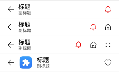
示例2(右侧自定义按钮播报)
该示例通过设置标题栏右侧自定义按钮属性accessibilityText、accessibilityDescription、accessibilityLevel自定义屏幕朗读播报文本。
import { ComposeTitleBar, Prompt, ComposeTitleBarMenuItem } from '@kit.ArkUI';

@Entry
@Component
struct Index {
  //定义右侧菜单项目列表
  private menuItems: Array<ComposeTitleBarMenuItem> = [
    {
      //菜单图片资源
      value: $r('sys.media.ohos_save_button_filled'),
      //启用图标
      isEnabled: true,
      //点击菜单时触发事件
      action: () => Prompt.showToast({ message: "show toast index 1" }),
      //屏幕朗读播报文本,优先级比label高
      accessibilityText: '保存',
      //屏幕朗读是否可以聚焦到
      accessibilityLevel: 'yes',
      //屏幕朗读最后播报的描述文本
      accessibilityDescription: '点击操作保存图标'
    },
    {
      value: $r('sys.media.ohos_ic_public_copy'),
      isEnabled: true,
      action: () => Prompt.showToast({ message: "show toast index 1" }),
      accessibilityText: '复制',
      //此处为no,屏幕朗读不聚焦
      accessibilityLevel: 'no',
      accessibilityDescription: '点击操作复制图标'
    },
    {
      value: $r('sys.media.ohos_ic_public_edit'),
      isEnabled: true,
      action: () => Prompt.showToast({ message: "show toast index 1" }),
      accessibilityText: '编辑',
      accessibilityLevel: 'yes',
      accessibilityDescription: '点击操作编辑图标'
    },
    {
      value: $r('sys.media.ohos_ic_public_remove'),
      isEnabled: true,
      action: () => Prompt.showToast({ message: "show toast index 1" }),
      accessibilityText: '移除',
      accessibilityLevel: 'yes',
      accessibilityDescription: '点击操作移除图标'
    },
  ]

  build() {
    Row() {
      Column() {
        //分割线
        Divider().height(2).color(0xCCCCCC)
        ComposeTitleBar({
          title: "标题",
          subtitle: "副标题",
          menuItems: this.menuItems.slice(0, 1),
        })
        Divider().height(2).color(0xCCCCCC)
        ComposeTitleBar({
          title: "标题",
          subtitle: "副标题",
          menuItems: this.menuItems.slice(0, 2),
        })
        Divider().height(2).color(0xCCCCCC)
        ComposeTitleBar({
          title: "标题",
          subtitle: "副标题",
          menuItems: this.menuItems,
        })
        Divider().height(2).color(0xCCCCCC)
        //定义带头像的标题栏
        ComposeTitleBar({
          menuItems: [{ isEnabled: true, value: $r('sys.media.ohos_save_button_filled'),
            action: () => Prompt.showToast({ message: "show toast index 1" })
          }],
          title: "标题",
          subtitle: "副标题",
          item: { isEnabled: true, value: $r('sys.media.ohos_app_icon') }
        })
        Divider().height(2).color(0xCCCCCC)
      }
    }.height('100%')
  }
}
示例3(设置Symbol类型图标)
该示例通过设置ComposeTitleBarMenuItem的属性symbolStyle,展示了自定义Symbol类型图标。
import { ComposeTitleBar, Prompt, ComposeTitleBarMenuItem, SymbolGlyphModifier } from '@kit.ArkUI';

@Entry
@Component
struct Index {
  //定义右侧菜单项目列表
  private menuItems: Array<ComposeTitleBarMenuItem> = [
    {
      //菜单图片资源
      value: $r('sys.symbol.house'),
      //菜单symbol图标
      symbolStyle: new SymbolGlyphModifier($r('sys.symbol.bell')).fontColor([Color.Red]),
      //启用图标
      isEnabled: true,
      //点击菜单时触发事件
      action: () => Prompt.showToast({ message: "show toast index 1" })
    },
    {
      value: $r('sys.symbol.house'),
      isEnabled: true,
      action: () => Prompt.showToast({ message: "show toast index 1" })
    },
    {
      value: $r('sys.symbol.car'),
      symbolStyle: new SymbolGlyphModifier($r('sys.symbol.heart')).fontColor([Color.Pink]),
      isEnabled: true,
      action: () => Prompt.showToast({ message: "show toast index 1" })
    },
    {
      value: $r('sys.symbol.car'),
      isEnabled: true,
      action: () => Prompt.showToast({ message: "show toast index 1" })
    },
  ]

  build() {
    Row() {
      Column() {
        //分割线
        Divider().height(2).color(0xCCCCCC)
        ComposeTitleBar({
          title: "标题",
          subtitle: "副标题",
          menuItems: this.menuItems.slice(0, 1),
        })
        Divider().height(2).color(0xCCCCCC)
        ComposeTitleBar({
          title: "标题",
          subtitle: "副标题",
          menuItems: this.menuItems.slice(0, 2),
        })
        Divider().height(2).color(0xCCCCCC)
        ComposeTitleBar({
          title: "标题",
          subtitle: "副标题",
          menuItems: this.menuItems,
        })
        Divider().height(2).color(0xCCCCCC)
        //定义带头像的标题栏
        ComposeTitleBar({
          menuItems: [{ isEnabled: true, value: $r('sys.symbol.heart'),
            action: () => Prompt.showToast({ message: "show toast index 1" })
          }],
          title: "标题",
          subtitle: "副标题",
          item: { isEnabled: true, value: $r('sys.media.ohos_app_icon') }
        })
        Divider().height(2).color(0xCCCCCC)
      }
    }.height('100%')
  }
}
你可能感兴趣的鸿蒙文章
0
赞
- 所属分类: 后端技术
- 本文标签:
热门推荐
-
2、 优质文章
-
3、 gt
-
7、 openharmony
-
9、 golang
-
10、 Vue中input框自动聚焦