harmony 鸿蒙Polymorphic Style
Polymorphic Style
You can set state-specific styles for components.
NOTE
The APIs of this module are supported since API version 8. Updates will be marked with a superscript to indicate their earliest API version.
Since API version 11, you can also dynamically set component attributes through attributeModifier.
Polymorphic styles only support universal attributes. If a polymorphic style does not take effect, the attribute you are modifying might be a private attribute of the component, for example, fontColor or backgroundColor of the TextInput component. In this case, you can use attributeModifier to dynamically set these component-specific attributes.
stateStyles
stateStyles(value: StateStyles)
Sets the state-specific styles for the component.
Widget capability: This API can be used in ArkTS widgets since API version 9.
Atomic service API: This API can be used in atomic services since API version 11.
System capability: SystemCapability.ArkUI.ArkUI.Full
Parameters
| Name | Type | Mandatory | Description |
|---|---|---|---|
| value | StateStyles | Yes | State-specific styles for the component. |
StateStyles
Widget capability: This API can be used in ArkTS widgets since API version 9.
Atomic service API: This API can be used in atomic services since API version 11.
| Name | Type | Mandatory | Description |
|---|---|---|---|
| normal | ()=>void | No | Style of the component when being stateless. |
| pressed | ()=>void | No | Style of the component in the pressed state. |
| disabled | ()=>void | No | Style of the component in the disabled state. |
| focused | ()=>void | No | Style of the component in the focused state. |
| clicked | ()=>void | No | Style of the component in the clicked state. |
| selected10+ | ()=>void | No | Style of the component in the selected state. |
Notes about the selected state:
The selected state style depends on the value of the component’s selected attribute. You can change the attribute value through onClick or $$.
The table below lists the components that support the selected state style and their selected attributes or parameters.
| Component | Selected Parameter/Attribute | Initial API Version |
|---|---|---|
| Checkbox | select | 10 |
| CheckboxGroup | selectAll | 10 |
| Radio | checked | 10 |
| Toggle | isOn | 10 |
| ListItem | selected | 10 |
| GridItem | selected | 10 |
| MenuItem | selected | 10 |
Example
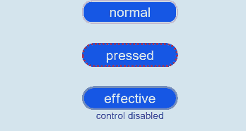
Example 1: Setting Polymorphic Styles for the Text Component
This example demonstrates the style changes of the Text component when its state is pressed or disabled.
// xxx.ets
@Entry
@Component
struct StyleExample {
  @State isEnable: boolean = true

  @Styles pressedStyles():void {
    .backgroundColor("#ED6F21")
    .borderRadius(10)
    .borderStyle(BorderStyle.Dashed)
    .borderWidth(2)
    .borderColor("#33000000")
    .width(120)
    .height(30)
    .opacity(1)
  }

  @Styles disabledStyles():void {
    .backgroundColor("#E5E5E5")
    .borderRadius(10)
    .borderStyle(BorderStyle.Solid)
    .borderWidth(2)
    .borderColor("#2a4c1919")
    .width(90)
    .height(25)
    .opacity(1)
  }

  @Styles normalStyles():void {
    .backgroundColor("#0A59F7")
    .borderRadius(10)
    .borderStyle(BorderStyle.Solid)
    .borderWidth(2)
    .borderColor("#33000000")
    .width(100)
    .height(25)
    .opacity(1)
  }

  build() {
    Flex({ direction: FlexDirection.Column, alignItems: ItemAlign.Center }) {
      Text("normal")
        .fontSize(14)
        .fontColor(Color.White)
        .opacity(0.5)
        .stateStyles({
          normal: this.normalStyles,
        })
        .margin({ bottom: 20 })
        .textAlign(TextAlign.Center)
      Text("pressed")
        .backgroundColor("#0A59F7")
        .borderRadius(20)
        .borderStyle(BorderStyle.Dotted)
        .borderWidth(2)
        .borderColor(Color.Red)
        .width(100)
        .height(25)
        .opacity(1)
        .fontSize(14)
        .fontColor(Color.White)
        .stateStyles({
          pressed: this.pressedStyles,
        })
        .margin({ bottom: 20 })
        .textAlign(TextAlign.Center)
      Text(this.isEnable == true ? "effective" : "disabled")
        .backgroundColor("#0A59F7")
        .borderRadius(20)
        .borderStyle(BorderStyle.Solid)
        .borderWidth(2)
        .borderColor(Color.Gray)
        .width(100)
        .height(25)
        .opacity(1)
        .fontSize(14)
        .fontColor(Color.White)
        .enabled(this.isEnable)
        .stateStyles({
          disabled: this.disabledStyles,
        })
        .textAlign(TextAlign.Center)
      Text("control disabled")
        .onClick(() => {
          this.isEnable = !this.isEnable
          console.log(`${this.isEnable}`)
        })
    }
    .width(350).height(300)
  }
}
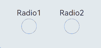
Example 2: Setting Polymorphic Styles for the Radio Component
This example demonstrates the style changes of the Radio component when its state is selected.
// xxx.ets
@Entry
@Component
struct Index {
  @State value: boolean = false
  @State value2: boolean = false

  @Styles
  normalStyles(): void{
    .backgroundColor("#E5E5E1")
  }

  @Styles
  selectStyles(): void{
    .backgroundColor("#ED6F21")
    .borderWidth(2)
  }

  build() {
    Flex({ direction: FlexDirection.Row, justifyContent: FlexAlign.Center, alignItems: ItemAlign.Center }) {
      Column() {
        Text('Radio1')
          .fontSize(25)
        Radio({ value: 'Radio1', group: 'radioGroup1' })
          .checked(this.value)
          .height(50)
          .width(50)
          .borderWidth(0)
          .borderRadius(30)
          .onClick(() => {
            this.value = !this.value
          })
          .stateStyles({
            normal: this.normalStyles,
            selected: this.selectStyles,
          })
      }
      .margin(30)

      Column() {
        Text('Radio2')
          .fontSize(25)
        Radio({ value: 'Radio2', group: 'radioGroup2' })
          .checked($$this.value2)
          .height(50)
          .width(50)
          .borderWidth(0)
          .borderRadius(30)
          .stateStyles({
            normal: this.normalStyles,
            selected: this.selectStyles,
          })
      }
      .margin(30)
    }.padding({ top: 30 })
  }
}
你可能感兴趣的鸿蒙文章
- 所属分类: 后端技术
- 本文标签:
热门推荐
-
2、 优质文章
-
3、 gt
-
7、 openharmony
-
9、 golang
-
10、 Vue中input框自动聚焦