harmony 鸿蒙Background
Background
You can set the background for a component.
NOTE
The APIs of this module are supported since API version 7. Updates will be marked with a superscript to indicate their earliest API version.
background10+
background(builder: CustomBuilder, options?: { align?: Alignment })
Sets the background color of the component.
Atomic service API: This API can be used in atomic services since API version 11.
System capability: SystemCapability.ArkUI.ArkUI.Full
Parameters
| Name | Type | Mandatory | Description |
|---|---|---|---|
| builder | CustomBuilder | Yes | Custom background. |
| options | {align?:Alignment} | No | Alignment mode between the custom background and the component. If background, backgroundColor, and backgroundImage are set at the same time, they will all take effect, with background at the top layer. |
NOTE
The custom background takes some time to render, during which it cannot respond to events, or be dynamically updated. This attribute cannot be nested or be previewed in DevEco Studio Previewer.
backgroundColor
backgroundColor(value: ResourceColor)
Sets the background color of the component.
Widget capability: This API can be used in ArkTS widgets since API version 9.
Atomic service API: This API can be used in atomic services since API version 11.
System capability: SystemCapability.ArkUI.ArkUI.Full
Parameters
| Name | Type | Mandatory | Description |
|---|---|---|---|
| value | ResourceColor | Yes | Background color of the component. |
backgroundColor18+
backgroundColor(color: Optional<ResourceColor>)
Sets the background color of the component. Compared to backgroundColor, this API supports the undefined type for the color parameter.
Widget capability: This API can be used in ArkTS widgets since API version 18.
Atomic service API: This API can be used in atomic services since API version 18.
System capability: SystemCapability.ArkUI.ArkUI.Full
Parameters
| Name | Type | Mandatory | Description |
|---|---|---|---|
| color | Optional<ResourceColor> | Yes | Background color of the component. If color is undefined, the background color reverts to the default transparent color. |
NOTE
If the background color is specified through inactiveColor in backgroundBlurStyle, avoid setting the background color again using backgroundColor.
backgroundImage
backgroundImage(src: ResourceStr|PixelMap, repeat?: ImageRepeat)
Sets the background image of the component.
Widget capability: This API can be used in ArkTS widgets since API version 9.
Atomic service API: This API can be used in atomic services since API version 11.
System capability: SystemCapability.ArkUI.ArkUI.Full
Parameters
| Name | Type | Mandatory | Description |
|---|---|---|---|
| src | ResourceStr |PixelMap12+ | Yes | Image address, which can be the address of an online or local image, a Base64 encoded string, or a pixel map. SVG images are not supported. |
| repeat | ImageRepeat | No | Whether the background image is repeated. By default, the background image is not repeated. If the set image has a transparent background and backgroundColor is set, the image is overlaid on the background color. |
backgroundImage18+
backgroundImage(src: ResourceStr|PixelMap, options?: BackgroundImageOptions)
Sets the background image of the component. Compared to backgroundImage, this API supports the BackgroundImageOptions type, but not the ImageRepeat type.
Widget capability: This API can be used in ArkTS widgets since API version 18.
Atomic service API: This API can be used in atomic services since API version 18.
System capability: SystemCapability.ArkUI.ArkUI.Full
Parameters
| Name | Type | Mandatory | Description |
|---|---|---|---|
| src | ResourceStr |PixelMap | Yes | Image address, which can be the address of an online or local image, a Base64 encoded string, or a pixel map. SVG images are not supported. |
| options | BackgroundImageOptions | No | Background image loading mode. NOTE By default, the image is loaded asynchronously. |
backgroundImageSize
backgroundImageSize(value: SizeOptions|ImageSize)
Sets the width and height of the component background image.
Widget capability: This API can be used in ArkTS widgets since API version 9.
Atomic service API: This API can be used in atomic services since API version 11.
System capability: SystemCapability.ArkUI.ArkUI.Full
Parameters
| Name | Type | Mandatory | Description |
|---|---|---|---|
| value | SizeOptions |ImageSize | Yes | Width and height of the background image. If the input is a {width: Length, height: Length} object and only one attribute is set, the other attribute is the set value multiplied by the original aspect ratio of the image. By default, the original image aspect ratio remains unchanged. The value range of width and height is [0, +∞). Default value: ImageSize.Auto NOTE If both width and height are set to values less than or equal to 0, they are treated as 0. If either width or height is unset or set to a value less than or equal to 0, the other one is adjusted based on the original aspect ratio of the image. |
backgroundImagePosition
backgroundImagePosition(value: Position|Alignment)
Sets the position of the component background image.
Widget capability: This API can be used in ArkTS widgets since API version 9.
Atomic service API: This API can be used in atomic services since API version 11.
System capability: SystemCapability.ArkUI.ArkUI.Full
Parameters
| Name | Type | Mandatory | Description |
|---|---|---|---|
| value | Position |Alignment | Yes | Position of the background image in the component, that is, the coordinates relative to the upper left corner of the component. Default value: { x: 0, y: 0 } When x and y are set in percentage, the offset is calculated based on the width and height of the component. |
BlurStyle9+
Widget capability: This API can be used in ArkTS widgets since API version 9.
System capability: SystemCapability.ArkUI.ArkUI.Full
| Name | Description |
|---|---|
| Thin | Thin material. Atomic service API: This API can be used in atomic services since API version 11. |
| Regular | Regular material. Atomic service API: This API can be used in atomic services since API version 11. |
| Thick | Thick material. Atomic service API: This API can be used in atomic services since API version 11. |
| BACKGROUND_THIN10+ | Material that creates the minimum depth of field effect. Atomic service API: This API can be used in atomic services since API version 11. |
| BACKGROUND_REGULAR10+ | Material that creates a medium shallow depth of field effect. Atomic service API: This API can be used in atomic services since API version 11. |
| BACKGROUND_THICK10+ | Material that creates a high shallow depth of field effect. Atomic service API: This API can be used in atomic services since API version 11. |
| BACKGROUND_ULTRA_THICK10+ | Material that creates the maximum depth of field effect. Atomic service API: This API can be used in atomic services since API version 11. |
| NONE10+ | No blur. Atomic service API: This API can be used in atomic services since API version 11. |
| COMPONENT_ULTRA_THIN11+ | Component ultra-thin material. Atomic service API: This API can be used in atomic services since API version 12. |
| COMPONENT_THIN11+ | Component thin material. Atomic service API: This API can be used in atomic services since API version 12. |
| COMPONENT_REGULAR11+ | Component regular material. Atomic service API: This API can be used in atomic services since API version 12. |
| COMPONENT_THICK11+ | Component thick material. Atomic service API: This API can be used in atomic services since API version 12. |
| COMPONENT_ULTRA_THICK11+ | Component ultra-thick material. Atomic service API: This API can be used in atomic services since API version 12. |
SystemAdaptiveOptions18+
Provides parameters for system adaptive adjustments. By default, the system performs adaptive adjustments based on chip performance.
Widget capability: This API can be used in ArkTS widgets since API version 18.
Atomic service API: This API can be used in atomic services since API version 18.
System capability: SystemCapability.ArkUI.ArkUI.Full
| Name | Type | Mandatory | Description |
|---|---|---|---|
| disableSystemAdaptation | boolean | No | Whether to disable system adaptive adjustment. Whenever possible, do not include this parameter. This parameter only affects low-computing-power devices, the definition of which is determined by the device manufacturer. On low-computing-power devices, the system automatically decides whether to adjust effects (such as blur) to lower-computing-power alternatives based on conditions including computing power and load. To disable this feature, set this parameter to true. Default value: false |
backgroundBlurStyle9+
backgroundBlurStyle(value: BlurStyle, options?: BackgroundBlurStyleOptions)
Defines the blur style to apply between the background and content of a component. It encapsulates various blur radius, mask color, mask opacity, saturation, and brightness values through enum values.
Widget capability: This API can be used in ArkTS widgets since API version 9.
Atomic service API: This API can be used in atomic services since API version 11.
System capability: SystemCapability.ArkUI.ArkUI.Full
Parameters
| Name | Type | Mandatory | Description |
|---|---|---|---|
| value | BlurStyle | Yes | Settings of the background blur style, including the blur radius, mask color, mask opacity, saturation, and brightness. |
| options10+ | BackgroundBlurStyleOptions | No | Background blur options. |
backgroundBlurStyle18+
backgroundBlurStyle(style: Optional<BlurStyle>, options?: BackgroundBlurStyleOptions, sysOptions?: SystemAdaptiveOptions)
Defines the blur style to apply between the background and content of a component. It encapsulates various blur radius, mask color, mask opacity, saturation, and brightness values through enum values. Compared to backgroundBlurStyle9+, this API supports the undefined type for the style parameter.
Widget capability: This API can be used in ArkTS widgets since API version 18.
Atomic service API: This API can be used in atomic services since API version 18.
System capability: SystemCapability.ArkUI.ArkUI.Full
Parameters
| Name | Type | Mandatory | Description |
|---|---|---|---|
| style | Optional<BlurStyle> | Yes | Settings of the background blur style, including the blur radius, mask color, mask opacity, saturation, and brightness. If style is undefined, the background blur reverts to its default state (that is, no blur). |
| options16+ | BackgroundBlurStyleOptions | No | Background blur options. |
| sysOptions18+ | SystemAdaptiveOptions | No | System adaptive adjustment options. Default value: { disableSystemAdaptation: false } |
NOTE
If the background color is specified through inactiveColor in backgroundBlurStyle, avoid setting the background color again using backgroundColor.
backdropBlur
backdropBlur(value: number, options?: BlurOptions)
Applies a background blur effect to the component. You can customize the blur radius and grayscale parameters.
Widget capability: This API can be used in ArkTS widgets since API version 9.
Atomic service API: This API can be used in atomic services since API version 11.
System capability: SystemCapability.ArkUI.ArkUI.Full
Parameters
| Name | Type | Mandatory | Description |
|---|---|---|---|
| value | number | Yes | Background blur effect to apply to the component. The input parameter is the blur radius. The larger the radius is, the more blurred the background is. If the value is 0, the background is not blurred. |
| options11+ | BlurOptions | No | Grayscale parameters. |
backdropBlur18+
backdropBlur(radius: Optional<number>, options?: BlurOptions, sysOptions?: SystemAdaptiveOptions)
Applies a background blur effect to the component. You can customize the blur radius and grayscale parameters. Compared to backdropBlur, this API supports the undefined type for the radius parameter.
Widget capability: This API can be used in ArkTS widgets since API version 18.
Atomic service API: This API can be used in atomic services since API version 18.
System capability: SystemCapability.ArkUI.ArkUI.Full
Parameters
| Name | Type | Mandatory | Description |
|---|---|---|---|
| radius | Optional<number> | Yes | Background blur effect to apply to the component. The input parameter is the blur radius. The larger the radius is, the more blurred the background is. If the value is 0, the background is not blurred. If radius is undefined, the background blur reverts to its default state (that is, no blur). |
| options16+ | BlurOptions | No | Grayscale parameters. |
| sysOptions18+ | SystemAdaptiveOptions | No | System adaptive adjustment options. Default value: { disableSystemAdaptation: false } |
NOTE
The blur and backdropBlur APIs provide real-time blurring by rendering each frame, which can be performance-intensive. For static blur effects where content and radius remain unchanged, you are advised to use the static blur API to reduce the load.
backgroundEffect11+
backgroundEffect(options: BackgroundEffectOptions)
Sets the background effect of the component, including the blur radius, brightness, saturation, and color.
Atomic service API: This API can be used in atomic services since API version 11.
System capability: SystemCapability.ArkUI.ArkUI.Full
Parameters
| Name | Type | Mandatory | Description |
|---|---|---|---|
| options | BackgroundEffectOptions | Yes | Background effect, including saturation, brightness, and color. |
backgroundEffect18+
backgroundEffect(options: Optional<BackgroundEffectOptions>, sysOptions?: SystemAdaptiveOptions)
Sets the background effect of the component, including the blur radius, brightness, saturation, and color. Compared to backgroundEffect11+, this API supports the undefined type for the options parameter.
Atomic service API: This API can be used in atomic services since API version 18.
System capability: SystemCapability.ArkUI.ArkUI.Full
Parameters
| Name | Type | Mandatory | Description |
|---|---|---|---|
| options | Optional<BackgroundEffectOptions> | Yes | Background effect, including saturation, brightness, and color. If options is undefined, the background reverts to its default state with no effect. |
| sysOptions18+ | SystemAdaptiveOptions | No | System adaptive adjustment options. Default value: { disableSystemAdaptation: false } |
BackgroundEffectOptions11+
Describes the background effect.
Atomic service API: This API can be used in atomic services since API version 12.
System capability: SystemCapability.ArkUI.ArkUI.Full
| Name | Type | Mandatory | Description |
|---|---|---|---|
| radius | number | Yes | Blur radius. Value range: [0, +∞) Default value: 0 |
| saturation | number | No | Saturation. Value range: [0, +∞) Default value: 1 Recommended value range: [0, 50] |
| brightness | number | No | Brightness. Value range: [0, +∞) Default value: 1 Recommended value range: [0, 2] |
| color | ResourceColor | No | Color. Default value: transparent |
| adaptiveColor | AdaptiveColor | No | Adaptive color mode used for the background blur effect. Default value: DEFAULT When set to AVERAGE, the adaptive color mode takes effect only when the color has transparency. |
| blurOptions | BlurOptions | No | Grayscale blur. Default value: [0, 0] |
| policy14+ | BlurStyleActivePolicy | No | Blur activation policy. Default value: BlurStyleActivePolicy.ALWAYS_ACTIVE |
| inactiveColor14+ | ResourceColor | No | Background color of the components within the window after the window loses focus (in which case, the blur effect on the components within the window is removed). |
backgroundImageResizable12+
backgroundImageResizable(value: ResizableOptions)
Sets the resizable background image options.
When ResizableOptions is set to a valid value, the repeat parameter in backgroundImage does not take effect.
When the sum of the values of top and bottom is greater than the source image height, or the sum of the values of left and right is greater than the source image width, the ResizableOptions attribute does not take effect.
Atomic service API: This API can be used in atomic services since API version 12.
System capability: SystemCapability.ArkUI.ArkUI.Full
Parameters
| Name | Type | Mandatory | Description |
|---|---|---|---|
| value | ResizableOptions | Yes | Resizable image options. |
BackgroundBlurStyleOptions10+
Inherited from BlurStyleOptions.
Atomic service API: This API can be used in atomic services since API version 13.
System capability: SystemCapability.ArkUI.ArkUI.Full
| Name | Type | Mandatory | Description |
|---|---|---|---|
| policy14+ | BlurStyleActivePolicy | No | Blur activation policy. Default value: BlurStyleActivePolicy.ALWAYS_ACTIVE |
| inactiveColor14+ | ResourceColor | No | Background color of the components within the window after the window loses focus (in which case, the blur effect on the components within the window is removed). |
BlurStyleActivePolicy14+
Atomic service API: This API can be used in atomic services since API version 14.
System capability: SystemCapability.ArkUI.ArkUI.Full
| Name | Value | Description |
|---|---|---|
| FOLLOWS_WINDOW_ACTIVE_STATE | 0 | The blur effect changes according to the window’s focus state; it is inactive when the window is not in focus and active when the window is in focus. |
| ALWAYS_ACTIVE | 1 | The blur effect is always active. |
| ALWAYS_INACTIVE | 2 | The blur effect is always inactive. |
backgroundBrightness12+
backgroundBrightness(params: BackgroundBrightnessOptions)
Sets the background brightness of the component.
Atomic service API: This API can be used in atomic services since API version 12.
System capability: SystemCapability.ArkUI.ArkUI.Full
Parameters
| Name | Type | Mandatory | Description |
|---|---|---|---|
| params | BackgroundBrightnessOptions | Yes | Parameters for setting the background brightness. |
backgroundBrightness18+
backgroundBrightness(options: Optional<BackgroundBrightnessOptions>)
Sets the background brightness of the component. Compared to backgroundBrightness12+, this API supports the undefined type for the options parameter.
Atomic service API: This API can be used in atomic services since API version 18.
System capability: SystemCapability.ArkUI.ArkUI.Full
Parameters
| Name | Type | Mandatory | Description |
|---|---|---|---|
| options | Optional<BackgroundBrightnessOptions> | Yes | Parameters for setting the background brightness. If options is undefined, the background reverts to its default state with no brightness effect. |
BackgroundBrightnessOptions12+
Atomic service API: This API can be used in atomic services since API version 12.
System capability: SystemCapability.ArkUI.ArkUI.Full
| Name | Type | Mandatory | Description |
|---|---|---|---|
| rate | number | Yes | Brightness change rate. A higher rate means that brightness decreases more quickly. If rate is set to 0, lightUpDegree will not take effect, meaning no brightening effect will occur. Default value: 0.0 Value range: (0.0, +∞) |
| lightUpDegree | number | Yes | Light up degree. A greater degree indicates a greater increase in brightness. Default value: 0.0 Value range: [-1.0, 1.0] |
NOTE
The brightness (gray scale value) of each pixel in the component background content is calculated using the following formula: Y = (0.299R + 0.587G + 0.114B) / 255.0, where R, G, and B represent red, green, and blue channel values of the pixel, respectively, and Y is the gray scale value. This formula normalizes the gray scale value to a range of 0 to 1. The formula for calculating the increase in brightness for each pixel is as follows: ΔY = -rate * Y + lightUpDegree. For example, when rate = 0.5 and lightUpDegree = 0.5, for a pixel with a gray scale value of 0.2, the increase in brightness is -0.5 * 0.2 + 0.5 = 0.4. For a pixel with a gray scale value of 1, the increase in brightness is -0.5 * 1 + 0.5 = 0.
Example
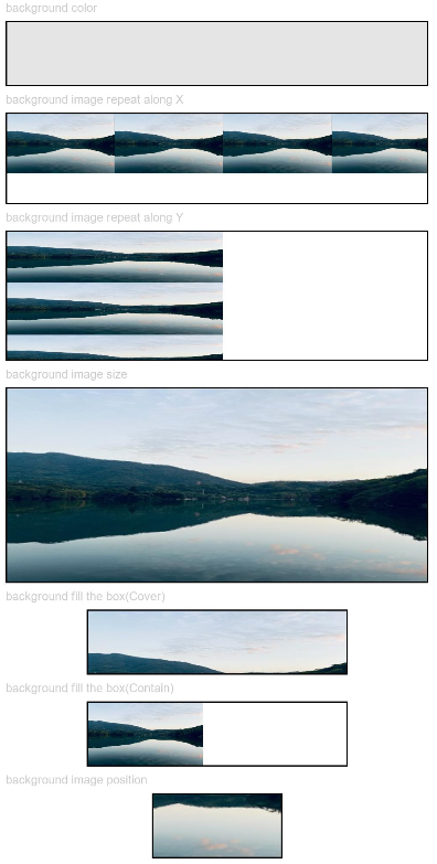
Example 1: Setting Basic Background Styles
This example shows how to configure basic background styles by setting backgroundColor, backgroundImage, backgroundImageSize, and backgroundImagePosition.
// xxx.ets
@Entry
@Component
struct BackgroundExample {

  build() {
    Column({ space: 5 }) {
      Text('background color').fontSize(9).width('90%').fontColor(0xCCCCCC)
      Row().width('90%').height(50).backgroundColor(0xE5E5E5).border({ width: 1 })

      Text('background image repeat along X').fontSize(9).width('90%').fontColor(0xCCCCCC)
      Row()
        .backgroundImage('/comment/bg.jpg', ImageRepeat.X)
        .backgroundImageSize({ width: '250px', height: '140px' })
        .width('90%')
        .height(70)
        .border({ width: 1 })

      Text('background image repeat along Y').fontSize(9).width('90%').fontColor(0xCCCCCC)
      Row()
        .backgroundImage('/comment/bg.jpg', ImageRepeat.Y)
        .backgroundImageSize({ width: '500px', height: '120px' })
        .width('90%')
        .height(100)
        .border({ width: 1 })

      Text('background image size').fontSize(9).width('90%').fontColor(0xCCCCCC)
      Row()
        .width('90%').height(150)
        .backgroundImage('/comment/bg.jpg', ImageRepeat.NoRepeat)
        .backgroundImageSize({ width: 1000, height: 500 })
        .border({ width: 1 })

      Text('background fill the box(Cover)').fontSize(9).width('90%').fontColor(0xCCCCCC)
      // Occupy all the space of the container, without ensuring that the image is completely displayed.
      Row()
        .width(200)
        .height(50)
        .backgroundImage('/comment/bg.jpg', ImageRepeat.NoRepeat)
        .backgroundImageSize(ImageSize.Cover)
        .border({ width: 1 })

      Text('background fill the box(Contain)').fontSize(9).width('90%').fontColor(0xCCCCCC)
      // Maximize the image while ensuring that it can be completely displayed.
      Row()
        .width(200)
        .height(50)
        .backgroundImage('/comment/bg.jpg', ImageRepeat.NoRepeat)
        .backgroundImageSize(ImageSize.Contain)
        .border({ width: 1 })

      Text('background image position').fontSize(9).width('90%').fontColor(0xCCCCCC)
      Row()
        .width(100)
        .height(50)
        .backgroundImage('/comment/bg.jpg', ImageRepeat.NoRepeat)
        .backgroundImageSize({ width: 1000, height: 560 })
        .backgroundImagePosition({ x: -500, y: -300 })
        .border({ width: 1 })
    }
    .width('100%').height('100%').padding({ top: 5 })
  }
}
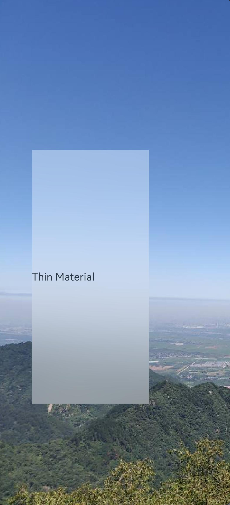
Example 2: Setting the Background Blur Style
This example sets the background blur style using backgroundBlurStyle.
// xxx.ets
@Entry
@Component
struct BackgroundBlurStyleDemo {
  build() {
    Column() {
      Row() {
        Text("Thin Material")
      }
      .width('50%')
      .height('50%')
      .backgroundBlurStyle(BlurStyle.Thin, { colorMode: ThemeColorMode.LIGHT, adaptiveColor: AdaptiveColor.DEFAULT, scale: 1.0 })
      .position({ x: '15%', y: '30%' })
    }
    .height('100%')
    .width('100%')
    .backgroundImage($r('app.media.bg'))
    .backgroundImageSize(ImageSize.Cover)
  }
}
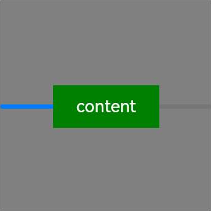
Example 3: Setting the Component Background
This example sets the component background using background.
// xxx.ets
@Entry
@Component
struct BackgroundExample {
  @Builder renderBackground() {
    Column() {
      Progress({value : 50})
    }
  }

  build() {
    Column() {
      Text("content")
        .width(100)
        .height(40)
        .fontColor("#FFF")
        .position({x:50, y:80})
        .textAlign(TextAlign.Center)
        .backgroundColor(Color.Green)
    }
    .width(200).height(200)
    .background(this.renderBackground)
    .backgroundColor(Color.Gray)
  }
}
Example 4: Setting Component Background Brightness
This example sets the component background brightness using backgroundBrightness.
// xxx.ets
@Entry
@Component
struct BackgroundBrightnessDemo {
  build() {
    Column() {
      Row() {
        Text("BackgroundBrightness")
      }
      .width(200)
      .height(100)
      .position({ x: 100, y: 100 })
      .backgroundBlurStyle(BlurStyle.Thin, { colorMode: ThemeColorMode.LIGHT, adaptiveColor: AdaptiveColor.DEFAULT})
      .backgroundBrightness({rate:0.5,lightUpDegree:0.5}) // Background brightness
    }
    .width('100%')
    .height('100%')
    .backgroundImage($r('app.media.image'))
    .backgroundImageSize(ImageSize.Cover)
  }
}
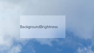
The following figures show how the component looks with the background brightness set.
When rate and lightUpDegree are both set to 0.5
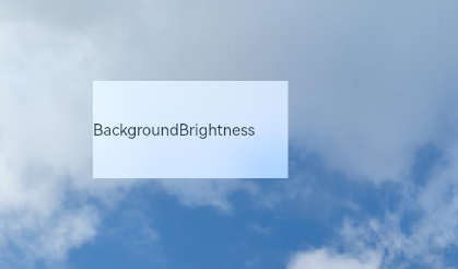
When rate is set to 0.5 and lightUpDegree -0.1
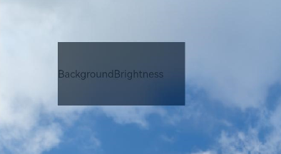
The following figure shows how the component looks without the background brightness set.
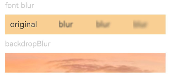
Example 5: Setting Blur Effects
This example shows how to use blur to apply a foreground blur effect and backdropBlur to apply a background blur effect.
// xxx.ets
@Entry
@Component
struct BlurEffectsExample {
  build() {
    Column({ space: 10 }) {
      // Blur the font.
      Text('font blur').fontSize(15).fontColor(0xCCCCCC).width('90%')
      Flex({ alignItems: ItemAlign.Center }) {
        Text('original text').margin(10)
        Text('blur text')
          .blur(5).margin(10)
        Text('blur text')
          .blur(10, undefined).margin(10) // Set the foreground blur radius to 5 and disable system adaptive adjustment.
        Text('blur text')
          .blur(15).margin(10)
      }.width('90%').height(40)
      .backgroundColor(0xF9CF93)


      // Blur the background.
      Text('backdropBlur').fontSize(15).fontColor(0xCCCCCC).width('90%')
      Text()
        .width('90%')
        .height(40)
        .fontSize(16)
        .backdropBlur(3)
        .backgroundImage($r('app.media.image'))
        .backgroundImageSize({ width: 1200, height: 160 })
    }.width('100%').margin({ top: 5 })
  }
}
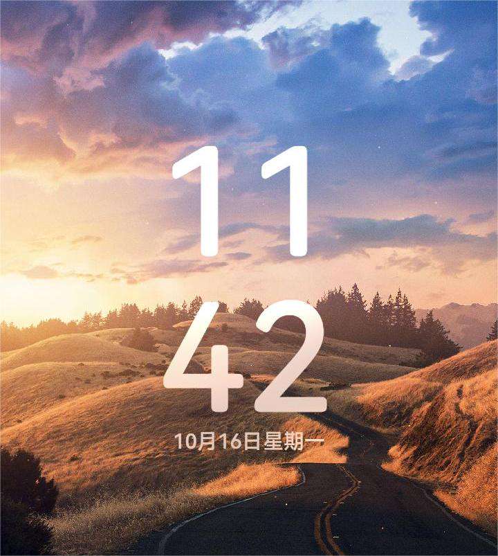
Example 6: Setting Text Blur Effects
This example applies anamorphic blur effects on text using blendMode and backgroundEffect.
If unwanted lines appear, make sure the sizes of the two owning components of blendMode are the same. If the issue persists, the component bounds may have fallen on the floating-point coordinates. In this case, set the universal attribute pixelRound to align the component bounds on both sides of the unwanted lines with the integer pixel coordinates.
// xxx.ets
@Entry
@Component
struct Index {
  @State shColor: Color = Color.White;
  @State sizeDate: number = 20;
  @State rVal: number = 255;
  @State gVal: number = 255;
  @State bVal: number = 255;
  @State aVal: number = 0.1;
  @State rad: number = 40;
  @State satVal: number = 0.8;
  @State briVal: number = 1.5;
  build() {
    Stack() {
      Image($r('app.media.image'))
      Column() {
        Column({ space: 0 }) {
          Column() {
            Text('11')
              .fontSize(144)
              .fontWeight(FontWeight.Bold)
              .fontColor('rgba(255,255,255,1)')
              .fontFamily('HarmonyOS-Sans-Digit')
              .maxLines(1)
              .lineHeight(120 * 1.25)
              .height(120 * 1.25)
              .letterSpacing(4 * 1.25)
            Text('42')
              .fontSize(144)
              .fontWeight(FontWeight.Bold)
              .fontColor('rgba(255,255,255,1)')
              .fontFamily('HarmonyOS-Sans-Digit')
              .maxLines(1)
              .lineHeight(120 * 1.25)
              .height(120 * 1.25)
              .letterSpacing(4 * 1.25)
              .shadow({
                color: 'rgba(0,0,0,0)',
                radius: 20,
                offsetX: 0,
                offsetY: 0
              })
            Row() {
              Text('October 16')
                .fontSize(this.sizeDate)
                .height(22)
                .fontWeight('medium')
                .fontColor('rgba(255,255,255,1)')
              Text('Monday')
                .fontSize(this.sizeDate)
                .height(22)
                .fontWeight('medium')
                .fontColor('rgba(255,255,255,1)')
            }
          }
          .blendMode(BlendMode.DST_IN, BlendApplyType.OFFSCREEN)
          .pixelRound({
            start: PixelRoundCalcPolicy.FORCE_FLOOR ,
            top: PixelRoundCalcPolicy.FORCE_FLOOR ,
            end: PixelRoundCalcPolicy.FORCE_CEIL,
            bottom: PixelRoundCalcPolicy.FORCE_CEIL
          })
        }
        .blendMode(BlendMode.SRC_OVER, BlendApplyType.OFFSCREEN)
        .backgroundEffect({
          radius: this.rad,
          saturation: this.satVal,
          brightness: this.briVal,
          color: this.getVolumeDialogWindowColor()
        })
        .justifyContent(FlexAlign.Center)
        .pixelRound({
          start: PixelRoundCalcPolicy.FORCE_FLOOR ,
          top: PixelRoundCalcPolicy.FORCE_FLOOR ,
          end: PixelRoundCalcPolicy.FORCE_CEIL,
          bottom: PixelRoundCalcPolicy.FORCE_CEIL
        })
      }
    }
  }
  getVolumeDialogWindowColor(): ResourceColor|string {
    return `rgba(${this.rVal.toFixed(0)}, ${this.gVal.toFixed(0)}, ${this.bVal.toFixed(0)}, ${this.aVal.toFixed(0)})`;
  }
}
Example 7: Comparing Blur Effects
This example compares three different blur effects: backgroundEffect, backDropBlur, and backgroundBlurStyle.
// xxx.ets
@Entry
@Component
struct BackGroundBlur {
  private imageSize: number = 150;

  build() {
    Column({ space: 5 }) {
      // Use backgroundBlurStyle with an enum value to set blur parameters.
      Stack() {
        Image($r('app.media.test'))
          .width(this.imageSize)
          .height(this.imageSize)
        Column()
          .width(this.imageSize)
          .height(this.imageSize)
          .backgroundBlurStyle(BlurStyle.Thin)
      }

      // backgroundEffect allows for custom settings for blur radius, brightness, saturation, and more.
      Stack() {
        Image($r('app.media.test'))
          .width(this.imageSize)
          .height(this.imageSize)
        Column()
          .width(this.imageSize)
          .height(this.imageSize)
          .backgroundEffect({ radius: 20, brightness: 0.6, saturation: 15 })
      }

      // backdropBlur only sets blur radius and grayscale parameters.
      Stack() {
        Image($r('app.media.test'))
          .width(this.imageSize)
          .height(this.imageSize)
        Column()
          .width(this.imageSize)
          .height(this.imageSize)
          .backdropBlur(20, { grayscale: [30, 50] })
      }
    }
    .width('100%')
    .padding({ top: 5 })
  }
}

你可能感兴趣的鸿蒙文章
- 所属分类: 后端技术
- 本文标签:
热门推荐
-
2、 优质文章
-
3、 gt
-
7、 openharmony
-
9、 golang
-
10、 Vue中input框自动聚焦