harmony 鸿蒙Chip
Chip
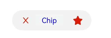
The chip component is typically used in the search box history or email address list.
NOTE
This component is supported since API version 11. Updates will be marked with a superscript to indicate their earliest API version.
Modules to Import
import { Chip, ChipOptions, ChipSize } from '@kit.ArkUI';
Child Components
Not supported
Chip
Chip(options:ChipOptions): void
Decorator: @Builder
Atomic service API: This API can be used in atomic services since API version 12.
System capability: SystemCapability.ArkUI.ArkUI.Full
Parameters
| Name | Type | Mandatory | Description |
|---|---|---|---|
| options | ChipOptions | Yes | Parameters of the chip. |
ChipOptions
Defines the type and style parameters of the chip.
System capability: SystemCapability.ArkUI.ArkUI.Full
| Name | Type | Mandatory | Description |
|---|---|---|---|
| size | ChipSize |SizeOptions | No | Size of the chip. Default value: ChipSize: ChipSize.NORMAL If of the SizeOptions type, this parameter cannot be set in percentage. Atomic service API: This API can be used in atomic services since API version 12. |
| enabled | boolean | No | Whether the chip can be selected. Default value: true true: The chip can be selected. false: The chip cannot be selected. Atomic service API: This API can be used in atomic services since API version 12. |
| activated12+ | boolean | No | Whether the chip is activated. Default value: false true: The chip is activated. false: The chip is not activated. Atomic service API: This API can be used in atomic services since API version 12. |
| prefixIcon | PrefixIconOptions | No | Prefix icon of the chip. Atomic service API: This API can be used in atomic services since API version 12. |
| prefixSymbol12+ | ChipSymbolGlyphOptions | No | Symbol-type prefix icon of the chip. Atomic service API: This API can be used in atomic services since API version 12. |
| label | LabelOptions | Yes | Text of the chip. Atomic service API: This API can be used in atomic services since API version 12. |
| suffixIcon | SuffixIconOptions | No | Suffix icon of the chip. Atomic service API: This API can be used in atomic services since API version 12. |
| suffixSymbol12+ | ChipSymbolGlyphOptions | No | Symbol-type suffix icon of the chip. Atomic service API: This API can be used in atomic services since API version 12. |
| suffixSymbolOptions14+ | ChipSuffixSymbolGlyphOptions | No | Accessibility settings of the symbol-type suffix icon. Atomic service API: This API can be used in atomic services since API version 14. |
| backgroundColor | ResourceColor | No | Background color of the chip. Default value: $r(‘sys.color.ohos_id_color_button_normal’) Atomic service API: This API can be used in atomic services since API version 12. |
| activatedBackgroundColor12+ | ResourceColor | No | Background color of the chip when it is activated. Default value: $r(‘sys.color.ohos_id_color_emphasize’). Atomic service API: This API can be used in atomic services since API version 12. |
| borderRadius | Dimension | No | Border radius of the chip. This parameter cannot be set in percentage. Default value: $r(‘sys.float.ohos_id_corner_radius_button’) Atomic service API: This API can be used in atomic services since API version 12. |
| allowClose | boolean | No | Whether to show the close icon. Default value: true Atomic service API: This API can be used in atomic services since API version 12. |
| onClose | ()=>void | No | Event triggered when the close icon is clicked. Atomic service API: This API can be used in atomic services since API version 12. |
| onClicked12+ | Callback<void> | No | Event triggered when the chip is clicked. Atomic service API: This API can be used in atomic services since API version 12. |
| direction12+ | Direction | No | Layout direction. Default value: Direction.Auto Atomic service API: This API can be used in atomic services since API version 12. |
| closeOptions14+ | CloseOptions | No | Accessibility settings of the default close icon. Atomic service API: This API can be used in atomic services since API version 14. |
| accessibilityDescription14+ | ResourceStr | No | Accessible description of the chip. You can provide comprehensive text explanations to help users understand the operation they are about to perform and its potential consequences, especially when these cannot be inferred from the component’s attributes and accessibility text alone. If a component contains both text information and the accessible description, the text is announced first and then the accessible description, when the component is selected. Atomic service API: This API can be used in atomic services since API version 14. |
| accessibilityLevel14+ | string | No | Accessibility level of the chip. It determines whether the component can be recognized by accessibility services. The options are as follows: “auto”: It is treated as “yes” by the system. “yes”: The component can be recognized by accessibility services. “no”: The component cannot be recognized by accessibility services. “no-hide-descendants”: Neither the component nor its child components can be recognized by accessibility services. Default value: “auto” Atomic service API: This API can be used in atomic services since API version 14. |
| accessibilitySelectedType14+ | AccessibilitySelectedType | No | Type of selected state for the chip. Default value: If the activated property is set but accessibilitySelectedType is not specified, the default type is CHECKED. If the activated property is not set, the default type is CLICKED. Atomic service API: This API can be used in atomic services since API version 14. |
NOTE
When suffixSymbol is provided with an argument, suffixIcon and allowClose will not take effect. If suffixSymbol is not provided, but suffixIcon is, allowClose still will not take effect. When neither suffixSymbol nor suffixIcon is provided with arguments, allowClose determines whether the deletion icon is displayed.
If undefined is assigned to backgroundColor or activatedBackgroundColor, the default background color is used. If an invalid value is specified, the background color is transparent.
Default font colors for prefixSymbol and suffixSymbol: normalFontColor: [$r(‘sys.color.ohos_id_color_primary’)]; activatedFontColor: [$r(‘sys.color.ohos_id_color_text_primary_contrary’)]. The default value of fontColor is 16.
The default value of fillColor is $r(‘sys.color.ohos_id_color_secondary’) for prefixIcon and $r(‘sys.color.ohos_id_color_primary’) for suffixIcon. The color parsing of fillColor is the same as that of the Image component.
The default value of activatedFillColor is $r(‘sys.color.ohos_id_color_text_primary_contrary’) for prefixIcon and $r(‘sys.color.ohos_id_color_text_primary_contrary’) for suffixIcon. The color parsing of activatedFillColor is the same as that of the Image component.
ChipSize
Enumerates the size types of the chip.
Atomic service API: This API can be used in atomic services since API version 12.
System capability: SystemCapability.ArkUI.ArkUI.Full
| Name | Value | Description |
|---|---|---|
| NORMAL | “NORMAL” | Normal size. |
| SMALL | “SMALL” | Small size. |
AccessibilitySelectedType14+
Enumerates the selected state types of the chip. It allows you to specify how accessibility services convey the component’s selected state to users. Different selected state types provide distinct semantics and user experiences.
Atomic service API: This API can be used in atomic services since API version 14.
System capability: SystemCapability.ArkUI.ArkUI.Full
|Name|Value|Description| |—-|–|—-| |CLICKED|0|Clickable type. The chip acts as a regular button, without reporting any selected state to accessibility services. Use this type when the chip triggers an action but does not maintain a selected state.| |CHECKED|1|Checkbox type. The chip reports its selected state to accessibility services using the accessibilityChecked attribute. Use this type for multi-select scenarios, such as tag filtering and attribute selection.| |SELECTED|2|Radio type. The chip reports its selected state to accessibility services using the accessibilitySelected attribute. Use this type for single-select scenarios, such as navigation bar tabs and radio buttons.|
IconCommonOptions
Defines the common icon options of the chip.
Atomic service API: This API can be used in atomic services since API version 12.
System capability: SystemCapability.ArkUI.ArkUI.Full
| Name | Type | Mandatory | Description |
|---|---|---|---|
| src | ResourceStr | Yes | Icon source, which can be a specific image path or an image reference. |
| size | SizeOptions | No | Icon size. This parameter cannot be set in percentage. Default value: {width: 16,height: 16} |
| fillColor | ResourceColor | No | Icon fill color. |
| activatedFillColor12+ | ResourceColor | No | Icon fill color when the chip is activated. |
NOTE
fillColor and activatedFillColor take effect only when the icon format is SVG.
PrefixIconOptions
Defines the prefix icon options.
Inherits IconCommonOptions.
Atomic service API: This API can be used in atomic services since API version 12.
System capability: SystemCapability.ArkUI.ArkUI.Full
SuffixIconOptions
Defines the suffix icon options.
Inherits IconCommonOptions.
System capability: SystemCapability.ArkUI.ArkUI.Full
| Name | Type | Mandatory | Description |
|---|---|---|---|
| action | () => void | No | Action of the suffix icon. Atomic service API: This API can be used in atomic services since API version 12. |
| accessibilityText14+ | ResourceStr | No | Accessibility text, that is, accessibility label name, of the suffix icon. If a component does not contain text information, it will not be announced by the screen reader when selected. In this case, the screen reader user cannot know which component is selected. To solve this problem, you can set accessibility text for components without text information. When such a component is selected, the screen reader announces the specified accessibility text, informing the user which component is selected. Atomic service API: This API can be used in atomic services since API version 14. |
| accessibilityDescription14+ | ResourceStr | No | Accessible description of the suffix icon. You can provide comprehensive text explanations to help users understand the operation they are about to perform and its potential consequences, especially when these cannot be inferred from the chip’s attributes and accessibility text alone. If a component contains both text information and the accessible description, the text is announced first and then the accessible description, when the component is selected. Atomic service API: This API can be used in atomic services since API version 14. |
| accessibilityLevel14+ | string | No | Accessibility level of the suffix icon. It determines whether the component can be recognized by accessibility services. The options are as follows: “auto”: It is treated as “yes” when action is set for the component and as “no” otherwise. “yes”: The component can be recognized by accessibility services. “no”: The component cannot be recognized by accessibility services. “no-hide-descendants”: Neither the component nor its child components can be recognized by accessibility services. Default value: “auto” Atomic service API: This API can be used in atomic services since API version 14. |
AccessibilityOptions14+
Defines the accessibility options of the suffix icon.
Atomic service API: This API can be used in atomic services since API version 14.
System capability: SystemCapability.ArkUI.ArkUI.Full
| Name | Type | Mandatory | Description |
|---|---|---|---|
| accessibilityText | ResourceStr | No | Accessibility text, that is, accessible label name. If a component does not contain text information, it will not be announced by the screen reader when selected. In this case, the screen reader user cannot know which component is selected. To solve this problem, you can set accessibility text for components without text information. When such a component is selected, the screen reader announces the specified accessibility text, informing the user which component is selected. |
| accessibilityDescription | ResourceStr | No | Accessibility description. You can provide comprehensive text explanations to help users understand the operation they are about to perform and its potential consequences, especially when these cannot be inferred from the component’s attributes and accessibility text alone. If a component contains both text information and the accessible description, the text is announced first and then the accessible description, when the component is selected. |
| accessibilityLevel | string | No | Accessibility level. It determines whether the component can be recognized by accessibility services. The options are as follows: “auto”: It is treated as “yes” by the system. “yes”: The component can be recognized by accessibility services. “no”: The component cannot be recognized by accessibility services. “no-hide-descendants”: Neither the component nor its child components can be recognized by accessibility services. Default value: “auto” |
ChipSuffixSymbolGlyphOptions14+
Defines the accessibility options of the symbol-type suffix icon.
Atomic service API: This API can be used in atomic services since API version 14.
System capability: SystemCapability.ArkUI.ArkUI.Full
| Name | Type | Mandatory | Description |
|---|---|---|---|
| action | VoidCallback | No | Action of the suffix icon. |
| normalAccessibility | AccessibilityOptions | No | Accessibility settings for the normal state. |
| activatedAccessibility | AccessibilityOptions | No | Accessibility settings for the activated state. |
ChipSymbolGlyphOptions12+
Defines the prefix and suffix icon options.
Atomic service API: This API can be used in atomic services since API version 12.
System capability: SystemCapability.ArkUI.ArkUI.Full
| Name | Type | Mandatory | Description |
|---|---|---|---|
| normal | SymbolGlyphModifier | No | Icon setup event. |
| activated | SymbolGlyphModifier | No | Icon setup event when the icon is activated. |
NOTE
Modifying the animation type with symbolEffect and setting the animation with effectStrategy are not supported.
LabelOptions
Defines the label options of the chip.
Atomic service API: This API can be used in atomic services since API version 12.
System capability: SystemCapability.ArkUI.ArkUI.Full
| Name | Type | Mandatory | Description |
|---|---|---|---|
| text | string | Yes | Text content. |
| fontSize | Dimension | No | Font size. This parameter cannot be set in percentage. Default value: $r(‘sys.float.ohos_id_text_size_button2’) |
| fontColor | ResourceColor | No | Font color. Default value: $r(‘sys.color.ohos_id_color_text_primary’) |
| activatedFontColor12+ | ResourceColor | No | Font color when the chip is activated. Default value: $r(‘sys.color.ohos_id_color_text_primary_contrary’). |
| fontFamily | string | No | Font family. Default value: “HarmonyOS Sans” |
| labelMargin | LabelMarginOptions | No | Spacing between the text and the left and right icons. |
| localizedLabelMargin12+ | LocalizedLabelMarginOptions | No | Spacing between the localized text and the left and right icons. Default value: { start: LengthMetrics.vp(6), end: LengthMetrics.vp(6) } |
CloseOptions14+
Defines the accessibility settings of the close icon. The default value of accessibilityText is Delete.
Inherits AccessibilityOptions.
Atomic service API: This API can be used in atomic services since API version 14.
System capability: SystemCapability.ArkUI.ArkUI.Full
LabelMarginOptions
Defines the spacing between the text and the left and right icons.
Atomic service API: This API can be used in atomic services since API version 12.
System capability: SystemCapability.ArkUI.ArkUI.Full
| Name | Type | Mandatory | Description |
|---|---|---|---|
| left | Dimension | No | Spacing between the text and the left icon. This parameter cannot be set in percentage. |
| right | Dimension | No | Spacing between the text and the right icon. This parameter cannot be set in percentage. |
LocalizedLabelMarginOptions12+
Defines the spacing between the localized text and the left and right icons.
Atomic service API: This API can be used in atomic services since API version 12.
System capability: SystemCapability.ArkUI.ArkUI.Full
| Name | Type | Mandatory | Description |
|---|---|---|---|
| start | LengthMetrics | No | Spacing between the text and the left icon. This parameter cannot be set in percentage. |
| end | LengthMetrics | No | Spacing between the text and the right icon. This parameter cannot be set in percentage. |
Example
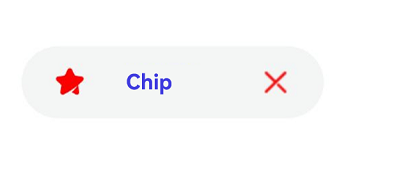
Example 1: Setting a Custom Suffix Icon
This example shows how to implement a custom suffix icon for a chip.
import { Chip, ChipSize } from '@kit.ArkUI';

@Entry
@Component
struct Index {
  build() {
    Column({ space: 10 }) {
      Chip({
        prefixIcon: {
          // Replace 'app.media.chips' with your actual icon resource.
          src: $r('app.media.chips'),
          size: { width: 16, height: 16 },
          fillColor: Color.Red
        },
        label: {
          text: "Chip",
          fontSize: 12,
          fontColor: Color.Blue,
          fontFamily: "HarmonyOS Sans",
          labelMargin: { left: 20, right: 30 }
        },
        suffixIcon: {
          // Replace 'app.media.close' with your actual icon resource.
          src: $r('app.media.close'),
          size: { width: 16, height: 16 },
          fillColor: Color.Red
        },
        size: ChipSize.NORMAL,
        allowClose: false,
        enabled: true,
        backgroundColor: $r('sys.color.ohos_id_color_button_normal'),
        borderRadius: $r('sys.float.ohos_id_corner_radius_button')
      })
    }
  }
}
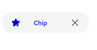
Example 2: Using the Default Suffix Icon
This example demonstrates how to display a default suffix delete icon by setting allowClose to true.
import { Chip, ChipSize } from '@kit.ArkUI';

@Entry
@Component
struct Index {
  build() {
    Column({ space: 10 }) {
      Chip({
        prefixIcon: {
          // Replace 'app.media.chips' with your actual icon resource.
          src: $r('app.media.chips'),
          size: { width: 16, height: 16 },
          fillColor: Color.Blue
        },
        label: {
          text: "Chip",
          fontSize: 12,
          fontColor: Color.Blue,
          fontFamily: "HarmonyOS Sans",
          labelMargin: { left: 20, right: 30 }
        },
        size: ChipSize.NORMAL,
        allowClose: true,
        enabled: true,
        backgroundColor: $r('sys.color.ohos_id_color_button_normal'),
        borderRadius: $r('sys.float.ohos_id_corner_radius_button')
      })
    }
  }
}
Example 3: Displaying No Suffix Icon
This example shows how to hide the suffix delete icon by setting allowClose to false.
import { Chip, ChipSize } from '@kit.ArkUI';

@Entry
@Component
struct Index {
  build() {
    Column({ space: 10 }) {
      Chip({
        prefixIcon: {
          // Replace 'app.media.chips' with your actual icon resource.
          src: $r('app.media.chips'),
          size: { width: 16, height: 16 },
          fillColor: Color.Blue
        },
        label: {
          text: "Chip",
          fontSize: 12,
          fontColor: Color.Blue,
          fontFamily: "HarmonyOS Sans",
          labelMargin: { left: 20, right: 30 }
        },
        size: ChipSize.SMALL,
        allowClose: false,
        enabled: true,
        backgroundColor: $r('sys.color.ohos_id_color_button_normal'),
        borderRadius: $r('sys.float.ohos_id_corner_radius_button'),
        onClose:()=>{
          console.log("chip on close")
      }
      })
    }
  }
}

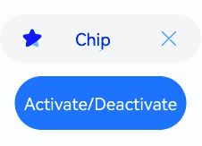
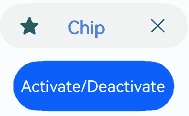
Example 4: Implementing the Activated State
This example shows how to implement the activated state for a chip by configuring activated.
import { Chip, ChipSize } from '@kit.ArkUI';

@Entry
@Component
struct Index {
  @State isActivated: boolean = false

  build() {
    Column({ space: 10 }) {
      Chip({
        prefixIcon: {
          // Replace 'app.media.chips' with your actual icon resource.
          src: $r('app.media.chips'),
          size: { width: 16, height: 16 },
          fillColor: Color.Blue,
          activatedFillColor: $r('sys.color.ohos_id_color_text_primary_contrary')
        },
        label: {
          text: "Chip",
          fontSize: 12,
          fontColor: Color.Blue,
          activatedFontColor: $r('sys.color.ohos_id_color_text_primary_contrary'),
          fontFamily: "HarmonyOS Sans",
          labelMargin: { left: 20, right: 30 }
        },
        size: ChipSize.NORMAL,
        allowClose: true,
        enabled: true,
        activated: this.isActivated,
        backgroundColor: $r('sys.color.ohos_id_color_button_normal'),
        activatedBackgroundColor: $r('sys.color.ohos_id_color_emphasize'),
        borderRadius: $r('sys.float.ohos_id_corner_radius_button'),
        onClose:()=>{
          console.log("chip on close")
        },
        onClicked:()=>{
          console.log("chip on clicked")
        }
      })

      Button('Activate/Deactivate').onClick(()=>{
        this.isActivated = !this.isActivated
      })
    }
  }
}
Example 5: Setting the Symbol Icon
This example implements symbol-type prefix and suffix icons for the Chip component.
import { Chip, ChipSize, SymbolGlyphModifier } from '@kit.ArkUI';

@Entry
@Component
struct Index {
  @State isActivated: boolean = false

  build() {
    Column({ space: 10 }) {
      Chip({
        prefixIcon: {
          // Replace 'app.media.chips' with your actual icon resource.
          src: $r('app.media.chips'),
          size: { width: 16, height: 16 },
          fillColor: Color.Blue,
          activatedFillColor: $r('sys.color.ohos_id_color_text_primary_contrary')
        },
		prefixSymbol: {
          normal: new SymbolGlyphModifier($r('sys.symbol.ohos_star')).fontSize(16).fontColor([Color.Green]),
          activated: new SymbolGlyphModifier($r('sys.symbol.ohos_star')).fontSize(16).fontColor([Color.Red]),
		},
        label: {
          text: "Chip",
          fontSize: 12,
          fontColor: Color.Blue,
          activatedFontColor: $r('sys.color.ohos_id_color_text_primary_contrary'),
          fontFamily: "HarmonyOS Sans",
          labelMargin: { left: 20, right: 30 },
        },
        size: ChipSize.NORMAL,
        allowClose: true,
        enabled: true,
        activated: this.isActivated,
        backgroundColor: $r('sys.color.ohos_id_color_button_normal'),
        activatedBackgroundColor: $r('sys.color.ohos_id_color_emphasize'),
        borderRadius: $r('sys.float.ohos_id_corner_radius_button'),
        onClose:()=>{
          console.log("chip on close")
        },
        onClicked:()=>{
          console.log("chip on clicked")
        }
      })

      Button('Activate/Deactivate').onClick(()=>{
        this.isActivated = !this.isActivated
      })
    }
  }
}
Example 6: Implementing a Mirroring Effect
This example shows how to achieve a mirroring effect for a chip by configuring direction.
import { Chip, ChipSize,LengthMetrics } from '@kit.ArkUI';

@Entry
@Component
struct ChipPage {

  build() {
    Column() {
      Chip({
        direction: Direction.Rtl,
        prefixIcon: {
          // Replace 'app.media.chips' with your actual icon resource.
          src: $r('app.media.chips'),
          size: { width: 16, height: 16 },
          fillColor: Color.Red,
        },
        label: {
          text: "Chip",
          fontSize: 12,
          fontColor: Color.Blue,
          fontFamily: "HarmonyOS Sans",
          localizedLabelMargin: { start: LengthMetrics.vp(20), end: LengthMetrics.vp(20) },
        },
        suffixIcon: {
          // Replace 'app.media.close' with your actual icon resource.
          src: $r('app.media.close'),
          size: { width: 16, height: 16 },
          fillColor: Color.Red,
        },
        size: ChipSize.NORMAL,
        allowClose: false,
        enabled: true,
        backgroundColor: $r('sys.color.ohos_id_color_button_normal'),
        borderRadius: $r('sys.float.ohos_id_corner_radius_button')
      })
    }.justifyContent(FlexAlign.Center)
    .width('100%')
    .height('100%')
  }
}
Example 7: Implementing Accessibility for an Image-Type Suffix Icon
This example implements the accessibility feature for a chip with an image-type suffix icon.
// xxx.ets
import { Chip } from '@kit.ArkUI';

@Builder
function DefaultFunction(): void {
}

@Component
struct SectionGroup {
  @Prop
  @Require
  title: ResourceStr;
  @BuilderParam
  @Require
  content: () => void = DefaultFunction;

  build() {
    Column({ space: 4 }) {
      Text(this.title)
        .fontColor('#FF666666')
        .fontSize(12)
      Column({ space: 8 }) {
        this.content()
      }
    }
    .alignItems(HorizontalAlign.Start)
    .width('100%')
  }
}

@Component
struct SectionItem {
  @Prop
  @Require
  title: ResourceStr;
  @BuilderParam
  @Require
  content: () => void = DefaultFunction;

  build() {
    Column({ space: 12 }) {
      Text(this.title)
      this.content()
    }
    .backgroundColor('#FFFFFFFF')
    .borderRadius(12)
    .padding(12)
    .width('100%')
  }
}

@Entry
@Component
struct ChipExample2 {
  @State activated: boolean = false;

  build() {
    NavDestination() {
      Scroll() {
        SectionGroup({ title: 'Suffix icon announcement' }) {
          SectionItem({ title: 'Custom announcement' }) {
            Chip({
              label: { text: 'Chip' },
              suffixIcon: {
                src: $r('sys.media.ohos_ic_public_cut'),
                accessibilityText: 'Icon',
                accessibilityDescription: 'Usage hints',
                action: () => {
                  this.getUIContext().getPromptAction().showToast({
                    message: 'Suffix icon touched.'
                  });
                }
              },
              onClicked: () => {
                this.getUIContext().getPromptAction().showToast({
                  message: 'Chip touched.'
                });
              }
            })
          }
        }
      }
    }
  }
}
Example 8: Implementing Accessibility for a Symbol-Type Suffix Icon
This example implements the accessibility feature for a chip with a symbol-type suffix icon.
import { Chip, SymbolGlyphModifier } from '@kit.ArkUI';

@Builder
function DefaultFunction(): void {
}

@Component
struct SectionGroup {
  @Prop
  @Require
  title: ResourceStr;
  @BuilderParam
  @Require
  content: () => void = DefaultFunction;

  build() {
    Column({ space: 4 }) {
      Text(this.title)
        .fontColor('#FF666666')
        .fontSize(12)
      Column({ space: 8 }) {
        this.content()
      }
    }
    .alignItems(HorizontalAlign.Start)
    .width('100%')
  }
}

@Component
struct SectionItem {
  @Prop
  @Require
  title: ResourceStr;
  @BuilderParam
  @Require
  content: () => void = DefaultFunction;

  build() {
    Column({ space: 12 }) {
      Text(this.title)
      this.content()
    }
    .backgroundColor('#FFFFFFFF')
    .borderRadius(12)
    .padding(12)
    .width('100%')
  }
}

@Entry
@Component
struct ChipExample2 {
  @State activated: boolean = false;

  build() {
    NavDestination() {
      Scroll() {
          SectionGroup({ title: 'Suffix symbol announcement' }) {
            SectionItem({ title: 'activatedAccessibility' }) {
              Chip({
                label: { text: 'Chip' },
                activated: true,
                suffixSymbol: {
                  activated: new SymbolGlyphModifier($r('sys.symbol.media_sound'))
                    .fontSize(72),
                },
                suffixSymbolOptions: {
                  activatedAccessibility: {
                    accessibilityText: 'Music',
                    accessibilityDescription: 'Usage hints'
                  },
                  action: () => {
                    this.getUIContext().getPromptAction().showToast({
                      message: 'Suffix symbol touched.'
                    });
                  }
                },
                onClicked: () => {
                  this.getUIContext().getPromptAction().showToast({
                    message: 'Chip touched.'
                  });
                }
              })
            }
            SectionItem({ title: 'normalAccessibility' }) {
              Chip({
                label: { text: 'Chip' },
                suffixSymbol: {
                  normal: new SymbolGlyphModifier($r('sys.symbol.media_sound'))
                    .fontSize(72),
                },
                suffixSymbolOptions: {
                  normalAccessibility: {
                    accessibilityText: 'Music',
                    accessibilityDescription: 'Usage hints'
                  },
                  action: () => {
                    this.getUIContext().getPromptAction().showToast({
                      message: 'Suffix symbol touched.'
                    });
                  }
                },
                onClicked: () => {
                  this.getUIContext().getPromptAction().showToast({
                    message: 'Chip touched.'
                  });
                }
              })
            }
          }
        }
      }
      .padding({
        top: 8,
        bottom: 8,
        left: 16,
        right: 16,
      })
    }
}
Example 9: Implementing Chip Accessibility
This example demonstrates how to set accessibility properties for the chip, including different selected state types.
import { AccessibilitySelectedType, Chip, ChipSize } from '@kit.ArkUI';

@Entry
@Component
struct ChipAccessibilityExample {
  @State clickedChipActivated: boolean = false;
  @State checkedChipActivated: boolean = false;
  @State selectedChipActivated: boolean = false;

  build() {
    Column({ space: 20 }) {
      Text("Chip accessibility example").fontSize(20).fontWeight(FontWeight.Bold)

      // Clickable chip - CLICKED type
      Chip({
        label: { text: "Clickable chip" },
        prefixIcon: {
          src: $r('sys.media.ohos_app_icon'),
          fillColor: Color.Blue
        },
        size: ChipSize.NORMAL,
        accessibilitySelectedType: AccessibilitySelectedType.CLICKED, // Clickable type
        accessibilityDescription: "This is a clickable chip", // Overall accessibility description
        accessibilityLevel: "yes," // Make sure it can be recognized by accessibility services.
        closeOptions: {
          accessibilityDescription: "Remove this chip. This action cannot be undone" // Detailed description for the close icon.
        },
        activated: this.clickedChipActivated,
        onClicked: () => {
          this.clickedChipActivated = !this.clickedChipActivated;
          this.getUIContext().getPromptAction().showToast({ message: "Clickable chip is clicked" });
        },
        onClose: () => {
          this.getUIContext().getPromptAction().showToast({ message: "The close icon of the clickable chip is clicked" });
        }
      })

      // Checkbox chip - CHECKED type
      Chip({
        label: { text: "Checkbox chip" },
        prefixIcon: {
          src: $r('sys.media.ohos_app_icon'),
          fillColor: Color.Green
        },
        size: ChipSize.NORMAL,
        accessibilitySelectedType: AccessibilitySelectedType.CHECKED, // Checkbox chip
        accessibilityDescription: "This is a checkbox chip", // Overall accessibility description
        activated: this.checkedChipActivated,
        onClicked: () => {
          this.checkedChipActivated = !this.checkedChipActivated;
          this.getUIContext().getPromptAction().showToast({
            message: this.checkedChipActivated ? "Checkbox chip is selected" : "Checkbox chip is deselected"
          });
        }
      })

      // Radio chip - SELECTED type
      Chip({
        label: { text: "Radio chip" },
        prefixIcon: {
          src: $r('sys.media.ohos_app_icon'),
          fillColor: Color.Red
        },
        size: ChipSize.NORMAL,
        accessibilitySelectedType: AccessibilitySelectedType.SELECTED, // Radio type
        accessibilityDescription: "This is a radio chip", // Overall accessibility description
        activated: this.selectedChipActivated,
        onClicked: () => {
          this.selectedChipActivated = !this.selectedChipActivated;
          this.getUIContext().getPromptAction().showToast({
            message: this.checkedChipActivated ? "Radio chip is selected" : "Radio chip is deselected"
          });
        }
      })

      // Example of setting the accessibility level
      Chip({
        label: { text: ""Accessibility level set to no" },
        size: ChipSize.NORMAL,
        accessibilityLevel: "no," // This chip cannot be recognized by accessibility services.
        closeOptions: {
          accessibilityLevel: "no"
        },
        backgroundColor: '#CCCCCC',
        onClicked: () => {
          this.getUIContext().getPromptAction().showToast({ message: "This chip cannot be recognized by accessibility services." });
        }
      })
    }
    .width('100%')
    .padding(16)
  }
}
你可能感兴趣的鸿蒙文章
- 所属分类: 后端技术
- 本文标签:
热门推荐
-
2、 优质文章
-
3、 gt
-
7、 openharmony
-
9、 golang
-
10、 Vue中input框自动聚焦