harmony 鸿蒙图片边框设置
图片边框设置
设置容器组件的图片边框样式。
说明:
从API Version 9开始支持。后续版本如有新增内容,则采用上角标单独标记该内容的起始版本。
属性
| 名称 | 参数类型 | 描述 |
|---|---|---|
| borderImage | BorderImageOption | 图片边框或者渐变色边框设置接口。 该接口支持在ArkTS卡片中使用。 |
BorderImageOption对象说明
该接口支持在ArkTS卡片中使用。
| 名称 | 类型 | 描述 |
|---|---|---|
| source | string |Resource |linearGradient | 边框图源或者渐变色设置。 说明: 边框图源仅适用于容器组件,如Row、Column、Flex,在非容器组件上使用会失效。 |
| slice | Length |EdgeWidths | 设置边框图片左上角、右上角、左下角以及右下角的切割宽度。 默认值:0 说明: 设置负数时取默认值。 参数类型为Length时,统一设置四个角的宽高。 参数类型为EdgeWidths时: - Top:设置图片左上角或者右上角被切割的高。 - Bottom:设置图片左下角或者右下角被切割的高。 - Left:设置图片左上角或者左下角被切割的宽。 - Right:设置图片右上角或者右下角被切割的宽。 |
| width | Length |EdgeWidths | 设置图片边框宽度。 默认值:0 说明: 参数类型为Length时,统一设置四个角的宽高,设置负数时取默认值。 参数类型为EdgeWidths时: - Top:设置图片边框上边框的宽。 - Bottom:设置图片边框下边框的宽。 - Left:设置图片边框左边框的宽。 - Right:设置图片边框右边框宽。 设置负数时值取1。 |
| outset | Length |EdgeWidths | 设置边框图片向外延伸距离。 默认值:0 说明: 设置负数时取默认值。 参数类型为Length时,统一设置四个角的宽高。 参数类型为EdgeWidths时: - Top:设置边框图片上边框向外延伸的距离。 - Bottom:设置边框图片下边框向外延伸的距离。 - Left:设置边框图片左边框向外延伸的距离。 - Right:设置边框图片右边框向外延伸的距离。 |
| repeat | RepeatMode | 设置被切割的图片在边框上的重复方式。 默认值:RepeatMode.Stretch |
| fill | boolean | 设置边框图片中心填充。 默认值:false |
RepeatMode枚举说明
该接口支持在ArkTS卡片中使用。
| 名称 | 描述 |
|---|---|
| Repeat | 被切割图片重复铺平在图片边框上,超出的部分会被剪裁。 |
| Stretch | 被切割图片以拉伸填充的方式铺满图片边框。 |
| Round | 被切割图片以整数次平铺在图片边框上,无法以整数次平铺时压缩被切割图片。 |
| Space | 被切割图片以整数次平铺在图片边框上,无法以整数次平铺时以空白填充。 |
示例
示例1
// xxx.ets
@Entry
@Component
struct Index {
build() {
Row() {
Column() {
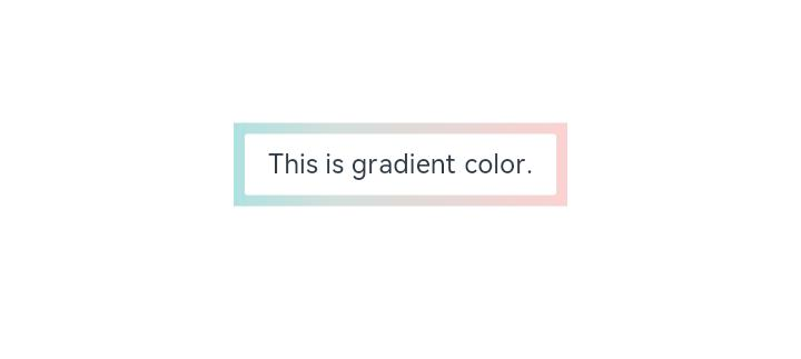
Text('This is gradient color.').textAlign(TextAlign.Center).height(50).width(200)
.borderImage({
source: {
angle: 90,
direction: GradientDirection.Left,
colors: [[0xAEE1E1, 0.0], [0xD3E0DC, 0.3], [0xFCD1D1, 1.0]]
},
slice: { top: 10, bottom: 10, left: 10, right: 10 },
width: { top: "10px", bottom: "10px", left: "10px", right: "10px" },
repeat: RepeatMode.Stretch,
fill: false
})
}
.width('100%')
}
.height('100%')
}
}
示例2
// xxx.ets
@Entry
@Component
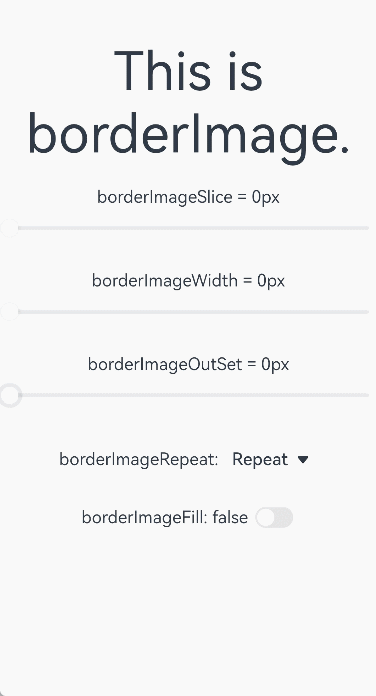
struct BorderImage {
@State WidthValue: number = 0
@State SliceValue: number = 0
@State OutSetValue: number = 0
@State RepeatValue: RepeatMode[] = [RepeatMode.Repeat, RepeatMode.Stretch, RepeatMode.Round, RepeatMode.Space]
@State SelectIndex: number = 0
@State SelectText: string = 'Repeat'
@State FillValue: boolean = false
build() {
Row() {
Column({ space: 20 }) {
Row() {
Text('This is borderImage.').textAlign(TextAlign.Center).fontSize(50)
}
.borderImage({
source: $r('app.media.icon'),
slice: this.SliceValue,
width: this.WidthValue,
outset: this.OutSetValue,
repeat: this.RepeatValue[this.SelectIndex],
fill: this.FillValue
})
Column() {
Text(`borderImageSlice = ${this.SliceValue}px`)
Slider({
value: this.SliceValue,
min: 0,
max: 100,
style: SliderStyle.OutSet
})
.onChange((value: number, mode: SliderChangeMode) => {
this.SliceValue = value
})
}
Column() {
Text(`borderImageWidth = ${this.WidthValue}px`)
Slider({
value: this.WidthValue,
min: 0,
max: 100,
style: SliderStyle.OutSet
})
.onChange((value: number, mode: SliderChangeMode) => {
this.WidthValue = value
})
}
Column() {
Text(`borderImageOutSet = ${this.OutSetValue}px`)
Slider({
value: this.OutSetValue,
min: 0,
max: 100,
style: SliderStyle.OutSet
})
.onChange((value: number, mode: SliderChangeMode) => {
this.OutSetValue = value
})
}
Row() {
Text('borderImageRepeat: ')
Select([{ value: 'Repeat' }, { value: 'Stretch' }, { value: 'Round' }, { value: 'Space' }])
.value(this.SelectText)
.selected(this.SelectIndex)
.onSelect((index: number, value?: string) => {
this.SelectIndex = index
this.SelectText = value as string
})
}
Row() {
Text(`borderImageFill: ${this.FillValue} `)
Toggle({ type: ToggleType.Switch, isOn: this.FillValue })
.onChange((isOn: boolean) => {
this.FillValue = isOn
})
}
}
.width('100%')
}
.height('100%')
}
}
你可能感兴趣的鸿蒙文章
harmony 鸿蒙@ohos.arkui.advanced.Counter(计数器组件)
harmony 鸿蒙@ohos.arkui.advanced.SegmentButton(分段按钮)
0
赞
热门推荐
-
2、 优质文章
-
3、 gt
-
7、 openharmony
-
9、 golang
-
10、 Vue中input框自动聚焦