harmony 鸿蒙Button
Button
按钮组件,可快速创建不同样式的按钮。
说明:
该组件从API Version 7开始支持。后续版本如有新增内容,则采用上角标单独标记该内容的起始版本。
子组件
可以包含单个子组件。
接口
Button
Button(options?: {type?: ButtonType, stateEffect?: boolean})
从API version 9开始,该接口支持在ArkTS卡片中使用。
参数:
| 参数名 | 参数类型 | 必填 | 参数描述 |
|---|---|---|---|
| type | ButtonType | 否 | 描述按钮显示样式。 默认值:ButtonType.Capsule |
| stateEffect | boolean | 否 | 按钮按下时是否开启按压态显示效果,当设置为false时,按压效果关闭。 默认值:true 说明: 当开启按压态显示效果,开发者设置状态样式时,会基于状态样式设置完成后的背景色再进行颜色叠加。 |
Button
Button(label?: ResourceStr, options?: { type?: ButtonType, stateEffect?: boolean })
使用文本内容创建相应的按钮组件,此时Button无法包含子组件。
从API version 9开始,该接口支持在ArkTS卡片中使用。
参数:
| 参数名 | 参数类型 | 必填 | 参数描述 |
|---|---|---|---|
| label | ResourceStr | 否 | 按钮文本内容。 |
| options | { type?: ButtonType, stateEffect?: boolean } | 否 | 见Button参数说明。 |
属性
除支持通用属性外,还支持以下属性:
| 名称 | 参数类型 | 描述 |
|---|---|---|
| type | ButtonType | 设置Button样式。 默认值:ButtonType.Capsule 从API version 9开始,该接口支持在ArkTS卡片中使用。 |
| stateEffect | boolean | 按钮按下时是否开启按压态显示效果,当设置为false时,按压效果关闭。 默认值:true 从API version 9开始,该接口支持在ArkTS卡片中使用。 |
| labelStyle10+ | LabelStyle | 设置Button组件label文本和字体的样式。 |
ButtonType枚举说明
从API version 9开始,该接口支持在ArkTS卡片中使用。
| 名称 | 描述 |
|---|---|
| Capsule | 胶囊型按钮(圆角默认为高度的一半)。 |
| Circle | 圆形按钮。 |
| Normal | 普通按钮(默认不带圆角)。 |
说明: - 按钮圆角通过通用属性borderRadius设置(不支持通过border接口设置圆角),且只支持设置参数为Length的圆角。 - 当按钮类型为Capsule时,borderRadius设置不生效,按钮圆角始终为宽、高中较小值的一半。 - 当按钮类型为Circle时,borderRadius即为按钮半径,若未设置borderRadius按钮半径则为宽、高中较小值的一半。 - 按钮文本通过通用文本样式进行设置。 - 设置颜色渐变需先设置backgroundColor为透明色。
LabelStyle10+对象说明
| 名称 | 参数类型 | 必填 | 描述 |
|---|---|---|---|
| overflow | TextOverflow | 否 | 设置Label文本超长时的显示方式。文本截断是按字截断。例如,英文以单词为最小单位进行截断,若需要以字母为单位进行截断,可在字母间添加零宽空格。 |
| maxLines | number | 否 | 设置Label文本的最大行数。默认情况下,文本是自动折行的,如果指定此参数,则文本最多不会超过指定的行。如果有多余的文本,可以通过textOverflow来指定截断方式。 |
| minFontSize | number |ResourceStr | 否 | 设置Label文本最小显示字号。需配合maxFontSize以及maxLines或布局大小限制使用。 |
| maxFontSize | number |ResourceStr | 否 | 设置Label文本最大显示字号。需配合minFontSize以及maxLines或布局大小限制使用。 |
| heightAdaptivePolicy | TextHeightAdaptivePolicy | 否 | 设置Label文本自适应高度的方式。 |
| font | Font | 否 | 设置Label文本字体样式。 |
事件
支持通用事件。
示例
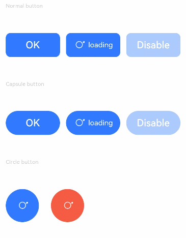
示例1
// xxx.ets
@Entry
@Component
struct ButtonExample {
  build() {
    Flex({ direction: FlexDirection.Column, alignItems: ItemAlign.Start, justifyContent: FlexAlign.SpaceBetween }) {
      Text('Normal button').fontSize(9).fontColor(0xCCCCCC)
      Flex({ alignItems: ItemAlign.Center, justifyContent: FlexAlign.SpaceBetween }) {
        Button('OK', { type: ButtonType.Normal, stateEffect: true })
          .borderRadius(8)
          .backgroundColor(0x317aff)
          .width(90)
          .onClick(() => {
            console.log('ButtonType.Normal')
          })
        Button({ type: ButtonType.Normal, stateEffect: true }) {
          Row() {
            LoadingProgress().width(20).height(20).margin({ left: 12 }).color(0xFFFFFF)
            Text('loading').fontSize(12).fontColor(0xffffff).margin({ left: 5, right: 12 })
          }.alignItems(VerticalAlign.Center)
        }.borderRadius(8).backgroundColor(0x317aff).width(90).height(40)

        Button('Disable', { type: ButtonType.Normal, stateEffect: false }).opacity(0.4)
          .borderRadius(8).backgroundColor(0x317aff).width(90)
      }

      Text('Capsule button').fontSize(9).fontColor(0xCCCCCC)
      Flex({ alignItems: ItemAlign.Center, justifyContent: FlexAlign.SpaceBetween }) {
        Button('OK', { type: ButtonType.Capsule, stateEffect: true }).backgroundColor(0x317aff).width(90)
        Button({ type: ButtonType.Capsule, stateEffect: true }) {
          Row() {
            LoadingProgress().width(20).height(20).margin({ left: 12 }).color(0xFFFFFF)
            Text('loading').fontSize(12).fontColor(0xffffff).margin({ left: 5, right: 12 })
          }.alignItems(VerticalAlign.Center).width(90).height(40)
        }.backgroundColor(0x317aff)

        Button('Disable', { type: ButtonType.Capsule, stateEffect: false }).opacity(0.4)
          .backgroundColor(0x317aff).width(90)
      }

      Text('Circle button').fontSize(9).fontColor(0xCCCCCC)
      Flex({ alignItems: ItemAlign.Center, wrap: FlexWrap.Wrap }) {
        Button({ type: ButtonType.Circle, stateEffect: true }) {
          LoadingProgress().width(20).height(20).color(0xFFFFFF)
        }.width(55).height(55).backgroundColor(0x317aff)

        Button({ type: ButtonType.Circle, stateEffect: true }) {
          LoadingProgress().width(20).height(20).color(0xFFFFFF)
        }.width(55).height(55).margin({ left: 20 }).backgroundColor(0xF55A42)
      }
    }.height(400).padding({ left: 35, right: 35, top: 35 })
  }
}
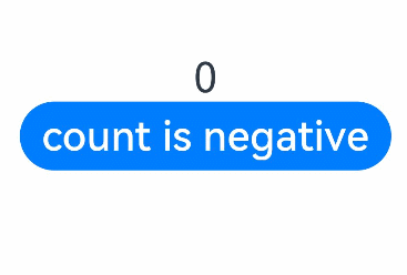
示例2
// xxx.ets
@Entry
@Component
struct SwipeGestureExample {
  @State count: number = 0

  build() {
    Column() {
      Text(`${this.count}`)
        .fontSize(30)
        .onClick(() => {
          this.count++
        })
      if (this.count <= 0) {
        Button('count is negative').fontSize(30).height(50)
      } else if (this.count % 2 === 0) {
        Button('count is even').fontSize(30).height(50)
      } else {
        Button('count is odd').fontSize(30).height(50)
      }
    }.height('100%').width('100%').justifyContent(FlexAlign.Center)
  }
}
示例3
// xxx.ets
@Entry
@Component
struct buttonTestDemo {
  @State txt: string = 'overflowTextOverlengthTextOverflow.Clip';
  @State widthShortSize: number = 200;

  build() {
    Row() {
      Column() {
        Button(this.txt)
          .width(this.widthShortSize)
          .height(100)
          .labelStyle({ overflow: TextOverflow.Clip,
            maxLines: 1,
            minFontSize: 20,
            maxFontSize: 20,
            font: {
              size: 20,
              weight: FontWeight.Bolder,
              family: 'cursive',
              style: FontStyle.Italic
            }
          })
          .fontSize(40)
      }
      .width('100%')
    }
    .height('100%')
  }
}

你可能感兴趣的鸿蒙文章
harmony 鸿蒙@ohos.arkui.advanced.Counter(计数器组件)
harmony 鸿蒙@ohos.arkui.advanced.SegmentButton(分段按钮)
0
赞
热门推荐
-
2、 优质文章
-
3、 gt
-
7、 openharmony
-
9、 golang
-
10、 Vue中input框自动聚焦