harmony 鸿蒙边框设置
边框设置
设置组件边框样式。
说明:
从API Version 7开始支持。后续版本如有新增内容,则采用上角标单独标记该内容的起始版本。
从API Version 9开始,父节点的border显示在子节点内容之上。
属性
| 名称 | 参数类型 | 描述 |
|---|---|---|
| border | { width?: Length | EdgeWidths9+, color?: ResourceColor | EdgeColors9+, radius?: Length | BorderRadiuses9+, style?: BorderStyle | EdgeStyles9+ } |
统一边框样式设置接口。 - width:设置边框宽度。 - color:设置边框颜色。 - radius:设置边框圆角半径。 - style:设置边框样式。 从API version 9开始,该接口支持在ArkTS卡片中使用。 说明: 边框宽度默认值为0,即不显示边框。 |
| borderStyle | BorderStyle |EdgeStyles9+ | 设置元素的边框样式。 默认值:BorderStyle.Solid 从API version 9开始,该接口支持在ArkTS卡片中使用。 |
| borderWidth | Length |EdgeWidths9+ | 设置元素的边框宽度,不支持百分比。 从API version 9开始,该接口支持在ArkTS卡片中使用。 |
| borderColor | ResourceColor |EdgeColors9+ | 设置元素的边框颜色。 默认值:Color.Black 从API version 9开始,该接口支持在ArkTS卡片中使用。 |
| borderRadius | Length |BorderRadiuses9+ | 设置元素的边框圆角半径,不支持百分比。 从API version 9开始,该接口支持在ArkTS卡片中使用。 |
EdgeWidths9+对象说明
引入该对象时,至少传入一个参数。
| 名称 | 参数类型 | 必填 | 描述 |
|---|---|---|---|
| left | Length | 否 | 左侧边框宽度。 |
| right | Length | 否 | 右侧边框宽度。 |
| top | Length | 否 | 上侧边框宽度。 |
| bottom | Length | 否 | 下侧边框宽度。 |
EdgeColors9+对象说明
引入该对象时,至少传入一个参数。
| 名称 | 参数类型 | 必填 | 描述 |
|---|---|---|---|
| left | ResourceColor | 否 | 左侧边框颜色。 |
| right | ResourceColor | 否 | 右侧边框颜色。 |
| top | ResourceColor | 否 | 上侧边框颜色。 |
| bottom | ResourceColor | 否 | 下侧边框颜色。 |
BorderRadiuses9+对象说明
引用该对象时,至少传入一个参数。
| 名称 | 参数类型 | 必填 | 描述 |
|---|---|---|---|
| topLeft | Length | 否 | 左上角圆角半径。 |
| topRight | Length | 否 | 右上角圆角半径。 |
| bottomLeft | Length | 否 | 左下角圆角半径。 |
| bottomRight | Length | 否 | 右下角圆角半径。 |
EdgeStyles9+对象说明
引入该对象时,至少传入一个参数。
| 名称 | 参数类型 | 必填 | 描述 |
|---|---|---|---|
| left | BorderStyle | 否 | 左侧边框样式。 |
| right | BorderStyle | 否 | 右侧边框样式。 |
| top | BorderStyle | 否 | 上侧边框样式。 |
| bottom | BorderStyle | 否 | 下侧边框样式。 |
示例
// xxx.ets
@Entry
@Component
struct BorderExample {
build() {
Column() {
Flex({ justifyContent: FlexAlign.SpaceAround, alignItems: ItemAlign.Center }) {
// 线段
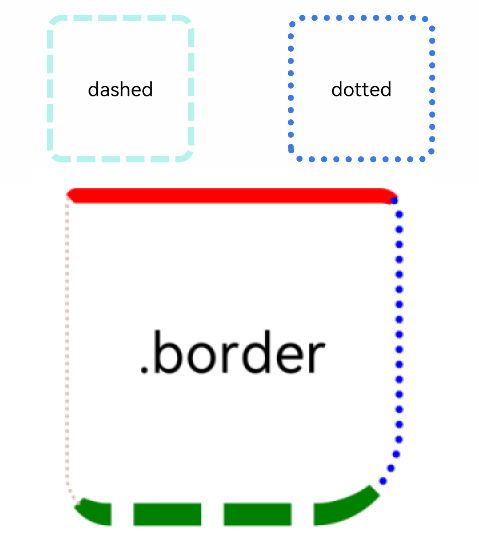
Text('dashed')
.borderStyle(BorderStyle.Dashed).borderWidth(5).borderColor(0xAFEEEE).borderRadius(10)
.width(120).height(120).textAlign(TextAlign.Center).fontSize(16)
// 点线
Text('dotted')
.border({ width: 5, color: 0x317AF7, radius: 10, style: BorderStyle.Dotted })
.width(120).height(120).textAlign(TextAlign.Center).fontSize(16)
}.width('100%').height(150)
Text('.border')
.fontSize(50)
.width(300)
.height(300)
.border({
width: { left: 3, right: 6, top: 10, bottom: 15 },
color: { left: '#e3bbbb', right: Color.Blue, top: Color.Red, bottom: Color.Green },
radius: { topLeft: 10, topRight: 20, bottomLeft: 40, bottomRight: 80 },
style: {
left: BorderStyle.Dotted,
right: BorderStyle.Dotted,
top: BorderStyle.Solid,
bottom: BorderStyle.Dashed
}
}).textAlign(TextAlign.Center)
}
}
}
你可能感兴趣的鸿蒙文章
harmony 鸿蒙@ohos.arkui.advanced.Counter(计数器组件)
harmony 鸿蒙@ohos.arkui.advanced.SegmentButton(分段按钮)
0
赞
热门推荐
-
2、 优质文章
-
3、 gt
-
7、 openharmony
-
9、 golang
-
10、 Vue中input框自动聚焦