harmony 鸿蒙背景设置
背景设置
设置组件的背景样式。
说明:
从API Version 7开始支持。后续版本如有新增内容,则采用上角标单独标记该内容的起始版本。
属性
| 名称 | 参数类型 | 描述 |
|---|---|---|
| background10+ | builder: CustomBuilder, options?: {align?:Alignment} |
builder:自定义背景。 align:设置自定义背景与组件的对齐方式。 同时设置了background,backgroundColor,backgroundImage时,叠加显示,background在最上层。 说明: 自定义背景渲染会有一定延迟,不能响应事件,不能进行动态更新。该属性不支持嵌套使用,不支持预览器预览。 |
| backgroundColor | ResourceColor | 设置组件的背景色。 从API version 9开始,该接口支持在ArkTS卡片中使用。 |
| backgroundImage | src: ResourceStr, repeat?: ImageRepeat |
src:图片地址,支持网络图片资源地址和本地图片资源地址和Base64,不支持svg类型的图片。 repeat:设置背景图片的重复样式,默认不重复。当设置的背景图片为透明底色图片,且同时设置了backgroundColor时,二者叠加显示,背景颜色在最底部。 从API version 9开始,该接口支持在ArkTS卡片中使用。 |
| backgroundImageSize | { width?: Length, height?: Length } | ImageSize |
设置背景图像的高度和宽度。当输入为{width: Length, height: Length}对象时,如果只设置一个属性,则第二个属性保持图片原始宽高比进行调整。默认保持原图的比例不变。 width和height取值范围: [0, +∞) 默认值:ImageSize.Auto 从API version 9开始,该接口支持在ArkTS卡片中使用。 说明: 设置为小于0的值时,按值为0显示。当设置了height未设置width时,width根据图片原始宽高比进行调整。 |
| backgroundImagePosition | Position | Alignment | 设置背景图在组件中显示位置,即相对于组件左上角的坐标。 默认值: { x: 0, y: 0 } x和y值设置百分比时,偏移量是相对组件自身宽高计算的。 从API version 9开始,该接口支持在ArkTS卡片中使用。 |
| backgroundBlurStyle9+ | value:BlurStyle, options10+?:BackgroundBlurStyleOptions |
为当前组件提供一种在背景和内容之间的模糊能力。 value: 背景模糊样式。模糊样式中封装了模糊半径、蒙版颜色、蒙版透明度、饱和度、亮度五个参数。 options: 可选参数,背景模糊选项。 该接口支持在ArkTS卡片中使用。 |
BackgroundBlurStyleOptions10+对象说明
| 名称 | 参数类型 | 必填 | 描述 |
|---|---|---|---|
| colorMode | ThemeColorMode | 否 | 背景模糊效果使用的深浅色模式。 默认值:ThemeColorMode.System |
| adaptiveColor | AdaptiveColor | 否 | 背景模糊效果使用的取色模式。 默认值:AdaptiveColor.Default |
| scale | number | 否 | 背景材质模糊效果程度。此参数为系统接口。 默认值:1.0 取值范围:[0.0, 1.0] |
示例
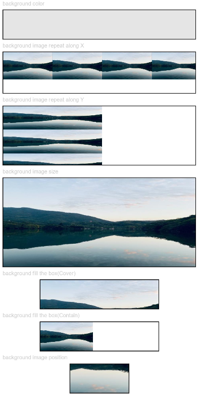
示例1
// xxx.ets
@Entry
@Component
struct BackgroundExample {

  build() {
    Column({ space: 5 }) {
      Text('background color').fontSize(9).width('90%').fontColor(0xCCCCCC)
      Row().width('90%').height(50).backgroundColor(0xE5E5E5).border({ width: 1 })

      Text('background image repeat along X').fontSize(9).width('90%').fontColor(0xCCCCCC)
      Row()
        .backgroundImage('/comment/bg.jpg', ImageRepeat.X)
        .backgroundImageSize({ width: '250px', height: '140px' })
        .width('90%')
        .height(70)
        .border({ width: 1 })

      Text('background image repeat along Y').fontSize(9).width('90%').fontColor(0xCCCCCC)
      Row()
        .backgroundImage('/comment/bg.jpg', ImageRepeat.Y)
        .backgroundImageSize({ width: '500px', height: '120px' })
        .width('90%')
        .height(100)
        .border({ width: 1 })

      Text('background image size').fontSize(9).width('90%').fontColor(0xCCCCCC)
      Row()
        .width('90%').height(150)
        .backgroundImage('/comment/bg.jpg', ImageRepeat.NoRepeat)
        .backgroundImageSize({ width: 1000, height: 500 })
        .border({ width: 1 })

      Text('background fill the box(Cover)').fontSize(9).width('90%').fontColor(0xCCCCCC)
      // 不保准图片完整的情况下占满盒子
      Row()
        .width(200)
        .height(50)
        .backgroundImage('/comment/bg.jpg', ImageRepeat.NoRepeat)
        .backgroundImageSize(ImageSize.Cover)
        .border({ width: 1 })

      Text('background fill the box(Contain)').fontSize(9).width('90%').fontColor(0xCCCCCC)
      // 保准图片完整的情况下放到最大
      Row()
        .width(200)
        .height(50)
        .backgroundImage('/comment/bg.jpg', ImageRepeat.NoRepeat)
        .backgroundImageSize(ImageSize.Contain)
        .border({ width: 1 })

      Text('background image position').fontSize(9).width('90%').fontColor(0xCCCCCC)
      Row()
        .width(100)
        .height(50)
        .backgroundImage('/comment/bg.jpg', ImageRepeat.NoRepeat)
        .backgroundImageSize({ width: 1000, height: 560 })
        .backgroundImagePosition({ x: -500, y: -300 })
        .border({ width: 1 })
    }
    .width('100%').height('100%').padding({ top: 5 })
  }
}
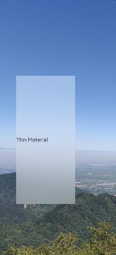
示例2
// xxx.ets
@Entry
@Component
struct BackgroundBlurStyleDemo {
  build() {
    Column() {
      Row() {
        Text("Thin Material")
      }
      .width('50%')
      .height('50%')
      .backgroundBlurStyle(BlurStyle.Thin, { colorMode: ThemeColorMode.LIGHT, adaptiveColor: AdaptiveColor.DEFAULT, scale: 1.0 })
      .position({ x: '15%', y: '30%' })
    }
    .height('100%')
    .width('100%')
    .backgroundImage($r('app.media.bg'))
    .backgroundImageSize(ImageSize.Cover)
  }
}
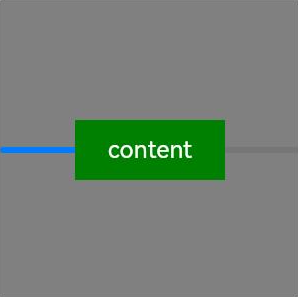
示例3
// xxx.ets
@Entry
@Component
struct BackgroundExample {
  @Builder renderBackground() {
    Column() {
      Progress({value : 50})
    }
  }

  build() {
    Column() {
      Text("content")
        .width(100)
        .height(40)
        .fontColor("#FFF")
        .position({x:50, y:80})
        .textAlign(TextAlign.Center)
        .backgroundColor(Color.Green)
    }
    .width(200).height(200)
    .background(this.renderBackground)
    .backgroundColor(Color.Gray)
  }
}
你可能感兴趣的鸿蒙文章
harmony 鸿蒙@ohos.arkui.advanced.Counter(计数器组件)
harmony 鸿蒙@ohos.arkui.advanced.SegmentButton(分段按钮)
1
赞
热门推荐
-
2、 优质文章
-
3、 gt
-
7、 openharmony
-
9、 golang
-
10、 Vue中input框自动聚焦