harmony 鸿蒙@ohos.arkui.advanced.SegmentButton(分段按钮)
@ohos.arkui.advanced.SegmentButton(分段按钮)
分段按钮组件,包含页签类分段按钮、单选类分段按钮、多选类分段按钮。
说明:
该组件及其子组件从 API Version 11 开始支持。后续版本如有新增内容,则采用上角标单独标记该内容的起始版本。
导入模块
import { SegmentButton, SegmentButtonOptions, SegmentButtonItemOptionsArray } from '@ohos.arkui.advanced.SegmentButton'
子组件
无
SegmentButton
SegmentButton({ options: SegmentButtonOptions, selectedIndexes: number[] })
装饰器类型:@Component
系统能力: SystemCapability.ArkUI.ArkUI.Full
参数:
| 名称 | 参数类型 | 必填 | 装饰器类型 | 说明 |
|---|---|---|---|---|
| options | SegmentButtonOptions | 是 | @ObjectLink | 分段按钮选项。 |
| selectedIndexes | number[] | 是 | @Link | 分段按钮的选中项编号,第一项的编号为0,之后顺序增加。 说明: selectedIndexes使用@Link装饰器:父子双向同步,仅支持有效的按钮编号(第一个按钮编号为0,之后按顺序累加),如没有选中项可传入空数组[]。 |
说明:
分段按钮组件不支持通用属性。分段按钮组件使用当前区域可使用的最大宽度做为组件宽度,并且根据按钮个数平均分配每个按钮宽度;分段按钮组件高度根据按钮内容(文本及图片)自动适应,其最小高度为28vp。
SegmentButtonOptions
分段按钮选项类,用于为分段按钮提供初始数据和自定义属性。
属性
| 属性 | 类型 | 描述 |
|---|---|---|
| type | “tab” |“capsule” | 分段按钮的类型。 |
| multiply | boolean | 是否可以多选。 说明: 页签类分段按钮只支持单选,设置 multiply为true不生效。 |
| buttons | SegmentButtonItemOptionsArray | 按钮信息,包括图标和文本信息。 |
| fontColor | ResourceColor | 按钮未选中态的文本颜色,默认值:#99182431。 |
| selectedFontColor | ResourceColor | 按钮选中态的文本颜色,默认值:#ff182431。 |
| fontSize | DimensionNoPercentage | 按钮未选中态的字体大小(不支持百分比设置),默认值:14.0fp。 |
| selectedFontSize | DimensionNoPercentage | 按钮选中态的字体大小(不支持百分比设置),默认值:14.0fp。 |
| fontWeight | FontWeight | 按钮未选中态的字体粗细,默认值:FontWeight.Regular。 |
| selectedFontWeight | FontWeight | 按钮选中态的字体粗细,默认值:FontWeight.Medium。 |
| backgroundColor | ResourceColor | 底板颜色,默认值:页签类#0c182431,单选类/多选类#0c182431。 |
| selectedBackgroundColor | ResourceColor | 按钮选中态底板颜色,默认值:页签类#ffffffff,单选类/多选类#ff007dff。 |
| imageSize | SizeOptions | 图片尺寸,默认值:{ width: 24, height: 24 }。 说明: imageSize属性对仅图标按钮和图标+文本按钮生效,对仅文字按钮无效果。 |
| buttonMargin | Margin|Dimension | 按钮内边距,默认值:{ top: 4, right: 8, bottom: 4, left: 8 }。 |
| textMargin | Margin|Dimension | 文本内边距,默认值:0。 |
constructor
constructor(options: TabSegmentButtonOptions|CapsuleSegmentButtonOptions)
构造函数。
参数:
| 名称 | 参数类型 | 必填 | 说明 |
|---|---|---|---|
| options | TabSegmentButtonConstructionOptions | CapsuleSegmentButtonConstructionOptions | 是 | 页签类或者单选类/多选类分段按钮信息。 |
tab
static tab(options: TabSegmentButtonConstructionOptions): SegmentButtonOptions
创建页签类的SegmentButtonOptions。
参数:
| 名称 | 参数类型 | 必填 | 说明 |
|---|---|---|---|
| options | TabSegmentButtonConstructionOptions | 是 | 页签类分段按钮信息。 |
返回值:
| 类型 | 说明 |
|---|---|
| SegmentButtonOptions | 分段按钮选项。 |
capsule
static capsule(options: CapsuleSegmentButtonConstructionOptions): SegmentButtonOptions
创建单选类/多选类的SegmentButtonOptions。
参数:
| 名称 | 参数类型 | 必填 | 说明 |
|---|---|---|---|
| options | CapsuleSegmentButtonConstructionOptions | 是 | 单选类/多选类分段按钮信息。 |
返回值:
| 类型 | 说明 |
|---|---|
| SegmentButtonOptions | 分段按钮选项。 |
DimensionNoPercentage
不支持百分比类型的长度的联合类型。
系统能力: SystemCapability.ArkUI.ArkUI.Full
| 取值范围 | 说明 |
|---|---|
| PX | 长度类型,用于描述以px像素单位为单位的长度。 |
| VP | 长度类型,用于描述以vp像素单位为单位的长度。 |
| FP | 长度类型,用于描述以fp像素单位为单位的长度。 |
| LPX | 长度类型,用于描述以lpx像素单位为单位的长度。 |
| Resource | 资源引用类型,用于设置组件属性的值。 |
CommonSegmentButtonOptions
用于定义分段按钮组件可自定义的属性。
系统能力: SystemCapability.ArkUI.ArkUI.Full
属性:
| 属性 | 类型 | 描述 |
|---|---|---|
| fontColor | ResourceColor | 按钮未选中态的文本颜色,默认值:#99182431。 |
| selectedFontColor | ResourceColor | 按钮选中态的文本颜色,默认值:#ff182431。 |
| fontSize | DimensionNoPercentage | 按钮未选中态的字体大小(不支持百分比设置),默认值:14.0fp。 |
| selectedFontSize | DimensionNoPercentage | 按钮选中态的字体大小(不支持百分比设置),默认值:14.0fp。 |
| fontWeight | FontWeight | 按钮未选中态的字体粗细,默认值:FontWeight.Regular。 |
| selectedFontWeight | FontWeight | 按钮选中态的字体粗细,默认值:FontWeight.Medium。 |
| backgroundColor | ResourceColor | 底板颜色,默认值:页签类#0c182431,单选类/多选类#0c182431。 |
| selectedBackgroundColor | ResourceColor | 按钮选中态底板颜色,默认值:页签类#ffffffff,单选类/多选类#ff007dff。 |
| imageSize | SizeOptions | 图片尺寸,默认值:{ width: 24, height: 24 }。 说明: imageSize属性对仅图标按钮和图标+文本按钮生效,对仅文字按钮无效果。 |
| buttonMargin | Margin|Dimension | 按钮内边距,默认值:{ top: 4, right: 8, bottom: 4, left: 8 }。 |
| textMargin | Margin|Dimension | 文本内边距,默认值:0。 |
TabSegmentButtonConstructionOptions
用于构建页签类的SegmentButtonOptions对象。
系统能力: SystemCapability.ArkUI.ArkUI.Full
| 属性 | 类型 | 必填 | 描述 |
|---|---|---|---|
| buttons | ItemRestriction<SegmentButtonTextItem> | 是 | 按钮信息。 |
CapsuleSegmentButtonConstructionOptions
用于构建单选类/多选类的SegmentButtonOptions对象。
系统能力: SystemCapability.ArkUI.ArkUI.Full
| 属性 | 类型 | 必填 | 描述 |
|---|---|---|---|
| buttons | SegmentButtonItemTuple | 是 | 按钮信息。 |
| multiply | boolean | 否 | 是否可以多选,默认值:false。 |
ItemRestriction
用于保存按钮信息的元组。
| 取值范围 | 说明 |
|---|---|
| ItemRestriction<T> = [T, T, T?, T?, T?] | 表示包含2~5个相同类型元素的元组。 |
说明:
分段按钮组件仅支持2到5个按钮。
SegmentButtonItemTuple
用于保存按钮信息的元组的联合类型。
系统能力: SystemCapability.ArkUI.ArkUI.Full
| 取值范围 | 说明 |
|---|---|
| ItemRestriction<SegmentButtonTextItem> | 仅文本按钮信息的元组。 |
| ItemRestriction<SegmentButtonIconItem> | 仅图标按钮信息的元组。 |
| ItemRestriction<SegmentButtonIconTextItem> | 图标+文本按钮信息的元组。 |
SegmentButtonItemArray
用于保存按钮信息的数组的联合类型。
系统能力: SystemCapability.ArkUI.ArkUI.Full
| 取值范围 | 说明 |
|---|---|
| Array<SegmentButtonTextItem> | 仅文本按钮信息的数组。 |
| Array<SegmentButtonIconItem> | 仅图标按钮信息的数组。 |
| Array<SegmentButtonIconTextItem> | 图标+文本按钮信息的数组。 |
SegmentButtonItemOptionsArray
用于保存按钮信息的数组。
说明:
分段按钮组件仅支持2到5个按钮,SegmentButtonItemOptionsArray只保存2到5个按钮信息。
constructor
constructor(elements: SegmentButtonItemTuple)
构造函数。
参数:
| 名称 | 参数类型 | 必填 | 说明 |
|---|---|---|---|
| elements | SegmentButtonItemTuple | 是 | 按钮信息。 |
push
push(…items: SegmentButtonItemArray): number
在数组末尾添加新的元素,返回添加元素后数组的长度。
参数:
| 名称 | 参数类型 | 必填 | 说明 |
|---|---|---|---|
| items | SegmentButtonItemArray | 是 | 被添加的按钮信息数组。 |
返回值:
| 类型 | 说明 |
|---|---|
| number | 添加元素后数组的长度。 |
说明:
分段按钮组件仅支持2到5个按钮,SegmentButtonItemOptionsArray只保存2到5个按钮信息,当超过按钮信息个数限制此方法无效。
pop
pop(): SegmentButtonItemOptions|undefined
移除数组末尾最后一个元素,返回被移除的元素。
返回值:
| 类型 | 说明 |
|---|---|
| SegmentButtonItemOptions|undefined | 被移除的元素。 |
说明:
分段按钮组件仅支持2到5个按钮,SegmentButtonItemOptionsArray只保存2到5个按钮信息,当超过按钮信息个数限制此方法无效。
shift
shift(): SegmentButtonItemOptions|undefined
移除数组开头第一个元素,返回被移除的元素。
返回值:
| 类型 | 说明 |
|---|---|
| SegmentButtonItemOptions|undefined | 被移除的元素。 |
说明:
分段按钮组件仅支持2到5个按钮,SegmentButtonItemOptionsArray只保存2到5个按钮信息,当超过按钮信息个数限制此方法无效。
unshift
unshift(…items: SegmentButtonItemArray): number
在数组开头添加新的元素,返回添加元素后数组的长度。
参数:
| 名称 | 参数类型 | 必填 | 说明 |
|---|---|---|---|
| items | SegmentButtonItemArray | 是 | 添加的按钮信息数组。 |
返回值:
| 类型 | 说明 |
|---|---|
| number | 添加元素后数组的长度。 |
说明:
分段按钮组件仅支持2到5个按钮,SegmentButtonItemOptionsArray只保存2到5个按钮信息,当超过按钮信息个数限制此方法无效。
splice
splice(start: number, deleteCount: number, …items: SegmentButtonItemOptions[]): SegmentButtonItemOptions[]
在数组中,删除从start位置开始的deleteCount数量的元素,并插入items中的元素,返回一个包含了被删除的元素的数组。
参数:
| 名称 | 参数类型 | 必填 | 说明 |
|---|---|---|---|
| start | number | 是 | 删除元素的起始位置。 |
| deleteCount | number | 是 | 删除元素的数量。 |
| items | SegmentButtonItemOptions[] | 否 | 插入元素数组。 |
返回值:
| 类型 | 说明 |
|---|---|
| SegmentButtonItemOptions[] | 返回包含了被删除的元素的数组。 |
说明:
分段按钮组件仅支持2到5个按钮,SegmentButtonItemOptionsArray只保存2到5个按钮信息,当超过按钮信息个数限制此方法无效。
create
static create(elements: SegmentButtonItemTuple): SegmentButtonItemOptionsArray
创建一个SegmentButtonItemOptionsArray对象。
参数:
| 名称 | 参数类型 | 必填 | 说明 |
|---|---|---|---|
| elements | SegmentButtonItemTuple | 是 | 按钮信息。 |
返回值:
| 类型 | 说明 |
|---|---|
| SegmentButtonItemOptionsArray | 创建的SegmentButtonItemOptionsArray对象。 |
TabSegmentButtonOptions
页签类分段按钮选项。继承自TabSegmentButtonConstructionOptions。
系统能力: SystemCapability.ArkUI.ArkUI.Full
| 属性 | 类型 | 必填 | 描述 |
|---|---|---|---|
| type | “tab” | 否 | 类型为页签类分段按钮。 |
CapsuleSegmentButtonOptions
单选类/多选类分段按钮选项。继承自CapsuleSegmentButtonConstructionOptions。
系统能力: SystemCapability.ArkUI.ArkUI.Full
| 属性 | 类型 | 必填 | 描述 |
|---|---|---|---|
| type | “capsule” | 否 | 类型为单选类/多选类分段按钮。 |
SegmentButtonTextItem
仅文本按钮信息。
系统能力: SystemCapability.ArkUI.ArkUI.Full
| 属性 | 类型 | 必填 | 描述 |
|---|---|---|---|
| text | ResourceStr | 是 | 按钮文本。 |
SegmentButtonIconItem
仅图标按钮信息。
系统能力: SystemCapability.ArkUI.ArkUI.Full
| 属性 | 类型 | 必填 | 描述 |
|---|---|---|---|
| icon | ResourceStr | 是 | 未选中态的按钮图标。 |
| selectedIcon | ResourceStr | 是 | 选中态的按钮图标。 |
说明:
未选中态图标
icon与选中态图标selectedIcon都需要被设置,单独设置不生效。
SegmentButtonIconTextItem
图标+文本按钮信息。
系统能力: SystemCapability.ArkUI.ArkUI.Full
| 属性 | 类型 | 必填 | 描述 |
|---|---|---|---|
| icon | ResourceStr | 是 | 未选中态的按钮图标。 |
| selectedIcon | ResourceStr | 是 | 选中态的按钮图标。 |
| text | ResourceStr | 是 | 按钮文本。 |
说明:
未选中态图标
icon与选中态图标selectedIcon都需要被设置,单独设置不生效。
SegmentButtonItemOptions
分段按钮中按钮的选项。
属性:
| 属性 | 类型 | 必填 | 描述 |
|---|---|---|---|
| icon | ResourceStr | 否 | 未选中态的按钮图标。 |
| selectedIcon | ResourceStr | 否 | 选中态的按钮图标。 |
| text | ResourceStr | 否 | 按钮文本。 |
constructor
constructor(options: SegmentButtonItemOptionsConstructorOptions)
构造函数。
参数:
| 参数名 | 类型 | 必填 | 说明 |
|---|---|---|---|
| options | SegmentButtonItemOptionsConstructorOptions | 是 | 分段按钮按钮选项。 |
SegmentButtonItemOptionsConstructorOptions
SegmentButtonItemOptions的构造参数。
系统能力: SystemCapability.ArkUI.ArkUI.Full
| 属性 | 类型 | 必填 | 描述 |
|---|---|---|---|
| icon | ResourceStr | 否 | 未选中态的按钮图标。 |
| selectedIcon | ResourceStr | 否 | 选中态的按钮图标。 |
| text | ResourceStr | 否 | 按钮文本。 |
示例
示例1
// xxx.ets
import { SegmentButton, SegmentButtonOptions } from '@ohos.arkui.advanced.SegmentButton'
@Entry
@Component
struct Index {
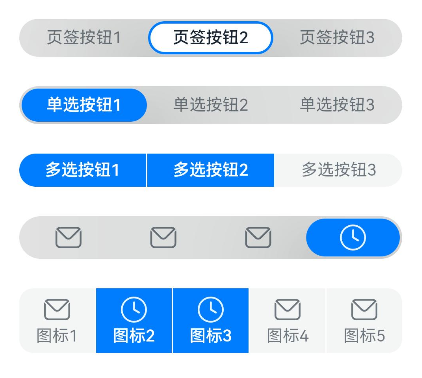
@State tabOptions: SegmentButtonOptions = SegmentButtonOptions.tab({
buttons: [{ text: '页签按钮1' }, { text: '页签按钮2' }, { text: '页签按钮3' }]
})
@State singleSelectCapsuleOptions: SegmentButtonOptions = SegmentButtonOptions.capsule({
buttons: [{ text: '单选按钮1' }, { text: '单选按钮2' }, { text: '单选按钮3' }],
multiply: false,
})
@State multiplySelectCapsuleOptions: SegmentButtonOptions = SegmentButtonOptions.capsule({
buttons: [{ text: '多选按钮1' }, { text: '多选按钮2' }, { text: '多选按钮3' }],
multiply: true
})
@State iconCapsuleOptions: SegmentButtonOptions = SegmentButtonOptions.capsule({
buttons: [
{ icon: $r('sys.media.ohos_ic_public_email'), selectedIcon: $r('sys.media.ohos_ic_public_clock') },
{ icon: $r('sys.media.ohos_ic_public_email'), selectedIcon: $r('sys.media.ohos_ic_public_clock') },
{ icon: $r('sys.media.ohos_ic_public_email'), selectedIcon: $r('sys.media.ohos_ic_public_clock') },
{ icon: $r('sys.media.ohos_ic_public_email'), selectedIcon: $r('sys.media.ohos_ic_public_clock') }
],
multiply: false
})
@State iconTextCapsuleOptions: SegmentButtonOptions = SegmentButtonOptions.capsule({
buttons: [
{ text: '图标1', icon: $r('sys.media.ohos_ic_public_email'), selectedIcon: $r('sys.media.ohos_ic_public_clock') },
{ text: '图标2', icon: $r('sys.media.ohos_ic_public_email'), selectedIcon: $r('sys.media.ohos_ic_public_clock') },
{ text: '图标3', icon: $r('sys.media.ohos_ic_public_email'), selectedIcon: $r('sys.media.ohos_ic_public_clock') },
{ text: '图标4', icon: $r('sys.media.ohos_ic_public_email'), selectedIcon: $r('sys.media.ohos_ic_public_clock') },
{ text: '图标5', icon: $r('sys.media.ohos_ic_public_email'), selectedIcon: $r('sys.media.ohos_ic_public_clock') }
],
multiply: true
})
@State tabSelectedIndexes: number[] = [1]
@State singleSelectCapsuleSelectedIndexes: number[] = [0]
@State multiplySelectCapsuleSelectedIndexes: number[] = [0, 1]
@State singleSelectIconCapsuleSelectedIndexes: number[] = [3]
@State multiplySelectIconTextCapsuleSelectedIndexes: number[] = [1, 2]
build() {
Row() {
Column() {
Column({ space: 25 }) {
SegmentButton({ options: this.tabOptions,
selectedIndexes: $tabSelectedIndexes })
SegmentButton({ options: this.singleSelectCapsuleOptions,
selectedIndexes: $singleSelectCapsuleSelectedIndexes })
SegmentButton({
options: this.multiplySelectCapsuleOptions,
selectedIndexes: $multiplySelectCapsuleSelectedIndexes })
SegmentButton({ options: this.iconCapsuleOptions,
selectedIndexes: $singleSelectIconCapsuleSelectedIndexes })
SegmentButton({ options: this.iconTextCapsuleOptions,
selectedIndexes: $multiplySelectIconTextCapsuleSelectedIndexes })
}.width('90%')
}.width('100%')
}.height('100%')
}
}
示例2
// xxx.ets
import { SegmentButton, SegmentButtonOptions } from '@ohos.arkui.advanced.SegmentButton'

@Entry
@Component
struct Index {
  @State tabOptions: SegmentButtonOptions = SegmentButtonOptions.tab({
    buttons: [{ text: '页签按钮1' }, { text: '页签按钮2' }, { text: '页签按钮3' }],
    backgroundColor: Color.Green,
    selectedBackgroundColor: Color.Orange,
    textMargin: { top: 10, right: 10, bottom: 10, left: 10 },
  })
  @State singleSelectCapsuleOptions: SegmentButtonOptions = SegmentButtonOptions.capsule({
    buttons: [{ text: '单选按钮1' }, { text: '单选按钮2' }, { text: '单选按钮3' }],
    multiply: false,
    fontColor: Color.Black,
    selectedFontColor: Color.Yellow,
  })
  @State multiplySelectCapsuleOptions: SegmentButtonOptions = SegmentButtonOptions.capsule({
    buttons: [{ text: '多选按钮1' }, { text: '多选按钮2' }, { text: '多选按钮3' }],
    multiply: true,
    fontSize: 18,
    selectedFontSize: 18,
    fontWeight: FontWeight.Bolder,
    selectedFontWeight: FontWeight.Lighter,
  })
  @State iconCapsuleOptions: SegmentButtonOptions = SegmentButtonOptions.capsule({
    buttons: [
      { icon: $r('sys.media.ohos_ic_public_email'), selectedIcon: $r('sys.media.ohos_ic_public_clock') },
      { icon: $r('sys.media.ohos_ic_public_email'), selectedIcon: $r('sys.media.ohos_ic_public_clock') },
      { icon: $r('sys.media.ohos_ic_public_email'), selectedIcon: $r('sys.media.ohos_ic_public_clock') },
      { icon: $r('sys.media.ohos_ic_public_email'), selectedIcon: $r('sys.media.ohos_ic_public_clock') }
    ],
    multiply: false,
    imageSize: { width: 40, height: 40 },
    buttonMargin: { top: 6, right: 10, bottom: 6, left: 10 }
  })
  @State iconTextCapsuleOptions: SegmentButtonOptions = SegmentButtonOptions.capsule({
    buttons: [
      { text: '图标1', icon: $r('sys.media.ohos_ic_public_email'), selectedIcon: $r('sys.media.ohos_ic_public_clock') },
      { text: '图标2', icon: $r('sys.media.ohos_ic_public_email'), selectedIcon: $r('sys.media.ohos_ic_public_clock') },
      { text: '图标3', icon: $r('sys.media.ohos_ic_public_email'), selectedIcon: $r('sys.media.ohos_ic_public_clock') },
      { text: '图标4', icon: $r('sys.media.ohos_ic_public_email'), selectedIcon: $r('sys.media.ohos_ic_public_clock') },
      { text: '图标5', icon: $r('sys.media.ohos_ic_public_email'), selectedIcon: $r('sys.media.ohos_ic_public_clock') }
    ],
    multiply: true,
    imageSize: { width: 10, height: 10 },
  })
  @State tabSelectedIndexes: number[] = [0]
  @State singleSelectCapsuleSelectedIndexes: number[] = [0]
  @State multiplySelectCapsuleSelectedIndexes: number[] = [0, 1]
  @State singleSelectIconCapsuleSelectedIndexes: number[] = [3]
  @State multiplySelectIconTextCapsuleSelectedIndexes: number[] = [1, 2]

  build() {
    Row() {
      Column() {
        Column({ space: 20 }) {
          SegmentButton({ options: this.tabOptions, selectedIndexes: $tabSelectedIndexes })
          SegmentButton({ options: this.singleSelectCapsuleOptions,
            selectedIndexes: $singleSelectCapsuleSelectedIndexes })
          SegmentButton({ options: this.multiplySelectCapsuleOptions,
            selectedIndexes: $multiplySelectCapsuleSelectedIndexes })
          SegmentButton({ options: this.iconCapsuleOptions,
            selectedIndexes: $singleSelectIconCapsuleSelectedIndexes })
          SegmentButton({ options: this.iconTextCapsuleOptions,
            selectedIndexes: $multiplySelectIconTextCapsuleSelectedIndexes })
        }.width('90%')
      }.width('100%')
    }.height('100%')
  }
}
示例3
import { SegmentButton, SegmentButtonOptions, SegmentButtonItemOptionsArray } from '@ohos.arkui.advanced.SegmentButton'
@Entry
@Component
struct Index {
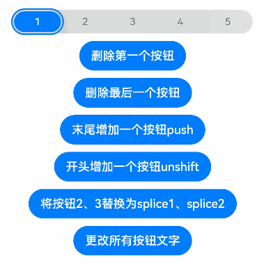
@State singleSelectCapsuleOptions: SegmentButtonOptions = SegmentButtonOptions.capsule({
buttons: [{ text: '1' }, { text: '2' }, { text: '3' },
{ text: '4' }, { text: '5' }],
multiply: false,
})
@State capsuleSelectedIndexes: number[] = [0]
build() {
Row() {
Column() {
Column({ space: 10 }) {
SegmentButton({ options: this.singleSelectCapsuleOptions,
selectedIndexes: $capsuleSelectedIndexes })
Button("删除第一个按钮")
.onClick(() => {
this.singleSelectCapsuleOptions.buttons.shift()
})
Button("删除最后一个按钮")
.onClick(() => {
this.singleSelectCapsuleOptions.buttons.pop()
})
Button("末尾增加一个按钮push")
.onClick(() => {
this.singleSelectCapsuleOptions.buttons.push({ text: 'push' })
})
Button("开头增加一个按钮unshift")
.onClick(() => {
this.singleSelectCapsuleOptions.buttons.unshift(({ text: 'unshift' }))
})
Button("将按钮2、3替换为splice1、splice2")
.onClick(() => {
this.singleSelectCapsuleOptions.buttons.splice(1, 2, { text: 'splice1' }, { text: 'splice2' })
})
Button("更改所有按钮文字")
.onClick(() => {
this.singleSelectCapsuleOptions.buttons =
SegmentButtonItemOptionsArray.create([{ text: 'a' }, { text: 'b' },
{ text: 'c' }, { text: 'd' }, { text: 'e' }])
})
}.width('90%')
}.width('100%')
}.height('100%')
}
}
你可能感兴趣的鸿蒙文章
harmony 鸿蒙@ohos.arkui.advanced.Counter(计数器组件)
- 所属分类: 后端技术
- 本文标签:
热门推荐
-
2、 优质文章
-
3、 gt
-
7、 openharmony
-
9、 golang
-
10、 Vue中input框自动聚焦