harmony 鸿蒙PatternLock
PatternLock
The PatternLock component allows users to use a pattern password for authentication. It enters the input state once a finger is pressed against it, and exits the input state and completes the input once the finger leaves the screen.
NOTE
This component is supported since API version 9. Updates will be marked with a superscript to indicate their earliest API version.
Child Components
Not supported
APIs
PatternLock(controller?: PatternLockController)
Atomic service API: This API can be used in atomic services since API version 12.
System capability: SystemCapability.ArkUI.ArkUI.Full
Parameters
| Name | Type | Mandatory | Description |
|---|---|---|---|
| controller | PatternLockController | No | Controller of a component to reset the component status. |
Attributes
In addition to the universal attributes, the following attributes are supported.
sideLength
sideLength(value: Length)
Sets the width and height (same value) of the component. If this attribute is set to 0 or a negative number, the component is not displayed.
Atomic service API: This API can be used in atomic services since API version 12.
System capability: SystemCapability.ArkUI.ArkUI.Full
Parameters
| Name | Type | Mandatory | Description |
|---|---|---|---|
| value | Length | Yes | Width and height of the component. Default value: 288vp |
circleRadius
circleRadius(value: Length)
Sets the radius of the dots in a grid. If this attribute is set to 0 or a negative value, the default value is used.
Atomic service API: This API can be used in atomic services since API version 12.
System capability: SystemCapability.ArkUI.ArkUI.Full
Parameters
| Name | Type | Mandatory | Description |
|---|---|---|---|
| value | Length | Yes | Radius of the dots in a grid. Default value: 6vp Value range: (0, sideLength/11] Values less than or equal to 0 are handled as the default value, and values exceeding the maximum are handled as the maximum. |
backgroundColor
backgroundColor(value: ResourceColor)
Sets the background color.
Atomic service API: This API can be used in atomic services since API version 12.
System capability: SystemCapability.ArkUI.ArkUI.Full
| Name | Type | Mandatory | Description |
|---|---|---|---|
| value | ResourceColor | Yes | Background color. |
regularColor
regularColor(value: ResourceColor)
Sets the fill color of the grid dot in the unselected state.
Atomic service API: This API can be used in atomic services since API version 12.
System capability: SystemCapability.ArkUI.ArkUI.Full
Parameters
| Name | Type | Mandatory | Description |
|---|---|---|---|
| value | ResourceColor | Yes | Fill color of the grid dot in the unselected state. Default value: ’#ff182431’ |
selectedColor
selectedColor(value: ResourceColor)
Sets the fill color of the grid dot in the selected state.
Atomic service API: This API can be used in atomic services since API version 12.
System capability: SystemCapability.ArkUI.ArkUI.Full
Parameters
| Name | Type | Mandatory | Description |
|---|---|---|---|
| value | ResourceColor | Yes | Fill color of the grid dot in the selected state. Default value: ’#ff182431’ |
activeColor
activeColor(value: ResourceColor)
Sets the fill color of the grid dot in the activated state, which is when the dot is highlighted but not selected.
Atomic service API: This API can be used in atomic services since API version 12.
System capability: SystemCapability.ArkUI.ArkUI.Full
Parameters
| Name | Type | Mandatory | Description |
|---|---|---|---|
| value | ResourceColor | Yes | Fill color of the grid dot in the activated state. Default value: ’#ff182431’ |
pathColor
pathColor(value: ResourceColor)
Sets the path color.
Atomic service API: This API can be used in atomic services since API version 12.
System capability: SystemCapability.ArkUI.ArkUI.Full
Parameters
| Name | Type | Mandatory | Description |
|---|---|---|---|
| value | ResourceColor | Yes | Path color. Default value: **‘#33182431’ ** |
pathStrokeWidth
pathStrokeWidth(value: number|string)
Sets the width of the path stroke. If this attribute is set to 0 or a negative value, the path stroke is not displayed.
Atomic service API: This API can be used in atomic services since API version 12.
System capability: SystemCapability.ArkUI.ArkUI.Full
Parameters
| Name | Type | Mandatory | Description |
|---|---|---|---|
| value | number |string | Yes | Width of the path stroke. Default value: 12vp Value range: [0, sideLength/3]. If the value exceeds the maximum value, the maximum value is used. |
autoReset
autoReset(value: boolean)
Sets whether to allow the user to reset the component status (that is, clear the input) by touching the component again after the input is complete.
Atomic service API: This API can be used in atomic services since API version 12.
System capability: SystemCapability.ArkUI.ArkUI.Full
Parameters
| Name | Type | Mandatory | Description |
|---|---|---|---|
| value | boolean | Yes | Whether to allow the user to reset the component status (that is, clear the input) by touching the component again after the input is complete. The value true means that the user can reset the component status by touching the component again after the input is complete, and false means the opposite. Default value: true |
activateCircleStyle12+
activateCircleStyle(options: Optional<CircleStyleOptions>)
Sets the background circle style for the dots in a grid when they are in the activated state.
Atomic service API: This API can be used in atomic services since API version 12.
System capability: SystemCapability.ArkUI.ArkUI.Full
Parameters
| Name | Type | Mandatory | Description |
|---|---|---|---|
| options | CircleStyleOptions | Yes | Background circle style of the dots in the activated state. |
CircleStyleOptions12+
System capability: SystemCapability.ArkUI.ArkUI.Full
| Name | Type | Mandatory | Description |
|---|---|---|---|
| color | ResourceColor | No | Color of the background circle. Default value: same as the value of pathColor Atomic service API: This API can be used in atomic services since API version 12. |
| radius | LengthMetrics | No | Radius of the background circle. Default value: 11⁄6 of circleRadius Atomic service API: This API can be used in atomic services since API version 12. |
| enableWaveEffect | boolean | No | Whether to enable the wave effect. Default value: true Atomic service API: This API can be used in atomic services since API version 12. |
| enableForeground15+ | boolean | No | Whether the background circle is displayed in the foreground. Default value: false, meaning the background circle is not displayed in the foreground Atomic service API: This API can be used in atomic services since API version 15. |
skipUnselectedPoint15+
skipUnselectedPoint(skipped: boolean)
Sets whether unselected dots in the grid are automatically selected when the password path passes over them.
Atomic service API: This API can be used in atomic services since API version 15.
System capability: SystemCapability.ArkUI.ArkUI.Full
Parameters
| Name | Type | Mandatory | Description |
|---|---|---|---|
| skipped | boolean | Yes | Whether unselected dots in the grid are automatically selected when the password path passes over them. Default value: false, meaning unselected dots are automatically selected |
Events
In addition to the universal events, the following events are supported.
onPatternComplete
onPatternComplete(callback: (input: Array<number>) => void)
Invoked when the pattern password input is complete.
Atomic service API: This API can be used in atomic services since API version 12.
System capability: SystemCapability.ArkUI.ArkUI.Full
Parameters
| Name | Type | Mandatory | Description |
|---|---|---|---|
| input | Array<number> | Yes | Array of digits that are the indexes of the connected grid dots and are arranged in the same sequence as the dots are connected. The indexes of the grid dots are as follows: 0, 1, 2 for the dots in the first row from left to right; 3, 4, 5 for the dots in the second row; 6, 7, 8 for the dots in the third row. |
onDotConnect11+
onDotConnect(callback: Callback<number>)
Invoked when a grid dot is connected during pattern password input.
The callback parameter is a digit that is the index of the connected grid dot. The indexes of the grid dots are as follows: 0, 1, 2 for the dots in the first row from left to right; 3, 4, 5 for the dots in the second row; 6, 7, 8 for the dots in the third row.
Atomic service API: This API can be used in atomic services since API version 12.
System capability: SystemCapability.ArkUI.ArkUI.Full
PatternLockController
Implements the controller bound to the PatternLock component for resetting the component status.
Objects to Import
let patternLockController: PatternLockController = new PatternLockController()
constructor
constructor()
A constructor used to create a PatternLockController instance.
Atomic service API: This API can be used in atomic services since API version 12.
System capability: SystemCapability.ArkUI.ArkUI.Full
reset
reset()
Resets the component status.
Atomic service API: This API can be used in atomic services since API version 12.
System capability: SystemCapability.ArkUI.ArkUI.Full
setChallengeResult11+
setChallengeResult(result: PatternLockChallengeResult): void
Sets the authentication challenge result for the pattern password.
Atomic service API: This API can be used in atomic services since API version 12.
System capability: SystemCapability.ArkUI.ArkUI.Full
| Name | Type | Mandatory | Description |
|---|---|---|---|
| result | PatternLockChallengeResult | Yes | Authentication challenge result of the pattern password. |
PatternLockChallengeResult11+
Atomic service API: This API can be used in atomic services since API version 12.
System capability: SystemCapability.ArkUI.ArkUI.Full
| Name | Value | Description |
|---|---|---|
| CORRECT | 1 | The pattern password is correct. |
| WRONG | 2 | The pattern password is incorrect. |
Example
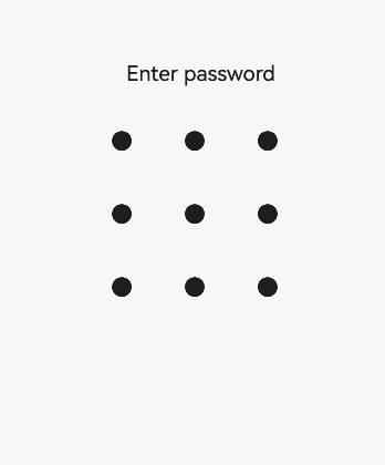
Example 1: Creating a Pattern Lock
This example shows the basic usage of the PatternLock component.
// xxx.ets
@Entry
@Component
struct PatternLockExample {
  @State passwords: Number[] = []
  @State message: string = 'Enter password'
  private patternLockController: PatternLockController = new PatternLockController()

  build() {
    Column() {
      Text(this.message).textAlign(TextAlign.Center).margin(20).fontSize(20)
      PatternLock(this.patternLockController)
        .sideLength(200)
        .circleRadius(9)
        .pathStrokeWidth(5)
        .activeColor('#707070')
        .selectedColor('#707070')
        .pathColor('#707070')
        .backgroundColor('#F5F5F5')
        .autoReset(true)
        .onDotConnect((index: number) => {
          console.log("onDotConnect index: " + index)
        })
    }.width('100%').height('100%')
  }
}
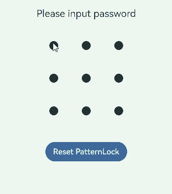
Example 2: Verifying the Password
This example demonstrates how to set the size of the grid using sideLength, customize the dot styles using circleRadius and other attributes, and set a callback for password input using onPatternComplete.
When the user completes the password input, different responses are given based on the input:
- If the password length is less than 5, a message is displayed to prompt the user to re-enter the password.
- After the first input, a message is displayed to prompt the user to enter the password again.
- After the second input, the system checks whether the two inputs match. If they match, a message is displayed to indicate that the password setup is successful; otherwise, the user is prompted to re-enter the password.
The user can click Reset PatternLock to reset the password lock.
// xxx.ets
import { LengthUnit } from '@kit.ArkUI'

@Entry
@Component
struct PatternLockExample {
  @State passwords: Number[] = []
  @State message: string = 'please input password!'
  private patternLockController: PatternLockController = new PatternLockController()

  build() {
    Column() {
      Text(this.message).textAlign(TextAlign.Center).margin(20).fontSize(20)
      PatternLock(this.patternLockController)
        .sideLength(200)
        .circleRadius(9)
        .pathStrokeWidth(5)
        .activeColor('#707070')
        .selectedColor('#707070')
        .pathColor('#707070')
        .backgroundColor('#F5F5F5')
        .autoReset(true)
        .activateCircleStyle({
          color: '#707070',
          radius: { value: 16, unit: LengthUnit.VP },
          enableWaveEffect: true
        })
        .onDotConnect((index: number) => {
          console.log("onDotConnect index: " + index)
        })
        .onPatternComplete((input: Array<number>) => {
          // If the length of the entered password is less than 5, the system prompts the user to enter the password again.
          if (input.length < 5) {
            this.message = 'The password length needs to be greater than 5, please enter again.'
            return
          }
          // Check whether the password length is greater than 0.
          if (this.passwords.length > 0) {
            // Check whether the two passwords are the same. If yes, the system displays a message indicating that the password is set successfully. If no, the system prompts the user to enter the password again.
            if (this.passwords.toString() === input.toString()) {
              this.passwords = input
              this.message = 'Set password successfully: ' + this.passwords.toString()
              this.patternLockController.setChallengeResult(PatternLockChallengeResult.CORRECT)
            } else {
              this.message = 'Inconsistent passwords, please enter again.'
              this.patternLockController.setChallengeResult(PatternLockChallengeResult.WRONG)
            }
          } else {
            // The system prompts the user to enter the password again.
            this.passwords = input
            this.message = "Please enter again."
          }
        })
      Button('Reset PatternLock').margin(30).onClick(() => {
        // Reset the pattern lock.
        this.patternLockController.reset()
        this.passwords = []
        this.message = 'Please input password'
      })
    }.width('100%').height('100%')
  }
}
你可能感兴趣的鸿蒙文章
- 所属分类: 后端技术
- 本文标签:
热门推荐
-
2、 优质文章
-
3、 gt
-
7、 openharmony
-
9、 golang
-
10、 Vue中input框自动聚焦