harmony 鸿蒙Outline
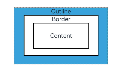
Outline
You can set outline attributes for components. Drawn outside the component, the outline does not affect the component’s layout or increases its size.
NOTE
This feature is supported since API version 11. Updates will be marked with a superscript to indicate their earliest API version.
outline
outline(value: OutlineOptions)
Sets the outline attributes in one declaration.
Widget capability: This API can be used in ArkTS widgets since API version 11.
Atomic service API: This API can be used in atomic services since API version 12.
System capability: SystemCapability.ArkUI.ArkUI.Full
Parameters
| Name | Type | Mandatory | Description |
|---|---|---|---|
| value | OutlineOptions | Yes | Outline attributes. |
outline18+
outline(options: Optional<OutlineOptions>)
Sets the outline attributes in one declaration. Compared to outline, this API supports the undefined type for the options parameter.
Widget capability: This API can be used in ArkTS widgets since API version 18.
Atomic service API: This API can be used in atomic services since API version 18.
System capability: SystemCapability.ArkUI.ArkUI.Full
Parameters
| Name | Type | Mandatory | Description |
|---|---|---|---|
| options | Optional<OutlineOptions> | Yes | Outline attributes. If options is undefined, the component reverts to its original style with no outline. |
OutlineStyle11+
Outline attributes.
Widget capability: This API can be used in ArkTS widgets since API version 11.
Atomic service API: This API can be used in atomic services since API version 12.
System capability: SystemCapability.ArkUI.ArkUI.Full
| Name | Description |
|---|---|
| SOLID | Solid border. |
| DASHED | Dashed border. |
| DOTTED | Dotted border. The radius of a dot is half of outlineWidth. |
outlineStyle
outlineStyle(value: OutlineStyle|EdgeOutlineStyles)
Sets the style of the outline.
Widget capability: This API can be used in ArkTS widgets since API version 11.
Atomic service API: This API can be used in atomic services since API version 12.
System capability: SystemCapability.ArkUI.ArkUI.Full
Parameters
| Name | Type | Mandatory | Description |
|---|---|---|---|
| value | OutlineStyle |EdgeOutlineStyles | Yes | Outline style. Default value: OutlineStyle.SOLID |
outlineStyle18+
outlineStyle(style: Optional<OutlineStyle|EdgeOutlineStyles>)
Sets the style of the outline. Compared to outlineStyle, this API supports the undefined type for the style parameter.
Widget capability: This API can be used in ArkTS widgets since API version 18.
Atomic service API: This API can be used in atomic services since API version 18.
System capability: SystemCapability.ArkUI.ArkUI.Full
Parameters
| Name | Type | Mandatory | Description |
|---|---|---|---|
| style | Optional<OutlineStyle |EdgeOutlineStyles> | Yes | Outline style. Default value: OutlineStyle.SOLID If style is undefined, the component reverts to its original style with no outline. |
outlineWidth
outlineWidth(value: Dimension|EdgeOutlineWidths)
Sets the thickness of the outline.
Widget capability: This API can be used in ArkTS widgets since API version 11.
Atomic service API: This API can be used in atomic services since API version 12.
System capability: SystemCapability.ArkUI.ArkUI.Full
Parameters
| Name | Type | Mandatory | Description |
|---|---|---|---|
| value | Dimension |EdgeOutlineWidths | Yes | Outline thickness. Percentage values are not supported. Default value: 0 |
outlineWidth18+
outlineWidth(width: Optional<Dimension|EdgeOutlineWidths>)
Sets the thickness of the outline. Compared to [outlineWidth, this API supports the undefined type for the width parameter.
Widget capability: This API can be used in ArkTS widgets since API version 18.
Atomic service API: This API can be used in atomic services since API version 18.
System capability: SystemCapability.ArkUI.ArkUI.Full
Parameters
| Name | Type | Mandatory | Description |
|---|---|---|---|
| width | Optional<Dimension |EdgeOutlineWidths> | Yes | Outline thickness. Percentage values are not supported. Default value: 0 If width is undefined, the component reverts to its original style with no outline width. |
outlineColor
outlineColor(value: ResourceColor|EdgeColors)
Sets the color of the outline.
Widget capability: This API can be used in ArkTS widgets since API version 11.
Atomic service API: This API can be used in atomic services since API version 12.
System capability: SystemCapability.ArkUI.ArkUI.Full
Parameters
| Name | Type | Mandatory | Description |
|---|---|---|---|
| value | ResourceColor |EdgeColors | Yes | Outline color. Default value: Color.Black |
outlineColor18+
outlineColor(color: Optional<ResourceColor|EdgeColors>)
Sets the color of the outline. Compared to outlineColor, this API supports the undefined type for the color parameter.
Widget capability: This API can be used in ArkTS widgets since API version 18.
Atomic service API: This API can be used in atomic services since API version 18.
System capability: SystemCapability.ArkUI.ArkUI.Full
Parameters
| Name | Type | Mandatory | Description |
|---|---|---|---|
| color | Optional<ResourceColor |EdgeColors> | Yes | Outline color. Default value: Color.Black If color is undefined, the component reverts to its original style with the outline color of Color.Black. |
outlineRadius
outlineRadius(value: Dimension|OutlineRadiuses)
Sets the radius of the outline corners.
Widget capability: This API can be used in ArkTS widgets since API version 11.
Atomic service API: This API can be used in atomic services since API version 12.
System capability: SystemCapability.ArkUI.ArkUI.Full
Parameters
| Name | Type | Mandatory | Description |
|---|---|---|---|
| value | Dimension |OutlineRadiuses | Yes | Radius of the outline corners. Percentage values are not supported. Default value: 0 Maximum effective value: Component width/2 + outlineWidth or component height/2 + outlineWidth |
outlineRadius18+
outlineRadius(radius: Optional<Dimension|OutlineRadiuses>)
Sets the radius of the outline corners. Compared to outlineRadius, this API supports the undefined type for the radius parameter.
Widget capability: This API can be used in ArkTS widgets since API version 18.
Atomic service API: This API can be used in atomic services since API version 18.
System capability: SystemCapability.ArkUI.ArkUI.Full
Parameters
| Name | Type | Mandatory | Description |
|---|---|---|---|
| radius | Optional<Dimension |OutlineRadiuses> | Yes | Radius of the outline corners. Percentage values are not supported. Default value: 0 Maximum effective value: Component width/2 + outlineWidth or component height/2 + outlineWidth If radius is undefined, the component reverts to its original style with the outline corner radius of 0. |
OutlineOptions
Atomic service API: This API can be used in atomic services since API version 12.
Widget capability: This API can be used in ArkTS widgets since API version 12.
| Name | Type | Mandatory | Description |
|---|---|---|---|
| width | Dimension |EdgeOutlineWidths | No | Outline thickness. Percentage values are not supported. Default value: 0 |
| color | ResourceColor |EdgeColors |LocalizedEdgeColors12+ | No | Outline color. Default value: Color.Black |
| radius | Dimension |OutlineRadiuses | No | Radius of the outline corners. Percentage values are not supported. Default value: 0 Maximum effective value: Component width/2 + outlineWidth or component height/2 + outlineWidth |
| style | OutlineStyle |EdgeOutlineStyles | No | Outline style. Default value: OutlineStyle.SOLID |
EdgeOutlineWidths
To reference this object, at least one parameter must be passed.
Atomic service API: This API can be used in atomic services since API version 12.
Widget capability: This API can be used in ArkTS widgets since API version 12.
| Name | Type | Mandatory | Description |
|---|---|---|---|
| left | Dimension | No | Thickness of the left outline. |
| right | Dimension | No | Thickness of the right outline. |
| top | Dimension | No | Thickness of the top outline. |
| bottom | Dimension | No | Thickness of the bottom outline. |
EdgeColors
To reference this object, at least one parameter must be passed.
Atomic service API: This API can be used in atomic services since API version 11.
System capability: SystemCapability.ArkUI.ArkUI.Full
Widget capability: This API can be used in ArkTS widgets since API version 12.
| Name | Type | Mandatory | Description |
|---|---|---|---|
| left | ResourceColor | No | Color of the left outline. |
| right | ResourceColor | No | Color of the right outline. |
| top | ResourceColor | No | Color of the top outline. |
| bottom | ResourceColor | No | Color of the bottom outline. |
LocalizedEdgeColors12+
To reference this object, at least one parameter must be passed.
Atomic service API: This API can be used in atomic services since API version 12.
Widget capability: This API can be used in ArkTS widgets since API version 12.
| Name | Type | Mandatory | Description |
|---|---|---|---|
| start | ResourceColor | No | Color of the left outline. For right-to-left scripts, this indicates the color of the right outline. |
| end | ResourceColor | No | Color of the right outline. For right-to-left scripts, this indicates the color of the left outline. |
| top | ResourceColor | No | Color of the top outline. |
| bottom | ResourceColor | No | Color of the bottom outline. |
OutlineRadiuses
To reference this object, at least one parameter must be passed.
Atomic service API: This API can be used in atomic services since API version 12.
Widget capability: This API can be used in ArkTS widgets since API version 12.
| Name | Type | Mandatory | Description |
|---|---|---|---|
| topLeft | Dimension | No | Radius of the upper-left corner. |
| topRight | Dimension | No | Radius of the upper-right corner. |
| bottomLeft | Dimension | No | Radius of the lower-left corner. |
| bottomRight | Dimension | No | Radius of the lower-right corner. |
EdgeOutlineStyles
To reference this object, at least one parameter must be passed.
Atomic service API: This API can be used in atomic services since API version 12.
Widget capability: This API can be used in ArkTS widgets since API version 12.
| Name | Type | Mandatory | Description |
|---|---|---|---|
| left | OutlineStyle | No | Style of the left outline. |
| right | OutlineStyle | No | Style of the right outline. |
| top | OutlineStyle | No | Style of the top outline. |
| bottom | OutlineStyle | No | Style of the bottom outline. |
Example
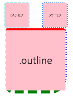
Example 1: Creating Outlines
This example demonstrates how to create component outlines using outline.
// xxx.ets
@Entry
@Component
struct OutlineExample {
  build() {
    Column() {
      Flex({ justifyContent: FlexAlign.SpaceAround, alignItems: ItemAlign.Center }) {
        // Dashed line
        Text('DASHED')
          .backgroundColor(Color.Pink)
          .outlineStyle(OutlineStyle.DASHED).outlineWidth(5).outlineColor(0xAFEEEE).outlineRadius(10)
          .width(120).height(120).textAlign(TextAlign.Center).fontSize(16)
        // Dotted line
        Text('DOTTED')
          .backgroundColor(Color.Pink)
          .outline({ width: 5, color: 0x317AF7, radius: 10, style: OutlineStyle.DOTTED })
          .width(120).height(120).textAlign(TextAlign.Center).fontSize(16)
      }.width('100%').height(150)

      Text('.outline')
        .backgroundColor(Color.Pink)
        .fontSize(50)
        .width(300)
        .height(300)
        .outline({
          width: { left: 3, right: 6, top: 10, bottom: 15 },
          color: { left: '#e3bbbb', right: Color.Blue, top: Color.Red, bottom: Color.Green },
          radius: { topLeft: 10, topRight: 20, bottomLeft: 40, bottomRight: 80 },
          style: {
            left: OutlineStyle.DOTTED,
            right: OutlineStyle.DOTTED,
            top: OutlineStyle.SOLID,
            bottom: OutlineStyle.DASHED
          }
        }).textAlign(TextAlign.Center)
    }
  }
}
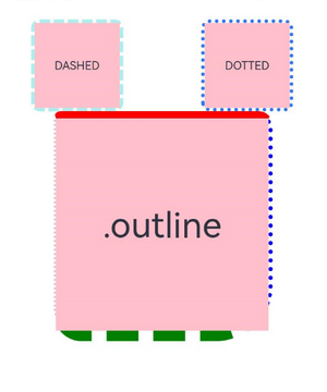
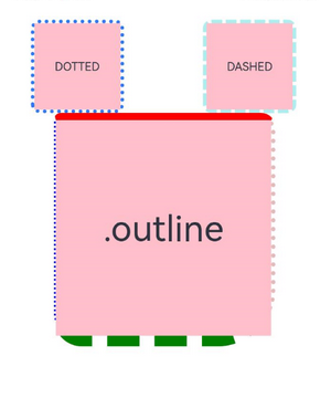
Example 2: Using the LocalizedEdgeColors Type
This example sets the color property of the outline attribute to the LocalizedEdgeColors type.
// xxx.ets

@Entry
@Component
struct OutlineExample {
  build() {
    Column() {
      Flex({ justifyContent: FlexAlign.SpaceAround, alignItems: ItemAlign.Center }) {
        // Dashed line
        Text('DASHED')
          .backgroundColor(Color.Pink)
          .outlineStyle(OutlineStyle.DASHED).outlineWidth(5).outlineColor(0xAFEEEE).outlineRadius(10)
          .width(120).height(120).textAlign(TextAlign.Center).fontSize(16)
        // Dotted line
        Text('DOTTED')
          .backgroundColor(Color.Pink)
          .outline({ width: 5, color: 0x317AF7, radius: 10, style: OutlineStyle.DOTTED })
          .width(120).height(120).textAlign(TextAlign.Center).fontSize(16)
      }.width('100%').height(150)

      Text('.outline')
        .backgroundColor(Color.Pink)
        .fontSize(50)
        .width(300)
        .height(300)
        .outline({
          width: { left: 3, right: 6, top: 10, bottom: 15 },
          color: { start: '#e3bbbb', end: Color.Blue, top: Color.Red, bottom: Color.Green },
          radius: { topLeft: 10, topRight: 20, bottomLeft: 40, bottomRight: 80 },
          style: {
            left: OutlineStyle.DOTTED,
            right: OutlineStyle.DOTTED,
            top: OutlineStyle.SOLID,
            bottom: OutlineStyle.DASHED
          }
        }).textAlign(TextAlign.Center)
    }
  }
}
The following shows how the example is represented with left-to-right scripts.
The following shows how the example is represented with right-to-left scripts.
你可能感兴趣的鸿蒙文章
- 所属分类: 后端技术
- 本文标签:
热门推荐
-
2、 优质文章
-
3、 gt
-
7、 openharmony
-
9、 golang
-
10、 Vue中input框自动聚焦