harmony 鸿蒙Foreground Color
Foreground Color
The foreground color attributes set the foreground color of a component.
NOTE
The initial APIs of this module are supported since API version 10. Newly added APIs will be marked with a superscript to indicate their earliest API version.
foregroundColor
foregroundColor(value: ResourceColor|ColoringStrategy)
Sets the foreground color of the component. If the component does not have a foreground color set, it inherits the color from its parent component by default.
Atomic service API: This API can be used in atomic services since API version 11.
System capability: SystemCapability.ArkUI.ArkUI.Full
Parameters
| Name | Type | Mandatory | Description |
|---|---|---|---|
| value | ResourceColor |ColoringStrategy | Yes | Foreground color. The value can be a specific color or a coloring strategy. Property animations are supported. |
foregroundColor18+
foregroundColor(color: Optional<ResourceColor|ColoringStrategy>)
Sets the foreground color of the component. If the component does not have a foreground color set, it inherits the color from its parent component by default. Compared to foregroundColor, this API supports the undefined type for the color parameter.
Atomic service API: This API can be used in atomic services since API version 18.
System capability: SystemCapability.ArkUI.ArkUI.Full
Parameters
| Name | Type | Mandatory | Description |
|---|---|---|---|
| color | Optional<ResourceColor |ColoringStrategy> | Yes | Foreground color. The value can be a specific color or a coloring strategy. Property animations are supported. If color is set to undefined, the previous value is retained. |
Example
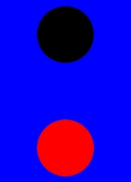
Example 1: Using Foreground Color Settings
This example demonstrates how to set the foreground color using foregroundColor.
// xxx.ets
@Entry
@Component
struct ForegroundColorExample {
  build() {
    Column({ space: 100 }) {
      // Draw a circle with a diameter of 150 and the default fill color black.
      Circle({ width: 150, height: 200 })
      // Draw a circle with a diameter of 150.
      Circle({ width: 150, height: 200 }).foregroundColor(Color.Red)
    }.width('100%').backgroundColor(Color.Blue)
  }
}
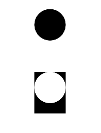
Example 2: Setting the Foreground Color to Background Inverse
This example shows how to use ColoringStrategy.INVERT to set the foreground color to the inverse of the background color.
// xxx.ets
@Entry
@Component
struct ColoringStrategyExample {
  build() {
    Column({ space: 100 }) {
      // Draw a circle with a diameter of 150 and the default fill color black.
      Circle({ width: 150, height: 200 })
      // Draw a circle with a diameter of 150 and set its foreground color to the inverse of the component background color.
      Circle({ width: 150, height: 200 })
        .backgroundColor(Color.Black)
        .foregroundColor(ColoringStrategy.INVERT)
    }.width('100%')
  }
}
Example 3: Implementing a Foreground Color Not Inherited from Parent Component
This example compares the effects of setting both foreground and background colors on a component versus setting only the background color. When a foreground color is explicitly set on a component, the component does not inherit the color from its parent component.
// xxx.ets
@Entry
@Component
struct foregroundColorInherit {
  build() {
    Column() {
      Button('Foreground Color: Set to Orange').fontSize(20).foregroundColor(Color.Orange).backgroundColor(Color.Gray)
      Divider()
      Button('Foreground Color: Inherited from Parent Component When Not Set').fontSize(20).backgroundColor(Color.Gray)
    }.foregroundColor(Color.Red)
  }
}

你可能感兴趣的鸿蒙文章
- 所属分类: 后端技术
- 本文标签:
热门推荐
-
2、 优质文章
-
3、 gt
-
7、 openharmony
-
9、 golang
-
10、 Vue中input框自动聚焦