harmony 鸿蒙Modal Transition
Modal Transition
Modal transition is a type of transition achieved by a modal – a view that appears on top of the current view while the current view remains.
Table 1 Modal transition APIs |API |Description |Usage | |—————————————-|—————–|—————————————-| |bindContentCover|Binds a modal to the component. |Use this API to display a custom modal. It can work with the transition animation and shared element animation to implement complex transition animation effects, for example, displaying an image in full in the modal upon the click of a thumbnail.| |bindSheet|Binds a sheet to the component. |Use this API to display a custom sheet, for example, a sharing confirmation dialog box. | |bindMenu|Binds a menu to the component, which is displayed when the component is clicked. |Use this API where a menu is required, for example, for the plus sign (+), a common menu indicator in applications. | |bindContextMenu|Binds a context menu to the component, which is displayed when the user long-presses or right-clicks the component.|Use this API for components that bounce up when long-pressed, for example, home screen icons. | |bindPopup|Binds a popup to the component. |Use this API to display a popup containing additional information about a component when the component is clicked. | |if |Adds or deletes the component. |Use this API to display a temporary page in a certain state. In this mode, the return navigation needs to be implemented with a listener.|
Creating Modal Transition with bindContentCover
You can bind a full-screen modal to a component through the bindContentCover attribute. Better yet, with the ModalTransition parameter, you can apply a transition effect for when the component appears or disappears.
Define bindContentCover.
Define the modal view.
   // Use @Builder to build a modal view.
   @Builder MyBuilder() {
     Column() {
       Text('my model view')
     }
     // Use the transition API to implement the transition animation for component appearance and disappearance. The transition API must be added to the first component of the builder.
     .transition(TransitionEffect.translate({ y: 1000 }).animation({ curve: curves.springMotion(0.6, 0.8) }))
   }
- Call the modal API to display the modal. Implement an animation by using the animation or shared element transition APIs.
   // Define the state variable to control the visibility of the modal.
   @State isPresent: boolean = false;

   Button('Click to present model view')
     // Bind a modal to the component. ModalTransition.NONE means not to use the default transition animation for the modal. You can use onDisappear to control state variable changes.
     .bindContentCover(this.isPresent, this.MyBuilder(), {
               modalTransition: ModalTransition.NONE,
               onDisappear: () => {
                 if (this.isPresent) {
                   this.isPresent = !this.isPresent;
                 }
               }
             })
     .onClick(() => {
       // Change the state variable to display the modal.
       this.isPresent = !this.isPresent;
     })
Below is the complete sample code and effect.
import { curves } from '@kit.ArkUI';
interface PersonList {
name: string,
cardnum: string
}
@Entry
@Component
struct BindContentCoverDemo {
private personList: Array<PersonList> = [
{ name: 'Wang **', cardnum: '1234***********789' },
{ name: 'Song *', cardnum: '2345***********789' },
{ name: 'Xu **', cardnum: '3456***********789' },
{ name: 'Tang *', cardnum: '4567***********789' }
];
// Step 1: Define bindContentCover.
// Define the state variable to control the visibility of the modal.
@State isPresent: boolean = false;
// Step 2: Define the modal view.
// Use @Builder to build a modal view.
@Builder
MyBuilder() {
Column() {
Row() {
Text('Select passengers')
.fontSize(20)
.fontColor(Color.White)
.width('100%')
.textAlign(TextAlign.Center)
.padding({ top: 30, bottom: 15 })
}
.backgroundColor(0x007dfe)
Row() {
Text('+ Add')
.fontSize(16)
.fontColor(0x333333)
.margin({ top: 10 })
.padding({ top: 20, bottom: 20 })
.width('92%')
.borderRadius(10)
.textAlign(TextAlign.Center)
.backgroundColor(Color.White)
}
Column() {
ForEach(this.personList, (item: PersonList, index: number) => {
Row() {
Column() {
if (index % 2 == 0) {
Column()
.width(20)
.height(20)
.border({ width: 1, color: 0x007dfe })
.backgroundColor(0x007dfe)
} else {
Column()
.width(20)
.height(20)
.border({ width: 1, color: 0x007dfe })
}
}
.width('20%')
Column() {
Text(item.name)
.fontColor(0x333333)
.fontSize(18)
Text(item.cardnum)
.fontColor(0x666666)
.fontSize(14)
}
.width('60%')
.alignItems(HorizontalAlign.Start)
Column() {
Text('Edit')
.fontColor(0x007dfe)
.fontSize(16)
}
.width('20%')
}
.padding({ top: 10, bottom: 10 })
.border({ width: { bottom: 1 }, color: 0xf1f1f1 })
.width('92%')
.backgroundColor(Color.White)
})
}
.padding({ top: 20, bottom: 20 })
Text('OK')
.width('90%')
.height(40)
.textAlign(TextAlign.Center)
.borderRadius(10)
.fontColor(Color.White)
.backgroundColor(0x007dfe)
.onClick(() => {
this.isPresent = !this.isPresent;
})
}
.size({ width: '100%', height: '100%' })
.backgroundColor(0xf5f5f5)
// Use the transition API to implement the transition animation for component appearance and disappearance.
.transition(TransitionEffect.translate({ y: 1000 }).animation({ curve: curves.springMotion(0.6, 0.8) }))
}
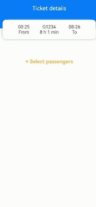
build() {
Column() {
Row() {
Text('Ticket details')
.fontSize(20)
.fontColor(Color.White)
.width('100%')
.textAlign(TextAlign.Center)
.padding({ top: 30, bottom: 60 })
}
.backgroundColor(0x007dfe)
Column() {
Row() {
Column() {
Text('00:25')
Text('From')
}
.width('30%')
Column() {
Text('G1234')
Text('8 h 1 min')
}
.width('30%')
Column() {
Text('08:26')
Text('To')
}
.width('30%')
}
}
.width('92%')
.padding(15)
.margin({ top: -30 })
.backgroundColor(Color.White)
.shadow({ radius: 30, color: '#aaaaaa' })
.borderRadius(10)
Column() {
Text('+ Select passengers')
.fontSize(18)
.fontColor(Color.Orange)
.fontWeight(FontWeight.Bold)
.padding({ top: 10, bottom: 10 })
.width('60%')
.textAlign(TextAlign.Center)
.borderRadius(15)// Bind a modal to the component. ModalTransition.DEFAULT means to use the slide-up and slide-down animation type. You can use onDisappear to control state variable changes.
.bindContentCover(this.isPresent, this.MyBuilder(), {
modalTransition: ModalTransition.DEFAULT,
onDisappear: () => {
if (this.isPresent) {
this.isPresent = !this.isPresent;
}
}
})
.onClick(() => {
// Step 3: Call the modal API to display the modal. Implement an animation by using the animation or shared element transition APIs.
// Change the state variable to display the modal.
this.isPresent = !this.isPresent;
})
}
.padding({ top: 60 })
}
}
}
Creating Sheet Transition with bindSheet
You can bind a sheet to a component through the bindSheet attribute. You can also set the sheet to the preset or custom height for when the component appears. The process of creating a sheet transition is basically the same as that of creating a modal transition using bindContentCover.
Below is the complete sample code and effect.
@Entry
@Component
struct BindSheetDemo {
// Set visibility of the sheet.
@State isShowSheet: boolean = false;
private menuList: string[] = ['No ice', 'Light ice', 'Extra ice', 'Light sauce', 'Extra sauce', 'Plastic cutlery', 'No plastic cutlery'];
// Use @Builder to build a sheet view.
@Builder
mySheet() {
Column() {
Flex({ direction: FlexDirection.Row, wrap: FlexWrap.Wrap }) {
ForEach(this.menuList, (item: string) => {
Text(item)
.fontSize(16)
.fontColor(0x333333)
.backgroundColor(0xf1f1f1)
.borderRadius(8)
.margin(10)
.padding(10)
})
}
.padding({ top: 18 })
}
.width('100%')
.height('100%')
.backgroundColor(Color.White)
}
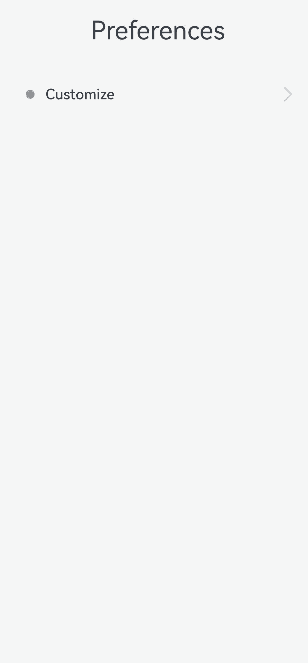
build() {
Column() {
Text('Preferences')
.fontSize(28)
.padding({ top: 30, bottom: 30 })
Column() {
Row() {
Row()
.width(10)
.height(10)
.backgroundColor('#a8a8a8')
.margin({ right: 12 })
.borderRadius(20)
Column() {
Text('Customize')
.fontSize(16)
.fontWeight(FontWeight.Medium)
}
.alignItems(HorizontalAlign.Start)
Blank()
Row()
.width(12)
.height(12)
.margin({ right: 15 })
.border({
width: { top: 2, right: 2 },
color: 0xcccccc
})
.rotate({ angle: 45 })
}
.borderRadius(15)
.shadow({ radius: 100, color: '#ededed' })
.width('90%')
.alignItems(VerticalAlign.Center)
.padding({ left: 15, top: 15, bottom: 15 })
.backgroundColor(Color.White)
// Bind a sheet to the component. Set height (sheet height; large by default) and DragBar (whether to display the drag bar; true by default). You can use onDisappear to control state variable changes.
.bindSheet(this.isShowSheet, this.mySheet(), {
height: 300,
dragBar: false,
onDisappear: () => {
this.isShowSheet = !this.isShowSheet;
}
})
.onClick(() => {
this.isShowSheet = !this.isShowSheet;
})
}
.width('100%')
}
.width('100%')
.height('100%')
.backgroundColor(0xf1f1f1)
}
}
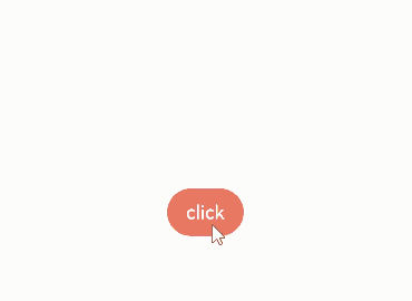
Creating a Menu with bindMenu
You can bind a menu to component through the bindMenu attribute. The menu can then be triggered by clicking. Below is the complete sample code and effect.
class BMD{
  value:ResourceStr = ''
  action:() => void = () => {}
}
@Entry
@Component
struct BindMenuDemo {

  // Step 1: Define a data array to represent menu items.
  @State items:BMD[] = [
    {
      value:'Menu item 1',
      action: () => {
        console.info('handle Menu1 select')
      }
    },
    {
      value:'Menu item 2',
      action: () => {
        console.info('handle Menu2 select')
      }
    },
  ]

  build() {
    Column() {
      Button('click')
        .backgroundColor(0x409eff)
        .borderRadius(5)
          // Step 2: Bind the menu data to the component through bindMenu.
        .bindMenu(this.items)
    }
    .justifyContent(FlexAlign.Center)
    .width('100%')
    .height(437)
  }
}
Creating a Context Menu with bindContextMenu
You can bind a menu to component through the bindContextMenu attribute. The menu can then be triggered by long-pressing or right-clicking.
Below is the complete sample code and effect.
@Entry
@Component
struct BindContextMenuDemo {
private menu: string[] = ['Save', 'Favorite', 'Search'];
private pics: Resource[] = [$r('app.media.icon_1'), $r('app.media.icon_2')];
// Use @Builder to build custom menu items.
@Builder myMenu() {
Column() {
ForEach(this.menu, (item: string) => {
Row() {
Text(item)
.fontSize(18)
.width('100%')
.textAlign(TextAlign.Center)
}
.padding(15)
.border({ width: { bottom: 1 }, color: 0xcccccc })
})
}
.width(140)
.borderRadius(15)
.shadow({ radius: 15, color: 0xf1f1f1 })
.backgroundColor(0xf1f1f1)
}
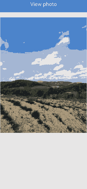
build() {
Column() {
Row() {
Text('View image')
.fontSize(20)
.fontColor(Color.White)
.width('100%')
.textAlign(TextAlign.Center)
.padding({ top: 20, bottom: 20 })
}
.backgroundColor(0x007dfe)
Column() {
ForEach(this.pics, (item: Resource) => {
Row(){
Image(item)
.width('100%')
.draggable(false)
}
.padding({ top: 20, bottom: 20, left: 10, right: 10 })
.bindContextMenu(this.myMenu, ResponseType.LongPress)
})
}
}
.width('100%')
.alignItems(HorizontalAlign.Center)
}
}
Creating a Popup with bindPopUp
You can bind a popup to a component through the bindpopup attribute, specifying its content, interaction logic, and display status.
Below is the complete sample code and effect.
@Entry
@Component
struct BindPopupDemo {

  // Step 1: Define the state variable to control the visibility of the popup.
  @State customPopup: boolean = false;

  // Step 2: Use @Builder to build a custom popup.
  @Builder popupBuilder() {
    Column({ space: 2 }) {
      Row().width(64)
        .height(64)
        .backgroundColor(0x409eff)
      Text('Popup')
        .fontSize(10)
        .fontColor(Color.White)
    }
    .justifyContent(FlexAlign.SpaceAround)
    .width(100)
    .height(100)
    .padding(5)
  }

  build() {
    Column() {

      Button('click')
        // Step 4: Add a click event to control the visibility of the popup.
        .onClick(() => {
          this.customPopup = !this.customPopup;
        })
        .backgroundColor(0xf56c6c)
          // Step 5: Bind the popup to the component through bindPopup.
        .bindPopup(this.customPopup, {
          builder: this.popupBuilder,
          placement: Placement.Top,
          maskColor: 0x33000000,
          popupColor: 0xf56c6c,
          enableArrow: true,
          onStateChange: (e) => {
            if (!e.isVisible) {
              this.customPopup = false;
            }
          }
        })
    }
    .justifyContent(FlexAlign.Center)
    .width('100%')
    .height(437)
  }
}
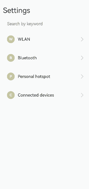
Creating Modal Transition with if
In addition to the preceding modal transition APIs, you can also use the if syntax to create a modal transition, eliminating the need for binding to the component and listening for state variable changes.
Below is the complete sample code and effect.
@Entry
@Component
struct ModalTransitionWithIf {
  private listArr: string[] = ['WLAN', 'Bluetooth', 'Personal hotspot', 'Connected devices'];
  private shareArr: string[] = ['Projection', 'Printing', 'VPN','Private DNS', 'NFC'];
  // Step 1: Define a state variable to control page display.
  @State isShowShare: boolean = false;
  private shareFunc(): void {
    this.getUIContext()?.animateTo({ duration: 500 }, () => {
      this.isShowShare = !this.isShowShare;
    })
  }

  build(){
    // Step 2: Define a stack layout to display the current view and modal view.
    Stack() {
      Column() {
        Column() {
          Text('Settings')
            .fontSize(28)
            .fontColor(0x333333)
        }
        .width('90%')
        .padding({ top: 30, bottom: 15 })
        .alignItems(HorizontalAlign.Start)

        TextInput({ placeholder: 'Search by keyword' })
          .width('90%')
          .height(40)
          .margin({ bottom: 10 })
          .focusable(false)

        List({ space: 12, initialIndex: 0 }) {
          ForEach(this.listArr, (item: string, index: number) => {
            ListItem() {
              Row() {
                Row() {
                  Text(`${item.slice(0, 1)}`)
                    .fontColor(Color.White)
                    .fontSize(14)
                    .fontWeight(FontWeight.Bold)
                }
                .width(30)
                .height(30)
                .backgroundColor('#a8a8a8')
                .margin({ right: 12 })
                .borderRadius(20)
                .justifyContent(FlexAlign.Center)

                Column() {
                  Text(item)
                    .fontSize(16)
                    .fontWeight(FontWeight.Medium)
                }
                .alignItems(HorizontalAlign.Start)

                Blank()

                Row()
                  .width(12)
                  .height(12)
                  .margin({ right: 15 })
                  .border({
                    width: { top: 2, right: 2 },
                    color: 0xcccccc
                  })
                  .rotate({ angle: 45 })
              }
              .borderRadius(15)
              .shadow({ radius: 100, color: '#ededed' })
              .width('90%')
              .alignItems(VerticalAlign.Center)
              .padding({ left: 15, top: 15, bottom: 15 })
              .backgroundColor(Color.White)
            }
            .width('100%')
            .onClick(() => {
              // Step 3: Change the state variable to display the modal view.
              if(item.slice(-2) === 'Share'){
                this.shareFunc();
              }
            })
          }, (item: string): string => item)
        }
        .width('100%')
      }
      .width('100%')
      .height('100%')
      .backgroundColor(0xfefefe)

      // Step 4: Define the modal view in if and display it at the top layer. Use if to control the appearance and disappearance of the modal view.
      if(this.isShowShare){
        Column() {
          Column() {
            Row() {
              Row() {
                Row()
                  .width(16)
                  .height(16)
                  .border({
                    width: { left: 2, top: 2 },
                    color: 0x333333
                  })
                  .rotate({ angle: -45 })
              }
              .padding({ left: 15, right: 10 })
              .onClick(() => {
                this.shareFunc();
              })
              Text('Connected devices')
                .fontSize(28)
                .fontColor(0x333333)
            }
            .padding({ top: 30 })
          }
          .width('90%')
          .padding({bottom: 15})
          .alignItems(HorizontalAlign.Start)

          List({ space: 12, initialIndex: 0 }) {
            ForEach(this.shareArr, (item: string) => {
              ListItem() {
                Row() {
                  Row() {
                    Text(`${item.slice(0, 1)}`)
                      .fontColor(Color.White)
                      .fontSize(14)
                      .fontWeight(FontWeight.Bold)
                  }
                  .width(30)
                  .height(30)
                  .backgroundColor('#a8a8a8')
                  .margin({ right: 12 })
                  .borderRadius(20)
                  .justifyContent(FlexAlign.Center)

                  Column() {
                    Text(item)
                      .fontSize(16)
                      .fontWeight(FontWeight.Medium)
                  }
                  .alignItems(HorizontalAlign.Start)

                  Blank()

                  Row()
                    .width(12)
                    .height(12)
                    .margin({ right: 15 })
                    .border({
                      width: { top: 2, right: 2 },
                      color: 0xcccccc
                    })
                    .rotate({ angle: 45 })
                }
                .borderRadius(15)
                .shadow({ radius: 100, color: '#ededed' })
                .width('90%')
                .alignItems(VerticalAlign.Center)
                .padding({ left: 15, top: 15, bottom: 15 })
                .backgroundColor(Color.White)
              }
              .width('100%')
            }, (item: string): string => item)
          }
          .width('100%')
        }
        .width('100%')
        .height('100%')
        .backgroundColor(0xffffff)
        // Step 5: Define the mode in which the modal view disappears.
        .transition(TransitionEffect.OPACITY
          .combine(TransitionEffect.translate({ x: '100%' }))
          .combine(TransitionEffect.scale({ x: 0.95, y: 0.95 })))
      }
    }
  }
}
你可能感兴趣的鸿蒙文章
harmony 鸿蒙Atomic Service Full Screen Launch Component (FullScreenLaunchComponent)
harmony 鸿蒙Arc Button (ArcButton)
harmony 鸿蒙Frame Animation (ohos.animator)
harmony 鸿蒙Implementing Property Animation
- 所属分类: 后端技术
- 本文标签:
热门推荐
-
2、 优质文章
-
3、 gt
-
7、 openharmony
-
9、 golang
-
10、 Vue中input框自动聚焦