harmony 鸿蒙Navigation Transition
Navigation Transition
Navigation transition is a transition animation that runs during the navigation from one view to another. You can customize the animation settings of the navigation transition. For details, see Navigation Example 3.
To implement the navigation transition, you are advised to use the Navigation component, complete with the NavDestination component.
Below is the complete sample code and effect.
Creating a Navigation Page
To create a navigation page:
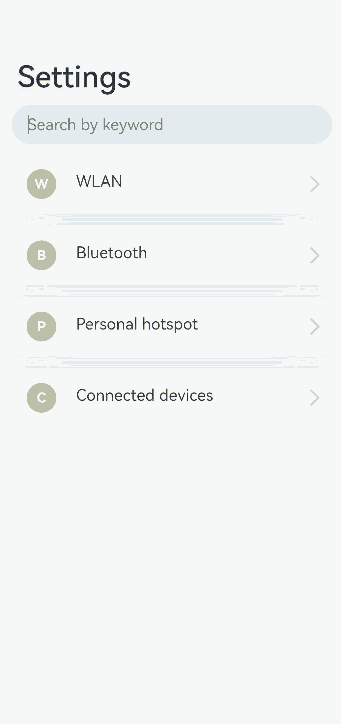
Use Navigation to create a navigation home page and create a NavPathStack as the navigation stack to enable transitions between different pages.
Add a List component to Navigation to define the different level-1 pages on the navigation home page.
Add an onClick method to the component inside the List, and use the pushPathByName method of the NavPathStack within it. This allows the component to transition from the current page to the page corresponding to the input parameter name in the routing table upon click. “`ts //PageOne.ets @Entry @Component struct NavigationDemo { @Provide(‘pathInfos’) pathInfos: NavPathStack = new NavPathStack(); private listArray: Array
= [‘WLAN’, ‘Bluetooth’, ‘Personal Hotpot’, ‘Connect & Share’];
build() { Column() { Navigation(this.pathInfos) { TextInput({ placeholder: ‘Search by keyword’ }) .width(‘90%’) .height(40) .margin({ bottom: 10 })
    // Define the level-1 navigation view through List.
    List({ space: 12, initialIndex: 0 }) {
      ForEach(this.listArray, (item: string) => {
        ListItem() {
          Row() {
            Row() {
              Text(`${item.slice(0, 1)}`)
                .fontColor(Color.White)
                .fontSize(14)
                .fontWeight(FontWeight.Bold)
            }
            .width(30)
            .height(30)
            .backgroundColor('#a8a8a8')
            .margin({ right: 20 })
            .borderRadius(20)
            .justifyContent(FlexAlign.Center)

            Column() {
              Text(item)
                .fontSize(16)
                .margin({ bottom: 5 })
            }
            .alignItems(HorizontalAlign.Start)

            Blank()

            Row()
              .width(12)
              .height(12)
              .margin({ right: 15 })
              .border({
                width: { top: 2, right: 2 },
                color: 0xcccccc
              })
              .rotate({ angle: 45 })
          }
          .borderRadius(15)
          .shadow({ radius: 100, color: '#ededed' })
          .width('90%')
          .alignItems(VerticalAlign.Center)
          .padding({ left: 15, top: 15, bottom: 15 })
          .backgroundColor(Color.White)
        }
        .width('100%')
        .onClick(() => {
          this.pathInfos.pushPathByName(`${item}`, 'Details page parameters')// Push the navigation destination page specified by name, with the data specified by param, to the navigation stack.
        })
      }, (item: string): string => item)
    }
    .listDirection(Axis.Vertical)
    .edgeEffect(EdgeEffect.Spring)
    .sticky(StickyStyle.Header)
    .chainAnimation(false)
    .width('100%')
  }
  .width('100%')
  .mode(NavigationMode.Auto)
  .title('Settings') // Set the title text.
}
.size({ width: '100%', height: '100%' })
.backgroundColor(0xf4f4f5)
} }
## Creating a Navigation Subpage
Create navigation subpage 1 as follows:

1. Use **NavDestination** to create a navigation subpage **CommonPage**.

2. Create a navigation stack **NavPathStack** and initialize it in **onReady** to obtain the current page stack to enable transitions between different pages.

3. Add an **onClick** method to the components within the subpage and use the **pop** method of the **NavPathStack** to pop the top element of the stack and return to the previous page upon click.
```ts
//PageOne.ets

@Builder
export function MyCommonPageBuilder(name: string, param: string) {
  MyCommonPage({ name: name, value: param })
}

@Component
export struct MyCommonPage {
  pathInfos: NavPathStack = new NavPathStack();
  name: String = '';
  @State value: String = '';

  build() {
    NavDestination() {
      Column() {
        Text(`${this.name} settings`)
          .width('100%')
          .fontSize(20)
          .fontColor(0x333333)
          .textAlign(TextAlign.Center)
          .textShadow({
            radius: 2,
            offsetX: 4,
            offsetY: 4,
            color: 0x909399
          })
          .padding({ top: 30 })
        Text(`${JSON.stringify(this.value)}`)
          .width('100%')
          .fontSize(18)
          .fontColor(0x666666)
          .textAlign(TextAlign.Center)
          .padding({ top: 45 })
        Button('Back')
          .width('50%')
          .height(40)
          .margin({ top: 50 })
          .onClick(() => {
            // Pop the top element of the stack and return to the previous page.
            this.pathInfos.pop();
          })
      }
      .size({ width: '100%', height: '100%' })
    }.title(`${this.name}`)
    .onReady((ctx: NavDestinationContext) => {
      // NavDestinationContext obtains the current page stack.
      this.pathInfos = ctx.pathStack;
    })

  }
}
Create navigation subpage 2 as follows:
Use NavDestination to create a navigation subpage SharePage.
Create a navigation stack NavPathStack and initialize it in onReady to obtain the current page stack to enable transitions between different pages.
Add an onClick method to a component inside the subpage and use the pushPathByName method of the NavPathStack. This allows the component to transition from the current page to the page corresponding to the input parameter name in the routing table upon click. “`ts //PageTwo.ets @Builder export function MySharePageBuilder(name: string, param: string) { MySharePage({ name: name }) }
@Component
export struct MySharePage {
pathInfos: NavPathStack = new NavPathStack();
name: String = “;
private listArray: Array
build() {
NavDestination() {
Column() {
List({ space: 12, initialIndex: 0 }) {
ForEach(this.listArray, (item: string) => {
ListItem() {
Row() {
Row() {
Text(${item.slice(0, 1)})
.fontColor(Color.White)
.fontSize(14)
.fontWeight(FontWeight.Bold)
}
.width(30)
.height(30)
.backgroundColor(‘#a8a8a8’)
.margin({ right: 20 })
.borderRadius(20)
.justifyContent(FlexAlign.Center)
            Column() {
              Text(item)
                .fontSize(16)
                .margin({ bottom: 5 })
            }
            .alignItems(HorizontalAlign.Start)

            Blank()

            Row()
              .width(12)
              .height(12)
              .margin({ right: 15 })
              .border({
                width: { top: 2, right: 2 },
                color: 0xcccccc
              })
              .rotate({ angle: 45 })
          }
          .borderRadius(15)
          .shadow({ radius: 100, color: '#ededed' })
          .width('90%')
          .alignItems(VerticalAlign.Center)
          .padding({ left: 15, top: 15, bottom: 15 })
          .backgroundColor(Color.White)
        }
        .width('100%')
        .onClick(() => {
          this.pathInfos.pushPathByName(`${item}`, 'Parameters')
        })
      }, (item: string): string => item)
    }
    .listDirection(Axis.Vertical)
    .edgeEffect(EdgeEffect.Spring)
    .sticky(StickyStyle.Header)
    .width('100%')
  }
  .size({ width: '100%', height: '100%' })
}.title(`${this.name}`)
.onReady((ctx: NavDestinationContext) => {
  // NavDestinationContext obtains the current page stack.
  this.pathInfos = ctx.pathStack;
})
} }
## Creating Route Navigation
To create route navigation:

1. In the project configuration file **module.json5**, add the configuration **{"routerMap": "$profile:route_map"}**.

2. In the **route_map.json** file, define the global routing table. The navigation stack **NavPathStack** can push the corresponding page information onto the stack based on the name in the routing table.
```ts
{
  "routerMap" : [
    {
      "name" : "WLAN",
      "pageSourceFile"  : "src/main/ets/pages/PageOne.ets",
      "buildFunction" : "MyCommonPageBuilder"
    },
    {
      "name" : "Bluetooth",
      "pageSourceFile"  : "src/main/ets/pages/PageOne.ets",
      "buildFunction" : "MyCommonPageBuilder"
    },
    {
      "name" : "Personal Hotpot",
      "pageSourceFile"  : "src/main/ets/pages/PageOne.ets",
      "buildFunction" : "MyCommonPageBuilder"
    },
    {
      "name" : "Connect & Share",
      "pageSourceFile"  : "src/main/ets/pages/PageTwo.ets",
      "buildFunction" : "MySharePageBuilder"
    },
    {
      "name" : "Projection",
      "pageSourceFile"  : "src/main/ets/pages/PageOne.ets",
      "buildFunction" : "MyCommonPageBuilder"
    },
    {
      "name" : "Print",
      "pageSourceFile"  : "src/main/ets/pages/PageOne.ets",
      "buildFunction" : "MyCommonPageBuilder"
    },
    {
      "name" : "VPN",
      "pageSourceFile"  : "src/main/ets/pages/PageOne.ets",
      "buildFunction" : "MyCommonPageBuilder"
    },
    {
      "name" : "Private DNS",
      "pageSourceFile"  : "src/main/ets/pages/PageOne.ets",
      "buildFunction" : "MyCommonPageBuilder"
    },
    {
      "name" : "NFC",
      "pageSourceFile"  : "src/main/ets/pages/PageOne.ets",
      "buildFunction" : "MyCommonPageBuilder"
    }
  ]
}
你可能感兴趣的鸿蒙文章
harmony 鸿蒙Atomic Service Full Screen Launch Component (FullScreenLaunchComponent)
harmony 鸿蒙Arc Button (ArcButton)
harmony 鸿蒙Frame Animation (ohos.animator)
harmony 鸿蒙Implementing Property Animation
- 所属分类: 后端技术
- 本文标签:
热门推荐
-
2、 优质文章
-
3、 gt
-
7、 openharmony
-
9、 golang
-
10、 Vue中input框自动聚焦