harmony 鸿蒙ListItem
ListItem
用来展示列表具体item,必须配合List来使用。
说明:
- 该组件从API Version 7开始支持。后续版本如有新增内容,则采用上角标单独标记该内容的起始版本。
- 该组件的父组件只能是List或者ListItemGroup。
子组件
可以包含单个子组件。
接口
从API version 9开始,该接口支持在ArkTS卡片中使用。
ListItem10+
ListItem(value?: ListItemOptions)
参数:
| 参数名 | 参数类型 | 必填 | 参数描述 |
|---|---|---|---|
| value | ListItemOptions | 否 | 为ListItem提供可选参数, 该对象内含有ListItemStyle枚举类型的style参数。 |
ListItem(deprecated)
ListItem(value?: string)
从API version 10开始, 该接口不再维护,推荐使用ListItem10+。
参数:
| 参数名 | 参数类型 | 必填 | 参数描述 |
|---|---|---|---|
| value | string | 否 | 无 |
属性
除支持通用属性外,还支持以下属性:
| 名称 | 参数类型 | 描述 |
|---|---|---|
| sticky(deprecated) | Sticky | 设置ListItem吸顶效果。 默认值:Sticky.None 从API version9开始废弃,推荐使用List组件sticky属性。 |
| editable(deprecated) | boolean | EditMode | 当前ListItem元素是否可编辑,进入编辑模式后可删除或移动列表项。 从API version9开始废弃。 默认值:false |
| selectable8+ | boolean | 当前ListItem元素是否可以被鼠标框选。 说明: 外层List容器的鼠标框选开启时,ListItem的框选才生效。 默认值:true |
| selected10+ | boolean | 设置当前ListItem选中状态。该属性支持$$双向绑定变量。 说明: 该属性需要在设置选中态样式前使用才能生效选中态样式。 默认值:false |
| swipeAction9+ | { start?: CustomBuilder | SwipeActionItem, end?:CustomBuilder | SwipeActionItem, edgeEffect?: SwipeEdgeEffect, } |
用于设置ListItem的划出组件。 - start: ListItem向右划动时item左边的组件(List垂直布局时)或ListItem向下划动时item上方的组件(List水平布局时)。 - end: ListItem向左划动时item右边的组件(List垂直布局时)或ListItem向上划动时item下方的组件(List水平布局时)。 - edgeEffect: 滑动效果。 说明: - start和end对应的@builder函数中顶层必须是单个组件,不能是if/else、ForEach、LazyForEach语句。 - 滑动手势只在listItem区域上,如果子组件划出ListItem区域外,在ListItem以外部分不会响应划动手势。所以在多列模式下,建议不要将划出组件设置太宽。 |
Sticky(deprecated)枚举说明
从API version9开始废弃,推荐使用List组件stickyStyle枚举。 |名称|描述| |——–|——–| |None|无吸顶效果。| |Normal|当前item吸顶。| |Opacity|当前item吸顶显示透明度变化效果。|
EditMode(deprecated)枚举说明
从API version9开始废弃。 |名称 |描述 | |——|———| |None |编辑操作不限制。 | |Deletable|可删除。| |Movable|可移动。|
SwipeEdgeEffect9+枚举说明
| 名称 | 描述 |
|---|---|
| Spring | ListItem划动距离超过划出组件大小后可以继续划动。如果设置了删除区域,ListItem划动距离超过删除阈值后可以继续划动,松手后按照弹簧阻尼曲线回弹。 |
| None | ListItem划动距离不能超过划出组件大小。如果设置了删除区域,ListItem划动距离不能超过删除阈值,并且在设置删除回调的情况下,达到删除阈值后松手触发删除回调。 |
SwipeActionItem10+对象说明
List垂直布局,ListItem向右滑动,item左边的长距离滑动删除选项或向左滑动时,item右边的长距离滑动删除选项。 List水平布局,ListItem向上滑动,item下边的长距离滑动删除选项或向下滑动时,item上边的长距离滑动删除选项。
| 名称 | 参数类型 | 必填 | 描述 |
|---|---|---|---|
| actionAreaDistance | Length | 否 | 设置组件长距离滑动删除距离阈值。 默认值:56vp 说明: 不支持设置百分比。 删除距离阈值大于item宽度减去划出组件宽度,或删除距离阈值小于等于0就不会设置删除区域。 |
| onAction | () => void | 否 | 组件进入长距删除区后删除ListItem时调用,进入长距删除区后抬手时触发。 说明: 滑动后松手的位置超过或等于设置的距离阈值,并且设置的距离阈值有效时才会触发。 |
| onEnterActionArea | () => void | 否 | 在滑动条目进入删除区域时调用,只触发一次,当再次进入时仍触发。 |
| onExitActionArea | () => void | 否 | 当滑动条目退出删除区域时调用,只触发一次,当再次退出时仍触发。 |
| builder | CustomBuilder | 否 | 当列表项向右或向右滑动(当列表方向为“垂直”时),向下或向下滑动(当列方向为“水平”时)时显示的操作项。 |
ListItemOptions10+对象说明
| 名称 | 参数类型 | 必填 | 描述 |
|---|---|---|---|
| style | ListItemStyle | 否 | 设置List组件卡片样式。 默认值: ListItemStyle.NONE 设置为ListItemStyle.NONE时无样式。 设置为ListItemStyle.CARD时,必须配合ListItemGroup的ListItemGroupStyle.CARD同时使用,显示默认卡片样式。 卡片样式下,ListItem默认规格:高度48vp,宽度100%。 卡片样式下, 为卡片内的列表选项提供了默认的focus、hover、press、selected和disable样式。 说明: 当前卡片模式下,不支持listDirection属性设置,使用默认Axis.Vertical排列方向。 当前卡片模式下,List属性alignListItem默认为ListItemAlign.Center,居中对齐显示。 若仅设置ListItemStyle.CARD,未设置ListItemGroupStyle.CARD时,只显示部分卡片样式及功能。 |
ListItemStyle10+枚举说明
| 名称 | 描述 |
|---|---|
| NONE | 无样式。 |
| CARD | 显示默认卡片样式。 |
事件
| 名称 | 功能描述 |
|---|---|
| onSelect(event: (isSelected: boolean) => void)8+ | ListItem元素被鼠标框选的状态改变时触发回调。 isSelected:进入鼠标框选范围即被选中返回true, 移出鼠标框选范围即未被选中返回false。 |
示例
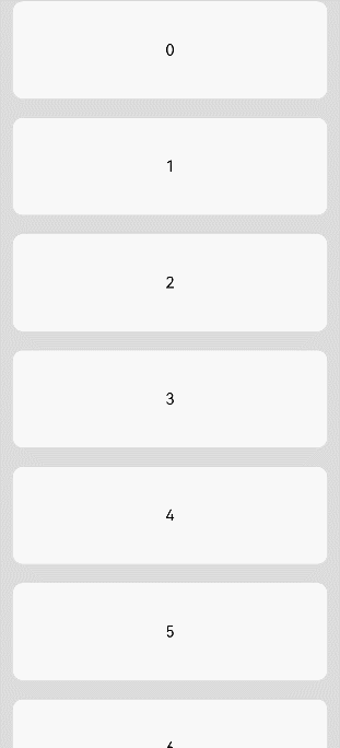
示例1
// xxx.ets
@Entry
@Component
struct ListItemExample {
  private arr: number[] = [0, 1, 2, 3, 4, 5, 6, 7, 8, 9]

  build() {
    Column() {
      List({ space: 20, initialIndex: 0 }) {
        ForEach(this.arr, (item: number) => {
          ListItem() {
            Text('' + item)
              .width('100%')
              .height(100)
              .fontSize(16)
              .textAlign(TextAlign.Center)
              .borderRadius(10)
              .backgroundColor(0xFFFFFF)
          }
        }, (item: string) => item)
      }.width('90%')
      .scrollBar(BarState.Off)
    }.width('100%').height('100%').backgroundColor(0xDCDCDC).padding({ top: 5 })
  }
}
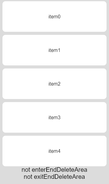
示例2
// xxx.ets
@Entry
@Component
struct ListItemExample2 {
  @State message: string = 'Hello World'
  @State arr: number[] = [0, 1, 2, 3, 4]
  @State enterEndDeleteAreaString: string = "not enterEndDeleteArea"
  @State exitEndDeleteAreaString: string = "not exitEndDeleteArea"

  @Builder itemEnd() {
    Row() {
      Button("Delete").margin("4vp")
      Button("Set").margin("4vp")
    }.padding("4vp").justifyContent(FlexAlign.SpaceEvenly)
  }

  build() {
    Column() {
      List({ space: 10 }) {
        ForEach(this.arr, (item: number) => {
          ListItem() {
            Text("item" + item)
              .width('100%')
              .height(100)
              .fontSize(16)
              .textAlign(TextAlign.Center)
              .borderRadius(10)
              .backgroundColor(0xFFFFFF)
          }
          .transition({ type: TransitionType.Delete, opacity: 0 })
          .swipeAction({
            end: {
              builder: () => { this.itemEnd() },
              onAction: () => {
                animateTo({ duration: 1000 }, () => {
                  let index = this.arr.indexOf(item)
                  this.arr.splice(index, 1)
                })
              },
              actionAreaDistance: 56,
              onEnterActionArea: () => {
                this.enterEndDeleteAreaString = "enterEndDeleteArea"
                this.exitEndDeleteAreaString = "not exitEndDeleteArea"
              },
              onExitActionArea: () => {
                this.enterEndDeleteAreaString = "not enterEndDeleteArea"
                this.exitEndDeleteAreaString = "exitEndDeleteArea"
              }
            }
          })
        }, (item: string) => item)
      }
      Text(this.enterEndDeleteAreaString).fontSize(20)
      Text(this.exitEndDeleteAreaString).fontSize(20)
    }
    .padding(10)
    .backgroundColor(0xDCDCDC)
    .width('100%')
    .height('100%')
  }
}
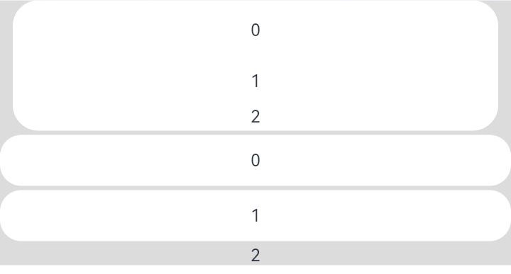
示例3
// xxx.ets
@Entry
@Component
struct ListItemExample3 {
  build() {
    Column() {
      List({ space: "4vp", initialIndex: 0 }) {
        ListItemGroup({ style: ListItemGroupStyle.CARD }) {
          ForEach([ListItemStyle.CARD, ListItemStyle.CARD, ListItemStyle.NONE], (itemStyle: number, index?: number) => {
            ListItem({ style: itemStyle }) {
              Text("" + index)
                .width("100%")
                .textAlign(TextAlign.Center)
            }
          })
        }
        ForEach([ListItemStyle.CARD, ListItemStyle.CARD, ListItemStyle.NONE], (itemStyle: number, index?: number) => {
          ListItem({ style: itemStyle }) {
            Text("" + index)
              .width("100%")
              .textAlign(TextAlign.Center)
          }
        })
      }
      .width('100%')
      .multiSelectable(true)
      .backgroundColor(0xDCDCDC) // 浅蓝色的List
    }
    .width('100%')
    .padding({ top: 5 })
  }
}
你可能感兴趣的鸿蒙文章
harmony 鸿蒙@ohos.arkui.advanced.Counter(计数器组件)
harmony 鸿蒙@ohos.arkui.advanced.SegmentButton(分段按钮)
0
赞
热门推荐
-
2、 优质文章
-
3、 gt
-
7、 openharmony
-
9、 golang
-
10、 Vue中input框自动聚焦