harmony 鸿蒙TextArea
TextArea
多行文本输入框组件,当输入的文本内容超过组件宽度时会自动换行显示。
高度未设置时,组件无默认高度,自适应内容高度。宽度未设置时,默认撑满最大宽度。
说明:
该组件从API version 7开始支持。后续版本如有新增内容,则采用上角标单独标记该内容的起始版本。
子组件
无
接口
TextArea(value?: TextAreaOptions)
原子化服务API: 从API version 11开始,该接口支持在原子化服务中使用。
系统能力: SystemCapability.ArkUI.ArkUI.Full
参数:
| 参数名 | 类型 | 必填 | 说明 |
|---|---|---|---|
| value | TextAreaOptions | 否 | TextArea组件参数。 |
TextAreaOptions对象说明
原子化服务API: 从API version 11开始,该接口支持在原子化服务中使用。
系统能力: SystemCapability.ArkUI.ArkUI.Full
| 名称 | 类型 | 必填 | 说明 |
|---|---|---|---|
| placeholder | ResourceStr | 否 | 设置无输入时的提示文本。输入内容后,提示文本不显示。 仅设置placeholder属性时,手柄依然跟随拖动,手柄松开后光标停留在文字开头位置。 |
| text | ResourceStr | 否 | 设置输入框当前的文本内容。建议通过onChange事件将状态变量与文本实时绑定,避免组件刷新时TextArea中的文本内容异常。 从API version 10开始,该参数支持$$双向绑定变量。 从API version 18开始,该参数支持!!双向绑定变量。 |
| controller8+ | TextAreaController | 否 | 设置TextArea控制器。 |
属性
除支持通用属性,还支持以下属性:
说明:
通用属性padding的默认值为:
{
top: ‘8vp’,
right: ‘16vp’,
bottom: ‘8vp’,
left: ‘16vp’
}从API version 11开始,多行输入框可设置.width(‘auto’)使组件宽度自适应文本宽度,自适应时组件宽度受constraintSize属性以及父容器传递的最大最小宽度限制,其余使用方式参考尺寸设置。
placeholderColor
placeholderColor(value: ResourceColor)
设置placeholder文本颜色。
原子化服务API: 从API version 11开始,该接口支持在原子化服务中使用。
系统能力: SystemCapability.ArkUI.ArkUI.Full
参数:
| 参数名 | 类型 | 必填 | 说明 |
|---|---|---|---|
| value | ResourceColor | 是 | placeholder文本颜色。 默认值:跟随主题。 |
placeholderFont
placeholderFont(value: Font)
设置placeholder文本样式,包括字体大小、字体粗细、字体族、字体风格。当前支持’HarmonyOS Sans’字体和注册自定义字体。
原子化服务API: 从API version 11开始,该接口支持在原子化服务中使用。
系统能力: SystemCapability.ArkUI.ArkUI.Full
参数:
| 参数名 | 类型 | 必填 | 说明 |
|---|---|---|---|
| value | Font | 是 | placeholder文本样式。 |
textAlign
textAlign(value: TextAlign)
设置文本在输入框中的水平对齐方式。
支持TextAlign.Start、TextAlign.Center和TextAlign.End。
可通过align属性控制文本段落在垂直方向上的位置,此组件中不可通过align属性控制文本段落在水平方向上的位置,即align属性中Alignment.TopStart、Alignment.Top、Alignment.TopEnd效果相同,控制内容在顶部,Alignment.Start、Alignment.Center、Alignment.End效果相同,控制内容垂直居中,Alignment.BottomStart、Alignment.Bottom、Alignment.BottomEnd效果相同,控制内容在底部。
当textAlign属性设置为TextAlign.JUSTIFY时,最后一行文本不参与两端对齐,为水平对齐首部效果。
从API version 11开始,textAlign可设置TextAlign.JUSTIFY
原子化服务API: 从API version 11开始,该接口支持在原子化服务中使用。
系统能力: SystemCapability.ArkUI.ArkUI.Full
参数:
| 参数名 | 类型 | 必填 | 说明 |
|---|---|---|---|
| value | TextAlign | 是 | 文本在输入框中的水平对齐方式。 默认值:TextAlign.Start |
caretColor
caretColor(value: ResourceColor)
设置输入框光标颜色。
原子化服务API: 从API version 11开始,该接口支持在原子化服务中使用。
系统能力: SystemCapability.ArkUI.ArkUI.Full
参数:
| 参数名 | 类型 | 必填 | 说明 |
|---|---|---|---|
| value | ResourceColor | 是 | 输入框光标颜色。 默认值:’#007DFF’ |
说明: 从API version 12开始,此接口支持设置文本手柄颜色,光标和文本手柄颜色保持一致。
fontColor
fontColor(value: ResourceColor)
设置字体颜色。
原子化服务API: 从API version 11开始,该接口支持在原子化服务中使用。
系统能力: SystemCapability.ArkUI.ArkUI.Full
参数:
| 参数名 | 类型 | 必填 | 说明 |
|---|---|---|---|
| value | ResourceColor | 是 | 字体颜色。 |
fontSize
fontSize(value: Length)
设置字体大小。
原子化服务API: 从API version 11开始,该接口支持在原子化服务中使用。
系统能力: SystemCapability.ArkUI.ArkUI.Full
参数:
| 参数名 | 类型 | 必填 | 说明 |
|---|---|---|---|
| value | Length | 是 | 字体大小。fontSize为number类型时,使用fp单位。字体默认大小16fp,Wearable设备上默认值为:18fp。不支持设置百分比字符串。 |
fontStyle
fontStyle(value: FontStyle)
设置字体样式。
原子化服务API: 从API version 11开始,该接口支持在原子化服务中使用。
系统能力: SystemCapability.ArkUI.ArkUI.Full
参数:
| 参数名 | 类型 | 必填 | 说明 |
|---|---|---|---|
| value | FontStyle | 是 | 字体样式。 默认值:FontStyle.Normal |
fontWeight
fontWeight(value: number|FontWeight|ResourceStr)
设置文本的字体粗细,设置过大可能会在不同字体下有截断。
原子化服务API: 从API version 11开始,该接口支持在原子化服务中使用。
系统能力: SystemCapability.ArkUI.ArkUI.Full
参数:
| 参数名 | 类型 | 必填 | 说明 |
|---|---|---|---|
| value | number | FontWeight | ResourceStr | 是 | 文本的字体粗细,number类型取值[100, 900],取值间隔为100,默认为400,取值越大,字体越粗。string类型仅支持number类型取值的字符串形式,例如”400”,以及”bold”、”bolder”、”lighter”、”regular”、”medium”,分别对应FontWeight中相应的枚举值。 默认值:FontWeight.Normal 从API version 20开始,支持Resource类型。 |
fontFamily
fontFamily(value: ResourceStr)
设置字体列表。
原子化服务API: 从API version 11开始,该接口支持在原子化服务中使用。
系统能力: SystemCapability.ArkUI.ArkUI.Full
参数:
| 参数名 | 类型 | 必填 | 说明 |
|---|---|---|---|
| value | ResourceStr | 是 | 字体列表。默认字体’HarmonyOS Sans’。 应用当前支持’HarmonyOS Sans’字体和注册自定义字体。 卡片当前仅支持’HarmonyOS Sans’字体。 |
inputFilter8+
inputFilter(value: ResourceStr, error?: (value: string) => void)
通过正则表达式设置输入过滤器。匹配表达式的输入允许显示,不匹配的输入将被过滤。仅支持单个字符匹配,不支持字符串匹配。
原子化服务API: 从API version 11开始,该接口支持在原子化服务中使用。
系统能力: SystemCapability.ArkUI.ArkUI.Full
参数:
| 参数名 | 类型 | 必填 | 说明 |
|---|---|---|---|
| value | ResourceStr | 是 | 正则表达式。 |
| error | (value: string) => void | 否 | 正则匹配失败时,返回被过滤的内容。 |
copyOption9+
copyOption(value: CopyOptions)
设置输入的文本是否可复制。设置CopyOptions.None时,当前TextArea中的文字无法被复制、剪切、翻译、分享、搜索和帮写,仅支持粘贴。
设置CopyOptions.None时,不支持拖拽操作。
原子化服务API: 从API version 11开始,该接口支持在原子化服务中使用。
系统能力: SystemCapability.ArkUI.ArkUI.Full
参数:
| 参数名 | 类型 | 必填 | 说明 |
|---|---|---|---|
| value | CopyOptions | 是 | 输入的文本是否可复制。 默认值:CopyOptions.LocalDevice,支持设备内复制。 |
maxLength10+
maxLength(value: number)
设置文本的最大输入字符数。默认不设置最大输入字符数限制。到达文本最大字符限制,将无法继续输入字符,同时边框变为红色。
原子化服务API: 从API version 11开始,该接口支持在原子化服务中使用。
系统能力: SystemCapability.ArkUI.ArkUI.Full
参数:
| 参数名 | 类型 | 必填 | 说明 |
|---|---|---|---|
| value | number | 是 | 文本的最大输入字符数。 |
showCounter10+
showCounter(value: boolean, options?: InputCounterOptions)
设置当通过InputCounterOptions输入的字符数超过阈值时显示计数器。
参数value为true时,才能设置options,文本框开启计数器功能,需要配合maxLength(设置最大字符限制)一起使用。字符计数器显示的效果是当前输入字符数/最大可输入字符数。
当输入字符数大于最大字符数乘百分比值时,显示字符计数器。如果用户设置计数器时不设置InputCounterOptions,那么当前输入字符数达到最大字符数时,边框和计数器下标将变为红色。用户同时设置参数value为true和InputCounterOptions,当thresholdPercentage数值在有效区间内,且输入字符数超过最大字符数时,边框和计数器下标将变为红色,框体抖动。highlightBorder设置为false,则不显示红色边框,计数器默认显示红色边框。内联模式下字符计数器不显示。
原子化服务API: 从API version 11开始,该接口支持在原子化服务中使用。
系统能力: SystemCapability.ArkUI.ArkUI.Full
参数:
| 参数名 | 类型 | 必填 | 说明 |
|---|---|---|---|
| value | boolean | 是 | 是否显示计数器。 true表示显示计时器,false表示不显示。 |
| options11+ | InputCounterOptions | 否 | 计数器的配置项。 |
style10+
style(value: TextContentStyle)
设置文本框多态样式,内联输入风格只支持TextAreaType.Normal类型。
原子化服务API: 从API version 11开始,该接口支持在原子化服务中使用。
系统能力: SystemCapability.ArkUI.ArkUI.Full
参数:
| 参数名 | 类型 | 必填 | 说明 |
|---|---|---|---|
| value | TextContentStyle | 是 | 文本框多态样式。 默认值:TextContentStyle.DEFAULT |
enableKeyboardOnFocus10+
enableKeyboardOnFocus(value: boolean)
设置TextArea通过点击以外的方式获焦时,是否主动拉起软键盘。
从API version 10开始,获焦默认绑定输入法。
原子化服务API: 从API version 11开始,该接口支持在原子化服务中使用。
系统能力: SystemCapability.ArkUI.ArkUI.Full
参数:
| 参数名 | 类型 | 必填 | 说明 |
|---|---|---|---|
| value | boolean | 是 | 通过点击以外的方式获焦时,是否主动拉起软键盘。 true表示主动拉起,false表示不主动拉起。 默认值:true |
selectionMenuHidden10+
selectionMenuHidden(value: boolean)
设置是否不弹出系统文本选择菜单。
原子化服务API: 从API version 11开始,该接口支持在原子化服务中使用。
系统能力: SystemCapability.ArkUI.ArkUI.Full
参数:
| 参数名 | 类型 | 必填 | 说明 |
|---|---|---|---|
| value | boolean | 是 | 是否不弹出系统文本选择菜单。 设置为true时,单击输入框光标、长按输入框、双击输入框、三击输入框或者右键输入框,不弹出系统文本选择菜单。 设置为false时,弹出系统文本选择菜单。 默认值:false |
barState10+
barState(value: BarState)
设置输入框滚动条的显示模式。
原子化服务API: 从API version 11开始,该接口支持在原子化服务中使用。
系统能力: SystemCapability.ArkUI.ArkUI.Full
参数:
| 参数名 | 类型 | 必填 | 说明 |
|---|---|---|---|
| value | BarState | 是 | 输入框滚动条的显示模式。 默认值:BarState.Auto |
maxLines10+
maxLines(value: number)
配置textOverflow一起使用时,maxLines为可显示行数,超出截断;未配置textOverflow时,内联模式获焦状态下内容超出maxLines时,文本可滚动显示,内联模式非获焦状态下不生效maxLines,非内联模式按行截断。
原子化服务API: 从API version 11开始,该接口支持在原子化服务中使用。
系统能力: SystemCapability.ArkUI.ArkUI.Full
参数:
| 参数名 | 类型 | 必填 | 说明 |
|---|---|---|---|
| value | number | 是 | 内联输入风格编辑态时文本可显示的最大行数。 默认值:3,非内联模式下,默认值为+∞,不限制最大行数。 取值范围:(0, +∞) |
maxLines20+
maxLines(lines: number, options: MaxLinesOptions)
配置textOverflow一起使用时,maxLines为可显示行数,超出可配置为截断或滚动。未配置textOverflow时,内联模式获焦状态下内容超出maxLines时,文本可滚动显示。内联模式非获焦状态下,maxLines不生效。
原子化服务API: 从API version 20开始,该接口支持在原子化服务中使用。
系统能力: SystemCapability.ArkUI.ArkUI.Full
参数:
| 参数名 | 类型 | 必填 | 说明 |
|---|---|---|---|
| lines | number | 是 | 内联输入风格编辑态时文本可显示的最大行数。 默认值:3,非内联模式下,默认值为+∞,不限制最大行数。 取值范围:(0, +∞) |
| options | MaxLinesOptions | 是 | 文本超长时显示效果。 默认值:MaxLinesMode.CLIP |
minLines20+
minLines(lines: Optional<number>)
设置节点显示的最小行数,若传入值小于1,则自动取值为1。如果节点设置了constraintSize,那么组件最后显示高度会在constraintSize约束内。
原子化服务API: 从API version 20开始,该接口支持在原子化服务中使用。
系统能力: SystemCapability.ArkUI.ArkUI.Full
参数:
| 参数名 | 类型 | 必填 | 说明 |
|---|---|---|---|
| lines | Optional<number> | 是 | 节点最小行数。 |
customKeyboard10+
customKeyboard(value: CustomBuilder, options?: KeyboardOptions)
设置自定义键盘。
当设置自定义键盘时,输入框激活后不会打开系统输入法,而是加载指定的自定义组件。
自定义键盘的高度可以通过自定义组件根节点的height属性设置,宽度则使用系统默认值。
自定义键盘采用覆盖原始界面的方式呈现,当没有开启避让模式或者输入框不需要避让的场景,不会对应用原始界面产生压缩或者上提。
自定义键盘无法获取焦点,但是会拦截手势事件。
默认在输入控件失去焦点时,关闭自定义键盘,开发者也可以通过TextAreaController.stopEditing方法控制键盘关闭。
如果设备支持拍摄输入,设置自定义键盘后,输入框将不再支持拍摄输入。
当设置自定义键盘时,可以通过绑定onKeyPrelme事件规避物理键盘的输入。
原子化服务API: 从API version 11开始,该接口支持在原子化服务中使用。
系统能力: SystemCapability.ArkUI.ArkUI.Full
参数:
| 参数名 | 类型 | 必填 | 说明 |
|---|---|---|---|
| value | CustomBuilder | 是 | 自定义键盘。 原子化服务API: 从API version 11开始,该接口支持在原子化服务中使用。 |
| options12+ | KeyboardOptions | 否 | 设置自定义键盘是否支持避让功能。 |
type11+
type(value: TextAreaType)
设置输入框类型。
原子化服务API: 从API version 12开始,该接口支持在原子化服务中使用。
系统能力: SystemCapability.ArkUI.ArkUI.Full
参数:
| 参数名 | 类型 | 必填 | 说明 |
|---|---|---|---|
| value | TextAreaType | 是 | 输入框类型。 默认值:TextAreaType.Normal |
enterKeyType11+
enterKeyType(value: EnterKeyType)
设置输入法回车键类型。
原子化服务API: 从API version 12开始,该接口支持在原子化服务中使用。
系统能力: SystemCapability.ArkUI.ArkUI.Full
参数:
| 参数名 | 类型 | 必填 | 说明 |
|---|---|---|---|
| value | EnterKeyType | 是 | 输入法回车键类型。 默认值:EnterKeyType.NEW_LINE |
enableAutoFill12+
enableAutoFill(value: boolean)
设置是否启用自动填充。
原子化服务API: 从API version 12开始,该接口支持在原子化服务中使用。
系统能力: SystemCapability.ArkUI.ArkUI.Full
参数:
| 参数名 | 类型 | 必填 | 说明 |
|---|---|---|---|
| value | boolean | 是 | 是否启用自动填充。 true表示启用,false表示不启用。 默认值:true |
contentType12+
contentType(contentType: ContentType)
设置自动填充类型。
原子化服务API: 从API version 12开始,该接口支持在原子化服务中使用。
系统能力: SystemCapability.ArkUI.ArkUI.Full
参数:
| 参数名 | 类型 | 必填 | 说明 |
|---|---|---|---|
| contentType | ContentType | 是 | 自动填充类型。 |
lineHeight12+
lineHeight(value: number|string|Resource)
设置文本的文本行高,设置值不大于0时,不限制文本行高,自适应字体大小,number类型时单位为fp。
原子化服务API: 从API version 12开始,该接口支持在原子化服务中使用。
系统能力: SystemCapability.ArkUI.ArkUI.Full
参数:
| 参数名 | 类型 | 必填 | 说明 |
|---|---|---|---|
| value | number | string | Resource | 是 | 文本的文本行高。 |
decoration12+
decoration(value: TextDecorationOptions)
设置文本装饰线类型样式及其颜色。
原子化服务API: 从API version 12开始,该接口支持在原子化服务中使用。
系统能力: SystemCapability.ArkUI.ArkUI.Full
参数:
| 参数名 | 类型 | 必填 | 说明 |
|---|---|---|---|
| value | TextDecorationOptions | 是 | 文本装饰线对象。 默认值:{ type: TextDecorationType.None, color: Color.Black, style: TextDecorationStyle.SOLID } |
letterSpacing12+
letterSpacing(value: number|string|Resource)
设置文本字符间距。设置该值为百分比时,按默认值显示。当设置该值为0时,使用默认值。string类型支持number类型取值的字符串形式,可以附带单位,例如”10”、”10fp”。
当取值为负值时,文字会发生压缩,负值过小时会将组件内容区大小压缩为0,导致无内容显示。
原子化服务API: 从API version 12开始,该接口支持在原子化服务中使用。
系统能力: SystemCapability.ArkUI.ArkUI.Full
参数:
| 参数名 | 类型 | 必填 | 说明 |
|---|---|---|---|
| value | number | string | Resource | 是 | 文本字符间距。 单位:fp |
fontFeature12+
fontFeature(value: string)
设置文字特性效果,比如数字等宽的特性。
格式为:normal |<feature-tag-value>
<feature-tag-value>的格式为:<string> [ <integer> |on |off ]
<feature-tag-value>的个数可以有多个,中间用’,‘隔开。
例如,使用等宽数字的输入格式为:”ss01” on。
原子化服务API: 从API version 12开始,该接口支持在原子化服务中使用。
系统能力: SystemCapability.ArkUI.ArkUI.Full
参数:
| 参数名 | 类型 | 必填 | 说明 |
|---|---|---|---|
| value | string | 是 | 文字特性效果。 |
Font Feature当前支持的属性见 fontFeature属性列表。 设置 Font Feature 属性,Font Feature 是 OpenType 字体的高级排版能力,如支持连字、数字等宽等特性,一般用在自定义字体中,其能力需要字体本身支持。 更多 Font Feature 能力介绍可参考 https://www.w3.org/TR/css-fonts-3/#font-feature-settings-prop 和 https://sparanoid.com/lab/opentype-features/
wordBreak12+
wordBreak(value: WordBreak)
设置文本断行规则。该属性对placeholder文本无效。
原子化服务API: 从API version 12开始,该接口支持在原子化服务中使用。
系统能力: SystemCapability.ArkUI.ArkUI.Full
参数:
| 参数名 | 类型 | 必填 | 说明 |
|---|---|---|---|
| value | WordBreak | 是 | 文本断行规则。 默认值:WordBreak.BREAK_WORD |
说明:
组件不支持clip属性设置,设置该属性任意枚举值对组件文本截断无影响。
selectedBackgroundColor12+
selectedBackgroundColor(value: ResourceColor)
设置文本选中底板颜色。如果未设置不透明度,默认为20%不透明度。
原子化服务API: 从API version 12开始,该接口支持在原子化服务中使用。
系统能力: SystemCapability.ArkUI.ArkUI.Full
参数:
| 参数名 | 类型 | 必填 | 说明 |
|---|---|---|---|
| value | ResourceColor | 是 | 文本选中底板颜色。 |
caretStyle12+
caretStyle(value: CaretStyle)
设置光标风格。
原子化服务API: 从API version 12开始,该接口支持在原子化服务中使用。
系统能力: SystemCapability.ArkUI.ArkUI.Full
参数:
| 参数名 | 类型 | 必填 | 说明 |
|---|---|---|---|
| value | CaretStyle | 是 | 光标的风格。 |
textIndent12+
textIndent(value: Dimension)
设置首行文本缩进。
原子化服务API: 从API version 12开始,该接口支持在原子化服务中使用。
系统能力: SystemCapability.ArkUI.ArkUI.Full
参数:
| 参数名 | 类型 | 必填 | 说明 |
|---|---|---|---|
| value | Dimension | 是 | 首行文本缩进。 默认值:0 |
textOverflow12+
textOverflow(value: TextOverflow)
设置文本超长时的显示方式。
内联模式,主动配置textoverflow才会生效按maxline截断效果,不配置时,默认不截断。
文本截断是按字截断。例如,英文以单词为最小单位进行截断,若需要以字母为单位进行截断,wordBreak属性可设置为WordBreak.BREAK_ALL。
当overflow设置为TextOverflow.None、TextOverflow.Clip、TextOverflow.Ellipsis时,需配合maxLines使用,单独设置不生效。设置TextOverflow.None与TextOverflow.Clip效果一样。
卡片能力: 该接口支持在ArkTS卡片中使用。
原子化服务API: 从API version 12开始,该接口支持在原子化服务中使用。
系统能力: SystemCapability.ArkUI.ArkUI.Full
参数:
| 参数名 | 类型 | 必填 | 说明 |
|---|---|---|---|
| value | TextOverflow | 是 | 文本超长时的显示方式。 默认值:TextOverflow.Clip |
说明:
TextArea组件不支持设置TextOverflow.MARQUEE模式,当设置为TextOverflow.MARQUEE模式时 显示为TextOverflow.Clip
minFontSize12+
minFontSize(value: number|string|Resource)
设置文本最小显示字号。string类型支持number类型取值的字符串形式,可以附带单位,例如”10”、”10fp”。
需配合maxFontSize以及maxLines或布局大小限制使用,单独设置不生效。
自适应字号生效时,fontSize设置不生效。
原子化服务API: 从API version 12开始,该接口支持在原子化服务中使用。
系统能力: SystemCapability.ArkUI.ArkUI.Full
参数:
| 参数名 | 类型 | 必填 | 说明 |
|---|---|---|---|
| value | number | string | Resource | 是 | 文本最小显示字号。 单位:fp |
maxFontSize12+
maxFontSize(value: number|string|Resource)
设置文本最大显示字号。string类型支持number类型取值的字符串形式,可以附带单位,例如”10”、”10fp”。
需配合minFontSize以及maxLines或布局大小限制使用,单独设置不生效。
自适应字号生效时,fontSize设置不生效。
原子化服务API: 从API version 12开始,该接口支持在原子化服务中使用。
系统能力: SystemCapability.ArkUI.ArkUI.Full
参数:
| 参数名 | 类型 | 必填 | 说明 |
|---|---|---|---|
| value | number | string | Resource | 是 | 文本最大显示字号。 单位:fp |
heightAdaptivePolicy12+
heightAdaptivePolicy(value: TextHeightAdaptivePolicy)
设置文本自适应高度的方式。
当设置为TextHeightAdaptivePolicy.MAX_LINES_FIRST时,优先使用maxLines属性来调整文本高度。如果使用maxLines属性的布局大小超过了布局约束,则尝试在minFontSize和maxFontSize的范围内缩小字体以显示更多文本。 组件设置为内联输入风格,编辑态与非编辑态存在字体大小不一致情况。
当设置为TextHeightAdaptivePolicy.MIN_FONT_SIZE_FIRST时,优先使用minFontSize属性来调整文本高度。如果使用minFontSize属性可以将文本布局在一行中,则尝试在minFontSize和maxFontSize的范围内增大字体并使用最大可能的字体大小。
当设置为TextHeightAdaptivePolicy.LAYOUT_CONSTRAINT_FIRST时,优先使用布局约束来调整文本高度。如果布局大小超过布局约束,则尝试在minFontSize和maxFontSize的范围内缩小字体以满足布局约束。
原子化服务API: 从API version 12开始,该接口支持在原子化服务中使用。
系统能力: SystemCapability.ArkUI.ArkUI.Full
参数:
| 参数名 | 类型 | 必填 | 说明 |
|---|---|---|---|
| value | TextHeightAdaptivePolicy | 是 | 文本自适应高度的方式。 默认值:TextHeightAdaptivePolicy.MAX_LINES_FIRST |
lineSpacing12+
lineSpacing(value: LengthMetrics)
设置文本的行间距,设置值不大于0时,取默认值0。
原子化服务API: 从API version 12开始,该接口支持在原子化服务中使用。
系统能力: SystemCapability.ArkUI.ArkUI.Full
参数:
| 参数名 | 类型 | 必填 | 说明 |
|---|---|---|---|
| value | LengthMetrics | 是 | 文本的行间距。默认值:0 |
lineSpacing20+
lineSpacing(value: LengthMetrics, options?: LineSpacingOptions)
设置文本的行间距。当不配置LineSpacingOptions时,首行上方和尾行下方默认会有行间距。
原子化服务API: 从API version 20开始,该接口支持在原子化服务中使用。
系统能力: SystemCapability.ArkUI.ArkUI.Full
参数:
| 参数名 | 类型 | 必填 | 说明 |
|---|---|---|---|
| value | LengthMetrics | 是 | 文本的行间距。设置值不大于0时,取默认值0。 |
| options | LineSpacingOptions | 否 | 设置行间距配置项。 默认值:{ onlyBetweenLines: false } |
lineBreakStrategy12+
lineBreakStrategy(strategy: LineBreakStrategy)
设置折行规则。该属性在wordBreak不等于breakAll的时候生效,不支持连词符。
原子化服务API: 从API version 12开始,该接口支持在原子化服务中使用。
系统能力: SystemCapability.ArkUI.ArkUI.Full
参数:
| 参数名 | 类型 | 必填 | 说明 |
|---|---|---|---|
| strategy | LineBreakStrategy | 是 | 文本的折行规则。 默认值:LineBreakStrategy.GREEDY |
editMenuOptions12+
editMenuOptions(editMenu: EditMenuOptions)
设置自定义菜单扩展项,允许用户设置扩展项的文本内容、图标、回调方法。
原子化服务API: 从API version 12开始,该接口支持在原子化服务中使用。
系统能力: SystemCapability.ArkUI.ArkUI.Full
参数:
| 参数名 | 类型 | 必填 | 说明 |
|---|---|---|---|
| editMenu | EditMenuOptions | 是 | 扩展菜单选项。 |
enablePreviewText12+
enablePreviewText(enable: boolean)
设置是否开启输入预上屏。
预上屏内容定义为文字暂存态,目前不支持文字拦截功能,因此不触发onWillInsert、onDidInsert、onWillDelete、onDidDelete回调。
原子化服务API: 从API version 12开始,该接口支持在原子化服务中使用。
系统能力: SystemCapability.ArkUI.ArkUI.Full
参数:
| 参数名 | 类型 | 必填 | 说明 |
|---|---|---|---|
| enable | boolean | 是 | 是否开启输入预上屏。 true表示开启,false表示不开启。 默认值:true |
enableHapticFeedback13+
enableHapticFeedback(isEnabled: boolean)
设置是否开启触控反馈。
原子化服务API: 从API version 13开始,该接口支持在原子化服务中使用。
系统能力: SystemCapability.ArkUI.ArkUI.Full
参数:
| 参数名 | 类型 | 必填 | 说明 |
|---|---|---|---|
| isEnabled | boolean | 是 | 是否开启触控反馈。 true表示开启,false表示不开启。 默认值:true |
说明:
开启触控反馈时,需要在工程的module.json5中配置requestPermissions字段以开启振动权限,配置如下:
> "requestPermissions": [ > { > "name": "ohos.permission.VIBRATE", > } > ] > ``` ### autoCapitalizationMode<sup>20+</sup> autoCapitalizationMode(mode: AutoCapitalizationMode) 设置自动大小写模式的文本模式,只提供接口能力,具体实现以输入法应用为主。 **原子化服务API:** 从API version 20开始,该接口支持在原子化服务中使用。 **系统能力:** SystemCapability.ArkUI.ArkUI.Full **参数:** |参数名 |类型 |必填|说明 | |--------|-----------------------------------------|----|--------------------------| |mode|[AutoCapitalizationMode](ts-text-common.md#autocapitalizationmode20枚举说明)|是 |自动大小写模式,默认状态无效。| ### keyboardAppearance<sup>15+</sup> keyboardAppearance(appearance: Optional\<KeyboardAppearance>) 设置输入框拉起的键盘样式。 **原子化服务API:** 从API version 15开始,该接口支持在原子化服务中使用。 **系统能力:** SystemCapability.ArkUI.ArkUI.Full **参数:** |参数名|类型|必填|说明| |------|-----------------------------------------|----|------------------------------------------------------| |appearance|[Optional](https://www.seaxiang.com/blog/wS3lqp)\<[KeyboardAppearance](ts-text-common.md#keyboardappearance15枚举说明)>|是 |键盘样式。<br/>默认值:KeyboardAppearance.NONE_IMMERSIVE| ### strokeWidth<sup>20+</sup> strokeWidth(width: Optional\<LengthMetrics>) 设置文本描边的宽度。 **原子化服务API:** 从API version 20开始,该接口支持在原子化服务中使用。 **系统能力:** SystemCapability.ArkUI.ArkUI.Full **参数:** |参数名|类型 |必填|说明 | |------|------------------------------------------------------------|----|----------------| |width|[Optional](https://www.seaxiang.com/blog/wS3lqp)\<[LengthMetrics](https://www.seaxiang.com/blog/Sao8oW)>|是 |文本描边的宽度。当LengthMetrics的单位为px时,<br/>若设置值小于0,显示实心字;若大于0,显示空心字。<br/>默认值为0,不做描边处理。| ### strokeColor<sup>20+</sup> strokeColor(color: Optional\<ResourceColor>) 设置文本描边的颜色。 **原子化服务API:** 从API version 20开始,该接口支持在原子化服务中使用。 **系统能力:** SystemCapability.ArkUI.ArkUI.Full **参数:** |参数名|类型 |必填|说明 | |------|------------------------------------------|----|----------| |color|[Optional](https://www.seaxiang.com/blog/wS3lqp)\<[ResourceColor](https://www.seaxiang.com/blog/3hxcXk)>|是 |描边颜色。默认值为字体颜色,设置异常值时取默认值。| ### stopBackPress<sup>15+</sup> stopBackPress(isStopped: Optional\<boolean>) 设置是否阻止返回键向其它组件或应用侧传递。 **原子化服务API:** 从API version 15开始,该接口支持在原子化服务中使用。 **系统能力:** SystemCapability.ArkUI.ArkUI.Full **参数:** |参数名|类型 |必填|说明 | |------|---------------------------------------------------|----|-----------------------------------------| |isStopped|[Optional](https://www.seaxiang.com/blog/wS3lqp)\<boolean>|是 |是否阻止返回键。<br/>true表示阻止返回键向其它组件或应用侧传递,false表示不阻止。<br />默认值:true| ### halfLeading<sup>18+</sup> halfLeading(halfLeading: Optional\<boolean>) 设置文本是否将行间距平分至行的顶部与底部。 **原子化服务API:** 从API version 18开始,该接口支持在原子化服务中使用。 **系统能力:** SystemCapability.ArkUI.ArkUI.Full **参数:** |参数名|类型 |必填|说明 | |------|---------------------------------------------|----|---------------------------------------------| |halfLeading|[Optional](https://www.seaxiang.com/blog/wS3lqp)\<boolean>|是|文本是否将行间距平分至行的顶部与底部。<br/>true表示将行间距平分至行的顶部与底部,false则不平分。<br/>默认值:false| ### minFontScale<sup>18+</sup> minFontScale(scale: Optional\<number|Resource>) 设置文本最小的字体缩放倍数。 **原子化服务API:** 从API version 18开始,该接口支持在原子化服务中使用。 **系统能力:** SystemCapability.ArkUI.ArkUI.Full **参数:** |参数名|类型 |必填|说明 | |------|---------------------------------------------|----|---------------------------------------------| |scale|[Optional](https://www.seaxiang.com/blog/wS3lqp)\<number \|[Resource](https://www.seaxiang.com/blog/3hxcXk)>|是 |文本最小的字体缩放倍数,支持undefined类型。<br/>取值范围:[0, 1]<br/>**说明:** <br/>设置的值小于0时,按值为0处理。设置的值大于1,按值为1处理。异常值默认不生效。<br/>使用前需在工程中配置configuration.json文件和app.json5文件,具体详见[示例17设置最小字体范围与最大字体范围](#示例17设置最小字体范围与最大字体范围)。| ### maxFontScale<sup>18+</sup> maxFontScale(scale: Optional\<number|Resource>) 设置文本最大的字体缩放倍数。 **原子化服务API:** 从API version 18开始,该接口支持在原子化服务中使用。 **系统能力:** SystemCapability.ArkUI.ArkUI.Full **参数:** |参数名|类型 |必填|说明 | |------|---------------------------------------------|----|---------------------------------------------| |scale|[Optional](https://www.seaxiang.com/blog/wS3lqp)\<number \|[Resource](https://www.seaxiang.com/blog/3hxcXk)>|是 |文本最大的字体缩放倍数,支持undefined类型。<br/>取值范围:[1, +∞)<br/>**说明:** <br/>设置的值小于1时,按值为1处理。异常值默认不生效。<br/>使用前需在工程中配置configuration.json文件和app.json5文件,具体详见[示例17设置最小字体范围与最大字体范围](#示例17设置最小字体范围与最大字体范围)。| ### ellipsisMode<sup>18+</sup> ellipsisMode(mode: Optional\<EllipsisMode>) 设置省略位置。ellipsisMode属性需要配合overflow设置为TextOverflow.Ellipsis以及maxLines使用,单独设置ellipsisMode属性不生效。 EllipsisMode.START和EllipsisMode.CENTER仅在maxLines设置为1生效。 **原子化服务API:** 从API version 18开始,该接口支持在原子化服务中使用。 **系统能力:** SystemCapability.ArkUI.ArkUI.Full **参数:** |参数名|类型 |必填|说明 | |------|---------------------------------------------------|----|-----------------------------------------| |mode|[Optional](https://www.seaxiang.com/blog/wS3lqp)\<[EllipsisMode](ts-appendix-enums.md#ellipsismode11)>|是 |省略位置。 <br />默认值:EllipsisMode.END| ### enableAutoSpacing<sup>20+</sup> enableAutoSpacing(enabled: Optional\<boolean>) 设置是否开启中文与西文的自动间距。 **原子化服务API:** 从API version 20开始,该接口支持在原子化服务中使用。 **系统能力:** SystemCapability.ArkUI.ArkUI.Full **参数:** |参数名|类型 |必填|说明 | |------|-------|----|----------------------------------| |enabled|[Optional](https://www.seaxiang.com/blog/wS3lqp)\<boolean>|是 |是否开启中文与西文的自动间距。<br/>true为开启自动间距,false为不开启。<br />默认值:false| ## 事件 除支持[通用事件](ts-component-general-events.md)外,还支持以下事件: ### onChange onChange(callback: EditableTextOnChangeCallback) 输入内容发生变化时,触发该回调。 在本回调中,若执行了光标操作,需要开发者在预上屏场景下依据previewText参数调整光标逻辑,以适应预上屏场景。 **原子化服务API:** 从API version 11开始,该接口支持在原子化服务中使用。 **系统能力:** SystemCapability.ArkUI.ArkUI.Full **参数:** |参数名|类型 |必填|说明 | |------|------|----|--------------------| |callback|[EditableTextOnChangeCallback](ts-text-common.md#editabletextonchangecallback12)|是 |当前输入文本内容变化时的回调。| ### onEditChange<sup>10+</sup> onEditChange(callback: (isEditing: boolean) => void) 输入状态变化时,触发该回调。有光标时为编辑态,无光标时为非编辑态。 **原子化服务API:** 从API version 11开始,该接口支持在原子化服务中使用。 **系统能力:** SystemCapability.ArkUI.ArkUI.Full **参数:** |参数名 |类型 |必填|说明 | |---------|-------|----|--------------------| |isEditing|boolean|是 |为true表示正在输入。| ### onCopy<sup>8+</sup> onCopy(callback: (value: string) => void) 进行复制操作时,触发该回调。 **原子化服务API:** 从API version 11开始,该接口支持在原子化服务中使用。 **系统能力:** SystemCapability.ArkUI.ArkUI.Full **参数:** |参数名|类型 |必填|说明 | |------|------|----|----------------| |value|string|是 |复制的文本内容。| ### onCut<sup>8+</sup> onCut(callback: (value: string) => void) 进行剪切操作时,触发该回调。 **原子化服务API:** 从API version 11开始,该接口支持在原子化服务中使用。 **系统能力:** SystemCapability.ArkUI.ArkUI.Full **参数:** |参数名|类型 |必填|说明 | |------|------|----|----------------| |value|string|是 |剪切的文本内容。| ### onPaste onPaste(callback: (value: string, event: PasteEvent) => void) 进行粘贴操作时,触发该回调。 **原子化服务API:** 从API version 11开始,该接口支持在原子化服务中使用。 **系统能力:** SystemCapability.ArkUI.ArkUI.Full **参数:** |参数名 |类型 |必填|说明 | |-------------------|------------------------------------------------------------|----|----------------------| |value |string |是 |粘贴的文本内容。 | |event<sup>11+</sup>|[PasteEvent](ts-basic-components-richeditor.md#pasteevent11)|是 |用户自定义的粘贴事件。| ### onTextSelectionChange<sup>10+</sup> onTextSelectionChange(callback: (selectionStart: number, selectionEnd: number) => void) 文本选择的位置或编辑状态下光标位置发生变化时,触发该回调。 **原子化服务API:** 从API version 11开始,该接口支持在原子化服务中使用。 **系统能力:** SystemCapability.ArkUI.ArkUI.Full **参数:** |参数名 |类型 |必填|说明 | |--------------|------|----|---------------------------------------| |selectionStart|number|是 |所选文本的起始位置,文字的起始位置为0。| |selectionEnd |number|是 |所选文本的结束位置。 | ### onContentScroll<sup>10+</sup> onContentScroll(callback: (totalOffsetX: number, totalOffsetY: number) => void) 文本内容滚动时,触发该回调。 **原子化服务API:** 从API version 11开始,该接口支持在原子化服务中使用。 **系统能力:** SystemCapability.ArkUI.ArkUI.Full **参数:** |参数名 |类型 |必填|说明 | |------------|------|----|----------------------------------| |totalOffsetX|number|是 |文本在内容区的横坐标偏移。<br/>单位:[px](https://www.seaxiang.com/blog/hiR1RC)| |totalOffsetY|number|是 |文本在内容区的纵坐标偏移。<br/>单位:[px](https://www.seaxiang.com/blog/hiR1RC)| ### onSubmit<sup>11+</sup> onSubmit(callback: (enterKey: EnterKeyType) => void) 按下软键盘输入法回车键时,触发该回调。 **原子化服务API:** 从API version 12开始,该接口支持在原子化服务中使用。 **系统能力:** SystemCapability.ArkUI.ArkUI.Full **参数:** |参数名 |类型 |必填|说明 | |--------|------------------------------------------------|----|------------------------------------------------------------| |enterKey|[EnterKeyType](https://www.seaxiang.com/blog/d90jSH)|是 |输入法回车键类型,类型为EnterKeyType.NEW_LINE时不触发onSubmit。| ### onSubmit<sup>14+</sup> onSubmit(callback: TextAreaSubmitCallback) 按下软键盘输入法回车键触发该回调事件,提交事件时提供保持TextArea编辑状态的方法。 **原子化服务API:** 从API version 14开始,该接口支持在原子化服务中使用。 **系统能力:** SystemCapability.ArkUI.ArkUI.Full **参数:** |参数名|类型 |必填|说明 | |------|-------|----|-----------------------------| |callback|[TextAreaSubmitCallback](#textareasubmitcallback14)|是 |按下软键盘输入法回车键时的回调事件。| ### onWillInsert<sup>12+</sup> onWillInsert(callback: Callback\<InsertValue, boolean>) 在将要输入时,触发该回调。 **原子化服务API:** 从API version 12开始,该接口支持在原子化服务中使用。 **系统能力:** SystemCapability.ArkUI.ArkUI.Full **参数:** |参数名|类型 |必填|说明 | |------|------------------------------------------------------------|----|------------------| |callback|Callback\<[InsertValue](ts-text-common.md#insertvalue12对象说明), boolean>|是 |在将要输入时调用的回调。<br/>在返回true时,表示正常插入,返回false时,表示不插入。<br/>在预上屏和候选词操作时,该回调不触发。<br/>仅支持系统输入法输入的场景。| ### onDidInsert<sup>12+</sup> onDidInsert(callback: Callback\<InsertValue>) 在输入完成时,触发该回调。 **原子化服务API:** 从API version 12开始,该接口支持在原子化服务中使用。 **系统能力:** SystemCapability.ArkUI.ArkUI.Full **参数:** |参数名|类型 |必填|说明 | |------|------------------------------------------------------------|----|------------------| |callback|Callback\<[InsertValue](ts-text-common.md#insertvalue12对象说明)>|是 |在输入完成时调用的回调。<br/>仅支持系统输入法输入的场景。| ### onWillDelete<sup>12+</sup> onWillDelete(callback: Callback\<DeleteValue, boolean>) 在将要删除时,触发该回调。 **原子化服务API:** 从API version 12开始,该接口支持在原子化服务中使用。 **系统能力:** SystemCapability.ArkUI.ArkUI.Full **参数:** |参数名|类型 |必填|说明 | |------|------------------------------------------------------------|----|------------------| |callback|Callback\<[DeleteValue](ts-text-common.md#deletevalue12对象说明), boolean>|是 |在将要删除时调用的回调。<br/>在返回true时,表示正常删除,返回false时,表示不删除。<br/>在预上屏删除操作时,该回调不触发。<br/>仅支持系统输入法输入的场景。| ### onDidDelete<sup>12+</sup> onDidDelete(callback: Callback\<DeleteValue>) 在删除完成时,触发该回调。 **原子化服务API:** 从API version 12开始,该接口支持在原子化服务中使用。 **系统能力:** SystemCapability.ArkUI.ArkUI.Full **参数:** |参数名|类型 |必填|说明 | |------|------------------------------------------------------------|----|------------------| |callback|Callback\<[DeleteValue](ts-text-common.md#deletevalue12对象说明)>|是 |在删除完成时调用的回调。<br/>仅支持系统输入法输入的场景。| ### onWillChange<sup>15+</sup> onWillChange(callback: Callback\<EditableTextChangeValue, boolean>) 在文本内容将要发生变化时,触发该回调。 onWillChange的回调时序晚于onWillInsert、onWillDelete,早于onDidInsert、onDidDelete。 **原子化服务API:** 从API version 15开始,该接口支持在原子化服务中使用。 **系统能力:** SystemCapability.ArkUI.ArkUI.Full **参数:** |参数名|类型 |必填|说明 | |------|------------------------------------------------------------|----|------------------| |callback|Callback\<[EditableTextChangeValue](ts-text-common.md#editabletextchangevalue15), boolean>|是 |在文本内容将要发生变化时的回调。<br/>返回true时,表示正常修改。返回false时,表示拦截此次触发。| ## TextAreaController<sup>8+</sup> TextArea组件的控制器继承自[TextContentControllerBase](ts-types.md#textcontentcontrollerbase10)。 **原子化服务API:** 从API version 11开始,该接口支持在原子化服务中使用。 **系统能力:** SystemCapability.ArkUI.ArkUI.Full ### 导入对象controller: TextAreaController = new TextAreaController()
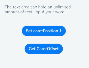
### constructor<sup>8+</sup>

constructor()

TextAreaController的构造函数。

**原子化服务API:** 从API version 11开始,该接口支持在原子化服务中使用。

**系统能力:** SystemCapability.ArkUI.ArkUI.Full

### caretPosition<sup>8+</sup>

caretPosition(value: number): void

设置输入光标的位置。

**原子化服务API:** 从API version 11开始,该接口支持在原子化服务中使用。

**系统能力:** SystemCapability.ArkUI.ArkUI.Full

**参数:**

|参数名|类型|必填|说明|
|------|----|----|----|
|value|number |是 |从字符串开始到光标所在位置的字符长度。|

### setTextSelection<sup>10+</sup>

setTextSelection(selectionStart: number, selectionEnd: number, options?: SelectionOptions): void

组件在获焦状态下,调用该接口设置文本选择区域并高亮显示,且只有在selectionStart小于selectionEnd时,文字才会被选取、高亮显示。

**原子化服务API:** 从API version 11开始,该接口支持在原子化服务中使用。

**系统能力:** SystemCapability.ArkUI.ArkUI.Full

**参数:**

|参数名|类型|必填|说明|
|------|----|----|----|
|selectionStart|number |是 |文本选择区域起始位置,文本框中文字的起始位置为0。<br/>当selectionStart小于0时,按0处理;当selectionStart大于文字最大长度时,按照文字最大长度处理。<br/>**原子化服务API:** 从API version 11开始,该接口支持在原子化服务中使用。|
|selectionEnd |number |是 |文本选择区域结束位置。<br/>当selectionEnd小于0时,按0处理;当selectionEnd大于文字最大长度时,按照文字最大长度处理。<br/>**原子化服务API:** 从API version 11开始,该接口支持在原子化服务中使用。|
|options<sup>12+</sup> |[SelectionOptions](ts-types.md#selectionoptions12对象说明)|否  |选中文字时的配置。<br />默认值:MenuPolicy.DEFAULT<br/>**原子化服务API:** 从API version 12开始,该接口支持在原子化服务中使用。|

>  **说明:**
>
>  如果selectionMenuHidden被赋值为true或设备为2in1时,即使options被赋值为MenuPolicy.SHOW,调用setTextSelection也不弹出菜单。
>
>  如果选中的文本含有emoji表情时,表情的起始位置包含在设置的文本选中区域内就会被选中。

### stopEditing<sup>10+</sup>

stopEditing(): void

退出编辑态。

**原子化服务API:** 从API version 11开始,该接口支持在原子化服务中使用。

**系统能力:** SystemCapability.ArkUI.ArkUI.Full

## TextAreaType<sup>11+</sup>枚举说明

**系统能力:** SystemCapability.ArkUI.ArkUI.Full

|名称 |值|说明|
|------|-----|------|
|NORMAL |0|基本输入模式。<br/>支持输入数字、字母、下划线、空格、特殊字符。<br/>**原子化服务API:** 从API version 12开始,该接口支持在原子化服务中使用。|
|NUMBER |2|纯数字输入模式。<br/>**原子化服务API:** 从API version 12开始,该接口支持在原子化服务中使用。|
|PHONE_NUMBER|3|电话号码输入模式。<br/>支持输入数字、空格、+ 、-、*、#、(、),长度不限。<br/>**原子化服务API:** 从API version 12开始,该接口支持在原子化服务中使用。|
|EMAIL  |5|邮箱地址输入模式。<br/>支持数字,字母,下划线、小数点、!、#、$、%、&、'、*、+、-、/、=、?、^、`、\{、\|、\}、~,以及@字符(只能存在一个@字符)。<br/>**原子化服务API:** 从API version 12开始,该接口支持在原子化服务中使用。|
|NUMBER_DECIMAL<sup>12+</sup>|12|带小数点的数字输入模式。<br/>支持数字,小数点(只能存在一个小数点)。<br/>**原子化服务API:** 从API version 12开始,该接口支持在原子化服务中使用。|
|URL<sup>12+</sup>|13|带URL的输入模式。<br/>**原子化服务API:** 从API version 12开始,该接口支持在原子化服务中使用。|
|ONE_TIME_CODE<sup>20+</sup>|14|验证码输入模式。<br/>**原子化服务API:** 从API version 20开始,该接口支持在原子化服务中使用。|

## TextAreaSubmitCallback<sup>14+</sup>

type TextAreaSubmitCallback = (enterKeyType: EnterKeyType, event?: SubmitEvent) => void

软键盘按下回车键时的回调事件。

**原子化服务API:** 从API version 14开始,该接口支持在原子化服务中使用。

**系统能力:** SystemCapability.ArkUI.ArkUI.Full

**参数:**

|参数名 |类型                                                       |必填|说明                                                   |
|--------|------------------------------------------------------------|----|--------------------------------------------------------|
|enterKeyType|[EnterKeyType](https://www.seaxiang.com/blog/d90jSH)           |是 |软键盘输入法回车键类型。<br>类型为EnterKeyType.NEW_LINE时不触发onSubmit。|
|event  |[SubmitEvent](ts-basic-components-textinput.md#submitevent11)|否 |提交事件。       |

## 示例

### 示例1(设置与获取光标位置)

该示例通过controller实现了光标位置的设置与获取。

```ts
// xxx.ets
@Entry
@Component
struct TextAreaExample {
  @State text: string = '';
  @State positionInfo: CaretOffset = { index: 0, x: 0, y: 0 };
  controller: TextAreaController = new TextAreaController();

  build() {
    Column() {
      TextArea({
        text: this.text,
        placeholder: 'The text area can hold an unlimited amount of text. input your word...',
        controller: this.controller
      })
        .placeholderFont({ size: 16, weight: 400 })
        .width(336)
        .height(56)
        .margin(20)
        .fontSize(16)
        .fontColor('#182431')
        .backgroundColor('#FFFFFF')
        .onChange((value: string) => {
          this.text = value;
        })
      Text(this.text)
      Button('Set caretPosition 1')
        .backgroundColor('#007DFF')
        .margin(15)
        .onClick(() => {
          // 设置光标位置到第一个字符后
          this.controller.caretPosition(1);
        })
      Button('Get CaretOffset')
        .backgroundColor('#007DFF')
        .margin(15)
        .onClick(() => {
          this.positionInfo = this.controller.getCaretOffset();
        })
    }.width('100%').height('100%').backgroundColor('#F1F3F5')
  }
}
示例2(设置计数器)
该示例通过maxLength、showCounter属性实现了计数器的功能。
// xxx.ets
@Entry
@Component
struct TextAreaExample {
  @State text: string = '';
  controller: TextAreaController = new TextAreaController();

  build() {
    Column() {
      TextArea({
        text: this.text,
        placeholder: 'The text area can hold an unlimited amount of text. input your word...',
        controller: this.controller
      })
        .placeholderFont({ size: 16, weight: 400 })
        .width(336)
        .height(56)
        .margin(20)
        .fontSize(16)
        .fontColor('#182431')
        .backgroundColor('#FFFFFF')
        .maxLength(4)
        .showCounter(true, { thresholdPercentage: 50, highlightBorder: true })
          //计数器显示效果为用户当前输入字符数/最大字符限制数。最大字符限制数通过maxLength()接口设置。
          //如果用户当前输入字符数达到最大字符限制乘50%(thresholdPercentage)。字符计数器显示。
          //用户设置highlightBorder为false时,配置取消红色边框。不设置此参数时,默认为true。
        .onChange((value: string) => {
          this.text = value;
        })
    }.width('100%').height('100%').backgroundColor('#F1F3F5')
  }
}

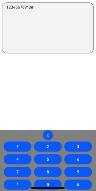
示例3(设置自定义键盘)
该示例通过customKeyboard属性实现了自定义键盘的功能。
// xxx.ets
@Entry
@Component
struct TextAreaExample {
  controller: TextAreaController = new TextAreaController();
  @State inputValue: string = "";

  // 自定义键盘组件
  @Builder CustomKeyboardBuilder() {
    Column() {
      Button('x').onClick(() => {
        // 关闭自定义键盘
        this.controller.stopEditing();
      })
      Grid() {
        ForEach([1, 2, 3, 4, 5, 6, 7, 8, 9, '*', 0, '#'], (item: number|string) => {
          GridItem() {
            Button(item + "")
              .width(110).onClick(() => {
              this.inputValue += item;
            })
          }
        })
      }.maxCount(3).columnsGap(10).rowsGap(10).padding(5)
    }.backgroundColor(Color.Gray)
  }

  build() {
    Column() {
      TextArea({ controller: this.controller, text: this.inputValue })
        // 绑定自定义键盘
        .customKeyboard(this.CustomKeyboardBuilder()).margin(10).border({ width: 1 })
        .height(200)
    }
  }
}
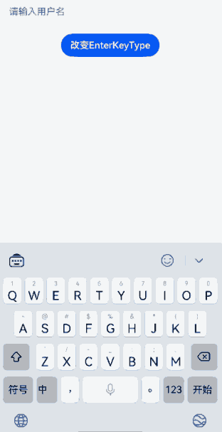
示例4(设置输入法回车键类型)
该示例通过enterKeyType属性实现了动态切换输入法回车键的效果。
// xxx.ets
@Entry
@Component
struct TextAreaExample {
  @State text: string = '';
  @State enterTypes: Array<EnterKeyType> =
    [EnterKeyType.Go, EnterKeyType.Search, EnterKeyType.Send, EnterKeyType.Done, EnterKeyType.Next,
      EnterKeyType.PREVIOUS, EnterKeyType.NEW_LINE];
  @State index: number = 0;

  build() {
    Column({ space: 20 }) {
      TextArea({ placeholder: '请输入用户名', text: this.text })
        .width(380)
        .enterKeyType(this.enterTypes[this.index])
        .onChange((value: string) => {
          this.text = value;
        })
        .onSubmit((enterKey: EnterKeyType) => {
          console.log("trigger area onsubmit" + enterKey);
        })
      Button('改变EnterKeyType').onClick(() => {
        this.index = (this.index + 1) % this.enterTypes.length;
      })

    }.width('100%')
  }
}
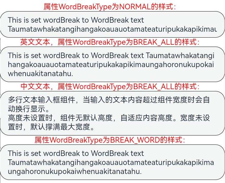
示例5(设置文本断行规则)
该示例通过wordBreak属性实现了TextArea不同断行规则下的效果。
// xxx.ets
@Entry
@Component
struct TextAreaExample {
  build() {
    Column() {
      Text("属性WordBreakType为NORMAL的样式:").fontSize(16).fontColor(0xFF0000)
      TextArea({
        text: 'This is set wordBreak to WordBreak text Taumatawhakatangihangakoauauotamateaturipukakapikimaungahoronukupokaiwhenuakitanatahu.'
      })
        .fontSize(16)
        .border({ width: 1 })
        .wordBreak(WordBreak.NORMAL)
      Text("英文文本,属性WordBreakType为BREAK_ALL的样式:").fontSize(16).fontColor(0xFF0000)
      TextArea({
        text: 'This is set wordBreak to WordBreak text Taumatawhakatangihangakoauauotamateaturipukakapikimaungahoronukupokaiwhenuakitanatahu.'
      })
        .fontSize(16)
        .border({ width: 1 })
        .wordBreak(WordBreak.BREAK_ALL)
      Text("中文文本,属性WordBreakType为BREAK_ALL的样式:").fontSize(16).fontColor(0xFF0000)
      TextArea({
        text: '多行文本输入框组件,当输入的文本内容超过组件宽度时会自动换行显示。\n高度未设置时,组件无默认高度,自适应内容高度。宽度未设置时,默认撑满最大宽度。'
      })
        .fontSize(16)
        .border({ width: 1 })
        .wordBreak(WordBreak.BREAK_ALL)
      Text("属性WordBreakType为BREAK_WORD的样式:").fontSize(16).fontColor(0xFF0000)
      TextArea({
        text: 'This is set wordBreak to WordBreak text Taumatawhakatangihangakoauauotamateaturipukakapikimaungahoronukupokaiwhenuakitanatahu.'
      })
        .fontSize(16)
        .border({ width: 1 })
        .wordBreak(WordBreak.BREAK_WORD)
    }
  }
}
示例6(设置文本样式)
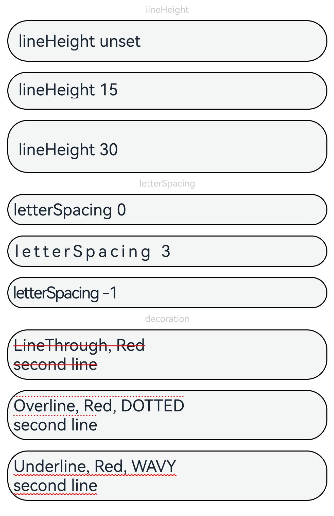
该示例通过lineHeight、letterSpacing、decoration属性展示了不同样式的文本效果。
// xxx.ets
@Entry
@Component
struct TextAreaExample {
  build() {
    Row() {
      Column() {
        Text('lineHeight').fontSize(9).fontColor(0xCCCCCC)
        TextArea({ text: 'lineHeight unset' })
          .border({ width: 1 }).padding(10).margin(5)
        TextArea({ text: 'lineHeight 15' })
          .border({ width: 1 }).padding(10).margin(5).lineHeight(15)
        TextArea({ text: 'lineHeight 30' })
          .border({ width: 1 }).padding(10).margin(5).lineHeight(30)

        Text('letterSpacing').fontSize(9).fontColor(0xCCCCCC)
        TextArea({ text: 'letterSpacing 0' })
          .border({ width: 1 }).padding(5).margin(5).letterSpacing(0)
        TextArea({ text: 'letterSpacing 3' })
          .border({ width: 1 }).padding(5).margin(5).letterSpacing(3)
        TextArea({ text: 'letterSpacing -1' })
          .border({ width: 1 }).padding(5).margin(5).letterSpacing(-1)

        Text('decoration').fontSize(9).fontColor(0xCCCCCC)
        TextArea({ text: 'LineThrough, Red\nsecond line' })
          .border({ width: 1 }).padding(5).margin(5)
          .decoration({ type: TextDecorationType.LineThrough, color: Color.Red })
        TextArea({ text: 'Overline, Red, DOTTED\nsecond line' })
          .border({ width: 1 }).padding(5).margin(5)
          .decoration({ type: TextDecorationType.Overline, color: Color.Red, style: TextDecorationStyle.DOTTED })
        TextArea({ text: 'Underline, Red, WAVY\nsecond line' })
          .border({ width: 1 }).padding(5).margin(5)
          .decoration({ type: TextDecorationType.Underline, color: Color.Red, style: TextDecorationStyle.WAVY })
      }.height('90%')
    }
    .width('90%')
    .margin(10)
  }
}
示例7(设置文字特性效果)
该示例通过fontFeature属性实现了文本在不同文字特性下的展示效果。
// xxx.ets
@Entry
@Component
struct TextAreaExample {
  @State text1: string = 'This is ss01 on : 0123456789';
  @State text2: string = 'This is ss01 off: 0123456789';

  build() {
    Column() {
      TextArea({ text: this.text1 })
        .fontSize(20)
        .margin({ top: 200 })
        .fontFeature("\"ss01\" on")
      TextArea({ text: this.text2 })
        .margin({ top: 10 })
        .fontSize(20)
        .fontFeature("\"ss01\" off")
    }
    .width("90%")
    .margin("5%")
  }
}

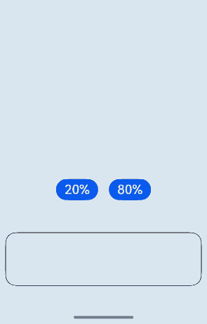
示例8(自定义键盘避让)
该示例通过自定义键盘实现了键盘避让的功能。
// xxx.ets
@Entry
@Component
struct TextAreaExample {
  controller: TextAreaController = new TextAreaController();
  @State inputValue: string = "";
  @State height1: string|number = '80%';
  @State height2: number = 100;
  @State supportAvoidance: boolean = true;

  // 自定义键盘组件
  @Builder
  CustomKeyboardBuilder() {
    Column() {
      Row() {
        Button('x').onClick(() => {
          // 关闭自定义键盘
          this.controller.stopEditing();
        }).margin(10)
      }

      Grid() {
        ForEach([1, 2, 3, 4, 5, 6, 7, 8, 9, '*', 0, '#'], (item: number|string) => {
          GridItem() {
            Button(item + "")
              .width(110).onClick(() => {
              this.inputValue += item;
            })
          }
        })
      }.maxCount(3).columnsGap(10).rowsGap(10).padding(5)
    }.backgroundColor(Color.Gray)
  }

  build() {
    Column() {
      Row() {
        Button("20%")
          .fontSize(24)
          .onClick(() => {
            this.height1 = "20%";
          })
        Button("80%")
          .fontSize(24)
          .margin({ left: 20 })
          .onClick(() => {
            this.height1 = "80%";
          })
      }
      .justifyContent(FlexAlign.Center)
      .alignItems(VerticalAlign.Bottom)
      .height(this.height1)
      .width("100%")
      .padding({ bottom: 50 })

      TextArea({ controller: this.controller, text: this.inputValue })
        .height(100)
        .customKeyboard(this.CustomKeyboardBuilder(), { supportAvoidance: this.supportAvoidance })// 绑定自定义键盘
        .margin(10)
        .border({ width: 1 })
    }
  }
}
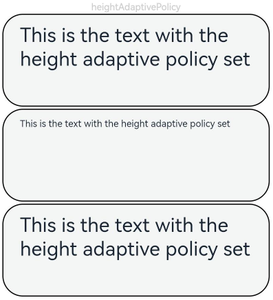
示例9(设置文本自适应)
该示例通过minFontSize、maxFontSize、heightAdaptivePolicy属性展示了文本自适应字号的效果。
// xxx.ets
@Entry
@Component
struct TextAreaExample {
  build() {
    Row() {
      Column() {
        Text('heightAdaptivePolicy').fontSize(9).fontColor(0xCCCCCC)
        TextArea({text: 'This is the text with the height adaptive policy set'})
          .width('80%').height(90).borderWidth(1).margin(1)
          .minFontSize(4)
          .maxFontSize(40)
          .maxLines(3)
          .heightAdaptivePolicy(TextHeightAdaptivePolicy.MAX_LINES_FIRST)
        TextArea({text: 'This is the text with the height adaptive policy set'})
          .width('80%').height(90).borderWidth(1).margin(1)
          .minFontSize(4)
          .maxFontSize(40)
          .maxLines(3)
          .heightAdaptivePolicy(TextHeightAdaptivePolicy.MIN_FONT_SIZE_FIRST)
        TextArea({text: 'This is the text with the height adaptive policy set'})
          .width('80%').height(90).borderWidth(1).margin(1)
          .minFontSize(4)
          .maxFontSize(40)
          .maxLines(3)
          .heightAdaptivePolicy(TextHeightAdaptivePolicy.LAYOUT_CONSTRAINT_FIRST)
      }.height('90%')
    }
    .width('90%')
    .margin(10)
  }
}
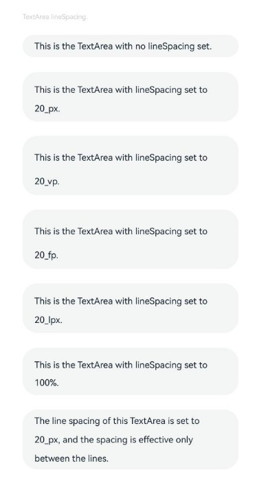
示例10(设置文本行间距)
该示例通过lineSpacing属性展示了文本在不同行间距下的展示效果。
// xxx.ets
import { LengthMetrics } from '@kit.ArkUI';

@Entry
@Component
struct TextAreaExample {
  build() {
    Flex({ direction: FlexDirection.Column, alignItems: ItemAlign.Start, justifyContent: FlexAlign.SpaceBetween }) {
      Text('TextArea lineSpacing.').fontSize(9).fontColor(0xCCCCCC)
      TextArea({ text: 'This is the TextArea with no lineSpacing set.' })
        .fontSize(12)
      TextArea({ text: 'This is the TextArea with lineSpacing set to 20_px.' })
        .fontSize(12)
        .lineSpacing(LengthMetrics.px(20))
      TextArea({ text: 'This is the TextArea with lineSpacing set to 20_vp.' })
        .fontSize(12)
        .lineSpacing(LengthMetrics.vp(20))
      TextArea({ text: 'This is the TextArea with lineSpacing set to 20_fp.' })
        .fontSize(12)
        .lineSpacing(LengthMetrics.fp(20))
      TextArea({ text: 'This is the TextArea with lineSpacing set to 20_lpx.' })
        .fontSize(12)
        .lineSpacing(LengthMetrics.lpx(20))
      TextArea({ text: 'This is the TextArea with lineSpacing set to 100%.' })
        .fontSize(12)
        .lineSpacing(LengthMetrics.percent(1))
      TextArea({ text: 'The line spacing of this TextArea is set to 20_px, and the spacing is effective only between the lines.' })
        .fontSize(12)
        .lineSpacing(LengthMetrics.px(20), { onlyBetweenLines: true })
    }.height(600).width(350).padding({ left: 35, right: 35, top: 35 })
  }
}
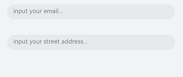
示例11(设置自动填充)
该示例通过contentType、enableAutoFill属性实现了文本自动填充的功能。
// xxx.ets
@Entry
@Component
struct TextAreaExample {
  @State text: string = '';

  build() {
    Column() {
      // 邮箱地址自动填充类型
      TextArea({ placeholder: 'input your email...' })
        .width('95%')
        .height(40)
        .margin(20)
        .contentType(ContentType.EMAIL_ADDRESS)
        .enableAutoFill(true)
        .maxLength(20)
      // 街道地址自动填充类型
      TextArea({ placeholder: 'input your street address...' })
        .width('95%')
        .height(40)
        .margin(20)
        .contentType(ContentType.FULL_STREET_ADDRESS)
        .enableAutoFill(true)
        .maxLength(20)
    }.width('100%').height('100%').backgroundColor('#F1F3F5')
  }
}
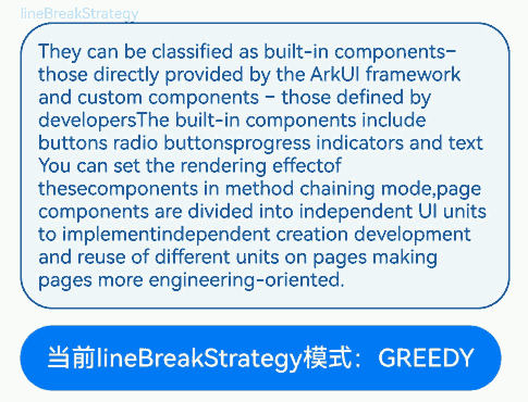
示例12(设置折行规则)
该示例通过lineBreakStrategy属性实现了TextArea不同折行规则下的效果。
// xxx.ets
@Entry
@Component
struct TextAreaExample {
  @State message1: string =
    "They can be classified as built-in components–those directly provided by the ArkUI framework and custom components – those defined by developers" +
      "The built-in components include buttons radio buttonsprogress indicators and text You can set the rendering effectof thesecomponents in method chaining mode," +
      "page components are divided into independent UI units to implementindependent creation development and reuse of different units on pages making pages more engineering-oriented.";
  @State lineBreakStrategyIndex: number = 0;
  @State lineBreakStrategy: LineBreakStrategy[] =
    [LineBreakStrategy.GREEDY, LineBreakStrategy.HIGH_QUALITY, LineBreakStrategy.BALANCED];
  @State lineBreakStrategyStr: string[] = ['GREEDY', 'HIGH_QUALITY', 'BALANCED'];

  build() {
    Flex({ direction: FlexDirection.Column, alignItems: ItemAlign.Start }) {
      Text('lineBreakStrategy').fontSize(9).fontColor(0xCCCCCC)
      TextArea({ text: this.message1 })
        .fontSize(12)
        .border({ width: 1 })
        .padding(10)
        .width('100%')
        .lineBreakStrategy(this.lineBreakStrategy[this.lineBreakStrategyIndex])
      Row() {
        Button('当前lineBreakStrategy模式:' + this.lineBreakStrategyStr[this.lineBreakStrategyIndex]).onClick(() => {
          this.lineBreakStrategyIndex++;
          if (this.lineBreakStrategyIndex > (this.lineBreakStrategyStr.length - 1)) {
            this.lineBreakStrategyIndex = 0;
          }
        })
      }.padding({ top: 10 })
    }.height(700).width(370).padding({ left: 35, right: 35, top: 35 })
  }
}
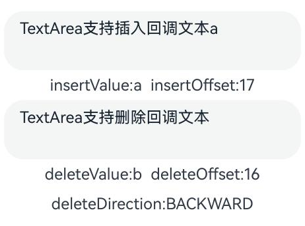
示例13(支持插入和删除回调)
该示例通过onWillInsert、onDidInsert、onWillDelete、onDidDelete接口实现了插入和删除的功能。
// xxx.ets
@Entry
@Component
struct TextAreaExample {
  @State insertValue: string = "";
  @State deleteValue: string = "";
  @State insertOffset: number = 0;
  @State deleteOffset: number = 0;
  @State deleteDirection: number = 0;

  build() {
    Row() {
      Column() {
        TextArea({ text: "TextArea支持插入回调文本" })
          .width(300)
          .height(60)
          .onWillInsert((info: InsertValue) => {
            this.insertValue = info.insertValue;
            return true;
          })
          .onDidInsert((info: InsertValue) => {
            this.insertOffset = info.insertOffset;
          })

        Text("insertValue:" + this.insertValue + "  insertOffset:" + this.insertOffset).height(30)

        TextArea({ text: "TextArea支持删除回调文本b" })
          .width(300)
          .height(60)
          .onWillDelete((info: DeleteValue) => {
            this.deleteValue = info.deleteValue;
            info.direction;
            return true;
          })
          .onDidDelete((info: DeleteValue) => {
            this.deleteOffset = info.deleteOffset;
            this.deleteDirection = info.direction;
          })

        Text("deleteValue:" + this.deleteValue + "  deleteOffset:" + this.deleteOffset).height(30)
        Text("deleteDirection:" + (this.deleteDirection == 0 ? "BACKWARD" : "FORWARD")).height(30)

      }.width('100%')
    }
    .height('100%')
  }
}
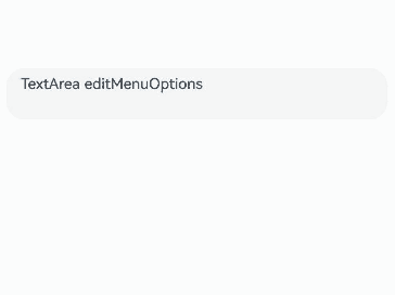
示例14(文本扩展自定义菜单)
该示例通过editMenuOptions接口实现了文本设置自定义菜单扩展项的文本内容、图标以及回调的功能。
// xxx.ets
@Entry
@Component
struct TextAreaExample {
  @State text: string = 'TextArea editMenuOptions';
  @State endIndex: number = 0;
  onCreateMenu = (menuItems: Array<TextMenuItem>) => {
    let item1: TextMenuItem = {
      content: 'create1',
      icon: $r('app.media.startIcon'),
      id: TextMenuItemId.of('create1'),
    };
    let item2: TextMenuItem = {
      content: 'create2',
      id: TextMenuItemId.of('create2'),
      icon: $r('app.media.startIcon'),
    };
    menuItems.push(item1);
    menuItems.unshift(item2);
    return menuItems;
  }
  onMenuItemClick = (menuItem: TextMenuItem, textRange: TextRange) => {
    if (menuItem.id.equals(TextMenuItemId.of("create2"))) {
      console.log("拦截 id: create2 start:" + textRange.start + "; end:" + textRange.end);
      return true;
    }
    if (menuItem.id.equals(TextMenuItemId.of("prepare1"))) {
      console.log("拦截 id: prepare1 start:" + textRange.start + "; end:" + textRange.end);
      return true;
    }
    if (menuItem.id.equals(TextMenuItemId.COPY)) {
      console.log("拦截 COPY start:" + textRange.start + "; end:" + textRange.end);
      return true;
    }
    if (menuItem.id.equals(TextMenuItemId.SELECT_ALL)) {
      console.log("不拦截 SELECT_ALL start:" + textRange.start + "; end:" + textRange.end);
      return false;
    }
    return false;
  }
  onPrepareMenu = (menuItems: Array<TextMenuItem>) => {
    let item1: TextMenuItem = {
      content: 'prepare1_' + this.endIndex,
      icon: $r('app.media.startIcon'),
      id: TextMenuItemId.of('prepare1'),
    };
    menuItems.unshift(item1);
    return menuItems;
  }
  @State editMenuOptions: EditMenuOptions = {
    onCreateMenu: this.onCreateMenu,
    onMenuItemClick: this.onMenuItemClick,
    onPrepareMenu: this.onPrepareMenu
  };

  build() {
    Column() {
      TextArea({ text: this.text })
        .width('95%')
        .height(56)
        .editMenuOptions(this.editMenuOptions)
        .margin({ top: 100 })
        .onTextSelectionChange((selectionStart: number, selectionEnd: number) => {
          this.endIndex = selectionEnd;
        })
    }
    .width("90%")
    .margin("5%")
  }
}
示例15(文本设置省略模式)
该示例通过textOverflow、ellipsisMode、maxlines属性展示了文本超长省略以及调整省略位置的效果。
// xxx.ets
@Entry
@Component
struct EllipsisModeExample {
  @State textIndex: number = 0;
  @State text: string = "As the sun begins to set, casting a warm golden hue across the sky," +
    "the world seems to slow down and breathe a sigh of relief. The sky is painted with hues of orange, " +
    " pink, and lavender, creating a breath taking tapestry that stretches as far as the eye can see." +
    "The air is filled with the sweet scent of blooming flowers, mingling with the earthy aroma of freshly turned soil.";
  @State ellipsisModeIndex: number = 0;
  @State ellipsisMode: (EllipsisMode|undefined|null)[] =
    [EllipsisMode.START, EllipsisMode.END, EllipsisMode.CENTER, undefined, null];
  @State ellipsisModeStr: string[] = ['START ', 'END', 'CENTER', 'undefined', 'null'];
  @State textOverflowIndex: number = 0;
  @State textOverflow: TextOverflow[] = [TextOverflow.Ellipsis, TextOverflow.Clip];
  @State textOverflowStr: string[] = ['Ellipsis', 'Clip'];
  @State maxLinesIndex: number = 0;
  @State maxLines: number[] = [1, 2, 3];
  @State maxLinesStr: string[] = ['1', '2', '3'];
  @State styleAreaIndex: number = 0;
  @State styleArea: TextContentStyle[] = [TextContentStyle.INLINE, TextContentStyle.DEFAULT];
  @State styleAreaStr: string[] = ['Inline', 'Default'];

  build() {
    Column() {
      TextArea({ text: this.text })
        .textOverflow(this.textOverflow[this.textOverflowIndex])
        .ellipsisMode(this.ellipsisMode[this.ellipsisModeIndex])
        .maxLines(this.maxLines[this.maxLinesIndex])
        .style(this.styleArea[this.styleAreaIndex])
        .fontSize(30)
        .margin(30)

      Button('更改ellipsisMode模式:' + this.ellipsisModeStr[this.ellipsisModeIndex]).onClick(() => {
        this.ellipsisModeIndex++;
        if (this.ellipsisModeIndex > (this.ellipsisModeStr.length - 1)) {
          this.ellipsisModeIndex = 0;
        }
      }).fontSize(20)
      Button('更改textOverflow模式:' + this.textOverflowStr[this.textOverflowIndex]).onClick(() => {
        this.textOverflowIndex++;
        if (this.textOverflowIndex > (this.textOverflowStr.length - 1)) {
          this.textOverflowIndex = 0;
        }
      }).fontSize(20)
      Button('更改maxLines大小:' + this.maxLinesStr[this.maxLinesIndex]).onClick(() => {
        this.maxLinesIndex++;
        if (this.maxLinesIndex > (this.maxLinesStr.length - 1)) {
          this.maxLinesIndex = 0;
        }
      }).fontSize(20)
      Button('更改Style大小:' + this.styleAreaStr[this.styleAreaIndex]).onClick(() => {
        this.styleAreaIndex++;
        if (this.styleAreaIndex > (this.styleAreaStr.length - 1)) {
          this.styleAreaIndex = 0;
        }
      }).fontSize(20)
    }.height(600).width('100%').padding({ left: 35, right: 35, top: 35 })
  }
}

示例16(自定义复制、剪切、粘贴)
该示例展示如何监听文本选择菜单的复制、剪切、粘贴按钮,以及如何屏蔽系统粘贴功能并实现自定义的粘贴能力。
// xxx.ets
@Entry
@Component
struct TextAreaExample {
  @State text: string = '';
  controller: TextAreaController = new TextAreaController();

  build() {
    Column() {
      TextArea({
        text: this.text,
        placeholder: 'placeholder',
        controller: this.controller
      })
        .placeholderColor(Color.Red)
        .textAlign(TextAlign.Center)
        .caretColor(Color.Green)
        .caretStyle({ width: '2vp' })
        .fontStyle(FontStyle.Italic)
        .fontWeight(FontWeight.Bold)
        .fontFamily('HarmonyOS Sans')
        .inputFilter('[a-zA-Z]+', (value) => { // 只允许字母输入
          console.error(`unsupport char ${value}`);
        })
        .copyOption(CopyOptions.LocalDevice)
        .enableKeyboardOnFocus(false)
        .selectionMenuHidden(false)
        .barState(BarState.On)
        .type(TextAreaType.NORMAL)
        .selectedBackgroundColor(Color.Orange)
        .textIndent(2)
        .halfLeading(true)
        .minFontScale(1)
        .maxFontScale(2)
        .enablePreviewText(true)
        .enableHapticFeedback(true)
        .stopBackPress(false)//返回键交给其他组件处理
        .width(336)
        .height(56)
        .margin(20)
        .fontSize(16)
        .onEditChange((isEditing: boolean) => {
          console.log(`isEditing ${isEditing}`);
        })
        .onCopy((value) => {
          console.log(`copy ${value}`);
        })
        .onCut((value) => {
          console.log(`cut ${value}`);
        })
        .onPaste((value, event) => {
          // 阻止系统粘贴功能,开发者可自行实现
          if (event.preventDefault) {
            event.preventDefault();
          }
          console.log(`paste:${value}`);
          this.text = value;
        })
        .onTextSelectionChange((start: number, end: number) => {
          console.log(`onTextSelectionChange start ${start}, end ${end}`);
        })
        .onContentScroll((totalOffsetX: number, totalOffsetY: number) => {
          console.log(`onContentScroll offsetX ${totalOffsetX}, offsetY ${totalOffsetY}`);
        })
    }.width('100%').height('100%').backgroundColor('#F1F3F5')
  }
}

示例17(设置最小字体范围与最大字体范围)
该示例通过minFontScale、maxFontScale设置字体显示最小与最大范围。
// 开启应用缩放跟随系统
// AppScope/resources/base,新建文件夹profile。
// AppScope/resources/base/profile,新建文件configuration.json。
// AppScope/resources/base/profile/configuration.json,增加如下代码。
{
  "configuration": {
    "fontSizeScale": "followSystem",
    "fontSizeMaxScale": "3.2"
  }
}
// AppScope/app.json5,修改如下代码。
{
  "app": {
    "bundleName": "com.example.myapplication",
    "vendor": "example",
    "versionCode": 1000000,
    "versionName": "1.0.0",
    "icon": "$media:app_icon",
    "label": "$string:app_name",
    "configuration": "$profile:configuration"
  }
}
// xxx.ets
@Entry
@Component
struct TextAreaExample {
  @State minFontScale: number = 0.85;
  @State maxFontScale: number = 2;

  build() {
    Column() {
      Column({ space: 30 }) {
        Text("系统字体变大变小,变大变小aaaaaaaAAAAAA")
        TextArea({
          placeholder: 'The text area can hold an unlimited amount of text. input your word...',
        })
          .minFontScale(this.minFontScale)// 设置最小字体缩放倍数,参数为undefined则跟随系统默认倍数缩放
          .maxFontScale(this.maxFontScale)// 设置最大字体缩放倍数,参数为undefined则跟随系统默认倍数缩放
      }.width('100%')
    }
  }
}
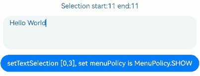
示例18(设置选中指定区域的文本内容)
该示例通过setTextSelection方法展示如何设置选中指定区域的文本内容以及菜单的显隐策略。
// xxx.ets

@Entry
@Component
struct TextAreaExample {
  controller: TextAreaController = new TextAreaController();
  @State startIndex: number = 0;
  @State endIndex: number = 0;

  build() {
    Column({ space: 3 }) {
      Text('Selection start:' + this.startIndex + ' end:' + this.endIndex)
      TextArea({ text: 'Hello World', controller: this.controller })
        .width('95%')
        .height(80)
        .margin(10)
        .defaultFocus(true)
        .enableKeyboardOnFocus(true)
        .onTextSelectionChange((selectionStart: number, selectionEnd: number) => {
          this.startIndex = selectionStart;
          this.endIndex = selectionEnd;
        })

      Button('setTextSelection [0,3], set menuPolicy is MenuPolicy.SHOW')
        .onClick(() => {
          this.controller.setTextSelection(0, 3, { menuPolicy: MenuPolicy.SHOW });
        })
    }
    .width('100%')
    .height('100%')
  }
}
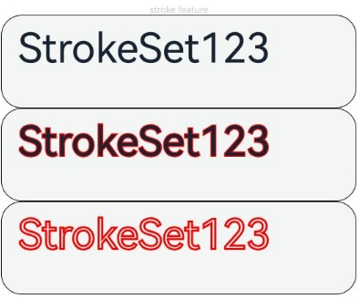
示例19(设置文本描边)
该示例通过strokeWidth和strokeColor属性设置文本的描边宽度及颜色。
// xxx.ets
@Entry
@Component
struct TextAreaExample {
  build() {
    Row() {
      Column() {
        Text('stroke feature').fontSize(9).fontColor(0xCCCCCC)

        TextArea({text: 'StrokeSet123'})
          .width('80%').height(90).borderWidth(1).fontSize(40)
        TextArea({text: 'StrokeSet123'})
          .width('80%').height(90).borderWidth(1).fontSize(40)
          .strokeWidth(LengthMetrics.px(-3.0))
          .strokeColor(Color.Red)
        TextArea({text: 'StrokeSet123'})
          .width('80%').height(90).borderWidth(1).fontSize(40)
          .strokeWidth(LengthMetrics.px(3.0))
          .strokeColor(Color.Red)
      }.height('90%')
    }
    .width('90%')
    .margin(10)
  }
}
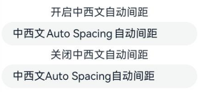
示例20(设置中西文自动间距)
该示例通过enableAutoSpacing属性设置中西文自动间距。
// xxx.ets
@Entry
@Component
struct TextAreaExample {
  build() {
    Row() {
      Column() {
        Text('开启中西文自动间距').margin(5)
        TextArea({text: '中西文Auto Spacing自动间距'})
          .enableAutoSpacing(true)
        Text('关闭中西文自动间距').margin(5)
        TextArea({text: '中西文Auto Spacing自动间距'})
          .enableAutoSpacing(false)
      }.height('100%')
    }
    .width('60%')
  }
}
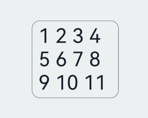
示例21(设置最大行数)
该示例通过maxLines属性设置显示最大行数,超出最大行数后可滚动。
// xxx.ets
@Entry
@Component
struct TextAreaExample {
  build() {
    Row() {
      Column() {
        TextArea({ text: '1 2 3 4 5 6 7 8 9 10 11 12 13 14 15 16 17 18 19 20' })
          .fontSize(50)
          .width('50%')
          .borderWidth(1)
          .margin(100)
          .textOverflow(TextOverflow.Clip)
          .maxLines(3, { overflowMode: MaxLinesMode.SCROLL })
      }.height('90%')
    }
    .width('90%')
    .margin(10)
  }
}
示例22(设置最小行数)
该示例通过minLines属性设置显示的最小行数。
// xxx.ets
@Entry
@Component
struct Index {
  @State message: string = 'Hello World';

  build() {
    Row() {
      Column() {
        TextArea({ text: this.message })
          .width('95%')
          .fontSize(20)
          .margin(10)
          .minLines(3)
      }
    }
    .width('90%')
    .margin(10)
  }
}

你可能感兴趣的鸿蒙文章
- 所属分类: 后端技术
- 本文标签:
热门推荐
-
2、 优质文章
-
3、 gt
-
7、 openharmony
-
9、 golang
-
10、 Vue中input框自动聚焦