harmony 鸿蒙Flex
Flex
以弹性方式布局子组件的容器组件。
说明:
子组件
可以包含子组件。
接口
Flex(value?: { direction?: FlexDirection, wrap?: FlexWrap, justifyContent?: FlexAlign, alignItems?: ItemAlign, alignContent?: FlexAlign })
标准Flex布局容器。具体指南请参考弹性布局。
从API version 9开始,该接口支持在ArkTS卡片中使用。
参数:
| 参数名 | 参数类型 | 必填 | 默认值 | 参数描述 |
|---|---|---|---|---|
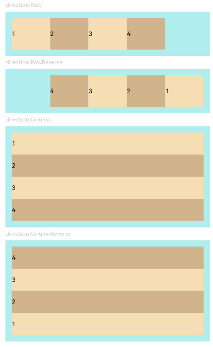
| direction | FlexDirection | 否 | FlexDirection.Row | 子组件在Flex容器上排列的方向,即主轴的方向。 |
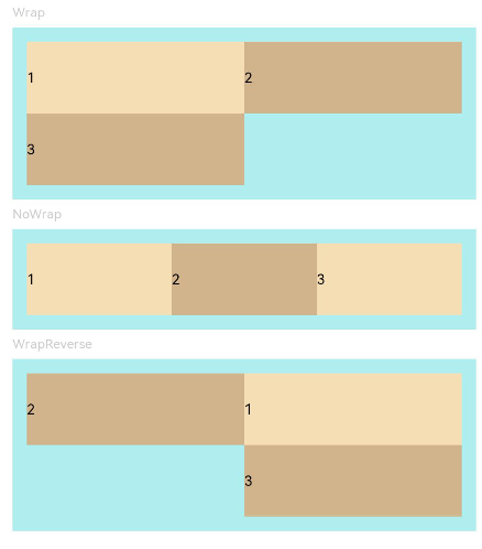
| wrap | FlexWrap | 否 | FlexWrap.NoWrap | Flex容器是单行/列还是多行/列排列。 说明: 在多行布局时,通过交叉轴方向,确认新行堆叠方向。 |
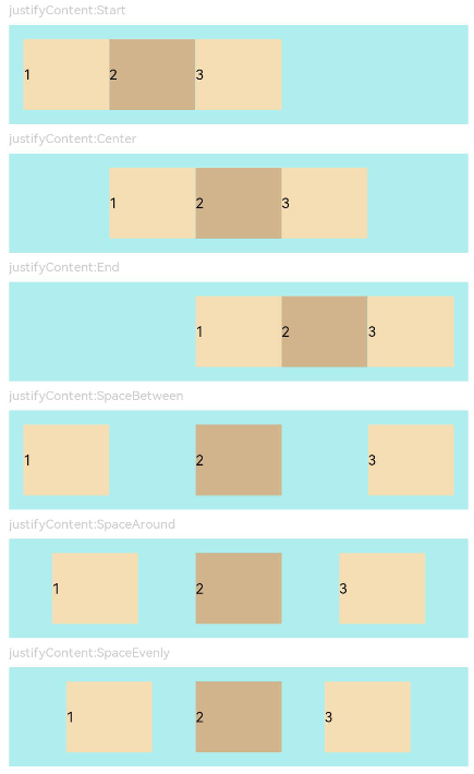
| justifyContent | FlexAlign | 否 | FlexAlign.Start | 所有子组件在Flex容器主轴上的对齐格式。 |
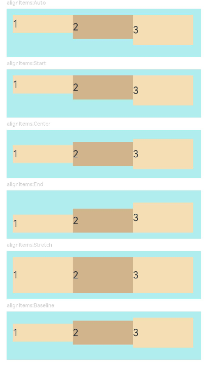
| alignItems | ItemAlign | 否 | ItemAlign.Start | 所有子组件在Flex容器交叉轴上的对齐格式。 |
| alignContent | FlexAlign | 否 | FlexAlign.Start | 交叉轴中有额外的空间时,多行内容的对齐方式。仅在wrap为Wrap或WrapReverse下生效。 |
示例
示例1
// xxx.ets
@Entry
@Component
struct FlexExample1 {
  build() {
    Column() {
      Column({ space: 5 }) {
        Text('direction:Row').fontSize(9).fontColor(0xCCCCCC).width('90%')
        Flex({ direction: FlexDirection.Row }) { // 子组件在容器主轴上行布局
          Text('1').width('20%').height(50).backgroundColor(0xF5DEB3)
          Text('2').width('20%').height(50).backgroundColor(0xD2B48C)
          Text('3').width('20%').height(50).backgroundColor(0xF5DEB3)
          Text('4').width('20%').height(50).backgroundColor(0xD2B48C)
        }
        .height(70)
        .width('90%')
        .padding(10)
        .backgroundColor(0xAFEEEE)

        Text('direction:RowReverse').fontSize(9).fontColor(0xCCCCCC).width('90%')
        Flex({ direction: FlexDirection.RowReverse }) { // 子组件在容器主轴上反向行布局
          Text('1').width('20%').height(50).backgroundColor(0xF5DEB3)
          Text('2').width('20%').height(50).backgroundColor(0xD2B48C)
          Text('3').width('20%').height(50).backgroundColor(0xF5DEB3)
          Text('4').width('20%').height(50).backgroundColor(0xD2B48C)
        }
        .height(70)
        .width('90%')
        .padding(10)
        .backgroundColor(0xAFEEEE)

        Text('direction:Column').fontSize(9).fontColor(0xCCCCCC).width('90%')
        Flex({ direction: FlexDirection.Column }) { // 子组件在容器主轴上列布局
          Text('1').width('100%').height(40).backgroundColor(0xF5DEB3)
          Text('2').width('100%').height(40).backgroundColor(0xD2B48C)
          Text('3').width('100%').height(40).backgroundColor(0xF5DEB3)
          Text('4').width('100%').height(40).backgroundColor(0xD2B48C)
        }
        .height(160)
        .width('90%')
        .padding(10)
        .backgroundColor(0xAFEEEE)

        Text('direction:ColumnReverse').fontSize(9).fontColor(0xCCCCCC).width('90%')
        Flex({ direction: FlexDirection.ColumnReverse }) { // 子组件在容器主轴上反向列布局
          Text('1').width('100%').height(40).backgroundColor(0xF5DEB3)
          Text('2').width('100%').height(40).backgroundColor(0xD2B48C)
          Text('3').width('100%').height(40).backgroundColor(0xF5DEB3)
          Text('4').width('100%').height(40).backgroundColor(0xD2B48C)
        }
        .height(160)
        .width('90%')
        .padding(10)
        .backgroundColor(0xAFEEEE)
      }.width('100%').margin({ top: 5 })
    }.width('100%')
  }
}
示例2
// xxx.ets
@Entry
@Component
struct FlexExample2 {
  build() {
    Column() {
      Column({ space: 5 }) {
        Text('Wrap').fontSize(9).fontColor(0xCCCCCC).width('90%')
        Flex({ wrap: FlexWrap.Wrap }) { // 子组件多行布局
          Text('1').width('50%').height(50).backgroundColor(0xF5DEB3)
          Text('2').width('50%').height(50).backgroundColor(0xD2B48C)
          Text('3').width('50%').height(50).backgroundColor(0xD2B48C)
        }
        .width('90%')
        .padding(10)
        .backgroundColor(0xAFEEEE)

        Text('NoWrap').fontSize(9).fontColor(0xCCCCCC).width('90%')
        Flex({ wrap: FlexWrap.NoWrap }) { // 子组件单行布局
          Text('1').width('50%').height(50).backgroundColor(0xF5DEB3)
          Text('2').width('50%').height(50).backgroundColor(0xD2B48C)
          Text('3').width('50%').height(50).backgroundColor(0xF5DEB3)
        }
        .width('90%')
        .padding(10)
        .backgroundColor(0xAFEEEE)

        Text('WrapReverse').fontSize(9).fontColor(0xCCCCCC).width('90%')
        Flex({ wrap: FlexWrap.WrapReverse , direction:FlexDirection.Row }) { // 子组件反向多行布局
          Text('1').width('50%').height(50).backgroundColor(0xF5DEB3)
          Text('2').width('50%').height(50).backgroundColor(0xD2B48C)
          Text('3').width('50%').height(50).backgroundColor(0xD2B48C)
        }
        .width('90%')
        .height(120)
        .padding(10)
        .backgroundColor(0xAFEEEE)
      }.width('100%').margin({ top: 5 })
    }.width('100%')
  }
}
示例3
// xxx.ets
@Component
struct JustifyContentFlex {
  justifyContent : number = 0;

  build() {
    Flex({ justifyContent: this.justifyContent }) {
      Text('1').width('20%').height(50).backgroundColor(0xF5DEB3)
      Text('2').width('20%').height(50).backgroundColor(0xD2B48C)
      Text('3').width('20%').height(50).backgroundColor(0xF5DEB3)
    }
    .width('90%')
    .padding(10)
    .backgroundColor(0xAFEEEE)
  }
}

@Entry
@Component
struct FlexExample3 {
  build() {
    Column() {
      Column({ space: 5 }) {
        Text('justifyContent:Start').fontSize(9).fontColor(0xCCCCCC).width('90%')
        JustifyContentFlex({ justifyContent: FlexAlign.Start }) // 子组件在容器主轴上首端对齐

        Text('justifyContent:Center').fontSize(9).fontColor(0xCCCCCC).width('90%')
        JustifyContentFlex({ justifyContent: FlexAlign.Center }) // 子组件在容器主轴上居中对齐

        Text('justifyContent:End').fontSize(9).fontColor(0xCCCCCC).width('90%')
        JustifyContentFlex({ justifyContent: FlexAlign.End }) // 子组件在容器主轴上尾端对齐

        Text('justifyContent:SpaceBetween').fontSize(9).fontColor(0xCCCCCC).width('90%')
        JustifyContentFlex({ justifyContent: FlexAlign.SpaceBetween }) // 子组件在容器主轴上均分容器布局,第一个子组件与行首对齐,最后一个子组件与行尾对齐。

        Text('justifyContent:SpaceAround').fontSize(9).fontColor(0xCCCCCC).width('90%')
        JustifyContentFlex({ justifyContent: FlexAlign.SpaceAround }) // 子组件在容器主轴上均分容器布局,第一个子组件到行首的距离和最后一个子组件到行尾的距离是相邻子组件之间距离的一半。

        Text('justifyContent:SpaceEvenly').fontSize(9).fontColor(0xCCCCCC).width('90%')
        JustifyContentFlex({ justifyContent: FlexAlign.SpaceEvenly }) // 子组件在容器主轴上均分容器布局,子组件之间的距离与第一子组件到行首、最后一个子组件到行尾的距离相等
      }.width('100%').margin({ top: 5 })
    }.width('100%')
  }
}
示例4
// xxx.ets
@Component
struct AlignItemsFlex {
  alignItems : number = 0;

  build() {
    Flex({ alignItems: this.alignItems }) {
      Text('1').width('33%').height(30).backgroundColor(0xF5DEB3)
      Text('2').width('33%').height(40).backgroundColor(0xD2B48C)
      Text('3').width('33%').height(50).backgroundColor(0xF5DEB3)
    }
    .size({width: '90%', height: 80})
    .padding(10)
    .backgroundColor(0xAFEEEE)
  }
}

@Entry
@Component
struct FlexExample4 {
  build() {
    Column() {
      Column({ space: 5 }) {
        Text('alignItems:Auto').fontSize(9).fontColor(0xCCCCCC).width('90%')
        AlignItemsFlex({ alignItems: ItemAlign.Auto }) // 子组件在容器交叉轴上首部对齐

        Text('alignItems:Start').fontSize(9).fontColor(0xCCCCCC).width('90%')
        AlignItemsFlex({ alignItems: ItemAlign.Start }) // 子组件在容器交叉轴上首部对齐

        Text('alignItems:Center').fontSize(9).fontColor(0xCCCCCC).width('90%')
        AlignItemsFlex({ alignItems: ItemAlign.Center }) // 子组件在容器交叉轴上居中对齐

        Text('alignItems:End').fontSize(9).fontColor(0xCCCCCC).width('90%')
        AlignItemsFlex({ alignItems: ItemAlign.End }) // 子组件在容器交叉轴上尾部对齐

        Text('alignItems:Stretch').fontSize(9).fontColor(0xCCCCCC).width('90%')
        AlignItemsFlex({ alignItems: ItemAlign.Stretch }) // 子组件在容器交叉轴上拉伸填充

        Text('alignItems:Baseline').fontSize(9).fontColor(0xCCCCCC).width('90%')
        AlignItemsFlex({ alignItems: ItemAlign.Baseline }) // 子组件在容器交叉轴上与文本基线对齐
      }.width('100%').margin({ top: 5 })
    }.width('100%')
  }
}
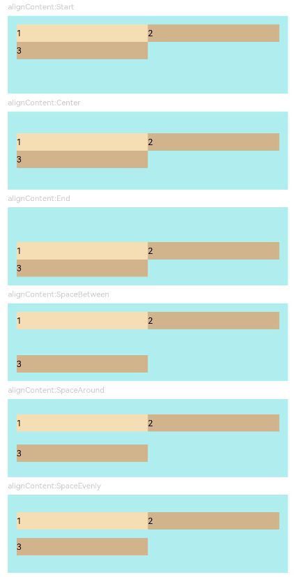
示例5
// xxx.ets
@Component
struct AlignContentFlex {
  alignContent: number = 0;

  build() {
    Flex({ wrap: FlexWrap.Wrap, alignContent: this.alignContent }) {
      Text('1').width('50%').height(20).backgroundColor(0xF5DEB3)
      Text('2').width('50%').height(20).backgroundColor(0xD2B48C)
      Text('3').width('50%').height(20).backgroundColor(0xD2B48C)
    }
    .size({ width: '90%', height: 90 })
    .padding(10)
    .backgroundColor(0xAFEEEE)
  }
}

@Entry
@Component
struct FlexExample5 {
  build() {
    Column() {
      Column({ space: 5 }) {
        Text('alignContent:Start').fontSize(9).fontColor(0xCCCCCC).width('90%')
        AlignContentFlex({ alignContent: FlexAlign.Start }) // 多行布局下子组件首部对齐

        Text('alignContent:Center').fontSize(9).fontColor(0xCCCCCC).width('90%')
        AlignContentFlex({ alignContent: FlexAlign.Center }) // 多行布局下子组件居中对齐

        Text('alignContent:End').fontSize(9).fontColor(0xCCCCCC).width('90%')
        AlignContentFlex({ alignContent: FlexAlign.End }) // 多行布局下子组件尾部对齐

        Text('alignContent:SpaceBetween').fontSize(9).fontColor(0xCCCCCC).width('90%')
        AlignContentFlex({ alignContent: FlexAlign.SpaceBetween }) // 多行布局下第一行子组件与列首对齐,最后一行子组件与列尾对齐

        Text('alignContent:SpaceAround').fontSize(9).fontColor(0xCCCCCC).width('90%')
        AlignContentFlex({ alignContent: FlexAlign.SpaceAround }) // 多行布局下第一行子组件到列首的距离和最后一行子组件到列尾的距离是相邻行之间距离的一半

        Text('alignContent:SpaceEvenly').fontSize(9).fontColor(0xCCCCCC).width('90%')
        AlignContentFlex({ alignContent: FlexAlign.SpaceEvenly }) // 多行布局下相邻行之间的距离与第一行子组件到列首的距离、最后一行子组件到列尾的距离完全一样
      }.width('100%').margin({ top: 5 })
    }.width('100%')
  }
}
你可能感兴趣的鸿蒙文章
harmony 鸿蒙@ohos.arkui.advanced.Counter(计数器组件)
harmony 鸿蒙@ohos.arkui.advanced.SegmentButton(分段按钮)
1
赞
热门推荐
-
2、 优质文章
-
3、 gt
-
7、 openharmony
-
9、 golang
-
10、 Vue中input框自动聚焦