harmony 鸿蒙Divider
Divider
提供分隔器组件,分隔不同内容块/内容元素。
说明:
该组件从API Version 7开始支持。后续版本如有新增内容,则采用上角标单独标记该内容的起始版本。
子组件
无
接口
Divider()
从API version 9开始,该接口支持在ArkTS卡片中使用。
属性
除支持通用属性外,还支持以下属性:
| 名称 | 参数类型 | 描述 |
|---|---|---|
| vertical | boolean | 使用水平分割线还是垂直分割线。false:水平分割线;true:垂直分割线。 默认值:false 从API version 9开始,该接口支持在ArkTS卡片中使用。 |
| color | ResourceColor | 分割线颜色。 默认值:’#33182431’ 从API version 9开始,该接口支持在ArkTS卡片中使用。 |
| strokeWidth | number | string | 分割线宽度。 默认值:1px 单位:vp 从API version 9开始,该接口支持在ArkTS卡片中使用。 说明: 分割线的宽度不支持百分比设置。优先级低于通用属性height,超过通用属性设置大小时,按照通用属性进行裁切。 |
| lineCap | LineCapStyle | 分割线的端点样式。 默认值:LineCapStyle.Butt 从API version 9开始,该接口支持在ArkTS卡片中使用。 |
示例
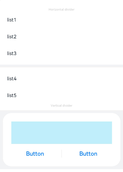
// xxx.ets
@Entry
@Component
struct DividerExample {
  build() {
    Column() {
      // 使用横向分割线场景
      Text('Horizontal divider').fontSize(9).fontColor(0xCCCCCC)
      List() {
        ForEach([1, 2, 3], (item: number) => {
          ListItem() {
            Text('list' + item).width('100%').fontSize(14).fontColor('#182431').textAlign(TextAlign.Start)
          }.width(244).height(48)
        }, (item: number) => item.toString())
      }.padding({ left: 24, bottom: 8 })

      Divider().strokeWidth(8).color('#F1F3F5')
      List() {
        ForEach([4, 5], (item: number) => {
          ListItem() {
            Text('list' + item).width('100%').fontSize(14).fontColor('#182431').textAlign(TextAlign.Start)
          }.width(244).height(48)
        }, (item: number) => item.toString())
      }.padding({ left: 24, top: 8 })

      // 使用纵向分割线场景
      Text('Vertical divider').fontSize(9).fontColor(0xCCCCCC)
      Column() {
        Column() {
          Row().width(288).height(64).backgroundColor('#30C9F0').opacity(0.3)
          Row() {
            Button('Button')
              .width(136)
              .height(22)
              .fontSize(16)
              .fontColor('#007DFF')
              .fontWeight(500)
              .backgroundColor(Color.Transparent)
            Divider().vertical(true).height(22).color('#182431').opacity(0.6).margin({ left: 8, right: 8 })
            Button('Button')
              .width(136)
              .height(22)
              .fontSize(16)
              .fontColor('#007DFF')
              .fontWeight(500)
              .backgroundColor(Color.Transparent)
          }.margin({ top: 17 })
        }
        .width(336)
        .height(152)
        .backgroundColor('#FFFFFF')
        .borderRadius(24)
        .padding(24)
      }
      .width('100%')
      .height(168)
      .backgroundColor('#F1F3F5')
      .justifyContent(FlexAlign.Center)
      .margin({ top: 8 })
    }.width('100%').padding({ top: 24 })
  }
}
你可能感兴趣的鸿蒙文章
harmony 鸿蒙@ohos.arkui.advanced.Counter(计数器组件)
harmony 鸿蒙@ohos.arkui.advanced.SegmentButton(分段按钮)
0
赞
热门推荐
-
2、 优质文章
-
3、 gt
-
7、 openharmony
-
9、 golang
-
10、 Vue中input框自动聚焦