harmony 鸿蒙EffectComponent
EffectComponent
特效合并容器组件,用于子节点特效绘制的合并,实现特效的绘制性能优化。
说明:
该组件从API Version 10开始支持。后续版本如有新增内容,则采用上角标单独标记该内容的起始版本。
该组件为系统接口。
目前该组件仅支持子组件背景模糊效果的绘制合并优化。
在对子组件的背景模糊特效进行绘制合并时,需要将子组件的backgroundBlurStyle(BlurStyle)属性替换成useEffect(true)。
子组件
可以包含子组件。
接口
EffectComponent()
创建特效绘制合并组件,用于对子组件背景模糊特效的绘制合并。
事件
不支持通用事件。
属性
支持通用属性,目前仅支持对backgroundBlurStyle属性做绘制合并优化。
示例
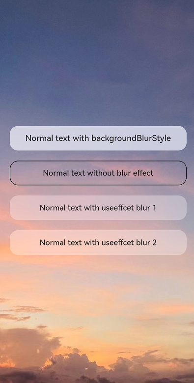
//Index.ets
@Entry
@Component
struct Index {
  build() {
    Stack() {
      Image($r("app.media.example"))
        .autoResize(true)
      EffectComponent() {
        Column({ space: 20 }) {
          // 使用backgroundBlurStyle进行模糊绘制
          Text("Normal text with backgroundBlurStyle")
            .textAlign(TextAlign.Center)
            .fontSize(16)
            .fontWeight(FontWeight.Medium)
            .backgroundBlurStyle(BlurStyle.Thick)
            .borderRadius(16)
            .width('90%')
            .height('48')

          // 不进行模糊绘制
          Text("Normal text without blur effect")
            .textAlign(TextAlign.Center)
            .fontSize(16)
            .fontWeight(FontWeight.Medium)
            .border({ width: 1 })
            .borderRadius(16)
            .width('90%')
            .height('48')

          // 使用useEffect进行模糊合并绘制,继承EffectComponent的模糊参数
          Text("Normal text with useeffcet blur 1")
            .textAlign(TextAlign.Center)
            .useEffect(true)
            .fontSize(16)
            .fontWeight(FontWeight.Medium)
            .borderRadius(16)
            .width('90%')
            .height('48')

          // 使用useEffect进行模糊合并绘制,继承EffectComponent的模糊参数
          Text("Normal text with useeffcet blur 2")
            .textAlign(TextAlign.Center)
            .useEffect(true)
            .fontSize(16)
            .fontWeight(FontWeight.Medium)
            .borderRadius(16)
            .width('90%')
            .height('48')
        }
        .width('100%')
      }
      .backgroundBlurStyle(BlurStyle.Thin)
    }
    .backgroundColor(Color.Black)
    .width('100%')
    .height('100%')
  }
}
你可能感兴趣的鸿蒙文章
harmony 鸿蒙@ohos.arkui.advanced.Counter(计数器组件)
harmony 鸿蒙@ohos.arkui.advanced.SegmentButton(分段按钮)
0
赞
- 所属分类: 后端技术
- 本文标签:
热门推荐
-
2、 优质文章
-
3、 gt
-
7、 openharmony
-
9、 golang
-
10、 Vue中input框自动聚焦