harmony 鸿蒙Select
Select
提供下拉选择菜单,可以让用户在多个选项之间选择。
说明:
该组件从API Version 8开始支持。后续版本如有新增内容,则采用上角标单独标记该内容的起始版本。
子组件
无
接口
Select(options: Array<SelectOption>)
SelectOption对象说明
| 参数名 | 参数类型 | 必填 | 参数描述 |
|---|---|---|---|
| value | ResourceStr | 是 | 下拉选项内容。 |
| icon | ResourceStr | 否 | 下拉选项图片。 |
属性
除支持通用属性外,还支持以下属性:
| 名称 | 参数类型 | 描述 |
|---|---|---|
| selected | number | 设置下拉菜单初始选项的索引,第一项的索引为0。 当不设置selected属性时,默认选择值为-1,菜单项不选中;当设置为undefined、null时,选中第一项。 从API version 10开始,该属性支持$$双向绑定变量。 |
| value | string | 设置下拉按钮本身的文本内容。当菜单选中时默认会替换为菜单项文本内容。 从API version 10开始,该参数支持$$双向绑定变量。 |
| font | Font | 设置下拉按钮本身的文本样式。 默认值: { size: ‘16fp’, weight: FontWeight.Medium } |
| fontColor | ResourceColor | 设置下拉按钮本身的文本颜色。 默认值:’#E6FFFFFF’ |
| selectedOptionBgColor | ResourceColor | 设置下拉菜单选中项的背景色。 默认值:’#33007DFF’ |
| selectedOptionFont | Font | 设置下拉菜单选中项的文本样式。 默认值: { size: ‘16fp’, weight: FontWeight.Regular } |
| selectedOptionFontColor | ResourceColor | 设置下拉菜单选中项的文本颜色。 默认值:’#ff007dff’ |
| optionBgColor | ResourceColor | 设置下拉菜单项的背景色。 默认值:’#ffffffff’ |
| optionFont | Font | 设置下拉菜单项的文本样式。 默认值: { size: ‘16fp’, weight: FontWeight.Regular } |
| optionFontColor | ResourceColor | 设置下拉菜单项的文本颜色。 默认值:’#ff182431’ |
| space10+ | Length | 设置下拉菜单项的文本与箭头之间的间距。 说明: 不支持设置百分比。 |
| arrowPosition10+ | ArrowPosition | 设置下拉菜单项的文本与箭头之间的对齐方式。 默认值:ArrowPosition.END |
| menuAlign10+ | alignType: MenuAlignType, offset?: Offset |
设置下拉按钮与下拉菜单间的对齐方式。 -alignType: 对齐方式类型,必填。 -offset: 按照对齐类型对齐后,下拉菜单相对下拉按钮的偏移量。 默认值:{dx: 0, dy: 0} |
ArrowPosition10+枚举说明
| 名称 | 描述 |
|---|---|
| END10+ | 文字在前,箭头在后。 |
| START10+ | 箭头在前,文字在后。 |
MenuAlignType10+枚举说明
| 名称 | 描述 |
|---|---|
| START | 按照语言方向起始端对齐。 |
| CENTER | 居中对齐。 |
| END | 按照语言方向末端对齐。 |
事件
| 名称 | 功能描述 |
|---|---|
| onSelect(callback: (index: number, value?: string) => void) | 下拉菜单选中某一项的回调。 index:选中项的索引。 value:选中项的值。 |
示例
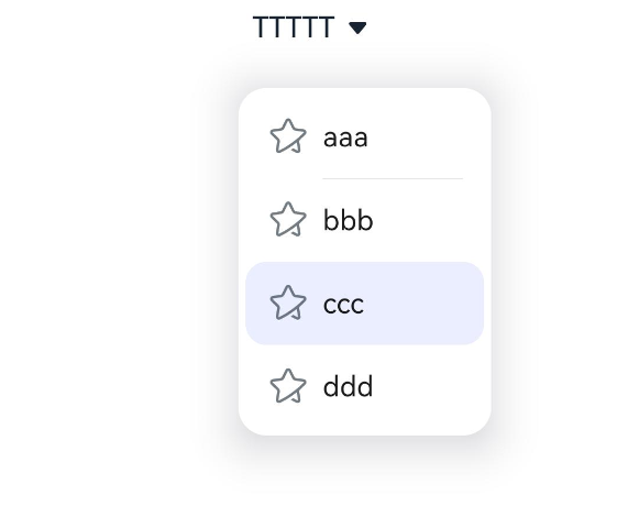
// xxx.ets
@Entry
@Component
struct SelectExample {
  @State text: string = "TTTTT"
  @State index: number = 2
  @State space: number = 8
  @State arrowPosition: ArrowPosition = ArrowPosition.END
  build() {
    Column() {
      Select([{ value: 'aaa', icon: "/common/public_icon.svg" },
        { value: 'bbb', icon: "/common/public_icon.svg" },
        { value: 'ccc', icon: "/common/public_icon.svg" },
        { value: 'ddd', icon: "/common/public_icon.svg" }])
        .selected(this.index)
        .value(this.text)
        .font({ size: 16, weight: 500 })
        .fontColor('#182431')
        .selectedOptionFont({ size: 16, weight: 400 })
        .optionFont({ size: 16, weight: 400 })
        .space(this.space)
        .arrowPosition(this.arrowPosition)
        .menuAlign(MenuAlignType.START, {dx:0, dy:0})
        .onSelect((index:number, text?: string|undefined)=>{
          console.info('Select:' + index)
          this.index = index;
          if(text){
            this.text = text;
          }
        })
    }.width('100%')
  }
}
你可能感兴趣的鸿蒙文章
harmony 鸿蒙@ohos.arkui.advanced.Counter(计数器组件)
harmony 鸿蒙@ohos.arkui.advanced.SegmentButton(分段按钮)
0
赞
热门推荐
-
2、 优质文章
-
3、 gt
-
7、 openharmony
-
9、 golang
-
10、 Vue中input框自动聚焦