harmony 鸿蒙@ohos.arkui.advanced.ComposeTitleBar(头像和单双行文本标题栏)
@ohos.arkui.advanced.ComposeTitleBar(头像和单双行文本标题栏)
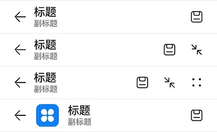
一种普通标题栏,支持设置标题、头像(可选)和副标题(可选),可用于一级页面、二级及其以上界面配置返回键。
说明:
该组件从API Version 10开始支持。后续版本如有新增内容,则采用上角标单独标记该内容的起始版本。
导入模块
import { ComposeTitleBar } from "@ohos.arkui.advanced.ComposeTitleBar"
子组件
无
属性
不支持通用属性
ComposeTitleBar
ComposeTitleBar({item?: ComposeTitleBarMenuItem, title: ResourceStr, subtitle?: ResourceStr, menuItems?: Array<ComposeTitleBarMenuItem>})
装饰器类型:\@Component
系统能力: SystemCapability.ArkUI.ArkUI.Full
参数:
| 名称 | 参数类型 | 必填 | 说明 |
|---|---|---|---|
| item | ComposeTitleBarMenuItem | 否 | 用于左侧头像的单个菜单项目。 |
| title | ResourceStr | 是 | 标题。 |
| subtitle | ResourceStr | 否 | 副标题。 |
| menuItems | Array<ComposeTitleBarMenuItem> | 否 | 右侧菜单项目列表。 |
ComposeTitleBarMenuItem
| 名称 | 类型 | 必填 | 说明 |
|---|---|---|---|
| value | ResourceStr | 是 | 图标资源。 |
| isEnabled | boolean | 是 | 是否启用,默认启用。 |
| action | () => void | 否 | 触发时的动作闭包。 |
事件
不支持通用事件
示例
import { ComposeTitleBar } from "@ohos.arkui.advanced.ComposeTitleBar"
import promptAction from '@ohos.promptAction'

@Entry
@Component
struct Index {
  menuItems: {
    value: Resource,
    isEnabled: boolean,
    action: () => void
  }[] = [
    { isEnabled: true, value: $r('app.media.ic_public_save'),
      action: () => promptAction.showToast({ message: "show toast index 1" })
    },
    { isEnabled: true, value: $r('app.media.ic_public_reduce'),
      action: () => promptAction.showToast({ message: "show toast index 2" })
    },
    { isEnabled: true, value: $r('app.media.ic_public_edit'),
      action: () => promptAction.showToast({ message: "show toast index 3" })
    },
    { isEnabled: true, value: $r('app.media.ic_public_reduce'),
      action: () => promptAction.showToast({ message: "show toast index 4" })
    }
  ]

  build() {
    Row() {
      Column() {
        Divider().height(2).color(0xCCCCCC)
        ComposeTitleBar({
          title: "标题",
          subtitle: "副标题",
          menuItems: this.menuItems.slice(0, 1),
        })
        Divider().height(2).color(0xCCCCCC)
        ComposeTitleBar({
          title: "标题",
          subtitle: "副标题",
          menuItems: this.menuItems.slice(0, 2),
        })
        Divider().height(2).color(0xCCCCCC)
        ComposeTitleBar({
          title: "标题",
          subtitle: "副标题",
          menuItems: this.menuItems,
        })
        Divider().height(2).color(0xCCCCCC)
        ComposeTitleBar({
          menuItems: [{ isEnabled: true, value: $r('app.media.ic_public_save'),
            action: () => promptAction.showToast({ message: "show toast index 1" })
          }],
          title: "标题",
          subtitle: "副标题",
          item: { isEnabled: true, value: $r('app.media.app_icon') }
        })
        Divider().height(2).color(0xCCCCCC)
      }
    }.height('100%')
  }
}
你可能感兴趣的鸿蒙文章
harmony 鸿蒙@ohos.arkui.advanced.Counter(计数器组件)
harmony 鸿蒙@ohos.arkui.advanced.SegmentButton(分段按钮)
0
赞
- 所属分类: 后端技术
- 本文标签:
热门推荐
-
2、 优质文章
-
3、 gt
-
7、 openharmony
-
9、 golang
-
10、 Vue中input框自动聚焦