harmony 鸿蒙RichEditor (系统接口)
RichEditor (系统接口)
支持图文混排和文本交互式编辑的组件。
说明:
该组件从API Version 10开始支持。后续版本如有新增内容,则采用上角标单独标记该内容的起始版本。
当前页面仅包含本模块的系统接口,其他公开接口参见RichEditor。
RichEditorBuilderSpanOptions11+
添加builder的偏移位置和builder样式信息。
系统能力: 此接口为系统接口。
系统能力: SystemCapability.ArkUI.ArkUI.Full
| 名称 | 类型 | 必填 | 说明 |
|---|---|---|---|
| dragBackgroundColor18+ | ColorMetrics | 否 | 添加builder单独拖拽时的背板背景颜色。不配置或者异常值时,颜色按系统默认配置。 |
| isDragShadowNeeded18+ | boolean | 否 | 添加builder单独拖拽时是否需要投影。不配置或者异常值时,默认需要投影。true表示需要投影,false表示不需要投影。 默认值: true |
RichEditorGesture11+
用户行为回调。
系统能力: 此接口为系统接口。
系统能力: SystemCapability.ArkUI.ArkUI.Full
| 名称 | 类型 | 必填 | 说明 |
|---|---|---|---|
| onDoubleClick14+ | Callback<GestureEvent> | 否 | GestureEvent为用户双击事件。 长按完成时回调事件。 |
RichEditorChangeValue12+
系统能力: 此接口为系统接口。
系统能力: SystemCapability.ArkUI.ArkUI.Full
| 名称 | 类型 | 必填 | 说明 |
|---|---|---|---|
| changeReason20+ | TextChangeReason | 是 | 组件内容变化的原因。 原子化服务API: 从API version 20开始,该接口支持在原子化服务中使用。 |
示例
示例1(获取组件内容变化原因)
可以通过onWillChange接口返回的changeReason获取组件内容变化的原因。
@Entry
@Component
struct RichEditorExample {
  controller: RichEditorController = new RichEditorController()
  options: RichEditorOptions = { controller: this.controller }

  build() {
    Column() {
      RichEditor(this.options)
        .height('25%')
        .width('100%')
        .border({ width: 1, color: Color.Blue })
        .onWillChange((value: RichEditorChangeValue) => {
          console.log('onWillChange, changeReason=' + value.changeReason)
          return true
        })
    }
  }
}
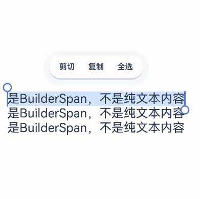
示例2(设置自定义布局拖拽背板及拖拽投影配置)
通过使用addBuilderSpan,可以在拖拽场景中为自定义布局的拖拽背板和拖拽投影设置相关参数。
// xxx.ets
import { ColorMetrics } from '@kit.ArkUI';

@Entry
@Component
struct richEditorNew03 {
  controller: RichEditorController = new RichEditorController();
  options: RichEditorOptions = { controller: this.controller }
  build() {
    Column({ space: 10 }) {
      Column() {
        RichEditor(this.options)
          .onReady(() => {
            this.controller.addBuilderSpan(() => {
              this.placeholderBuilder()
            }, {
              offset: -1,
              dragBackgroundColor: ColorMetrics.rgba(0xff, 0x80, 0, 0xff),
              isDragShadowNeeded: false
            })
            this.controller.addBuilderSpan(() => {
              this.placeholderBuilder()
            }, {
              offset: -1,
              dragBackgroundColor: ColorMetrics.resourceColor("#ffff0000")
                .blendColor(ColorMetrics.resourceColor("#ff00ff00")),
              isDragShadowNeeded: true
            })
            this.controller.addBuilderSpan(() => {
              this.placeholderBuilder()
            }, { offset: -1 })
          })
          .borderWidth(1)
          .width("100%")
          .height("50%")
          .margin(50)
      }
      .width('100%')
      .margin({top:100})
    }
  }

  @Builder
  placeholderBuilder() {
    Row() {
      Text('是BuilderSpan,不是纯文本内容')
        .fontSize(22)
        .copyOption(CopyOptions.InApp)
    }
  }
}
你可能感兴趣的鸿蒙文章
0
赞
- 所属分类: 后端技术
- 本文标签:
热门推荐
-
2、 优质文章
-
3、 gt
-
7、 openharmony
-
9、 golang
-
10、 Vue中input框自动聚焦