harmony 鸿蒙RelativeContainer
RelativeContainer
相对布局组件,用于复杂场景中元素对齐的布局。
说明:
- 该组件从API version 9开始支持。后续版本如有新增内容,则采用上角标单独标记该内容的起始版本。
- 从API version 11开始,在RelativeContainer组件中,width、height设置”auto”表示自适应子组件。当width设置”auto”时,如果水平方向上子组件以容器作为锚点,则”auto”不生效,垂直方向上同理。
- 从API version 20开始,在RelativeContainer组件中,width、height设置LayoutPolicy.wrapContent表示自适应子组件且被祖先节点尺寸约束,设置LayoutPolicy.fixAtIdealSize表示自适应子组件且不被祖先节点尺寸约束。当width设置wrapContent或fixAtIdealSize时,如果水平方向上子组件直接或间接以容器作为锚点,则容器在该方向上的尺寸不自适应该组件,垂直方向上同理。
- 相对布局容器内的子组件的margin含义不同于通用属性的margin,其含义为到该方向上的锚点的距离。若该方向上没有锚点,则该方向的margin不生效。
子组件
支持多个子组件。
接口
RelativeContainer()
卡片能力: 从API version 9开始,该接口支持在ArkTS卡片中使用。
原子化服务API: 从API version 11开始,该接口支持在原子化服务中使用。
系统能力: SystemCapability.ArkUI.ArkUI.Full
属性
除支持通用属性外,还支持如下属性:
guideLine12+
guideLine(value: Array<GuideLineStyle>)
设置RelativeContainer容器内的辅助线,Array中每个项目即为一条guideline。
原子化服务API: 从API version 12开始,该接口支持在原子化服务中使用。
系统能力: SystemCapability.ArkUI.ArkUI.Full
参数:
| 参数名 | 类型 | 必填 | 说明 |
|---|---|---|---|
| value | Array<GuideLineStyle> | 是 | RelativeContainer容器内的辅助线。 |
barrier12+
barrier(value: Array<BarrierStyle>)
设置RelativeContainer容器内的屏障,Array中每个项目即为一条barrier。
原子化服务API: 从API version 12开始,该接口支持在原子化服务中使用。
系统能力: SystemCapability.ArkUI.ArkUI.Full
参数:
| 参数名 | 类型 | 必填 | 说明 |
|---|---|---|---|
| value | Array<BarrierStyle> | 是 | RelativeContainer容器内的屏障。 |
barrier12+
barrier(barrierStyle: Array<LocalizedBarrierStyle>)
设置RelativeContainer容器内的屏障,Array中每个项目即为一条barrier。
原子化服务API: 从API version 12开始,该接口支持在原子化服务中使用。
系统能力: SystemCapability.ArkUI.ArkUI.Full
参数:
| 参数名 | 类型 | 必填 | 说明 |
|---|---|---|---|
| barrierStyle | Array<LocalizedBarrierStyle> | 是 | RelativeContainer容器内的屏障。 |
GuideLineStyle12+对象说明
guideLine参数,用于定义一条guideline的id、方向和位置。
原子化服务API: 从API version 12开始,该接口支持在原子化服务中使用。
系统能力: SystemCapability.ArkUI.ArkUI.Full
| 名称 | 类型 | 必填 | 说明 |
|---|---|---|---|
| id | string | 是 | guideline的id,必须是唯一的并且不可与容器内组件重名。 |
| direction | Axis | 是 | 指定guideline的方向。 垂直方向的guideline仅能作为组件水平方向的锚点,作为垂直方向的锚点时值为0;水平方向的guideline仅能作为组件垂直方向的锚点,作为水平方向的锚点时值为0。默认值:Axis.Vertical |
| position | GuideLinePosition | 是 | 指定guideline的位置。当未声明或声明异常值(如undefined)时,guideline的位置默认为start: 0。start和 end两种声明方式选择一种即可。若同时声明,仅start生效。若容器在某个方向的size被声明为”auto”,则该方向上guideline的位置只能使用start方式声明(不允许使用百分比)。 默认值: { start: 0 } |
GuideLinePosition12+对象说明
guideLine位置参数,用于定义guideline的位置。
原子化服务API: 从API version 12开始,该接口支持在原子化服务中使用。
系统能力: SystemCapability.ArkUI.ArkUI.Full
| 名称 | 类型 | 必填 | 说明 |
|---|---|---|---|
| start | Dimension | 否 | guideline距离容器左侧或者顶部的距离。 |
| end | Dimension | 否 | guideline距离容器右侧或者底部的距离。 |
BarrierStyle12+对象说明
barrier参数,用于定义一条barrier的id、方向和生成时所依赖的组件。
原子化服务API: 从API version 12开始,该接口支持在原子化服务中使用。
系统能力: SystemCapability.ArkUI.ArkUI.Full
| 名称 | 类型 | 必填 | 说明 |
|---|---|---|---|
| id | string | 是 | barrier的id,必须是唯一的并且不可与容器内组件重名。 |
| direction | BarrierDirection | 是 | 指定barrier的方向。垂直方向(TOP,BOTTOM)的barrier仅能作为组件的水平方向锚点,用作垂直方向锚点时值为0;水平方向(LEFT,RIGHT)的barrier仅能作为组件的垂直方向锚点,用作水平方向锚点时值为0。 默认值:BarrierDirection.LEFT |
| referencedId | Array<string> | 是 | 指定生成barrier所依赖的组件。 |
BarrierDirection12+枚举说明
定义屏障线的方向。
原子化服务API: 从API version 12开始,该接口支持在原子化服务中使用。
系统能力: SystemCapability.ArkUI.ArkUI.Full
| 名称 | 说明 |
|---|---|
| LEFT | 屏障在其所有referencedId的最左侧。 |
| RIGHT | 屏障在其所有referencedId的最右侧。 |
| TOP | 屏障在其所有referencedId的最上方。 |
| BOTTOM | 屏障在其所有referencedId的最下方。 |
LocalizedBarrierStyle12+对象说明
barrier参数,用于定义一条barrier的id、方向和生成时所依赖的组件。
原子化服务API: 从API version 12开始,该接口支持在原子化服务中使用。
系统能力: SystemCapability.ArkUI.ArkUI.Full
| 名称 | 类型 | 必填 | 说明 |
|---|---|---|---|
| id | string | 是 | barrier的id,必须是唯一的并且不可与容器内组件重名。 |
| localizedDirection | LocalizedBarrierDirection | 是 | 指定barrier的方向。 垂直方向(TOP,BOTTOM)的barrier仅能作为组件的水平方向锚点,作为垂直方向锚点时值为0。水平方向(START,END)的barrier仅能作为组件的垂直方向锚点,作为水平方向锚点时值为0。 |
| referencedId | Array<string> | 是 | 指定生成barrier所依赖的组件。 |
LocalizedBarrierDirection12+枚举说明
定义支持镜像模式的屏障线的方向。
原子化服务API: 从API version 12开始,该接口支持在原子化服务中使用。
系统能力: SystemCapability.ArkUI.ArkUI.Full
|名称| 值|说明 | |——|–|—————————–| |START|0|屏障在其所有referencedId的最左/右侧,LTR模式时为最左侧,RTL模式时为最右侧。| |END |1|屏障在其所有referencedId的最左/右侧, LTR模式时为最右侧,RTL模式时为最左侧。| |TOP |2|屏障在其所有referencedId的最上方。| |BOTTOM|3|屏障在其所有referencedId的最下方。|
示例
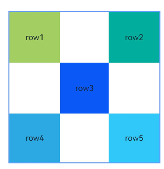
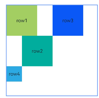
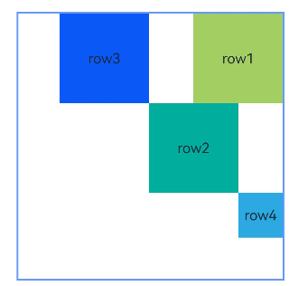
示例1(以容器和容器内组件作为锚点进行布局)
本示例通过alignRules接口实现了以容器和容器内组件作为锚点进行布局的功能。
@Entry
@Component
struct Index {
  build() {
    Row() {
      RelativeContainer() {
        Row() {
          Text('row1')
        }
        .justifyContent(FlexAlign.Center)
        .width(100)
        .height(100)
        .backgroundColor('#a3cf62')
        .alignRules({
          top: { anchor: "__container__", align: VerticalAlign.Top },
          left: { anchor: "__container__", align: HorizontalAlign.Start }
        })
        .id("row1")

        Row() {
          Text('row2')
        }
        .justifyContent(FlexAlign.Center)
        .width(100)
        .height(100)
        .backgroundColor('#00ae9d')
        .alignRules({
          top: { anchor: "__container__", align: VerticalAlign.Top },
          right: { anchor: "__container__", align: HorizontalAlign.End }
        })
        .id("row2")

        Row() {
          Text('row3')
        }
        .justifyContent(FlexAlign.Center)
        .height(100)
        .backgroundColor('#0a59f7')
        .alignRules({
          top: { anchor: "row1", align: VerticalAlign.Bottom },
          left: { anchor: "row1", align: HorizontalAlign.End },
          right: { anchor: "row2", align: HorizontalAlign.Start }
        })
        .id("row3")

        Row() {
          Text('row4')
        }.justifyContent(FlexAlign.Center)
        .backgroundColor('#2ca9e0')
        .alignRules({
          top: { anchor: "row3", align: VerticalAlign.Bottom },
          bottom: { anchor: "__container__", align: VerticalAlign.Bottom },
          left: { anchor: "__container__", align: HorizontalAlign.Start },
          right: { anchor: "row1", align: HorizontalAlign.End }
        })
        .id("row4")

        Row() {
          Text('row5')
        }.justifyContent(FlexAlign.Center)
        .backgroundColor('#30c9f7')
        .alignRules({
          top: { anchor: "row3", align: VerticalAlign.Bottom },
          bottom: { anchor: "__container__", align: VerticalAlign.Bottom },
          left: { anchor: "row2", align: HorizontalAlign.Start },
          right: { anchor: "__container__", align: HorizontalAlign.End }
        })
        .id("row5")
      }
      .width(300).height(300)
      .margin({ left: 50 })
      .border({ width: 2, color: "#6699FF" })
    }
    .height('100%')
  }
}
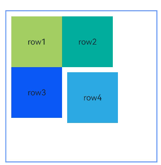
示例2(子组件设置外边距)
本示例展示了容器内子组件设置外边距的用法。
@Entry
@Component
struct Index {
  build() {
    Row() {
      RelativeContainer() {
        Row() {
          Text('row1')
        }
        .justifyContent(FlexAlign.Center)
        .width(100)
        .height(100)
        .backgroundColor('#a3cf62')
        .alignRules({
          top: { anchor: "__container__", align: VerticalAlign.Top },
          left: { anchor: "__container__", align: HorizontalAlign.Start }
        })
        .id("row1")
        .margin(10)

        Row() {
          Text('row2')
        }
        .justifyContent(FlexAlign.Center)
        .width(100)
        .height(100)
        .backgroundColor('#00ae9d')
        .alignRules({
          left: { anchor: "row1", align: HorizontalAlign.End },
          top: { anchor: "row1", align: VerticalAlign.Top }
        })
        .id("row2")

        Row() {
          Text('row3')
        }
        .justifyContent(FlexAlign.Center)
        .width(100)
        .height(100)
        .backgroundColor('#0a59f7')
        .alignRules({
          left: { anchor: "row1", align: HorizontalAlign.Start },
          top: { anchor: "row1", align: VerticalAlign.Bottom }
        })
        .id("row3")

        Row() {
          Text('row4')
        }
        .justifyContent(FlexAlign.Center)
        .width(100)
        .height(100)
        .backgroundColor('#2ca9e0')
        .alignRules({
          left: { anchor: "row3", align: HorizontalAlign.End },
          top: { anchor: "row2", align: VerticalAlign.Bottom }
        })
        .id("row4")
        .margin(10)
      }
      .width(300).height(300)
      .margin({ left: 50 })
      .border({ width: 2, color: "#6699FF" })
    }
    .height('100%')
  }
}
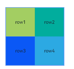
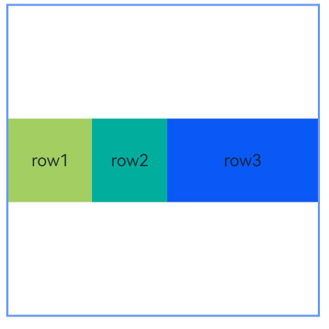
示例3(设置容器大小自适应内容)
本示例展示了容器大小适应内容(声明width或height为”auto”)的用法。
@Entry
@Component
struct Index {
  build() {
    Row() {
      RelativeContainer() {
        Row() {
          Text('row1')
        }
        .justifyContent(FlexAlign.Center)
        .width(100)
        .height(100)
        .backgroundColor('#a3cf62')
        .id("row1")

        Row() {
          Text('row2')
        }
        .justifyContent(FlexAlign.Center)
        .width(100)
        .height(100)
        .backgroundColor('#00ae9d')
        .alignRules({
          left: { anchor: "row1", align: HorizontalAlign.End },
          top: { anchor: "row1", align: VerticalAlign.Top }
        })
        .id("row2")

        Row() {
          Text('row3')
        }
        .justifyContent(FlexAlign.Center)
        .width(100)
        .height(100)
        .backgroundColor('#0a59f7')
        .alignRules({
          left: { anchor: "row1", align: HorizontalAlign.Start },
          top: { anchor: "row1", align: VerticalAlign.Bottom }
        })
        .id("row3")

        Row() {
          Text('row4')
        }
        .justifyContent(FlexAlign.Center)
        .width(100)
        .height(100)
        .backgroundColor('#2ca9e0')
        .alignRules({
          left: { anchor: "row3", align: HorizontalAlign.End },
          top: { anchor: "row2", align: VerticalAlign.Bottom }
        })
        .id("row4")
      }
      .width("auto").height("auto")
      .margin({ left: 50 })
      .border({ width: 2, color: "#6699FF" })
    }
    .height('100%')
  }
}
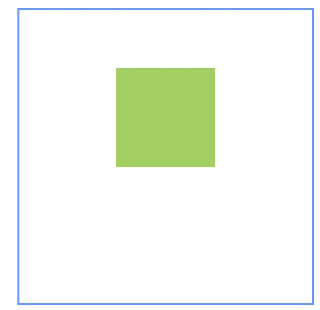
示例4(设置偏移)
本示例通过bias实现了子组件的位置在竖直方向的两个锚点间偏移的效果。
@Entry
@Component
struct Index {
  build() {
    Row() {
      RelativeContainer() {
        Row()
          .width(100)
          .height(100)
          .backgroundColor('#a3cf62')
          .alignRules({
            top: { anchor: "__container__", align: VerticalAlign.Top },
            bottom: { anchor: "__container__", align: VerticalAlign.Bottom },
            left: { anchor: "__container__", align: HorizontalAlign.Start },
            right: { anchor: "__container__", align: HorizontalAlign.End },
            bias: { vertical: 0.3 }
          })
          .id("row1")
      }
      .width(300).height(300)
      .margin({ left: 50 })
      .border({ width: 2, color: "#6699FF" })
    }
    .height('100%')
  }
}
示例5(设置辅助线)
本示例展示了相对布局组件通过guideLine接口设置辅助线,子组件以辅助线为锚点的功能。
@Entry
@Component
struct Index {
  build() {
    Row() {
      RelativeContainer() {
        Row()
          .width(100)
          .height(100)
          .backgroundColor('#a3cf62')
          .alignRules({
            left: { anchor: "guideline1", align: HorizontalAlign.End },
            top: { anchor: "guideline2", align: VerticalAlign.Top }
          })
          .id("row1")
      }
      .width(300)
      .height(300)
      .margin({ left: 50 })
      .border({ width: 2, color: "#6699FF" })
      .guideLine([{ id: "guideline1", direction: Axis.Vertical, position: { start: 50 } },
        { id: "guideline2", direction: Axis.Horizontal, position: { start: 50 } }])
    }
    .height('100%')
  }
}
示例6(设置屏障)
本示例展示了相对布局组件通过barrier接口设置屏障,子组件以屏障为锚点的用法。
@Entry
@Component
struct Index {
  build() {
    Row() {
      RelativeContainer() {
        Row() {
          Text('row1')
        }
        .justifyContent(FlexAlign.Center)
        .width(100)
        .height(100)
        .backgroundColor('#a3cf62')
        .id("row1")

        Row() {
          Text('row2')
        }
        .justifyContent(FlexAlign.Center)
        .width(100)
        .height(100)
        .backgroundColor('#00ae9d')
        .alignRules({
          middle: { anchor: "row1", align: HorizontalAlign.End },
          top: { anchor: "row1", align: VerticalAlign.Bottom }
        })
        .id("row2")

        Row() {
          Text('row3')
        }
        .justifyContent(FlexAlign.Center)
        .width(100)
        .height(100)
        .backgroundColor('#0a59f7')
        .alignRules({
          left: { anchor: "barrier1", align: HorizontalAlign.End },
          top: { anchor: "row1", align: VerticalAlign.Top }
        })
        .id("row3")

        Row() {
          Text('row4')
        }
        .justifyContent(FlexAlign.Center)
        .width(50)
        .height(50)
        .backgroundColor('#2ca9e0')
        .alignRules({
          left: { anchor: "row1", align: HorizontalAlign.Start },
          top: { anchor: "barrier2", align: VerticalAlign.Bottom }
        })
        .id("row4")
      }
      .width(300)
      .height(300)
      .margin({ left: 50 })
      .border({ width: 2, color: "#6699FF" })
      .barrier([{ id: "barrier1", direction: BarrierDirection.RIGHT, referencedId: ["row1", "row2"] },
        { id: "barrier2", direction: BarrierDirection.BOTTOM, referencedId: ["row1", "row2"] }])
    }
    .height('100%')
  }
}
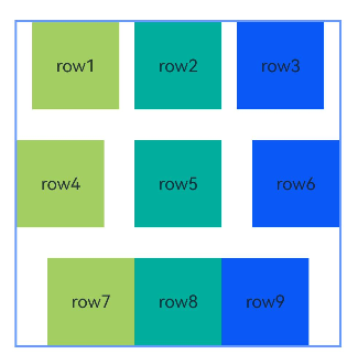
示例7(设置链)
本示例通过chainMode接口从上至下分别实现了水平方向的SPREAD链,SPREAD_INSIDE链和PACKED链。
@Entry
@Component
struct Index {
  build() {
    Row() {
      RelativeContainer() {
        Row() {
          Text('row1')
        }
        .justifyContent(FlexAlign.Center)
        .width(80)
        .height(80)
        .backgroundColor('#a3cf62')
        .alignRules({
          left: { anchor: "__container__", align: HorizontalAlign.Start },
          right: { anchor: "row2", align: HorizontalAlign.Start },
          top: { anchor: "__container__", align: VerticalAlign.Top }
        })
        .id("row1")
        .chainMode(Axis.Horizontal, ChainStyle.SPREAD)

        Row() {
          Text('row2')
        }
        .justifyContent(FlexAlign.Center)
        .width(80)
        .height(80)
        .backgroundColor('#00ae9d')
        .alignRules({
          left: { anchor: "row1", align: HorizontalAlign.End },
          right: { anchor: "row3", align: HorizontalAlign.Start },
          top: { anchor: "row1", align: VerticalAlign.Top }
        })
        .id("row2")

        Row() {
          Text('row3')
        }
        .justifyContent(FlexAlign.Center)
        .width(80)
        .height(80)
        .backgroundColor('#0a59f7')
        .alignRules({
          left: { anchor: "row2", align: HorizontalAlign.End },
          right: { anchor: "__container__", align: HorizontalAlign.End },
          top: { anchor: "row1", align: VerticalAlign.Top }
        })
        .id("row3")

        Row() {
          Text('row4')
        }
        .justifyContent(FlexAlign.Center)
        .width(80)
        .height(80)
        .backgroundColor('#a3cf62')
        .alignRules({
          left: { anchor: "__container__", align: HorizontalAlign.Start },
          right: { anchor: "row5", align: HorizontalAlign.Start },
          center: { anchor: "__container__", align: VerticalAlign.Center }
        })
        .id("row4")
        .chainMode(Axis.Horizontal, ChainStyle.SPREAD_INSIDE)

        Row() {
          Text('row5')
        }
        .justifyContent(FlexAlign.Center)
        .width(80)
        .height(80)
        .backgroundColor('#00ae9d')
        .alignRules({
          left: { anchor: "row4", align: HorizontalAlign.End },
          right: { anchor: "row6", align: HorizontalAlign.Start },
          top: { anchor: "row4", align: VerticalAlign.Top }
        })
        .id("row5")

        Row() {
          Text('row6')
        }
        .justifyContent(FlexAlign.Center)
        .width(80)
        .height(80)
        .backgroundColor('#0a59f7')
        .alignRules({
          left: { anchor: "row5", align: HorizontalAlign.End },
          right: { anchor: "__container__", align: HorizontalAlign.End },
          top: { anchor: "row4", align: VerticalAlign.Top }
        })
        .id("row6")

        Row() {
          Text('row7')
        }
        .justifyContent(FlexAlign.Center)
        .width(80)
        .height(80)
        .backgroundColor('#a3cf62')
        .alignRules({
          left: { anchor: "__container__", align: HorizontalAlign.Start },
          right: { anchor: "row8", align: HorizontalAlign.Start },
          bottom: { anchor: "__container__", align: VerticalAlign.Bottom }
        })
        .id("row7")
        .chainMode(Axis.Horizontal, ChainStyle.PACKED)

        Row() {
          Text('row8')
        }
        .justifyContent(FlexAlign.Center)
        .width(80)
        .height(80)
        .backgroundColor('#00ae9d')
        .alignRules({
          left: { anchor: "row7", align: HorizontalAlign.End },
          right: { anchor: "row9", align: HorizontalAlign.Start },
          top: { anchor: "row7", align: VerticalAlign.Top }
        })
        .id("row8")

        Row() {
          Text('row9')
        }
        .justifyContent(FlexAlign.Center)
        .width(80)
        .height(80)
        .backgroundColor('#0a59f7')
        .alignRules({
          left: { anchor: "row8", align: HorizontalAlign.End },
          right: { anchor: "__container__", align: HorizontalAlign.End },
          top: { anchor: "row7", align: VerticalAlign.Top }
        })
        .id("row9")
      }
      .width(300).height(300)
      .margin({ left: 50 })
      .border({ width: 2, color: "#6699FF" })
    }
    .height('100%')
  }
}
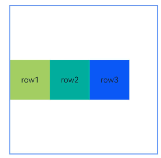
示例8(链中设置偏移)
本示例通过chainMode和bias接口实现了水平方向的带偏移的PACKED链。
@Entry
@Component
struct Index {
  build() {
    Row() {
      RelativeContainer() {
        Row() {
          Text('row1')
        }
        .justifyContent(FlexAlign.Center)
        .width(80)
        .height(80)
        .backgroundColor('#a3cf62')
        .alignRules({
          left: { anchor: "__container__", align: HorizontalAlign.Start },
          right: { anchor: "row2", align: HorizontalAlign.Start },
          center: { anchor: "__container__", align: VerticalAlign.Center },
          bias: { horizontal: 0 }
        })
        .id("row1")
        .chainMode(Axis.Horizontal, ChainStyle.PACKED)

        Row() {
          Text('row2')
        }
        .justifyContent(FlexAlign.Center)
        .width(80)
        .height(80)
        .backgroundColor('#00ae9d')
        .alignRules({
          left: { anchor: "row1", align: HorizontalAlign.End },
          right: { anchor: "row3", align: HorizontalAlign.Start },
          top: { anchor: "row1", align: VerticalAlign.Top }
        })
        .id("row2")

        Row() {
          Text('row3')
        }
        .justifyContent(FlexAlign.Center)
        .width(80)
        .height(80)
        .backgroundColor('#0a59f7')
        .alignRules({
          left: { anchor: "row2", align: HorizontalAlign.End },
          right: { anchor: "__container__", align: HorizontalAlign.End },
          top: { anchor: "row1", align: VerticalAlign.Top }
        })
        .id("row3")
      }
      .width(300).height(300)
      .margin({ left: 50 })
      .border({ width: 2, color: "#6699FF" })
    }
    .height('100%')
  }
}
示例9(设置镜像模式)
本示例展示了在镜像模式(direction声明Direction.Rtl)下以屏障为锚点时使用LocalizedAlignRuleOptions和LocalizedBarrierDirection设置对齐方式的用法。
@Entry
@Component
struct Index {
  build() {
    Row() {
      RelativeContainer() {
        Row() {
          Text('row1')
        }
        .justifyContent(FlexAlign.Center)
        .width(100)
        .height(100)
        .backgroundColor('#a3cf62')
        .id("row1")

        Row() {
          Text('row2')
        }
        .justifyContent(FlexAlign.Center)
        .width(100)
        .height(100)
        .backgroundColor('#00ae9d')
        .alignRules({
          middle: { anchor: "row1", align: HorizontalAlign.End },
          top: { anchor: "row1", align: VerticalAlign.Bottom }
        })
        .id("row2")

        Row() {
          Text('row3')
        }
        .justifyContent(FlexAlign.Center)
        .width(100)
        .height(100)
        .backgroundColor('#0a59f7')
        .alignRules({
          start: { anchor: "barrier1", align: HorizontalAlign.End },
          top: { anchor: "row1", align: VerticalAlign.Top }
        })
        .id("row3")

        Row() {
          Text('row4')
        }
        .justifyContent(FlexAlign.Center)
        .width(50)
        .height(50)
        .backgroundColor('#2ca9e0')
        .alignRules({
          start: { anchor: "row1", align: HorizontalAlign.Start },
          top: { anchor: "barrier2", align: VerticalAlign.Bottom }
        })
        .id("row4")
      }
      .direction(Direction.Rtl)
      .width(300)
      .height(300)
      .margin({ left: 50 })
      .border({ width: 2, color: "#6699FF" })
      .barrier([{ id: "barrier1", localizedDirection: LocalizedBarrierDirection.END, referencedId: ["row1", "row2"] },
        { id: "barrier2", localizedDirection: LocalizedBarrierDirection.BOTTOM, referencedId: ["row1", "row2"] }])
    }
    .height('100%')
  }
}
示例10(设置链中节点权重)
本示例展示了链中节点使用chainWeight设置尺寸权重的用法。
@Entry
@Component
struct Index {
  build() {
    Row() {
      RelativeContainer() {
        Row() {
          Text('row1')
        }
        .justifyContent(FlexAlign.Center)
        .width(80)
        .height(80)
        .backgroundColor('#a3cf62')
        .alignRules({
          left: { anchor: "__container__", align: HorizontalAlign.Start },
          right: { anchor: "row2", align: HorizontalAlign.Start },
          center: { anchor: "__container__", align: VerticalAlign.Center },
        })
        .id("row1")
        .chainMode(Axis.Horizontal, ChainStyle.PACKED)

        Row() {
          Text('row2')
        }
        .justifyContent(FlexAlign.Center)
        .width(80)
        .height(80)
        .backgroundColor('#00ae9d')
        .alignRules({
          left: { anchor: "row1", align: HorizontalAlign.End },
          right: { anchor: "row3", align: HorizontalAlign.Start },
          top: { anchor: "row1", align: VerticalAlign.Top }
        })
        .id("row2")
        .chainWeight({horizontal:1})

        Row() {
          Text('row3')
        }
        .justifyContent(FlexAlign.Center)
        .width(80)
        .height(80)
        .backgroundColor('#0a59f7')
        .alignRules({
          left: { anchor: "row2", align: HorizontalAlign.End },
          right: { anchor: "__container__", align: HorizontalAlign.End },
          top: { anchor: "row1", align: VerticalAlign.Top }
        })
        .id("row3")
        .chainWeight({horizontal:2})
      }
      .width(300).height(300)
      .margin({ left: 50 })
      .border({ width: 2, color: "#6699FF" })
    }
    .height('100%')
  }
}
你可能感兴趣的鸿蒙文章
- 所属分类: 后端技术
- 本文标签:
热门推荐
-
2、 优质文章
-
3、 gt
-
7、 openharmony
-
9、 golang
-
10、 Vue中input框自动聚焦