harmony 鸿蒙Tabs
Tabs
通过页签进行内容视图切换的容器组件,每个页签对应一个内容视图。
说明:
该组件从API Version 7开始支持。后续版本如有新增内容,则采用上角标单独标记该内容的起始版本。
子组件
仅可包含子组件TabContent。
接口
Tabs(value?: {barPosition?: BarPosition, index?: number, controller?: TabsController})
参数:
| 参数名 | 参数类型 | 必填 | 参数描述 |
|---|---|---|---|
| barPosition | BarPosition | 否 | 设置Tabs的页签位置。 默认值:BarPosition.Start |
| index | number | 否 | 设置初始页签索引。 默认值:0 说明: 设置为小于0的值时按默认值显示。 可选值为[0, TabContent子节点数量-1]。 设置不同值时,默认生效切换动效,可以设置animationDuration为0关闭动画。 从API version 10开始,该参数支持$$双向绑定变量。 |
| controller | TabsController | 否 | 设置Tabs控制器。 |
BarPosition枚举说明
| 名称 | 描述 |
|---|---|
| Start | vertical属性方法设置为true时,页签位于容器左侧;vertical属性方法设置为false时,页签位于容器顶部。 |
| End | vertical属性方法设置为true时,页签位于容器右侧;vertical属性方法设置为false时,页签位于容器底部。 |
属性
除支持通用属性外,还支持以下属性:
| 名称 | 参数类型 | 描述 |
|---|---|---|
| vertical | boolean | 设置为false是为横向Tabs,设置为true时为纵向Tabs。 默认值:false |
| scrollable | boolean | 设置为true时可以通过滑动页面进行页面切换,为false时不可滑动切换页面。 默认值:true |
| barMode | BarMode,ScrollableBarModeOptions | TabBar布局模式,BarMode为必选项,ScrollableBarModeOptions为可选项,具体描述见BarMode枚举说明、ScrollableBarModeOptions对象说明。从API version 10开始,支持ScrollableBarModeOptions参数。其中ScrollableBarModeOptions参数仅Scrollable模式下有效,非必填参数。 默认值:BarMode.Fixed |
| barWidth | number | Length8+ | TabBar的宽度值。 默认值: 未设置带样式的TabBar且vertical属性为false时,默认值为Tabs的宽度。 未设置带样式的TabBar且vertical属性为true时,默认值为56vp。 设置SubTabbarStyle样式且vertical属性为false时,默认值为Tabs的宽度。 设置SubTabbarStyle样式且vertical属性为true时,默认值为56vp。 设置BottomTabbarStyle样式且vertical属性为true时,默认值为96vp。 设置BottomTabbarStyle样式且vertical属性为false时,默认值为Tabs的宽度。 说明: 设置为小于0或大于Tabs宽度值时,按默认值显示。 |
| barHeight | number | Length8+ | TabBar的高度值。 默认值: 未设置带样式的TabBar且vertical属性为false时,默认值为56vp。 未设置带样式的TabBar且vertical属性为true时,默认值为Tabs的高度。 设置SubTabbarStyle样式且vertical属性为false时,默认值为56vp。 设置SubTabbarStyle样式且vertical属性为true时,默认值为Tabs的高度。 设置BottomTabbarStyle样式且vertical属性为true时,默认值为Tabs的高度。 设置BottomTabbarStyle样式且vertical属性为false时,默认值为56vp。 说明: 设置为小于0或大于Tabs高度值时,按默认值显示。 |
| animationDuration | number | TabContent滑动动画时长。不设置时,点击切换页签无动画,滑动切换有动画;设置时,点击切换和滑动切换都有动画。 默认值:300 说明: 设置为小于0或百分比时,按默认值显示。 |
| divider10+ | DividerStyle |null | 用于设置区分TabBar和TabContent的分割线样式设置分割线样式,默认不显示分割线。 DividerStyle: 分割线的样式; null: 不显示分割线。 |
| fadingEdge10+ | boolean | 设置页签超过容器宽度时是否渐隐消失。 默认值:true |
| barOverlap10+ | boolean | 设置TabBar是否背后变模糊并叠加在TabContent之上。 默认值:false |
| barBackgroundColor10+ | ResourceColor | 设置TabBar的背景颜色。 默认值:透明 |
| barGridAlign10+ | BarGridColumnOptions | 以栅格化方式设置TabBar的可见区域。具体参见BarGridColumnOptions对象。仅水平模式下有效,不适用于XS、XL和XXL设备。 |
DividerStyle10+对象说明
| 名称 | 参数类型 | 必填 | 描述 |
|---|---|---|---|
| strokeWidth | Length | 是 | 分割线的线宽(不支持百分比设置)。 |
| color | ResourceColor | 否 | 分割线的颜色。 默认值:#33182431 |
| startMargin | Length | 否 | 分割线与侧边栏顶端的距离(不支持百分比设置)。 默认值:0.0 单位:vp |
| endMargin | Length | 否 | 分割线与侧边栏底端的距离(不支持百分比设置)。 默认值:0.0 单位:vp |
BarGridColumnOptions10+对象说明
| 名称 | 参数类型 | 必填 | 描述 |
|---|---|---|---|
| margin | Dimension | 否 | 网格模式下的column边距(不支持百分比设置)。 默认值:24.0 单位:vp |
| gutter | Dimension | 否 | 网格模式下的column间隔(不支持百分比设置)。 默认值:24.0 单位:vp |
| sm | number | 否 | 小屏下,页签占用的columns数量,必须是非负偶数。小屏为大于等于320vp但小于600vp。 默认值为-1,代表页签占用TabBar全部宽度。 |
| md | number | 否 | 中屏下,页签占用的columns数量,必须是非负偶数。中屏为大于等于600vp但小于800vp。 默认值为-1,代表页签占用TabBar全部宽度。 |
| lg | number | 否 | 大屏下,页签占用的columns数量,必须是非负偶数。大屏为大于等于840vp但小于1024vp。 默认值为-1,代表页签占用TabBar全部宽度。 |
ScrollableBarModeOptions10+对象说明
| 名称 | 参数类型 | 必填 | 描述 |
|---|---|---|---|
| margin | Dimension | 否 | Scrollable模式下的TabBar的左右边距(不支持百分比设置)。 默认值:0.0 单位:vp |
| nonScrollableLayoutStyle | LayoutStyle | 否 | Scrollable模式下不滚动时的页签排布方式。 默认值:LayoutStyle.ALWAYS_CENTER |
BarMode枚举说明
| 名称 | 描述 |
|---|---|
| Scrollable | 每一个TabBar均使用实际布局宽度,超过总长度(横向Tabs的barWidth,纵向Tabs的barHeight)后可滑动。 |
| Fixed | 所有TabBar平均分配barWidth宽度(纵向时平均分配barHeight高度)。 |
LayoutStyle10+枚举说明
| 名称 | 描述 |
|---|---|
| ALWAYS_CENTER | 当页签内容超过TabBar宽度时,TabBar可滚动。 当页签内容不超过TabBar宽度时,TabBar不可滚动,页签紧凑居中。 |
| ALWAYS_AVERAGE_SPLITE | 当页签内容超过TabBar宽度时,TabBar可滚动。 当页签内容不超过TabBar宽度时,TabBar不可滚动,且所有页签平均分配TabBar宽度。 仅水平模式下有效,否则视为LayoutStyle.ALWAYS_CENTER。 |
| SPACE_BETWEEN_OR_CENTER | 当页签内容超过TabBar宽度时,TabBar可滚动。 当页签内容不超过TabBar宽度但超过TabBar宽度一半时,TabBar不可滚动,页签紧凑居中。 当页签内容不超过TabBar宽度一半时,TabBar不可滚动,保证页签居中排列在TabBar宽度一半,且间距相同。 |
事件
除支持通用事件外,还支持以下事件:
| 名称 | 功能描述 |
|---|---|
| onChange(event: (index: number) => void) | Tab页签切换后触发的事件。 - index:当前显示的index索引,索引从0开始计算。 触发该事件的条件: 1、TabContent支持滑动时,组件触发滑动时触发。 2、通过控制器API接口调用。 3、通过状态变量构造的属性值进行修改。 4、通过页签处点击触发。 |
| onTabBarClick(event: (index: number) => void)10+ | Tab页签点击后触发的事件。 - index:被点击的index索引,索引从0开始计算。 触发该事件的条件: 通过页签处点击触发。 |
TabsController
Tabs组件的控制器,用于控制Tabs组件进行页签切换。不支持一个TabsController控制多个Tabs组件。
导入对象
let controller: TabsController = new TabsController()
changeIndex
changeIndex(value: number): void
控制Tabs切换到指定页签。
参数:
| 参数名 | 参数类型 | 必填 | 参数描述 |
|---|---|---|---|
| value | number | 是 | 页签在Tabs里的索引值,索引值从0开始。 说明: 设置小于0或大于最大数量的值时,该事件失效。 |
示例
示例1
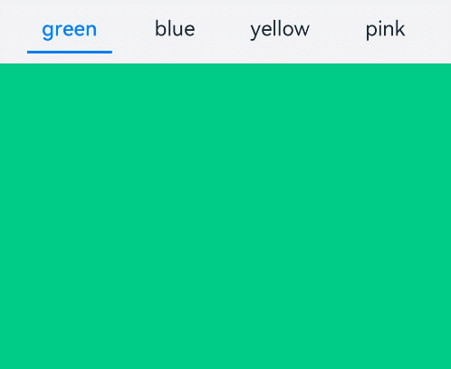
// xxx.ets
@Entry
@Component
struct TabsExample {
  @State fontColor: string = '#182431'
  @State selectedFontColor: string = '#007DFF'
  @State currentIndex: number = 0
  private controller: TabsController = new TabsController()

  @Builder TabBuilder(index: number, name: string) {
    Column() {
      Text(name)
        .fontColor(this.currentIndex === index ? this.selectedFontColor : this.fontColor)
        .fontSize(16)
        .fontWeight(this.currentIndex === index ? 500 : 400)
        .lineHeight(22)
        .margin({ top: 17, bottom: 7 })
      Divider()
        .strokeWidth(2)
        .color('#007DFF')
        .opacity(this.currentIndex === index ? 1 : 0)
    }.width('100%')
  }

  build() {
    Column() {
      Tabs({ barPosition: BarPosition.Start, controller: this.controller }) {
        TabContent() {
          Column().width('100%').height('100%').backgroundColor('#00CB87')
        }.tabBar(this.TabBuilder(0, 'green'))

        TabContent() {
          Column().width('100%').height('100%').backgroundColor('#007DFF')
        }.tabBar(this.TabBuilder(1, 'blue'))

        TabContent() {
          Column().width('100%').height('100%').backgroundColor('#FFBF00')
        }.tabBar(this.TabBuilder(2, 'yellow'))

        TabContent() {
          Column().width('100%').height('100%').backgroundColor('#E67C92')
        }.tabBar(this.TabBuilder(3, 'pink'))
      }
      .vertical(false)
      .barMode(BarMode.Fixed)
      .barWidth(360)
      .barHeight(56)
      .animationDuration(400)
      .onChange((index: number) => {
        this.currentIndex = index
      })
      .width(360)
      .height(296)
      .margin({ top: 52 })
      .backgroundColor('#F1F3F5')
    }.width('100%')
  }
}
示例2
// xxx.ets
@Entry
@Component
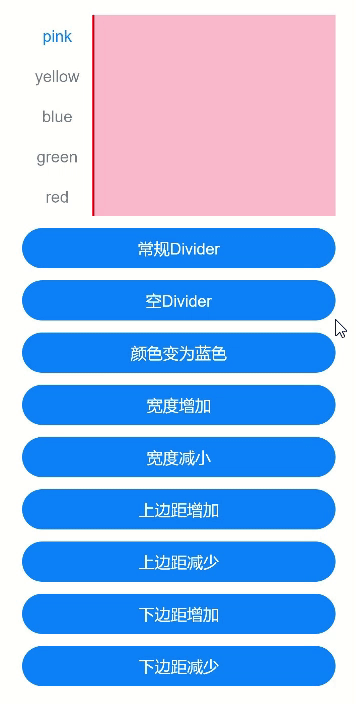
struct TabsDivider1 {
private controller1: TabsController = new TabsController()
@State dividerColor: string = 'red'
@State strokeWidth: number = 2
@State startMargin: number = 0
@State endMargin: number = 0
@State nullFlag: boolean = false
build() {
Column() {
Tabs({ controller: this.controller1 }) {
TabContent() {
Column().width('100%').height('100%').backgroundColor(Color.Pink)
}.tabBar('pink')
TabContent() {
Column().width('100%').height('100%').backgroundColor(Color.Yellow)
}.tabBar('yellow')
TabContent() {
Column().width('100%').height('100%').backgroundColor(Color.Blue)
}.tabBar('blue')
TabContent() {
Column().width('100%').height('100%').backgroundColor(Color.Green)
}.tabBar('green')
TabContent() {
Column().width('100%').height('100%').backgroundColor(Color.Red)
}.tabBar('red')
}
.vertical(true)
.scrollable(true)
.barMode(BarMode.Fixed)
.barWidth(70)
.barHeight(200)
.animationDuration(400)
.onChange((index: number) => {
console.info(index.toString())
})
.height('200vp')
.margin({ bottom: '12vp' })
.divider(this.nullFlag ? null : {
strokeWidth: this.strokeWidth,
color: this.dividerColor,
startMargin: this.startMargin,
endMargin: this.endMargin
})
Button('常规Divider').width('100%').margin({ bottom: '12vp' })
.onClick(() => {
this.nullFlag = false;
this.strokeWidth = 2;
this.dividerColor = 'red';
this.startMargin = 0;
this.endMargin = 0;
})
Button('空Divider').width('100%').margin({ bottom: '12vp' })
.onClick(() => {
this.nullFlag = true
})
Button('颜色变为蓝色').width('100%').margin({ bottom: '12vp' })
.onClick(() => {
this.dividerColor = 'blue'
})
Button('宽度增加').width('100%').margin({ bottom: '12vp' })
.onClick(() => {
this.strokeWidth += 2
})
Button('宽度减小').width('100%').margin({ bottom: '12vp' })
.onClick(() => {
if (this.strokeWidth > 2) {
this.strokeWidth -= 2
}
})
Button('上边距增加').width('100%').margin({ bottom: '12vp' })
.onClick(() => {
this.startMargin += 2
})
Button('上边距减少').width('100%').margin({ bottom: '12vp' })
.onClick(() => {
if (this.startMargin > 2) {
this.startMargin -= 2
}
})
Button('下边距增加').width('100%').margin({ bottom: '12vp' })
.onClick(() => {
this.endMargin += 2
})
Button('下边距减少').width('100%').margin({ bottom: '12vp' })
.onClick(() => {
if (this.endMargin > 2) {
this.endMargin -= 2
}
})
}.padding({ top: '24vp', left: '24vp', right: '24vp' })
}
}
示例3
// xxx.ets
@Entry
@Component
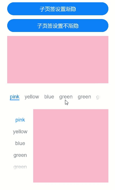
struct TabsOpaque {
@State message: string = 'Hello World'
private controller: TabsController = new TabsController()
private controller1: TabsController = new TabsController()
@State selfFadingFade: boolean = true;
build() {
Column() {
Button('子页签设置渐隐').width('100%').margin({ bottom: '12vp' })
.onClick((event?: ClickEvent) => {
this.selfFadingFade = true;
})
Button('子页签设置不渐隐').width('100%').margin({ bottom: '12vp' })
.onClick((event?: ClickEvent) => {
this.selfFadingFade = false;
})
Tabs({ barPosition: BarPosition.End, controller: this.controller }) {
TabContent() {
Column().width('100%').height('100%').backgroundColor(Color.Pink)
}.tabBar('pink')
TabContent() {
Column().width('100%').height('100%').backgroundColor(Color.Yellow)
}.tabBar('yellow')
TabContent() {
Column().width('100%').height('100%').backgroundColor(Color.Blue)
}.tabBar('blue')
TabContent() {
Column().width('100%').height('100%').backgroundColor(Color.Green)
}.tabBar('green')
TabContent() {
Column().width('100%').height('100%').backgroundColor(Color.Green)
}.tabBar('green')
TabContent() {
Column().width('100%').height('100%').backgroundColor(Color.Green)
}.tabBar('green')
TabContent() {
Column().width('100%').height('100%').backgroundColor(Color.Green)
}.tabBar('green')
TabContent() {
Column().width('100%').height('100%').backgroundColor(Color.Green)
}.tabBar('green')
}
.vertical(false)
.scrollable(true)
.barMode(BarMode.Scrollable)
.barHeight(80)
.animationDuration(400)
.onChange((index: number) => {
console.info(index.toString())
})
.fadingEdge(this.selfFadingFade)
.height('30%')
.width('100%')
Tabs({ barPosition: BarPosition.Start, controller: this.controller1 }) {
TabContent() {
Column().width('100%').height('100%').backgroundColor(Color.Pink)
}.tabBar('pink')
TabContent() {
Column().width('100%').height('100%').backgroundColor(Color.Yellow)
}.tabBar('yellow')
TabContent() {
Column().width('100%').height('100%').backgroundColor(Color.Blue)
}.tabBar('blue')
TabContent() {
Column().width('100%').height('100%').backgroundColor(Color.Green)
}.tabBar('green')
TabContent() {
Column().width('100%').height('100%').backgroundColor(Color.Green)
}.tabBar('green')
TabContent() {
Column().width('100%').height('100%').backgroundColor(Color.Green)
}.tabBar('green')
}
.vertical(true)
.scrollable(true)
.barMode(BarMode.Scrollable)
.barHeight(200)
.barWidth(80)
.animationDuration(400)
.onChange((index: number) => {
console.info(index.toString())
})
.fadingEdge(this.selfFadingFade)
.height('30%')
.width('100%')
}
.padding({ top: '24vp', left: '24vp', right: '24vp' })
}
}
示例4
// xxx.ets
@Entry
@Component
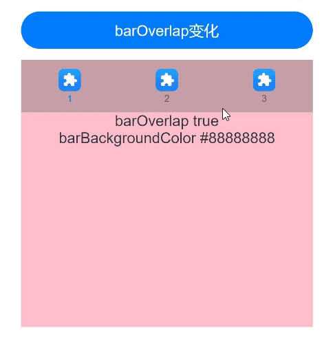
struct barBackgroundColorTest {
private controller: TabsController = new TabsController()
@State barOverlap: boolean = true;
@State barBackgroundColor: string = '#88888888';
build() {
Column() {
Button("barOverlap变化").width('100%').margin({ bottom: '12vp' })
.onClick((event?: ClickEvent) => {
if (this.barOverlap) {
this.barOverlap = false;
} else {
this.barOverlap = true;
}
})
Tabs({ barPosition: BarPosition.Start, index: 0, controller: this.controller }) {
TabContent() {
Column() {
Text(`barOverlap ${this.barOverlap}`).fontSize(16).margin({ top: this.barOverlap ? '56vp' : 0 })
Text(`barBackgroundColor ${this.barBackgroundColor}`).fontSize(16)
}.width('100%').width('100%').height('100%')
.backgroundColor(Color.Pink)
}
.tabBar(new BottomTabBarStyle($r('sys.media.ohos_app_icon'), "1"))
TabContent() {
Column() {
Text(`barOverlap ${this.barOverlap}`).fontSize(16).margin({ top: this.barOverlap ? '56vp' : 0 })
Text(`barBackgroundColor ${this.barBackgroundColor}`).fontSize(16)
}.width('100%').width('100%').height('100%')
.backgroundColor(Color.Yellow)
}
.tabBar(new BottomTabBarStyle($r('sys.media.ohos_app_icon'), "2"))
TabContent() {
Column() {
Text(`barOverlap ${this.barOverlap}`).fontSize(16).margin({ top: this.barOverlap ? '56vp' : 0 })
Text(`barBackgroundColor ${this.barBackgroundColor}`).fontSize(16)
}.width('100%').width('100%').height('100%')
.backgroundColor(Color.Green)
}
.tabBar(new BottomTabBarStyle($r('sys.media.ohos_app_icon'), "3"))
}
.vertical(false)
.barMode(BarMode.Fixed)
.height('60%')
.barOverlap(this.barOverlap)
.scrollable(true)
.animationDuration(10)
.barBackgroundColor(this.barBackgroundColor)
}
.height(500)
.padding({ top: '24vp', left: '24vp', right: '24vp' })
}
}
示例5
// xxx.ets
@Entry
@Component
struct TabsExample5 {
private controller: TabsController = new TabsController()
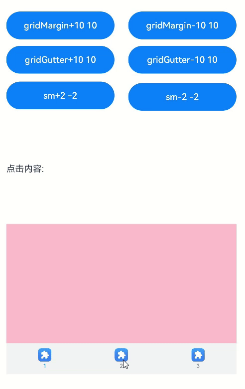
@State gridMargin: number = 10
@State gridGutter: number = 10
@State sm: number = -2
@State clickedContent: string = "";
build() {
Column() {
Row() {
Button("gridMargin+10 " + this.gridMargin)
.width('47%')
.height(50)
.margin({ top: 5 })
.onClick((event?: ClickEvent) => {
this.gridMargin += 10
})
.margin({ right: '6%', bottom: '12vp' })
Button("gridMargin-10 " + this.gridMargin)
.width('47%')
.height(50)
.margin({ top: 5 })
.onClick((event?: ClickEvent) => {
this.gridMargin -= 10
})
.margin({ bottom: '12vp' })
}
Row() {
Button("gridGutter+10 " + this.gridGutter)
.width('47%')
.height(50)
.margin({ top: 5 })
.onClick((event?: ClickEvent) => {
this.gridGutter += 10
})
.margin({ right: '6%', bottom: '12vp' })
Button("gridGutter-10 " + this.gridGutter)
.width('47%')
.height(50)
.margin({ top: 5 })
.onClick((event?: ClickEvent) => {
this.gridGutter -= 10
})
.margin({ bottom: '12vp' })
}
Row() {
Button("sm+2 " + this.sm)
.width('47%')
.height(50)
.margin({ top: 5 })
.onClick((event?: ClickEvent) => {
this.sm += 2
})
.margin({ right: '6%' })
Button("sm-2 " + this.sm).width('47%').height(50).margin({ top: 5 })
.onClick((event?: ClickEvent) => {
this.sm -= 2
})
}
Text("点击内容:" + this.clickedContent).width('100%').height(200).margin({ top: 5 })
Tabs({ barPosition: BarPosition.End, controller: this.controller }) {
TabContent() {
Column().width('100%').height('100%').backgroundColor(Color.Pink)
}.tabBar(BottomTabBarStyle.of($r("sys.media.ohos_app_icon"), "1"))
TabContent() {
Column().width('100%').height('100%').backgroundColor(Color.Green)
}.tabBar(BottomTabBarStyle.of($r("sys.media.ohos_app_icon"), "2"))
TabContent() {
Column().width('100%').height('100%').backgroundColor(Color.Blue)
}.tabBar(BottomTabBarStyle.of($r("sys.media.ohos_app_icon"), "3"))
}
.width('350vp')
.animationDuration(300)
.height('60%')
.barGridAlign({ sm: this.sm, margin: this.gridMargin, gutter: this.gridGutter })
.backgroundColor(0xf1f3f5)
.onTabBarClick((index: number) => {
this.clickedContent += "now index " + index + " is clicked\n";
})
}
.width('100%')
.height(500)
.margin({ top: 5 })
.padding('10vp')
}
}
示例6
// xxx.ets
@Entry
@Component
struct TabsExample6 {
private controller: TabsController = new TabsController()
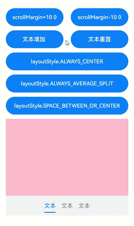
@State scrollMargin: number = 0
@State layoutStyle: LayoutStyle = LayoutStyle.ALWAYS_CENTER
@State text: string = "文本"
build() {
Column() {
Row() {
Button("scrollMargin+10 " + this.scrollMargin)
.width('47%')
.height(50)
.margin({ top: 5 })
.onClick((event?: ClickEvent) => {
this.scrollMargin += 10
})
.margin({ right: '6%', bottom: '12vp' })
Button("scrollMargin-10 " + this.scrollMargin)
.width('47%')
.height(50)
.margin({ top: 5 })
.onClick((event?: ClickEvent) => {
this.scrollMargin -= 10
})
.margin({ bottom: '12vp' })
}
Row() {
Button("文本增加 ")
.width('47%')
.height(50)
.margin({ top: 5 })
.onClick((event?: ClickEvent) => {
this.text += '文本增加'
})
.margin({ right: '6%', bottom: '12vp' })
Button("文本重置")
.width('47%')
.height(50)
.margin({ top: 5 })
.onClick((event?: ClickEvent) => {
this.text = "文本"
})
.margin({ bottom: '12vp' })
}
Row() {
Button("layoutStyle.ALWAYS_CENTER")
.width('100%')
.height(50)
.margin({ top: 5 })
.fontSize(15)
.onClick((event?: ClickEvent) => {
this.layoutStyle = LayoutStyle.ALWAYS_CENTER;
})
.margin({ bottom: '12vp' })
}
Row() {
Button("layoutStyle.ALWAYS_AVERAGE_SPLIT")
.width('100%')
.height(50)
.margin({ top: 5 })
.fontSize(15)
.onClick((event?: ClickEvent) => {
this.layoutStyle = LayoutStyle.ALWAYS_AVERAGE_SPLIT;
})
.margin({ bottom: '12vp' })
}
Row() {
Button("layoutStyle.SPACE_BETWEEN_OR_CENTER")
.width('100%')
.height(50)
.margin({ top: 5 })
.fontSize(15)
.onClick((event?: ClickEvent) => {
this.layoutStyle = LayoutStyle.SPACE_BETWEEN_OR_CENTER;
})
.margin({ bottom: '12vp' })
}
Tabs({ barPosition: BarPosition.End, controller: this.controller }) {
TabContent() {
Column().width('100%').height('100%').backgroundColor(Color.Pink)
}.tabBar(SubTabBarStyle.of(this.text))
TabContent() {
Column().width('100%').height('100%').backgroundColor(Color.Green)
}.tabBar(SubTabBarStyle.of(this.text))
TabContent() {
Column().width('100%').height('100%').backgroundColor(Color.Blue)
}.tabBar(SubTabBarStyle.of(this.text))
}
.animationDuration(300)
.height('60%')
.backgroundColor(0xf1f3f5)
.barMode(BarMode.Scrollable, { margin: this.scrollMargin, nonScrollableLayoutStyle: this.layoutStyle })
}
.width('100%')
.height(500)
.margin({ top: 5 })
.padding('24vp')
}
}
你可能感兴趣的鸿蒙文章
harmony 鸿蒙@ohos.arkui.advanced.Counter(计数器组件)
harmony 鸿蒙@ohos.arkui.advanced.SegmentButton(分段按钮)
0
赞
热门推荐
-
2、 优质文章
-
3、 gt
-
7、 openharmony
-
9、 golang
-
10、 Vue中input框自动聚焦