harmony 鸿蒙Popup控制
Popup控制
给组件绑定popup弹窗,并设置弹窗内容,交互逻辑和显示状态。
说明:
从API Version 7开始支持。后续版本如有新增内容,则采用上角标单独标记该内容的起始版本。
接口
| 名称 | 参数类型 | 描述 |
|---|---|---|
| bindPopup | show: boolean, popup: PopupOptions | CustomPopupOptions8+ |
给组件绑定Popup弹窗,设置参数show为true弹出弹框。 show: 弹窗显示状态,默认值为false,隐藏弹窗。popup弹窗必须等待页面全部构建完成才能展示,因此show不能在页面构建中设置为true,否则会导致popup弹窗显示位置及形状错误。 popup: 配置当前弹窗提示的参数。 |
PopupOptions类型说明
| 名称 | 类型 | 必填 | 描述 |
|---|---|---|---|
| message | string | 是 | 弹窗信息内容。 |
| placementOnTop(deprecated) | boolean | 否 | 是否在组件上方显示,默认值为false。 说明: 从 API version 10 开始废弃,建议使用 placement替代。 |
| primaryButton | { value: string, action: () => void } |
否 | 第一个按钮。 value: 弹窗里主按钮的文本。 action: 点击主按钮的回调函数。 |
| secondaryButton | { value: string, action: () => void } |
否 | 第二个按钮。 value: 弹窗里辅助按钮的文本。 action: 点击辅助按钮的回调函数。 |
| onStateChange | (event: { isVisible: boolean }) => void | 否 | 弹窗状态变化事件回调,参数isVisible为弹窗当前的显示状态。 |
| arrowOffset9+ | Length | 否 | popup箭头在弹窗处的偏移。箭头在气泡上下方时,数值为0表示箭头居最左侧,偏移量为箭头至最左侧的距离,默认居中。箭头在气泡左右侧时,偏移量为箭头至最上侧的距离,默认居中。如果显示在屏幕边缘,气泡会自动左右偏移,数值为0时箭头始终指向绑定组件。 |
| showInSubWindow9+ | boolean | 否 | 是否在子窗口显示气泡,默认值为false。 |
| mask10+ | boolean | ResourceColor | 否 | 设置气泡是否有遮罩层及遮罩颜色。如果设置为false,则没有遮罩层;如果设置为true,则设置有遮罩层并且颜色为透明色;如果设置为Color,则为遮罩层的颜色。 |
| messageOptions10+ | PopupMessageOptions | 否 | 设置弹窗信息文本参数。 |
| targetSpace10+ | Length | 否 | 设置popup与目标的间隙。 |
| placement10+ | Placement | 否 | 设置popup组件相对于目标的显示位置,默认值为Placement.Bottom。 如果同时设置了 placementOnTop和placement,则以placement的设置生效。 |
| offset10+ | Position | 否 | 设置popup组件相对于placement设置的显示位置的偏移。 说明: 不支持设置百分比。 |
| enableArrow10+ | boolean | 否 | 设置是否显示箭头。 默认值:true |
PopupMessageOptions10+类型说明
| 名称 | 类型 | 必填 | 描述 |
|---|---|---|---|
| textColor | ResourceColor | 否 | 设置弹窗信息文本颜色。 |
| font | Font | 否 | 设置弹窗信息字体属性。 |
CustomPopupOptions8+类型说明
| 名称 | 类型 | 必填 | 描述 |
|---|---|---|---|
| builder | CustomBuilder | 是 | 提示气泡内容的构造器。 说明: popup为通用属性,自定义popup中不支持再次弹出popup。对builder下的第一层容器组件不支持使用position属性,如果使用将导致气泡不显示。 |
| placement | Placement | 否 | 气泡组件优先显示的位置,当前位置显示不下时,会自动调整位置。 默认值:Placement.Bottom |
| popupColor | ResourceColor | 否 | 提示气泡的颜色。 默认值:’#4d4d4d’ |
| enableArrow | boolean | 否 | 是否显示箭头。 从API Version 9开始,如果箭头所在方位侧的气泡长度不足以显示下箭头,则会默认不显示箭头。比如:placement设置为Left,此时如果气泡高度小于箭头的宽度(32vp)与气泡圆角两倍(48vp)之和(80vp),则实际不会显示箭头。 默认值:true |
| autoCancel | boolean | 否 | 页面有操作时,是否自动关闭气泡。 默认值:true |
| onStateChange | (event: { isVisible: boolean }) => void | 否 | 弹窗状态变化事件回调,参数为弹窗当前的显示状态。 |
| arrowOffset9+ | Length | 否 | popup箭头在弹窗处的偏移。箭头在气泡上下方时,数值为0表示箭头居最左侧,偏移量为箭头至最左侧的距离,默认居中。箭头在气泡左右侧时,偏移量为箭头至最上侧的距离,默认居中。如果显示在屏幕边缘,气泡会自动左右偏移,数值为0时箭头始终指向绑定组件。 |
| showInSubWindow9+ | boolean | 否 | 是否在子窗口显示气泡,默认值为false。 |
| maskColor(deprecated) | ResourceColor | 否 | 设置气泡遮罩层颜色。 说明: 从 API version 10 开始废弃,建议使用 mask替代。 |
| mask10+ | boolean | ResourceColor | 否 | 设置气泡是否有遮罩层及遮罩颜色。如果设置为false,则没有遮罩层;如果设置为true,则设置有遮罩层并且颜色为透明色;如果设置为Color,则为遮罩层的颜色。 |
| targetSpace10+ | Length | 否 | 设置popup与目标的间隙。 |
| offset10+ | Position | 否 | 设置popup组件相对于placement设置的显示位置的偏移。 说明: 不支持设置百分比。 |
示例
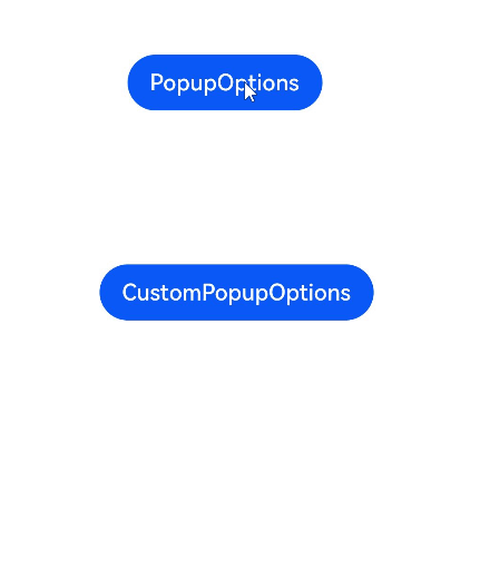
示例1
// xxx.ets
@Entry
@Component
struct PopupExample {
  @State handlePopup: boolean = false
  @State customPopup: boolean = false

  // popup构造器定义弹框内容
  @Builder popupBuilder() {
    Row({ space: 2 }) {
      Image($r("app.media.image")).width(24).height(24).margin({ left: -5 })
      Text('Custom Popup').fontSize(10)
    }.width(100).height(50).padding(5)
  }

  build() {
    Flex({ direction: FlexDirection.Column }) {
      // PopupOptions 类型设置弹框内容
      Button('PopupOptions')
        .onClick(() => {
          this.handlePopup = !this.handlePopup
        })
        .bindPopup(this.handlePopup, {
          message: 'This is a popup with PopupOptions',
          placementOnTop: true,
          showInSubWindow:false,
          primaryButton: {
            value: 'confirm',
            action: () => {
              this.handlePopup = !this.handlePopup
              console.info('confirm Button click')
            }
          },
          // 第二个按钮
          secondaryButton: {
            value: 'cancel',
            action: () => {
              this.handlePopup = !this.handlePopup
              console.info('cancel Button click')
            }
          },
          onStateChange: (e) => {
            console.info(JSON.stringify(e.isVisible))
            if (!e.isVisible) {
              this.handlePopup = false
            }
          }
        })
        .position({ x: 100, y: 50 })


      // CustomPopupOptions 类型设置弹框内容
      Button('CustomPopupOptions')
        .onClick(() => {
          this.customPopup = !this.customPopup
        })
        .bindPopup(this.customPopup, {
          builder: this.popupBuilder,
          placement: Placement.Top,
          mask: {color:'0x33000000'},
          popupColor: Color.Yellow,
          enableArrow: true,
          showInSubWindow: false,
          onStateChange: (e) => {
            if (!e.isVisible) {
              this.customPopup = false
            }
          }
        })
        .position({ x: 80, y: 200 })
    }.width('100%').padding({ top: 5 })
  }
}
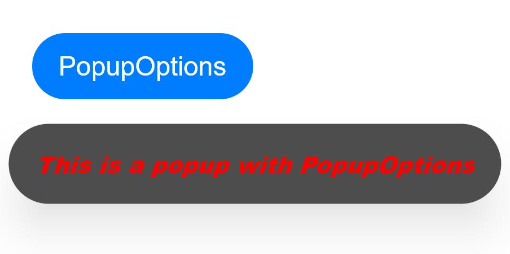
示例2
// xxx.ets
@Entry
@Component
struct PopupExample {
  @State handlePopup: boolean = false

  build() {
    Column() {
      Button('PopupOptions')
        .onClick(() => {
          this.handlePopup = !this.handlePopup
        })
        .bindPopup(this.handlePopup, {
          message: 'This is a popup with PopupOptions',
          messageOptions: {
            textColor: Color.Red,
            font: {
              size: '14vp',
              style: FontStyle.Italic,
              weight: FontWeight.Bolder
            }
          },
          placement: Placement.Bottom,
          enableArrow: false,
          targetSpace: '15vp',
          onStateChange: (e) => {
            console.info(JSON.stringify(e.isVisible))
            if (!e.isVisible) {
              this.handlePopup = false
            }
          }
        })
    }.margin(20)
  }
}
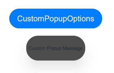
示例3
// xxx.ets
@Entry
@Component
struct PopupExample {
  @State customPopup: boolean = false

  // popup构造器定义弹框内容
  @Builder popupBuilder() {
    Row() {
      Text('Custom Popup Message').fontSize(10)
    }.height(50).padding(5)
  }

  build() {
    Column() {
      // CustomPopupOptions 类型设置弹框内容
      Button('CustomPopupOptions')
        .onClick(() => {
          this.customPopup = !this.customPopup
        })
        .bindPopup(this.customPopup, {
          builder: this.popupBuilder,
          targetSpace: '15vp',
          enableArrow: false,
          onStateChange: (e) => {
            if (!e.isVisible) {
              this.customPopup = false
            }
          }
        })
    }.margin(20)
  }
}
你可能感兴趣的鸿蒙文章
harmony 鸿蒙@ohos.arkui.advanced.Counter(计数器组件)
harmony 鸿蒙@ohos.arkui.advanced.SegmentButton(分段按钮)
0
赞
热门推荐
-
2、 优质文章
-
3、 gt
-
7、 openharmony
-
9、 golang
-
10、 Vue中input框自动聚焦