harmony 鸿蒙前景色设置
前景色设置
设置组件的前景色。
说明:
从API Version 10开始支持。后续版本如有新增内容,则采用上角标单独标记该内容的起始版本。
属性
| 名称 | 参数类型 | 描述 |
|---|---|---|
| foregroundColor | ResourceColor | ColoringStrategy | 设置组件的前景颜色或者根据智能取色策略设置前景颜色。 |
示例
示例1
// xxx.ets
@Entry
@Component
struct ForegroundColorExample {
build() {
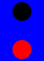
Column({ space: 100 }) {
// 绘制一个直径为150的圆,默认填充色为黑色
Circle({ width: 150, height: 200 })
// 绘制一个直径为150的圆,
Circle({ width: 150, height: 200 }).foregroundColor(Color.Red)
}.width('100%').backgroundColor(Color.Blue)
}
}
示例2
// xxx.ets
@Entry
@Component
struct ColoringStrategyExample {
build() {
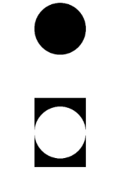
Column({ space: 100 }) {
// 绘制一个直径为150的圆,默认填充色为黑色
Circle({ width: 150, height: 200 })
// 绘制一个直径为150的圆,设置前景色为组件背景色的反色
Circle({ width: 150, height: 200 })
.backgroundColor(Color.Black)
.foregroundColor(ColoringStrategy.INVERT)
}.width('100%')
}
}
示例3
// xxx.ets
@Entry
@Component
struct foregroundColorInherit {
  build() {
    Column() {
      Button('设置前景色为橘色').fontSize(20).foregroundColor(Color.Orange).backgroundColor(Color.Gray)
      Divider()
      Button('未设置前景色继承自父组件').fontSize(20).backgroundColor(Color.Gray)
    }.foregroundColor(Color.Red)
  }
}

你可能感兴趣的鸿蒙文章
harmony 鸿蒙@ohos.arkui.advanced.Counter(计数器组件)
harmony 鸿蒙@ohos.arkui.advanced.SegmentButton(分段按钮)
0
赞
- 所属分类: 后端技术
- 本文标签:
热门推荐
-
2、 优质文章
-
3、 gt
-
7、 openharmony
-
9、 golang
-
10、 Vue中input框自动聚焦