harmony 鸿蒙Column
Column
沿垂直方向布局的容器。
说明:
该组件从API Version 7开始支持。后续版本如有新增内容,则采用上角标单独标记该内容的起始版本。
子组件
可以包含子组件。
接口
Column(value?: {space?: string | number})
从API version 9开始,该接口支持在ArkTS卡片中使用。
参数:
| 参数名 | 参数类型 | 必填 | 参数描述 |
|---|---|---|---|
| space | string | number | 否 | 纵向布局元素垂直方向间距。 从API version 9开始,space为负数或者justifyContent设置为FlexAlign.SpaceBetween、FlexAlign.SpaceAround、FlexAlign.SpaceEvenly时不生效。 默认值:0 说明: 可选值为大于等于0的数字,或者可以转换为数字的字符串。 |
属性
除支持通用属性外,还支持以下属性:
| 名称 | 参数类型 | 描述 |
|---|---|---|
| alignItems | HorizontalAlign | 设置子组件在水平方向上的对齐格式。 默认值:HorizontalAlign.Center 从API version 9开始,该接口支持在ArkTS卡片中使用。 |
| justifyContent8+ | FlexAlign | 设置子组件在垂直方向上的对齐格式。 默认值:FlexAlign.Start 从API version 9开始,该接口支持在ArkTS卡片中使用。 |
说明:
Column布局时若子组件不设置flexShrink则默认不会压缩子组件,即所有子组件主轴大小累加可超过容器主轴。
事件
支持通用事件。
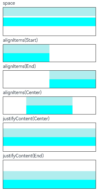
示例
// xxx.ets
@Entry
@Component
struct ColumnExample {
  build() {
    Column({ space: 5 }) {
      // 设置子元素垂直方向间距为5
      Text('space').width('90%')
      Column({ space: 5 }) {
        Column().width('100%').height(30).backgroundColor(0xAFEEEE)
        Column().width('100%').height(30).backgroundColor(0x00FFFF)
      }.width('90%').height(100).border({ width: 1 })

      // 设置子元素水平方向对齐方式
      Text('alignItems(Start)').width('90%')
      Column() {
        Column().width('50%').height(30).backgroundColor(0xAFEEEE)
        Column().width('50%').height(30).backgroundColor(0x00FFFF)
      }.alignItems(HorizontalAlign.Start).width('90%').border({ width: 1 })

      Text('alignItems(End)').width('90%')
      Column() {
        Column().width('50%').height(30).backgroundColor(0xAFEEEE)
        Column().width('50%').height(30).backgroundColor(0x00FFFF)
      }.alignItems(HorizontalAlign.End).width('90%').border({ width: 1 })

      Text('alignItems(Center)').width('90%')
      Column() {
        Column().width('50%').height(30).backgroundColor(0xAFEEEE)
        Column().width('50%').height(30).backgroundColor(0x00FFFF)
      }.alignItems(HorizontalAlign.Center).width('90%').border({ width: 1 })

      // 设置子元素垂直方向的对齐方式
      Text('justifyContent(Center)').width('90%')
      Column() {
        Column().width('90%').height(30).backgroundColor(0xAFEEEE)
        Column().width('90%').height(30).backgroundColor(0x00FFFF)
      }.height(100).border({ width: 1 }).justifyContent(FlexAlign.Center)

      Text('justifyContent(End)').width('90%')
      Column() {
        Column().width('90%').height(30).backgroundColor(0xAFEEEE)
        Column().width('90%').height(30).backgroundColor(0x00FFFF)
      }.height(100).border({ width: 1 }).justifyContent(FlexAlign.End)
    }.width('100%').padding({ top: 5 })
  }
}
你可能感兴趣的鸿蒙文章
harmony 鸿蒙@ohos.arkui.advanced.Counter(计数器组件)
harmony 鸿蒙@ohos.arkui.advanced.SegmentButton(分段按钮)
0
赞
热门推荐
-
2、 优质文章
-
3、 gt
-
7、 openharmony
-
9、 golang
-
10、 Vue中input框自动聚焦