harmony 鸿蒙Button
Button
按钮组件,可快速创建不同样式的按钮。
说明:
该组件从API version 7开始支持。后续版本如有新增内容,则采用上角标单独标记该内容的起始版本。
子组件
可以包含单个子组件。
接口
Button
Button(options: ButtonOptions)
创建可以包含单个子组件的按钮。
卡片能力: 从API version 9开始,该接口支持在ArkTS卡片中使用。
原子化服务API: 从API version 11开始,该接口支持在原子化服务中使用。
系统能力: SystemCapability.ArkUI.ArkUI.Full
参数:
| 参数名 | 类型 | 必填 | 说明 |
|---|---|---|---|
| options | ButtonOptions | 是 | 配置按钮的显示样式。 |
Button
Button(label: ResourceStr, options?: ButtonOptions)
使用文本内容创建相应的按钮组件,此时Button无法包含子组件。
文本内容默认单行显示。
卡片能力: 从API version 9开始,该接口支持在ArkTS卡片中使用。
原子化服务API: 从API version 11开始,该接口支持在原子化服务中使用。
系统能力: SystemCapability.ArkUI.ArkUI.Full
参数:
| 参数名 | 类型 | 必填 | 说明 |
|---|---|---|---|
| label | ResourceStr | 是 | 按钮文本内容。 说明: 当文本字符的长度超过按钮本身的宽度时,文本将会被截断。 |
| options | ButtonOptions | 否 | 配置按钮的显示样式。 |
Button
Button()
创建一个空按钮。
卡片能力: 从API version 9开始,该接口支持在ArkTS卡片中使用。
原子化服务API: 从API version 11开始,该接口支持在原子化服务中使用。
系统能力: SystemCapability.ArkUI.ArkUI.Full
ButtonOptions对象说明
按钮的样式。
系统能力: SystemCapability.ArkUI.ArkUI.Full
| 名称 | 类型 | 必填 | 说明 |
|---|---|---|---|
| type | ButtonType | 否 | 描述按钮显示样式。 默认值:ButtonType.ROUNDED_RECTANGLE。从API version 18及之后,ButtonType的默认值修改为ButtonType.ROUNDED_RECTANGLE。API version 18之前的版本,ButtonType的默认值为ButtonType.Capsule。 卡片能力: 从API version 9开始,该接口支持在ArkTS卡片中使用。 原子化服务API: 从API version 11开始,该接口支持在原子化服务中使用。 |
| stateEffect | boolean | 否 | 按钮按下时是否开启按压态显示效果,当设置为false时,按压效果关闭。设置为true时,开启按压效果。 默认值:true 说明: 当开启按压态显示效果,开发者设置状态样式时,会基于状态样式设置完成后的背景色再进行颜色叠加。 卡片能力: 从API version 9开始,该接口支持在ArkTS卡片中使用。 原子化服务API: 从API version 11开始,该接口支持在原子化服务中使用。 |
| buttonStyle11+ | ButtonStyleMode | 否 | 描述按钮的样式和重要程度。 默认值:ButtonStyleMode.EMPHASIZED 说明: 按钮重要程度:强调按钮>普通按钮>文字按钮。 卡片能力: 从API version 11开始,该接口支持在ArkTS卡片中使用。 原子化服务API: 从API version 12开始,该接口支持在原子化服务中使用。 |
| controlSize11+ | ControlSize | 否 | 描述按钮的尺寸。 默认值:ControlSize.NORMAL 卡片能力: 从API version 11开始,该接口支持在ArkTS卡片中使用。 原子化服务API: 从API version 12开始,该接口支持在原子化服务中使用。 |
| role12+ | ButtonRole | 否 | 描述按钮的角色。 默认值:ButtonRole.NORMAL 卡片能力: 从API version 12开始,该接口支持在ArkTS卡片中使用。 原子化服务API: 从API version 12开始,该接口支持在原子化服务中使用。 |
属性
除支持通用属性外,还支持以下属性:
type
type(value: ButtonType)
设置Button样式。
卡片能力: 从API version 9开始,该接口支持在ArkTS卡片中使用。
原子化服务API: 从API version 11开始,该接口支持在原子化服务中使用。
系统能力: SystemCapability.ArkUI.ArkUI.Full
参数:
| 参数名 | 类型 | 必填 | 说明 |
|---|---|---|---|
| value | ButtonType | 是 | Button样式。 从API version 18及之后,ButtonType的默认值修改为ButtonType.ROUNDED_RECTANGLE。API version 18之前的版本,ButtonType的默认值为ButtonType.Capsule。 |
fontSize
fontSize(value: Length)
设置文本显示字号。
卡片能力: 从API version 9开始,该接口支持在ArkTS卡片中使用。
原子化服务API: 从API version 11开始,该接口支持在原子化服务中使用。
系统能力: SystemCapability.ArkUI.ArkUI.Full
参数:
| 参数名 | 类型 | 必填 | 说明 |
|---|---|---|---|
| value | Length | 是 | 文本显示字号。 默认值:当controlSize为ControlSize.NORMAL时,默认值为 $r('sys.float.Body_L')。当controlSize为ControlSize.SMALL时,默认值为 $r('sys.float.Body_S')。说明:设置string类型时,不支持百分比。 |
fontColor
fontColor(value: ResourceColor)
设置文本显示颜色。
卡片能力: 从API version 9开始,该接口支持在ArkTS卡片中使用。
原子化服务API: 从API version 11开始,该接口支持在原子化服务中使用。
系统能力: SystemCapability.ArkUI.ArkUI.Full
参数:
| 参数名 | 类型 | 必填 | 说明 |
|---|---|---|---|
| value | ResourceColor | 是 | 文本显示颜色。 默认值:$r(‘sys.color.font_on_primary’),显示为白色字体。 |
fontWeight
fontWeight(value: number | FontWeight | string)
设置文本的字体粗细。
卡片能力: 从API version 9开始,该接口支持在ArkTS卡片中使用。
原子化服务API: 从API version 11开始,该接口支持在原子化服务中使用。
系统能力: SystemCapability.ArkUI.ArkUI.Full
参数:
| 参数名 | 类型 | 必填 | 说明 |
|---|---|---|---|
| value | number | FontWeight | string | 是 | 文本的字体粗细,number类型取值[100, 900],取值间隔为100,取值越大,字体越粗。 默认值:500 string类型仅支持number类型取值的字符串形式,例如’400’,以及’bold’、’bolder’、’lighter’、’regular’、’medium’,分别对应FontWeight中相应的枚举值。 当值为异常值或非法值时,字体粗细取值为400。 |
fontStyle8+
fontStyle(value: FontStyle)
设置文本的字体样式。
卡片能力: 从API version 9开始,该接口支持在ArkTS卡片中使用。
原子化服务API: 从API version 11开始,该接口支持在原子化服务中使用。
系统能力: SystemCapability.ArkUI.ArkUI.Full
参数:
| 参数名 | 类型 | 必填 | 说明 |
|---|---|---|---|
| value | FontStyle | 是 | 文本的字体样式。 默认值:FontStyle.Normal。 |
stateEffect
stateEffect(value: boolean)
设置是否开启按压态显示效果。
卡片能力: 从API version 9开始,该接口支持在ArkTS卡片中使用。
原子化服务API: 从API version 11开始,该接口支持在原子化服务中使用。
系统能力: SystemCapability.ArkUI.ArkUI.Full
参数:
| 参数名 | 类型 | 必填 | 说明 |
|---|---|---|---|
| value | boolean | 是 | 按钮按下时是否开启按压态显示效果,当设置为false时,按压效果关闭。设置为true时,开启按压效果。 默认值:true |
说明:
使用多态样式设置按压态时,需优先设置stateEffect为false,防止内置按压态与多态样式按压态冲突。
fontFamily8+
fontFamily(value: string|Resource)
设置字体列表。
卡片能力: 从API version 9开始,该接口支持在ArkTS卡片中使用。
原子化服务API: 从API version 11开始,该接口支持在原子化服务中使用。
系统能力: SystemCapability.ArkUI.ArkUI.Full
参数:
| 参数名 | 类型 | 必填 | 说明 |
|---|---|---|---|
| value | string | Resource | 是 | 字体列表。默认字体’HarmonyOS Sans’,当前支持’HarmonyOS Sans’字体和注册自定义字体。 |
labelStyle10+
labelStyle(value: LabelStyle)
设置Button组件label文本和字体的样式。
原子化服务API: 从API version 11开始,该接口支持在原子化服务中使用
系统能力: SystemCapability.ArkUI.ArkUI.Full
参数:
| 参数名 | 类型 | 必填 | 说明 |
|---|---|---|---|
| value | LabelStyle | 是 | Button组件label文本和字体的样式。 |
buttonStyle11+
buttonStyle(value: ButtonStyleMode)
设置Button组件的样式和重要程度。
卡片能力: 从API version 11开始,该接口支持在ArkTS卡片中使用。
原子化服务API: 从API version 12开始,该接口支持在原子化服务中使用。
系统能力: SystemCapability.ArkUI.ArkUI.Full
参数:
| 参数名 | 类型 | 必填 | 说明 |
|---|---|---|---|
| value | ButtonStyleMode | 是 | Button组件的样式和重要程度。 默认值:ButtonStyleMode.EMPHASIZED |
controlSize11+
controlSize(value: ControlSize)
设置Button组件的尺寸。
卡片能力: 从API version 11开始,该接口支持在ArkTS卡片中使用。
原子化服务API: 从API version 12开始,该接口支持在原子化服务中使用。
系统能力: SystemCapability.ArkUI.ArkUI.Full
参数:
| 参数名 | 类型 | 必填 | 说明 |
|---|---|---|---|
| value | ControlSize | 是 | Button组件的尺寸。 默认值:ControlSize.NORMAL |
role12+
role(value: ButtonRole)
设置Button组件的角色。
卡片能力: 从API version 12开始,该接口支持在ArkTS卡片中使用。
原子化服务API: 从API version 12开始,该接口支持在原子化服务中使用。
系统能力: SystemCapability.ArkUI.ArkUI.Full
参数:
| 参数名 | 类型 | 必填 | 说明 |
|---|---|---|---|
| value | ButtonRole | 是 | 设置Button组件的角色。 默认值:ButtonRole.NORMAL |
contentModifier12+
contentModifier(modifier: ContentModifier<ButtonConfiguration>)
定制Button内容区的方法。
原子化服务API: 从API version 12开始,该接口支持在原子化服务中使用。
系统能力: SystemCapability.ArkUI.ArkUI.Full
参数:
| 参数名 | 类型 | 必填 | 说明 |
|---|---|---|---|
| modifier | ContentModifier<ButtonConfiguration> | 是 | 在Button组件上,定制内容区的方法。 modifier:内容修改器,开发者需要自定义class实现ContentModifier接口。 |
minFontScale18+
minFontScale(scale: number|Resource)
设置文本最小的字体缩放倍数。
原子化服务API: 从API version 18开始,该接口支持在原子化服务中使用。
系统能力: SystemCapability.ArkUI.ArkUI.Full
参数:
| 参数名 | 类型 | 必填 | 说明 |
|---|---|---|---|
| scale | number |Resource | 是 | 文本最小的字体缩放倍数。 取值范围:[0, 1] 说明: 设置的值小于0时,按值为0处理,设置的值大于1,按值为1处理,异常值默认不生效。 |
maxFontScale18+
maxFontScale(scale: number|Resource)
设置文本最大的字体缩放倍数。
原子化服务API: 从API version 18开始,该接口支持在原子化服务中使用。
系统能力: SystemCapability.ArkUI.ArkUI.Full
参数:
| 参数名 | 类型 | 必填 | 说明 |
|---|---|---|---|
| scale | number |Resource | 是 | 文本最大的字体缩放倍数。 取值范围:[1, +∞) 说明: 设置的值小于1时,按值为1处理,异常值默认不生效。 未设置最大缩放倍数时,圆形按钮最大缩放倍数为1倍,胶囊型按钮、普通按钮、圆角矩形按钮最大缩放倍数跟随系统设置。 |
ButtonType枚举说明
按钮的类型。
系统能力: SystemCapability.ArkUI.ArkUI.Full
| 名称 | 说明 |
|---|---|
| Capsule | 胶囊型按钮(圆角默认为高度的一半)。 卡片能力: 从API version 9开始,该接口支持在ArkTS卡片中使用。 原子化服务API: 从API version 11开始,该接口支持在原子化服务中使用。 |
| Circle | 圆形按钮。 卡片能力: 从API version 9开始,该接口支持在ArkTS卡片中使用。 原子化服务API: 从API version 11开始,该接口支持在原子化服务中使用。 |
| Normal | 普通按钮(默认不带圆角)。 卡片能力: 从API version 9开始,该接口支持在ArkTS卡片中使用。 原子化服务API: 从API version 11开始,该接口支持在原子化服务中使用。 |
| ROUNDED_RECTANGLE15+ | 圆角矩形按钮(默认值:controlSize为NORMAL,圆角大小20vp,controlSize为SMALL,圆角大小14vp)。 卡片能力: 从API version 15开始,该接口支持在ArkTS卡片中使用。 原子化服务API: 从API version 15开始,该接口支持在原子化服务中使用。 |
说明: - 按钮圆角通过通用属性borderRadius设置。 - 当按钮类型为Capsule时,borderRadius设置不生效,按钮圆角始终为宽、高中较小值的一半。 - 当按钮类型为Circle时,若同时设置了宽和高,则borderRadius不生效,且按钮半径为宽高中较小值的一半;若只设置宽、高中的一个,则borderRadius不生效,且按钮半径为所设宽或所设高值的一半;若不设置宽高,则borderRadius为按钮半径;若borderRadius的值为负,则borderRadius的值按照0处理。 - 按钮文本通过fontSize、fontColor、fontStyle、fontFamily、fontWeight进行设置。 - 设置颜色渐变需先设置backgroundColor为透明色。 - 在不设置borderRadius时,圆角矩形按钮的圆角大小保持默认值不变。圆角大小不会随按钮高度变化而变化,和controlSize属性有关,controlSize为NORMAL时圆角大小20vp,controlSize为SMALL时圆角大小14vp。
LabelStyle10+对象说明
按钮中文本的显示样式。
原子化服务API: 从API version 11开始,该接口支持在原子化服务中使用
系统能力: SystemCapability.ArkUI.ArkUI.Full
| 名称 | 类型 | 必填 | 说明 |
|---|---|---|---|
| overflow | TextOverflow | 否 | 设置label文本超长时的显示方式。文本截断是按字截断。例如,英文以单词为最小单位进行截断,若需要以字母为单位进行截断,可在字母间添加零宽空格。 默认值:TextOverflow.Ellipsis |
| maxLines | number | 否 | 设置label文本的最大行数。如果指定此参数,则文本最多不会超过指定的行。如果有多余的文本,可以通过overflow来指定截断方式。 默认值:1 |
| minFontSize | number |ResourceStr | 否 | 设置label文本最小显示字号。需配合maxFontSize以及maxLines或布局大小限制使用。 说明: minFontSize小于或等于0时,自适应字号不生效。 |
| maxFontSize | number |ResourceStr | 否 | 设置label文本最大显示字号。需配合minFontSize以及maxLines或布局大小限制使用。 |
| heightAdaptivePolicy | TextHeightAdaptivePolicy | 否 | 设置label文本自适应高度的方式。 默认值:TextHeightAdaptivePolicy.MAX_LINES_FIRST。 |
| font | Font | 否 | 设置label文本字体样式。 默认值:默认值参考Font。 |
ButtonStyleMode11+枚举说明
按钮的重要程度。
卡片能力: 从API version 11开始,该接口支持在ArkTS卡片中使用。
原子化服务API: 从API version 12开始,该接口支持在原子化服务中使用。
系统能力: SystemCapability.ArkUI.ArkUI.Full
|名称 |值|说明 | |——-|–|——————| |NORMAL|0|普通按钮(一般界面操作)。 | |EMPHASIZED|1|强调按钮(用于强调当前操作)。| |TEXTUAL|2|文本按钮(纯文本,无背景颜色)。 |
ControlSize11+枚举说明
按钮的尺寸。
卡片能力: 从API version 11开始,该接口支持在ArkTS卡片中使用。
原子化服务API: 从API version 12开始,该接口支持在原子化服务中使用。
系统能力: SystemCapability.ArkUI.ArkUI.Full
|名称 |值|说明 | |——-|–|——————| |SMALL|“small”|小尺寸按钮。| |NORMAL|“normal”|正常尺寸按钮。 |
ButtonRole12+枚举说明
按钮的角色。
卡片能力: 从API version 12开始,该接口支持在ArkTS卡片中使用。
原子化服务API: 从API version 12开始,该接口支持在原子化服务中使用。
系统能力: SystemCapability.ArkUI.ArkUI.Full
|名称 |值|说明 | |——-|–|——————| |NORMAL|0|正常按钮。| |ERROR|1|警示按钮。 |
ButtonConfiguration12+对象说明
开发者需要自定义class实现ContentModifier接口。
原子化服务API: 从API version 12开始,该接口支持在原子化服务中使用。
系统能力: SystemCapability.ArkUI.ArkUI.Full
| 名称 | 类型 | 只读 | 可选 | 说明 |
|---|---|---|---|---|
| label | string | 否 | 否 | Button的文本标签。 说明:当文本字符的长度超过按钮本身的宽度时,文本将会被截断。 |
| pressed | boolean | 否 | 否 | 指示是否按下Button。值为true时,表示按下,值为false时,表示未按下。 说明: 此属性指示的是原本Button是否被按压,而非build出来的新组件。若新build出来的组件超过原本组件的大小,那么超出部分按压不触发。 默认值:false |
| triggerClick | ButtonTriggerClickCallback | 否 | 否 | 使用builder新构建出来组件的点击事件。 |
ButtonTriggerClickCallback12+
type ButtonTriggerClickCallback = (xPos: number, yPos: number) => void
定义ButtonConfiguration中使用的回调类型。
原子化服务API: 从API version 12开始,该接口支持在原子化服务中使用。
系统能力: SystemCapability.ArkUI.ArkUI.Full
参数:
| 参数名 | 类型 | 必填 | 说明 |
|---|---|---|---|
| xPos | number | 是 | 点击位置x的坐标。 单位:vp |
| yPos | number | 是 | 点击位置y的坐标。 单位:vp |
事件
支持通用事件。
示例
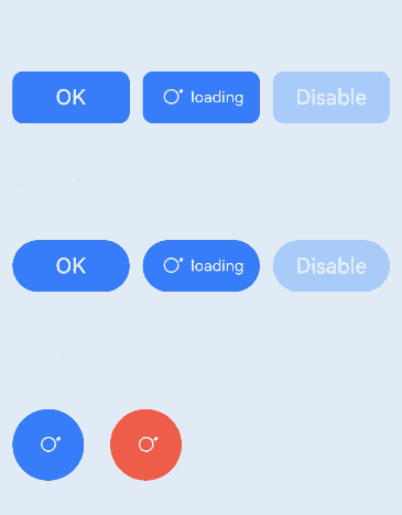
示例1(设置按钮的显示样式)
该示例实现了两种创建按钮的方式,包含子组件或使用文本内容创建相应的按钮。
// xxx.ets
@Entry
@Component
struct ButtonExample {
  build() {
    Flex({ direction: FlexDirection.Column, alignItems: ItemAlign.Start, justifyContent: FlexAlign.SpaceBetween }) {
      Text('Normal button').fontSize(9).fontColor(0xCCCCCC)
      Flex({ alignItems: ItemAlign.Center, justifyContent: FlexAlign.SpaceBetween }) {
        Button('OK', { type: ButtonType.Normal, stateEffect: true })
          .borderRadius(8)
          .backgroundColor(0x317aff)
          .width(90)
          .onClick(() => {
            console.log('ButtonType.Normal')
          })
        Button({ type: ButtonType.Normal, stateEffect: true }) {
          Row() {
            LoadingProgress().width(20).height(20).margin({ left: 12 }).color(0xFFFFFF)
            Text('loading').fontSize(12).fontColor(0xffffff).margin({ left: 5, right: 12 })
          }.alignItems(VerticalAlign.Center)
        }.borderRadius(8).backgroundColor(0x317aff).width(90).height(40)

        Button('Disable', { type: ButtonType.Normal, stateEffect: false }).opacity(0.4)
          .borderRadius(8).backgroundColor(0x317aff).width(90)
      }

      Text('Capsule button').fontSize(9).fontColor(0xCCCCCC)
      Flex({ alignItems: ItemAlign.Center, justifyContent: FlexAlign.SpaceBetween }) {
        Button('OK', { type: ButtonType.Capsule, stateEffect: true }).backgroundColor(0x317aff).width(90)
        Button({ type: ButtonType.Capsule, stateEffect: true }) {
          Row() {
            LoadingProgress().width(20).height(20).margin({ left: 12 }).color(0xFFFFFF)
            Text('loading').fontSize(12).fontColor(0xffffff).margin({ left: 5, right: 12 })
          }.alignItems(VerticalAlign.Center).width(90).height(40)
        }.backgroundColor(0x317aff)

        Button('Disable', { type: ButtonType.Capsule, stateEffect: false }).opacity(0.4)
          .backgroundColor(0x317aff).width(90)
      }

      Text('Circle button').fontSize(9).fontColor(0xCCCCCC)
      Flex({ alignItems: ItemAlign.Center, wrap: FlexWrap.Wrap }) {
        Button({ type: ButtonType.Circle, stateEffect: true }) {
          LoadingProgress().width(20).height(20).color(0xFFFFFF)
        }.width(55).height(55).backgroundColor(0x317aff)

        Button({ type: ButtonType.Circle, stateEffect: true }) {
          LoadingProgress().width(20).height(20).color(0xFFFFFF)
        }.width(55).height(55).margin({ left: 20 }).backgroundColor(0xF55A42)
      }
    }.height(400).padding({ left: 35, right: 35, top: 35 })
  }
}
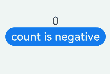
示例2 (为按钮添加渲染控制)
该示例通过if/else控制按钮的显示文本。
// xxx.ets
@Entry
@Component
struct SwipeGestureExample {
  @State count: number = 0;

  build() {
    Column() {
      Text(`${this.count}`)
        .fontSize(30)
        .onClick(() => {
          this.count++;
        })
      if (this.count <= 0) {
        Button('count is negative').fontSize(30).height(50)
      } else if (this.count % 2 === 0) {
        Button('count is even').fontSize(30).height(50)
      } else {
        Button('count is odd').fontSize(30).height(50)
      }
    }.height('100%').width('100%').justifyContent(FlexAlign.Center)
  }
}
示例3 (设置按钮文本样式)
该示例通过配置labelStyle自定义按钮文本的显示样式。
// xxx.ets
@Entry
@Component
struct buttonTestDemo {
  @State txt: string = 'overflowTextOverlengthTextOverflow.Clip';
  @State widthShortSize: number = 210;

  build() {
    Row() {
      Column() {
        Button(this.txt)
          .width(this.widthShortSize)
          .height(100)
          .backgroundColor(0x317aff)
          .labelStyle({ overflow: TextOverflow.Clip,
            maxLines: 1,
            minFontSize: 20,
            maxFontSize: 20,
            font: {
              size: 20,
              weight: FontWeight.Bolder,
              family: 'cursive',
              style: FontStyle.Italic
            }
          })
          .fontSize(40)
      }
      .width('100%')
    }
    .height('100%')
  }
}

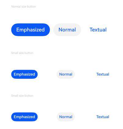
示例4(设置不同尺寸按钮的重要程度)
该示例通过配置controlSize、buttonStyle实现不同尺寸按钮的重要程度。
// xxx.ets
@Entry
@Component
struct ButtonExample {
  build() {
    Flex({ direction: FlexDirection.Column, alignItems: ItemAlign.Start, justifyContent: FlexAlign.SpaceBetween }) {
      Text('Normal size button').fontSize(9).fontColor(0xCCCCCC)
      Flex({ alignItems: ItemAlign.Center, justifyContent: FlexAlign.SpaceBetween }) {
        Button('Emphasized', { buttonStyle: ButtonStyleMode.EMPHASIZED });
        Button('Normal', { buttonStyle: ButtonStyleMode.NORMAL });
        Button('Textual', { buttonStyle: ButtonStyleMode.TEXTUAL });
      }

      Text('Small size button').fontSize(9).fontColor(0xCCCCCC)
      Flex({ alignItems: ItemAlign.Center, justifyContent: FlexAlign.SpaceBetween }) {
        Button('Emphasized', { controlSize: ControlSize.SMALL, buttonStyle: ButtonStyleMode.EMPHASIZED });
        Button('Normal', { controlSize: ControlSize.SMALL, buttonStyle: ButtonStyleMode.NORMAL });
        Button('Textual', { controlSize: ControlSize.SMALL, buttonStyle: ButtonStyleMode.TEXTUAL });
      }

      Text('Small size button').fontSize(9).fontColor(0xCCCCCC)
      Flex({ alignItems: ItemAlign.Center, justifyContent: FlexAlign.SpaceBetween }) {
        Button('Emphasized').controlSize(ControlSize.SMALL).buttonStyle(ButtonStyleMode.EMPHASIZED);
        Button('Normal').controlSize(ControlSize.SMALL).buttonStyle(ButtonStyleMode.NORMAL);
        Button('Textual').controlSize(ControlSize.SMALL).buttonStyle(ButtonStyleMode.TEXTUAL);
      }

    }.height(400).padding({ left: 35, right: 35, top: 35 })
  }
}
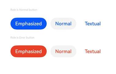
示例5(设置按钮的角色)
该示例通过配置role实现按钮的角色。
// xxx.ets
@Entry
@Component
struct ButtonExample {
  build() {
    Flex({ direction: FlexDirection.Column, alignItems: ItemAlign.Start, justifyContent: FlexAlign.SpaceBetween }) {
      Text('Role is Normal button').fontSize(9).fontColor(0xCCCCCC)
      Flex({ alignItems: ItemAlign.Center, justifyContent: FlexAlign.SpaceBetween }) {
        Button('Emphasized', { buttonStyle: ButtonStyleMode.EMPHASIZED, role: ButtonRole.NORMAL });
        Button('Normal', { buttonStyle: ButtonStyleMode.NORMAL, role: ButtonRole.NORMAL });
        Button('Textual', { buttonStyle: ButtonStyleMode.TEXTUAL, role: ButtonRole.NORMAL });
      }
      Text('Role is Error button').fontSize(9).fontColor(0xCCCCCC)
      Flex({ alignItems: ItemAlign.Center, justifyContent: FlexAlign.SpaceBetween }) {
        Button('Emphasized', { buttonStyle: ButtonStyleMode.EMPHASIZED, role: ButtonRole.ERROR});
        Button('Normal', { buttonStyle: ButtonStyleMode.NORMAL, role: ButtonRole.ERROR });
        Button('Textual', { buttonStyle: ButtonStyleMode.TEXTUAL, role: ButtonRole.ERROR });
      }
    }.height(200).padding({ left: 35, right: 35, top: 35 })
  }
}
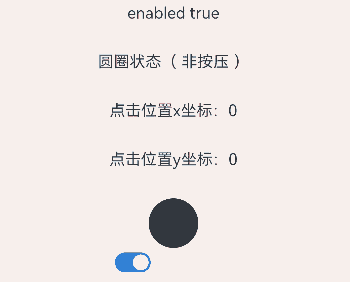
示例6(设置自定义样式按钮)
该示例实现了自定义样式的功能,自定义样式实现了一个圆圈替换原本的按钮样式。如果按压,圆圈将变成红色,标题会显示按压字样;如果没有按压,圆圈将变成黑色,标题会显示非按压字样。
class MyButtonStyle implements ContentModifier<ButtonConfiguration> {
  x: number = 0;
  y: number = 0;
  selectedColor: Color = Color.Black;

  constructor(x: number, y: number, ColorType: Color) {
    this.x = x;
    this.y = y;
    this.selectedColor = ColorType;
  }

  applyContent(): WrappedBuilder<[ButtonConfiguration]> {
    return wrapBuilder(buildButton1);
  }
}

@Builder
function buildButton1(config: ButtonConfiguration) {
  Column({ space: 30 }) {
    Text(config.enabled ? "enabled true" : "enabled false")
    Text('圆圈状态' + (config.pressed ? "( 按压 )" : "( 非按压 )"))
    Text('点击位置x坐标:' + (config.enabled ? (config.contentModifier as MyButtonStyle).x : "0"))
    Text('点击位置y坐标:' + (config.enabled ? (config.contentModifier as MyButtonStyle).y : "0"))
    Circle({ width: 50, height: 50 })
      .fill(config.pressed ? (config.contentModifier as MyButtonStyle).selectedColor : Color.Black)
      .gesture(
        TapGesture({ count: 1 }).onAction((event: GestureEvent) => {
          config.triggerClick(event.fingerList[0].localX, event.fingerList[0].localY)
        })).opacity(config.enabled ? 1 : 0.1)
  }
}

@Entry
@Component
struct ButtonExample {
  @State buttonEnabled: boolean = true;
  @State positionX: number = 0;
  @State positionY: number = 0;
  @State state: boolean[] = [true, false];
  @State index: number = 0;

  build() {
    Column() {
      Button('OK')
        .contentModifier(new MyButtonStyle(this.positionX, this.positionY, Color.Red))
        .onClick((event) => {
          console.info('change' + JSON.stringify(event));
          this.positionX = event.displayX;
          this.positionY = event.displayY;
        }).enabled(this.buttonEnabled)
      Row() {
        Toggle({ type: ToggleType.Switch, isOn: true }).onChange((value: boolean) => {
          if (value) {
            this.buttonEnabled = true;
          } else {
            this.buttonEnabled = false;
          }
        }).margin({ left: -80 })
      }
    }.height('100%').width('100%').justifyContent(FlexAlign.Center)
  }
}
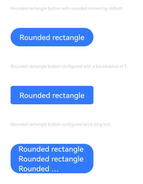
示例7(设置圆角矩形按钮)
该示例通过配置ButtonType.ROUNDED_RECTANGLE创建圆角矩形按钮。
@Entry
@Component
struct ButtonExample {
  build() {
    Flex({ direction: FlexDirection.Column, alignItems: ItemAlign.Start, justifyContent: FlexAlign.SpaceBetween }) {
      Text('Rounded rectangle button with rounded corners by default.').fontSize(9).fontColor(0xCCCCCC)
      Flex({ alignItems: ItemAlign.Center, justifyContent: FlexAlign.SpaceBetween }) {
        Button('Rounded rectangle')
          .type(ButtonType.ROUNDED_RECTANGLE)
          .backgroundColor(0x317aff)
          .controlSize(ControlSize.NORMAL)
          .width(180)
      }
      Text('Rounded rectangle button configured with a borderRadius of 5.').fontSize(9).fontColor(0xCCCCCC)
      Flex({ alignItems: ItemAlign.Center, justifyContent: FlexAlign.SpaceBetween }) {
        Button('Rounded rectangle')
          .type(ButtonType.ROUNDED_RECTANGLE)
          .backgroundColor(0x317aff)
          .controlSize(ControlSize.NORMAL)
          .width(180)
          .borderRadius(5)
      }
      Text('Rounded rectangle button configured extra long text.').fontSize(9).fontColor(0xCCCCCC)
      Flex({ alignItems: ItemAlign.Center, justifyContent: FlexAlign.SpaceBetween }) {
        Button('Rounded rectangle Rounded rectangle Rounded rectangle Rounded rectangle')
          .type(ButtonType.ROUNDED_RECTANGLE)
          .backgroundColor(0x317aff)
          .width(180)
            //.buttonStyle(ButtonStyleMode.NORMAL)
          .labelStyle({overflow:TextOverflow.Ellipsis, maxLines:3, minFontSize: 0})
      }
    }.height(400).padding({ left: 35, right: 35, top: 35 })
  }
}
你可能感兴趣的鸿蒙文章
- 所属分类: 后端技术
- 本文标签:
热门推荐
-
2、 优质文章
-
3、 gt
-
7、 openharmony
-
9、 golang
-
10、 Vue中input框自动聚焦