harmony 鸿蒙dialog
dialog
说明: 从API version 4开始支持。后续版本如有新增内容,则采用上角标单独标记该内容的起始版本。
自定义弹窗容器。
权限列表
无
子组件
支持单个子组件。
属性
除支持通用属性外,支持如下属性:
| 名称 | 类型 | 默认值 | 必填 | 描述 |
|---|---|---|---|---|
| dragable7+ | boolean | false | 否 | 设置对话框是否支持拖拽。 |
说明:
弹窗类组件不支持focusable、click-effect属性。
样式
仅支持通用样式中的width、height、margin、margin-[left|top|right|bottom]、margin-[start|end]样式。
事件
不支持通用事件,仅支持如下事件:
| 名称 | 参数 | 描述 |
|---|---|---|
| cancel | - | 用户点击非dialog区域触发取消弹窗时触发的事件。 |
| show7+ | - | 对话框弹出时触发该事件。 |
| close7+ | - | 对话框关闭时触发该事件。 |
方法
不支持通用方法,仅支持如下方法。
| 名称 | 参数 | 描述 |
|---|---|---|
| show | - | 弹出对话框。 |
| close | - | 关闭对话框。 |
说明: dialog属性、样式均不支持动态更新。
示例
<!-- xxx.hml -->
<div class="doc-page">
<div class="btn-div">
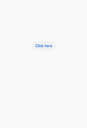
<button type="capsule" value="Click here" class="btn" onclick="showDialog"></button>
</div>
<dialog id="simpledialog" dragable="true" class="dialog-main" oncancel="cancelDialog">
<div class="dialog-div">
<div class="inner-txt">
<text class="txt" ondoubleclick="doubleclick">Simple dialog</text>
</div>
<div class="inner-btn">
<button type="capsule" value="Cancel" onclick="cancelSchedule" class="btn-txt"></button>
<button type="capsule" value="Confirm" onclick="setSchedule" class="btn-txt"></button>
</div>
</div>
</dialog>
</div>
/* xxx.css */
.doc-page {
  flex-direction: column;
  justify-content: center;
  align-items: center;
}
.btn-div {
  width: 100%;
  height: 200px;
  flex-direction: column;
  align-items: center;
  justify-content: center;
}
.btn {
  background-color: #F2F2F2;
  text-color: #0D81F2;
}
.txt {
  color: #000000;
  font-weight: bold;
  font-size: 39px;
}
.dialog-main {
  width: 500px;
}
.dialog-div {
  flex-direction: column;
  align-items: center;
}
.inner-txt {
  width: 400px;
  height: 160px;
  flex-direction: column;
  align-items: center;
  justify-content: space-around;
}
.inner-btn {
  width: 400px;
  height: 120px;
  justify-content: space-around;
  align-items: center;
}
.btn-txt {
  background-color: #F2F2F2;
  text-color: #0D81F2;
}
// xxx.js
import promptAction from '@ohos.promptAction';
export default {
  showDialog() {
    this.$element('simpledialog').show()
  },
  cancelDialog() {
    promptAction.showToast({
      message: 'Dialog cancelled'
    })
  },
  cancelSchedule() {
    this.$element('simpledialog').close()
    promptAction.showToast({
      message: 'Successfully cancelled'
    })
  },
  setSchedule() {
    this.$element('simpledialog').close()
    promptAction.showToast({
      message: 'Successfully confirmed'
    })
  },
  doubleclick(){
    promptAction.showToast({
      message: 'doubleclick'
    })
  }
}
你可能感兴趣的鸿蒙文章
0
赞
热门推荐
-
2、 优质文章
-
3、 gt
-
7、 openharmony
-
9、 golang
-
10、 Vue中input框自动聚焦