harmony 鸿蒙label
label
说明: 从API version 4开始支持。后续版本如有新增内容,则采用上角标单独标记该内容的起始版本。
为input、button、textarea组件定义相应的标注,点击该标注时会触发绑定组件的点击效果。
权限列表
无
子组件
不支持。
属性
除支持通用属性外,还支持如下属性:
| 名称 | 类型 | 默认值 | 必填 | 描述 |
|---|---|---|---|---|
| target | string | - | 否 | 目标组件的属性id值。 |
样式
除支持通用样式外,还支持如下样式:
| 名称 | 类型 | 默认值 | 必填 | 描述 |
|---|---|---|---|---|
| color | <color> | #e5000000 | 否 | 设置文本的颜色。 |
| font-size | <length> | 30px | 否 | 设置文本的尺寸。 |
| allow-scale | boolean | true | 否 | 文本尺寸是否跟随系统设置字体缩放尺寸进行放大缩小。 如果需要支持动态生效,请参看config描述文件中config-changes标签。 |
| letter-spacing | <length> | 0px | 否 | 设置文本的字符间距。 |
| font-style | string | normal | 否 | 设置文本的字体样式,可选值为: - normal:标准的字体样式; - italic:斜体的字体样式。 |
| font-weight | number | string | normal | 否 | 设置文本的字体粗细,number类型取值[100, 900],默认为400,取值越大,字体越粗。 number取值必须为100的整数倍。 string类型取值支持如下四个值:lighter、normal、bold、bolder。 |
| text-decoration | string | none | 否 | 设置文本的文本修饰,可选值为: - underline:文字下划线修饰; - line-through:穿过文本的修饰线n - none:标准文本。 |
| text-align | string | start |
否 | 设置文本的文本对齐方式,可选值为: - left:文本左对齐; - center:文本居中对齐; - right:文本右对齐; - start:根据文字书写相同的方向对齐; - end:根据文字书写相反的方向对齐。 如文本宽度未指定大小,文本的宽度和父容器的宽度大小相等的情况下,对齐效果可能会不明显。 |
| line-height | <length> | 0px | 否 | 设置文本的文本行高,设置为0px时,不限制文本行高,自适应字体大小。 |
| text-overflow | string | clip | 否 | 在设置了最大行数的情况下生效,可选值为: - clip:将文本根据父容器大小进行裁剪显示; - ellipsis:根据父容器大小显示,显示不下的文本用省略号代替。需配合max-lines使用。 |
| font-family | string | sans-serif | 否 | 设置文本的字体列表,用逗号分隔,每个字体用字体名或者字体族名设置。列表中第一个系统中存在的或者通过自定义字体指定的字体,会被选中作为文本的字体。 |
| max-lines | number | - | 否 | 设置文本的最大行数。 |
| min-font-size | <length> | - | 否 | 文本最小字号,需要和文本最大字号同时设置,支持文本字号动态变化。设置最大最小字体样式后,font-size不生效。 |
| max-font-size | <length> | - | 否 | 文本最大字号,需要和文本最小字号同时设置,支持文本字号动态变化。设置最大最小字体样式后,font-size不生效。 |
| font-size-step | <length> | 1px | 否 | 文本动态调整字号时的步长,需要设置最小,最大字号样式生效。 |
| prefer-font-sizes | <array> | - | 否 | 预设的字号集合,在动态尺寸调整时,优先使用预设字号集合中的字号匹配设置的最大行数,如果预设字号集合未设置,则使用最大最小和步长调整字号。针对仍然无法满足最大行数要求的情况,使用text-overflow设置项进行截断,设置预设尺寸集后,font-size、max-font-size、min-font-size和font-size-step不生效。 如:prefer-font-sizes: 12px,14px,16px |
事件
不支持。
方法
不支持。
示例
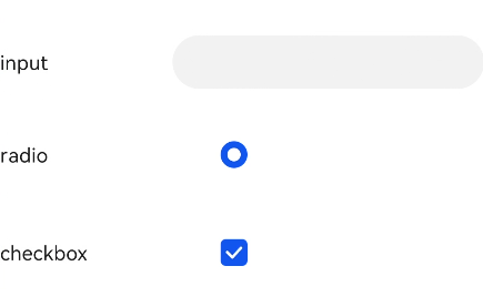
<!--xxx.hml -->
<div class="container">
  <div class="row">
    <label class="label" target="textId">input</label>
    <input class="input" id="textId" type="text"></input>
  </div>
  <div class="row">
    <label class="label" target="radioId">radio</label>
    <input class="input" id="radioId" type="radio" name="group" value="group"></input>
  </div>
  <div class="row">
    <label class="label" target="checkboxId">checkbox</label>
    <input class="input" id="checkboxId" type="checkbox"></input>
  </div>
</div>
/*xxx.css */
.container {
  flex-direction: column;
  margin-left: 20px;
}
.row {
  flex-direction: row;
}
.label {
  width: 200px;
  margin-top: 50px;
}
.input {
  margin-left: 100px;
  margin-top: 50px;
}
你可能感兴趣的鸿蒙文章
0
赞
热门推荐
-
2、 优质文章
-
3、 gt
-
7、 openharmony
-
9、 golang
-
10、 Vue中input框自动聚焦