harmony 鸿蒙图片边框设置
图片边框设置
设置组件的图片边框样式。
说明:
从API Version 9开始支持。后续版本如有新增内容,则采用上角标单独标记该内容的起始版本。
borderImage
borderImage(value: BorderImageOption): T
设置组件的图片边框。
卡片能力: 从API version 9开始,该接口支持在ArkTS卡片中使用。
原子化服务API: 从API version 11开始,该接口支持在原子化服务中使用。
系统能力: SystemCapability.ArkUI.ArkUI.Full
参数:
| 参数名 | 类型 | 必填 | 描述 |
|---|---|---|---|
| value | BorderImageOption | 是 | 图片边框或者渐变色边框设置接口。 |
返回值:
| 类型 | 说明 |
|---|---|
| T | 返回当前组件。 |
BorderImageOption对象说明
卡片能力: 从API version 9开始,该接口支持在ArkTS卡片中使用。
| 名称 | 类型 | 必填 | 描述 |
|---|---|---|---|
| source | string |Resource |LinearGradient | 否 | 边框图源或者渐变色设置。参数类型为string类型时,用于设置边框图源,引用方式请参考加载图片资源。 说明: 边框图源仅适用于容器组件,如Row、Column、Flex,在非容器组件上使用会失效。 原子化服务API: 从API version 11开始,该接口支持在原子化服务中使用。 |
| slice | Length |EdgeWidths |LocalizedEdgeWidths12+ | 否 | 设置边框图片左上角、右上角、左下角以及右下角的切割宽度。 默认值:0 说明: 设置负数时取默认值。 参数类型为Length时,统一设置四个角的宽高。 参数类型为EdgeWidths时: - Top:设置图片左上角或者右上角被切割的高。 - Bottom:设置图片左下角或者右下角被切割的高。 - Left:设置图片左上角或者左下角被切割的宽。 - Right:设置图片右上角或者右下角被切割的宽。 参数类型为LocalizedEdgeWidths12+时: - Top:设置图片左上角或者右上角被切割的高。 - Bottom:设置图片左下角或者右下角被切割的高。 - Start:设置图片左上角或者左下角被切割的宽。 从右至左显示语言模式下为设置图片右上角或者右下角被切割的宽。 - End:设置图片右上角或者右下角被切割的宽。 从右至左显示语言模式下为设置图片左上角或者左下角被切割的宽。 原子化服务API: 从API version 11开始,该接口支持在原子化服务中使用。 |
| width | Length |EdgeWidths |LocalizedEdgeWidths12+ | 否 | 设置图片边框宽度。 默认值:0 说明: 参数类型为Length时,统一设置四个角的宽高,设置负数时取默认值。 参数类型为EdgeWidths时: - Top:设置图片边框上边框的宽。 - Bottom:设置图片边框下边框的宽。 - Left:设置图片边框左边框的宽。 - Right:设置图片边框右边框宽。 参数类型为LocalizedEdgeWidths12+时: - Top:设置图片边框上边框的宽。 - Bottom:设置图片边框下边框的宽。 - Start:设置图片边框左边框的宽。 从右至左显示语言模式下为设置图片边框右边框宽。 - End:设置图片边框右边框宽。 从右至左显示语言模式下为设置图片边框左边框的宽。 设置负数时值取1。 原子化服务API: 从API version 11开始,该接口支持在原子化服务中使用。 |
| outset | Length |EdgeWidths |LocalizedEdgeWidths12+ | 否 | 设置边框图片向外延伸距离。 默认值:0 说明: 设置负数时取默认值。 参数类型为Length时,统一设置四个角的宽高。 参数类型为EdgeWidths时: - Top:设置边框图片上边框向外延伸的距离。 - Bottom:设置边框图片下边框向外延伸的距离。 - Left:设置边框图片左边框向外延伸的距离。 - Right:设置边框图片右边框向外延伸的距离。 参数类型为LocalizedEdgeWidths12+时: - Top:设置边框图片上边框向外延伸的距离。 - Bottom:设置边框图片下边框向外延伸的距离。 - Start:设置边框图片左边框向外延伸的距离。 从右至左显示语言模式下为设置边框图片右边框向外延伸的距离。 - End:设置边框图片右边框向外延伸的距离。 从右至左显示语言模式下为设置边框图片左边框向外延伸的距离。 原子化服务API: 从API version 11开始,该接口支持在原子化服务中使用。 |
| repeat | RepeatMode | 否 | 设置被切割的图片在边框上的重复方式。 默认值:RepeatMode.Stretch 原子化服务API: 从API version 11开始,该接口支持在原子化服务中使用。 |
| fill | boolean | 否 | 设置边框图片是否中心填充。true表示中心填充,false表示非中心填充。 默认值:false 原子化服务API: 从API version 11开始,该接口支持在原子化服务中使用。 |
RepeatMode枚举说明
卡片能力: 从API version 9开始,该接口支持在ArkTS卡片中使用。
原子化服务API: 从API version 11开始,该接口支持在原子化服务中使用。
| 名称 | 描述 |
|---|---|
| Repeat | 被切割的图片会重复铺平在图片边框上,超出部分会被剪裁。 |
| Stretch | 被切割的图片会以拉伸填充的方式铺满图片边框。 |
| Round | 被切割的图片会以整数次平铺在图片边框上,无法以整数次平铺时会压缩图片。 |
| Space | 被切割的图片会以整数次平铺在图片边框上,无法以整数次平铺时会以空白填充。 |
LinearGradient9+
原子化服务API: 从API version 11开始,该接口支持在原子化服务中使用。
系统能力: SystemCapability.ArkUI.ArkUI.Full
| 名称 | 类型 | 必填 | 说明 |
|---|---|---|---|
| angle | number |string | 否 | 线性渐变的起始角度。0点方向顺时针旋转为正向角度。 默认值:180 角度为字符串时仅支持类型’deg’,’grad’,’rad’,’turn’。 |
| direction | GradientDirection | 否 | 线性渐变的方向,设置angle后不生效。 默认值:GradientDirection.Bottom |
| colors | Array<[ResourceColor, number]> | 是 | 指定渐变色颜色和其对应的百分比位置的数组,设置非法颜色直接跳过。 |
| repeating | boolean | 否 | 为渐变的颜色重复着色。 默认值:false true:允许为渐变的颜色重复着色。 false:不允许为渐变的颜色重复着色。 |
示例
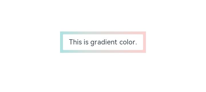
示例1(设置渐变色边框)
通过borderImage接口为组件设置渐变色边框。
// xxx.ets
@Entry
@Component
struct Index {
  build() {
    Row() {
      Column() {
        Text('This is gradient color.').textAlign(TextAlign.Center).height(50).width(200)
          .borderImage({
            source: {
              angle: 90,
              direction: GradientDirection.Left,
              colors: [[0xAEE1E1, 0.0], [0xD3E0DC, 0.3], [0xFCD1D1, 1.0]]
            },
            slice: { top: 10, bottom: 10, left: 10, right: 10 },
            width: { top: "10px", bottom: "10px", left: "10px", right: "10px" },
            repeat: RepeatMode.Stretch,
            fill: false
          })
      }
      .width('100%')
    }
    .height('100%')
  }
}
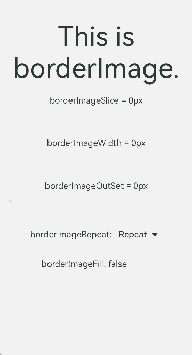
示例2(动态调整属性值)
通过slider接口动态调整borderImage接口中属性值。
// xxx.ets
@Entry
@Component
struct BorderImage {
  @State WidthValue: number = 0
  @State SliceValue: number = 0
  @State OutSetValue: number = 0
  @State RepeatValue: RepeatMode[] = [RepeatMode.Repeat, RepeatMode.Stretch, RepeatMode.Round, RepeatMode.Space]
  @State SelectIndex: number = 0
  @State SelectText: string = 'Repeat'
  @State FillValue: boolean = false

  build() {
    Row() {
      Column({ space: 20 }) {
        Row() {
          Text('This is borderImage.').textAlign(TextAlign.Center).fontSize(50)
        }
        .borderImage({
          source: $r('app.media.icon'),
          slice: this.SliceValue,
          width: this.WidthValue,
          outset: this.OutSetValue,
          repeat: this.RepeatValue[this.SelectIndex],
          fill: this.FillValue
        })

        Column() {
          Text(`borderImageSlice = ${this.SliceValue}px`)
          Slider({
            value: this.SliceValue,
            min: 0,
            max: 100,
            style: SliderStyle.OutSet
          })
            .onChange((value: number, mode: SliderChangeMode) => {
              this.SliceValue = value
            })
        }

        Column() {
          Text(`borderImageWidth = ${this.WidthValue}px`)
          Slider({
            value: this.WidthValue,
            min: 0,
            max: 100,
            style: SliderStyle.OutSet
          })
            .onChange((value: number, mode: SliderChangeMode) => {
              this.WidthValue = value
            })
        }

        Column() {
          Text(`borderImageOutSet = ${this.OutSetValue}px`)
          Slider({
            value: this.OutSetValue,
            min: 0,
            max: 100,
            style: SliderStyle.OutSet
          })
            .onChange((value: number, mode: SliderChangeMode) => {
              this.OutSetValue = value
            })
        }

        Row() {
          Text('borderImageRepeat: ')
          Select([{ value: 'Repeat' }, { value: 'Stretch' }, { value: 'Round' }, { value: 'Space' }])
            .value(this.SelectText)
            .selected(this.SelectIndex)
            .onSelect((index: number, value?: string) => {
              this.SelectIndex = index
              this.SelectText = value as string
            })
        }

        Row() {
          Text(`borderImageFill: ${this.FillValue} `)
          Toggle({ type: ToggleType.Switch, isOn: this.FillValue })
            .onChange((isOn: boolean) => {
              this.FillValue = isOn
            })
        }

      }
      .width('100%')
    }
    .height('100%')
  }
}
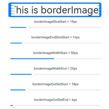
示例3(使用LocalizedEdgeWidths类型值)
borderImage接口中的slice、width和outset属性值使用LocalizedEdgeWidths类型。
// xxx.ets
import { LengthMetrics } from '@kit.ArkUI'

@Entry
@Component
struct BorderImage {
  @State WidthStartValue: number = 0
  @State WidthEndValue: number = 0
  @State SliceStartValue: number = 0
  @State SliceEndValue: number = 0
  @State OutSetStartValue: number = 0
  @State OutSetEndValue: number = 0
  @State RepeatValue: RepeatMode[] = [RepeatMode.Repeat, RepeatMode.Stretch, RepeatMode.Round, RepeatMode.Space]
  @State SelectIndex: number = 0
  @State SelectText: string = 'Repeat'
  @State FillValue: boolean = false

  build() {
    Row() {
      Column({ space: 20 }) {
        Row() {
          Text('This is borderImage.').textAlign(TextAlign.Center).fontSize(50)
        }
        .borderImage({
          source: $r('app.media.icon'),
          slice: {
            top: LengthMetrics.px(10),
            bottom: LengthMetrics.px(10),
            start: LengthMetrics.px(this.SliceStartValue),
            end: LengthMetrics.px(this.SliceEndValue) },
          width: {
            top: LengthMetrics.px(10),
            bottom: LengthMetrics.px(10),
            start: LengthMetrics.px(this.WidthStartValue),
            end: LengthMetrics.px(this.WidthEndValue)
          },
          outset: {
            top: LengthMetrics.px(10),
            bottom: LengthMetrics.px(10),
            start: LengthMetrics.px(this.OutSetStartValue),
            end: LengthMetrics.px(this.OutSetEndValue)
          },
          repeat: this.RepeatValue[this.SelectIndex],
          fill: this.FillValue
        })

        Column() {
          Text(`borderImageSliceStart = ${this.SliceStartValue}px`)
          Slider({
            value: this.SliceStartValue,
            min: 0,
            max: 100,
            style: SliderStyle.OutSet
          })
            .onChange((value: number, mode: SliderChangeMode) => {
              this.SliceStartValue = value
            })
        }

        Column() {
          Text(`borderImageEndSliceStart = ${this.SliceEndValue}px`)
          Slider({
            value: this.SliceEndValue,
            min: 0,
            max: 100,
            style: SliderStyle.OutSet
          })
            .onChange((value: number, mode: SliderChangeMode) => {
              this.SliceEndValue = value
            })
        }

        Column() {
          Text(`borderImageWidthStart = ${this.WidthStartValue}px`)
          Slider({
            value: this.WidthStartValue,
            min: 0,
            max: 100,
            style: SliderStyle.OutSet
          })
            .onChange((value: number, mode: SliderChangeMode) => {
              this.WidthStartValue = value
            })
        }

        Column() {
          Text(`borderImageWidthEnd = ${this.WidthEndValue}px`)
          Slider({
            value: this.WidthEndValue,
            min: 0,
            max: 100,
            style: SliderStyle.OutSet
          })
            .onChange((value: number, mode: SliderChangeMode) => {
              this.WidthEndValue = value
            })
        }

        Column() {
          Text(`borderImageOutSetStart = ${this.OutSetStartValue}px`)
          Slider({
            value: this.OutSetStartValue,
            min: 0,
            max: 100,
            style: SliderStyle.OutSet
          })
            .onChange((value: number, mode: SliderChangeMode) => {
              this.OutSetStartValue = value
            })
        }

        Column() {
          Text(`borderImageOutSetEnd = ${this.OutSetEndValue}px`)
          Slider({
            value: this.OutSetEndValue,
            min: 0,
            max: 100,
            style: SliderStyle.OutSet
          })
            .onChange((value: number, mode: SliderChangeMode) => {
              this.OutSetEndValue = value
            })
        }

        Row() {
          Text('borderImageRepeat: ')
          Select([{ value: 'Repeat' }, { value: 'Stretch' }, { value: 'Round' }, { value: 'Space' }])
            .value(this.SelectText)
            .selected(this.SelectIndex)
            .onSelect((index: number, value?: string) => {
              this.SelectIndex = index
              this.SelectText = value as string
            })
        }

        Row() {
          Text(`borderImageFill: ${this.FillValue} `)
          Toggle({ type: ToggleType.Switch, isOn: this.FillValue })
            .onChange((isOn: boolean) => {
              this.FillValue = isOn
            })
        }

      }
      .width('100%')
    }
    .height('100%')
  }
}
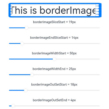
从左至右显示语言示例图
从右至左显示语言示例图
你可能感兴趣的鸿蒙文章
0
赞
- 所属分类: 后端技术
- 本文标签:
热门推荐
-
2、 优质文章
-
3、 gt
-
7、 openharmony
-
9、 golang
-
10、 Vue中input框自动聚焦