harmony 鸿蒙stateStyles: Polymorphic Style
stateStyles: Polymorphic Style
Unlike \@Styles, which are used to reuse styles only on static pages, stateStyles enables you to set state-specific styles.
NOTE
Polymorphic style supports only universal attributes. If the polymorphic style does not take effect, the attribute may be a private attribute of the component, for example, fontColor or backgroundColor of the TextInput component. In this case, you can use attributeModifier to dynamically set component attributes to enable the polymorphic style.
Overview
stateStyles is an attribute method that sets the style based on the internal state of a component. It is similar to a CSS pseudo-class, with different syntax. ArkUI provides the following states:
focused
normal
pressed
disabled
selected10+
NOTE
Currently, only the Tab button and arrow buttons on the external keyboard can be used to trigger the focused state. Sequential keyboard navigation is not supported for nested scrollable components.
Use Scenarios
Common Scenarios
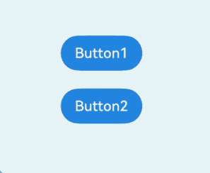
This example shows the most basic application scenario of stateStyles. Button1 is the first component and Button2 the second component. When the component is pressed, the black style specified for pressed takes effect. When the Tab key is pressed for sequential navigation, Button1 obtains focus first and is displayed in the pink style specified for focus. When Button 2 is focused, it is displayed in the pink style specified for focus, and Button1 changes to the blue style specified for normal.
@Entry
@Component
struct StateStylesSample {
  build() {
    Column() {
      Button('Button1')
        .stateStyles({
          focused: {
            .backgroundColor('#ffffeef0')
          },
          pressed: {
            .backgroundColor('#ff707070')
          },
          normal: {
            .backgroundColor('#ff2787d9')
          }
        })
        .margin(20)
      Button('Button2')
        .stateStyles({
          focused: {
            .backgroundColor('#ffffeef0')
          },
          pressed: {
            .backgroundColor('#ff707070')
          },
          normal: {
            .backgroundColor('#ff2787d9')
          }
        })
    }.margin('30%')
  }
}
Figure 1 Focused and pressed states
Combined Use of \@Styles and stateStyles
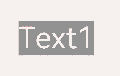
The following example uses \@Styles to specify different states of stateStyles.
@Entry
@Component
struct MyComponent {
  @Styles normalStyle() {
    .backgroundColor(Color.Gray)
  }

  @Styles pressedStyle() {
    .backgroundColor(Color.Red)
  }

  build() {
    Column() {
      Text('Text1')
        .fontSize(50)
        .fontColor(Color.White)
        .stateStyles({
          normal: this.normalStyle,
          pressed: this.pressedStyle,
        })
    }
  }
}
Figure 2 Normal and pressed states
Using Regular Variables and State Variables in stateStyles
stateStyles can use this to bind regular variables and state variables in a component.
@Entry
@Component
struct CompWithInlineStateStyles {
  @State focusedColor: Color = Color.Red;
  normalColor: Color = Color.Green

  build() {
    Column() {
      Button('clickMe').height(100).width(100)
        .stateStyles({
          normal: {
            .backgroundColor(this.normalColor)
          },
          focused: {
            .backgroundColor(this.focusedColor)
          }
        })
        .onClick(() => {
          this.focusedColor = Color.Pink
        })
        .margin('30%')
    }
  }
}
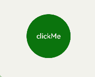
By default, the button is displayed in green in the normal state. When you press the Tab key for the first time, the button obtains focus and is displayed in the red style specified for focus. After a click event occurs and you press the Tab key again, the button obtains focus and changes to the pink style.
Figure 3 Change of the styles in focused state by a click
你可能感兴趣的鸿蒙文章
harmony 鸿蒙\@AnimatableExtend Decorator: Definition of Animatable Attributes
harmony 鸿蒙Application State Management Overview
harmony 鸿蒙AppStorage: Storing Application-wide UI State
harmony 鸿蒙Basic Syntax Overview
harmony 鸿蒙\@Builder Decorator: Custom Builder Function
harmony 鸿蒙\@BuilderParam Decorator: Referencing the \@Builder Function
harmony 鸿蒙Creating a Custom Component
harmony 鸿蒙Mixing Use of Custom Components
harmony 鸿蒙Constraints on Access Modifiers of Custom Component Member Variables
- 所属分类: 后端技术
- 本文标签:
热门推荐
-
2、 优质文章
-
3、 gt
-
7、 openharmony
-
9、 golang
-
10、 Vue中input框自动聚焦