harmony 鸿蒙AlphabetIndexer
AlphabetIndexer
可以与容器组件联动用于按逻辑结构快速定位容器显示区域的组件。
说明:
该组件从API version 7开始支持。后续版本如有新增内容,则采用上角标单独标记该内容的起始版本。
子组件
无
接口
AlphabetIndexer(options: AlphabetIndexerOptions)
创建索引条组件。
原子化服务API: 从API version 11开始,该接口支持在原子化服务中使用。
系统能力: SystemCapability.ArkUI.ArkUI.Full
参数:
| 参数名 | 类型 | 必填 | 说明 |
|---|---|---|---|
| options | AlphabetIndexerOptions | 是 | 设置索引条组件参数。 |
AlphabetIndexerOptions18+对象说明
用于设置索引条参数。
原子化服务API: 从API version 18开始,该接口支持在原子化服务中使用。
系统能力: SystemCapability.ArkUI.ArkUI.Full
| 名称 | 类型 | 必填 | 说明 |
|---|---|---|---|
| arrayValue7+ | Array<string> | 是 | 字符串数组,每个字符串代表一个索引项。 原子化服务API: 从API version 11开始,该接口支持在原子化服务中使用。 |
| selected7+ | number | 是 | 初始选中项索引值,若超出索引值范围,则取默认值0。 该参数支持$$双向绑定变量。 原子化服务API: 从API version 11开始,该接口支持在原子化服务中使用。 |
属性
width属性设置”auto”时表示自适应宽度,宽度会随索引项最大宽度变化。
padding属性默认为4vp。
文本最大的字体缩放倍数maxFontScale和最小的字体缩放倍数minFontScale皆为1,不跟随系统字体大小调节变化。
除支持通用属性外,还支持以下属性:
color
color(value: ResourceColor)
设置未选中项文本颜色。
原子化服务API: 从API version 11开始,该接口支持在原子化服务中使用。
系统能力: SystemCapability.ArkUI.ArkUI.Full
参数:
| 参数名 | 类型 | 必填 | 说明 |
|---|---|---|---|
| value | ResourceColor | 是 | 未选中项文本颜色。 默认值:0x99182431。 |
selectedColor
selectedColor(value: ResourceColor)
设置选中项文本颜色。
原子化服务API: 从API version 11开始,该接口支持在原子化服务中使用。
系统能力: SystemCapability.ArkUI.ArkUI.Full
参数:
| 参数名 | 类型 | 必填 | 说明 |
|---|---|---|---|
| value | ResourceColor | 是 | 选中项文本颜色。 默认值:0xFF007DFF。 |
popupColor
popupColor(value: ResourceColor)
设置提示弹窗一级索引项文本颜色。
原子化服务API: 从API version 11开始,该接口支持在原子化服务中使用。
系统能力: SystemCapability.ArkUI.ArkUI.Full
参数:
| 参数名 | 类型 | 必填 | 说明 |
|---|---|---|---|
| value | ResourceColor | 是 | 提示弹窗一级索引项文本颜色。 默认值:0xFF007DFF。 |
selectedBackgroundColor
selectedBackgroundColor(value: ResourceColor)
设置选中项背景颜色。
原子化服务API: 从API version 11开始,该接口支持在原子化服务中使用。
系统能力: SystemCapability.ArkUI.ArkUI.Full
参数:
| 参数名 | 类型 | 必填 | 说明 |
|---|---|---|---|
| value | ResourceColor | 是 | 选中项背景颜色。 默认值:0x1A007DFF。 |
popupBackground
popupBackground(value: ResourceColor)
设置提示弹窗背景颜色。
原子化服务API: 从API version 11开始,该接口支持在原子化服务中使用。
系统能力: SystemCapability.ArkUI.ArkUI.Full
参数:
| 参数名 | 类型 | 必填 | 说明 |
|---|---|---|---|
| value | ResourceColor | 是 | 提示弹窗背景颜色。 弹窗的背景模糊材质效果会对背景色产生影响,可通过设置popupBackgroundBlurStyle属性值为NONE关闭背景模糊材质效果。 默认值: API version 11及以前:0xFFFFFFFF。 API version 12及以后:#66808080。 |
usingPopup
usingPopup(value: boolean)
设置是否显示提示弹窗。
原子化服务API: 从API version 11开始,该接口支持在原子化服务中使用。
系统能力: SystemCapability.ArkUI.ArkUI.Full
参数:
| 参数名 | 类型 | 必填 | 说明 |
|---|---|---|---|
| value | boolean | 是 | 是否显示提示弹窗。 默认值:false,不显示提示弹窗。 |
selectedFont
selectedFont(value: Font)
设置选中项文本样式。
原子化服务API: 从API version 11开始,该接口支持在原子化服务中使用。
系统能力: SystemCapability.ArkUI.ArkUI.Full
参数:
| 参数名 | 类型 | 必填 | 说明 |
|---|---|---|---|
| value | Font | 是 | 选中项文本样式。 默认值: API version 11及以前: { size:‘12.0fp’, style:FontStyle.Normal, weight:FontWeight.Regular, family:‘HarmonyOS Sans’ } API version 12及以后: { size:‘10.0vp’, style:FontStyle.Normal, weight:FontWeight.Medium, family:‘HarmonyOS Sans’ } |
popupFont
popupFont(value: Font)
设置提示弹窗一级索引文本样式。
原子化服务API: 从API version 11开始,该接口支持在原子化服务中使用。
系统能力: SystemCapability.ArkUI.ArkUI.Full
参数:
| 参数名 | 类型 | 必填 | 说明 |
|---|---|---|---|
| value | Font | 是 | 提示弹窗一级索引文本样式。 默认值: { size:‘24.0vp’, style:FontStyle.Normal, weight:FontWeight.Medium, family:‘HarmonyOS Sans’ } |
font
font(value: Font)
设置未选中项文本样式。
原子化服务API: 从API version 11开始,该接口支持在原子化服务中使用。
系统能力: SystemCapability.ArkUI.ArkUI.Full
参数:
| 参数名 | 类型 | 必填 | 说明 |
|---|---|---|---|
| value | Font | 是 | 未选中索引项文本样式。 默认值: API version 11及以前: { size:‘12.0fp’, style:FontStyle.Normal, weight:FontWeight.Regular, family:‘HarmonyOS Sans’ } API version 12及以后: { size:‘10.0vp’, style:FontStyle.Normal, weight:FontWeight.Medium, family:‘HarmonyOS Sans’ } |
itemSize
itemSize(value: string | number)
设置索引项区域大小。
原子化服务API: 从API version 11开始,该接口支持在原子化服务中使用。
系统能力: SystemCapability.ArkUI.ArkUI.Full
参数:
| 参数名 | 类型 | 必填 | 说明 |
|---|---|---|---|
| value | string | number | 是 | 索引项区域大小,索引项区域为正方形,即正方形边长。不支持设置为百分比。 实际取值会受到组件尺寸的约束,索引项宽度最大为组件宽度-左右padding,索引项高度最大为(组件高度-上下padding)/索引项个数。传入值小于等于0时,按照默认值处理。 默认值:16.0 单位:vp |
alignStyle
alignStyle(value: IndexerAlign, offset?: Length)
设置索引条提示弹窗的对齐样式。
原子化服务API: 从API version 11开始,该接口支持在原子化服务中使用。
系统能力: SystemCapability.ArkUI.ArkUI.Full
参数:
| 参数名 | 类型 | 必填 | 说明 |
|---|---|---|---|
| value | IndexerAlign | 是 | 索引条提示弹窗的对齐样式,支持弹窗显示在索引条右侧和左侧。 默认值: IndexerAlign.END。 |
| offset10+ | Length | 否 | 提示弹窗与索引条之间间距,大于等于0为有效值,在不设置或设置为小于0的情况下间距与popupPosition.x相同。与popupPosition同时设置时,水平方向上offset生效,竖直方向上popupPosition.y生效。 |
selected8+
selected(index: number)
设置选中项索引值。
从API version 10开始,该参数支持$$双向绑定变量。
原子化服务API: 从API version 11开始,该接口支持在原子化服务中使用。
系统能力: SystemCapability.ArkUI.ArkUI.Full
参数:
| 参数名 | 类型 | 必填 | 说明 |
|---|---|---|---|
| index | number | 是 | 选中项索引值。 默认值:0 |
popupPosition8+
popupPosition(value: Position)
设置弹出窗口相对于索引条上边框中点的位置。
原子化服务API: 从API version 11开始,该接口支持在原子化服务中使用。
系统能力: SystemCapability.ArkUI.ArkUI.Full
参数:
| 参数名 | 类型 | 必填 | 说明 |
|---|---|---|---|
| value | Position | 是 | 弹出窗口相对于索引条上边框中点的位置。 默认值:{x:60.0, y:48.0} |
popupSelectedColor10+
popupSelectedColor(value: ResourceColor)
设置提示弹窗二级索引选中项文本颜色。
原子化服务API: 从API version 11开始,该接口支持在原子化服务中使用。
系统能力: SystemCapability.ArkUI.ArkUI.Full
参数:
| 参数名 | 类型 | 必填 | 说明 |
|---|---|---|---|
| value | ResourceColor | 是 | 提示弹窗二级索引选中项文本颜色。 默认值:#FF182431 |
popupUnselectedColor10+
popupUnselectedColor(value: ResourceColor)
设置提示弹窗二级索引未选中项文本颜色。
原子化服务API: 从API version 11开始,该接口支持在原子化服务中使用。
系统能力: SystemCapability.ArkUI.ArkUI.Full
参数:
| 参数名 | 类型 | 必填 | 说明 |
|---|---|---|---|
| value | ResourceColor | 是 | 提示弹窗二级索引选中项文本颜色。 默认值:#FF182431 |
popupItemFont10+
popupItemFont(value: Font)
设置提示弹窗二级索引项文本样式。
原子化服务API: 从API version 11开始,该接口支持在原子化服务中使用。
系统能力: SystemCapability.ArkUI.ArkUI.Full
参数:
| 参数名 | 类型 | 必填 | 说明 |
|---|---|---|---|
| value | Font | 是 | 提示弹窗二级索引项文本样式。 默认值: { size:24, weight:FontWeight.Medium } |
popupItemBackgroundColor10+
popupItemBackgroundColor(value: ResourceColor)
设置提示弹窗二级索引项背景颜色。
原子化服务API: 从API version 11开始,该接口支持在原子化服务中使用。
系统能力: SystemCapability.ArkUI.ArkUI.Full
参数:
| 参数名 | 类型 | 必填 | 说明 |
|---|---|---|---|
| value | ResourceColor | 是 | 提示弹窗二级索引项背景颜色。 默认值: API version 11及以前:#FFFFFFFF。 API version 12及以后:#00000000。 |
autoCollapse11+
autoCollapse(value: boolean)
设置是否使用自适应折叠模式。
如果索引项第一项为“#”,当除去第一项后剩余索引项数量 <= 9时,选择全显示模式;9 < 剩余索引项数量 <= 13时,根据索引条高度自适应选择全显示模式或者短折叠模式;剩余索引项数量 > 13时,根据索引条高度自适应选择短折叠模式或者长折叠模式。
如果索引项第一项不为“#”,当所有索引项数量 <= 9时,选择全显示模式;9 < 所有索引项数量 <= 13时,根据索引条高度自适应选择全显示模式或者短折叠模式;所有索引项数量 > 13时,根据索引条高度自适应选择短折叠模式或者长折叠模式。
原子化服务API: 从API version 12开始,该接口支持在原子化服务中使用。
系统能力: SystemCapability.ArkUI.ArkUI.Full
参数:
| 参数名 | 类型 | 必填 | 说明 |
|---|---|---|---|
| value | boolean | 是 | 是否使用自适应折叠模式。 默认值: API version 12之前:false,不使用自适应折叠模式。 API version 12及之后:true,使用自适应折叠模式。 |
popupItemBorderRadius12+
popupItemBorderRadius(value: number)
设置提示弹窗索引项背板圆角半径。
原子化服务API: 从API version 12开始,该接口支持在原子化服务中使用。
系统能力: SystemCapability.ArkUI.ArkUI.Full
参数:
| 参数名 | 类型 | 必填 | 说明 |
|---|---|---|---|
| value | number | 是 | 设置提示弹窗索引项背板圆角半径。 默认值:24vp。 不支持百分比,小于0时按照0设置。 提示弹窗背板圆角自适应变化(索引项圆角半径+4vp)。 |
itemBorderRadius12+
itemBorderRadius(value: number)
设置索引项背板圆角半径。
原子化服务API: 从API version 12开始,该接口支持在原子化服务中使用。
系统能力: SystemCapability.ArkUI.ArkUI.Full
参数:
| 参数名 | 类型 | 必填 | 说明 |
|---|---|---|---|
| value | number | 是 | 设置索引项背板圆角半径。 默认值:8vp 不支持百分比,小于0时按照0设置。 索引条背板圆角自适应变化(索引项圆角半径+4vp)。 |
popupBackgroundBlurStyle12+
popupBackgroundBlurStyle(value: BlurStyle)
设置提示弹窗的背景模糊材质。
原子化服务API: 从API version 12开始,该接口支持在原子化服务中使用。
系统能力: SystemCapability.ArkUI.ArkUI.Full
参数:
| 参数名 | 类型 | 必填 | 说明 |
|---|---|---|---|
| value | BlurStyle | 是 | 设置提示弹窗的背景模糊材质。 弹窗的背景模糊材质效果会对背景色popupBackground产生影响,可通过设置属性值为NONE关闭背景模糊材质效果。 默认值:COMPONENT_REGULAR。 |
popupTitleBackground12+
popupTitleBackground(value: ResourceColor)
设置提示弹窗一级索引项背景颜色。
原子化服务API: 从API version 12开始,该接口支持在原子化服务中使用。
系统能力: SystemCapability.ArkUI.ArkUI.Full
参数:
| 参数名 | 类型 | 必填 | 说明 |
|---|---|---|---|
| value | ResourceColor | 是 | 设置提示弹窗一级索引项背景颜色。 默认值: 提示弹窗只有一个索引项:#00FFFFFF。 提示弹窗有多个索引项:#0c182431。 |
enableHapticFeedback12+
enableHapticFeedback(value: boolean)
原子化服务API: 从API version 12开始,该接口支持在原子化服务中使用。
系统能力: SystemCapability.ArkUI.ArkUI.Full
| 参数名 | 类型 | 必填 | 说明 |
|---|---|---|---|
| value | boolean | 是 | 是否支持触控反馈。 默认值:true,支持触控反馈。 |
IndexerAlign枚举说明
索引条提示弹窗的对齐样式枚举。
系统能力: SystemCapability.ArkUI.ArkUI.Full
| 名称 | 说明 |
|---|---|
| Left | 提示弹窗显示在索引条右侧。 原子化服务API: 从API version 11开始,该接口支持在原子化服务中使用。 |
| Right | 提示弹窗显示在索引条左侧。 原子化服务API: 从API version 11开始,该接口支持在原子化服务中使用。 |
| START12+ | 在LTR场景下,提示弹窗显示在索引条右侧的位置。在RTL场景下,提示弹窗显示在索引条左侧的位置。 原子化服务API: 从API version 12开始,该接口支持在原子化服务中使用。 |
| END12+ | 在LTR场景下,提示弹窗显示在索引条左侧的位置。在RTL场景下,提示弹窗显示在索引条右侧的位置。 原子化服务API: 从API version 12开始,该接口支持在原子化服务中使用。 |
事件
除支持通用事件外,还支持以下事件:
onSelected(deprecated)
onSelected(callback: (index: number) => void)
索引项选中事件,回调参数为当前选中项索引。
从API version 8开始废弃,建议使用onSelect代替。
系统能力: SystemCapability.ArkUI.ArkUI.Full
参数:
| 参数名 | 类型 | 必填 | 说明 |
|---|---|---|---|
| index | number | 是 | 当前选中的索引。 |
onSelect8+
onSelect(callback: OnAlphabetIndexerSelectCallback)
索引项选中事件,回调参数为当前选中项索引。
原子化服务API: 从API version 11开始,该接口支持在原子化服务中使用。
系统能力: SystemCapability.ArkUI.ArkUI.Full
参数:
| 参数名 | 类型 | 必填 | 说明 |
|---|---|---|---|
| callback | OnAlphabetIndexerSelectCallback | 是 | 索引项选中事件。 |
onRequestPopupData8+
onRequestPopupData(callback: OnAlphabetIndexerRequestPopupDataCallback)
设置提示弹窗二级索引项内容事件,回调参数为当前选中项索引,回调返回值为提示弹窗需显示的二级索引项内容。
原子化服务API: 从API version 11开始,该接口支持在原子化服务中使用。
系统能力: SystemCapability.ArkUI.ArkUI.Full
参数:
| 参数名 | 类型 | 必填 | 说明 |
|---|---|---|---|
| callback | OnAlphabetIndexerRequestPopupDataCallback | 是 | 设置提示弹窗二级索引项内容事件。 |
onPopupSelect8+
onPopupSelect(callback: OnAlphabetIndexerPopupSelectCallback)
提示弹窗二级索引选中事件,回调参数为当前选中二级索引项索引。
原子化服务API: 从API version 11开始,该接口支持在原子化服务中使用。
系统能力: SystemCapability.ArkUI.ArkUI.Full
参数:
| 参数名 | 类型 | 必填 | 说明 |
|---|---|---|---|
| callback | OnAlphabetIndexerPopupSelectCallback | 是 | 提示弹窗二级索引选中事件。 |
OnAlphabetIndexerSelectCallback18+
type OnAlphabetIndexerSelectCallback = (index: number) => void
索引项被选中时触发的事件。
原子化服务API: 从API version 18开始,该接口支持在原子化服务中使用。
系统能力: SystemCapability.ArkUI.ArkUI.Full
参数: |参数名|类型 |必填|说明 | |——-|—–|—-|——| |index |number|是 |当前选中索引项的索引。|
OnAlphabetIndexerPopupSelectCallback18+
type OnAlphabetIndexerPopupSelectCallback = (index: number) => void
提示弹窗二级索引项被选中时触发的事件。
原子化服务API: 从API version 18开始,该接口支持在原子化服务中使用。
系统能力: SystemCapability.ArkUI.ArkUI.Full
参数: |参数名|类型 |必填|说明 | |——-|—–|—-|——| |index |number|是 |当前选中的提示弹窗二级索引项的索引。|
OnAlphabetIndexerRequestPopupDataCallback18+
type OnAlphabetIndexerRequestPopupDataCallback = (index: number) => Array<string>
usingPopup设置值为true,索引项被选中时触发的事件。
原子化服务API: 从API version 18开始,该接口支持在原子化服务中使用。
系统能力: SystemCapability.ArkUI.ArkUI.Full
参数: |参数名|类型 |必填|说明 | |——-|—–|—-|——| |index |number|是 |当前选中索引项的索引。|
返回值: |类型 |说明 | |————-|——————–| |Array<string>|索引项对应的提示弹窗二级索引字符串数组,此字符串数组在弹窗中竖排显示,字符串列表最多显示5个,超出部分可以滑动显示。|
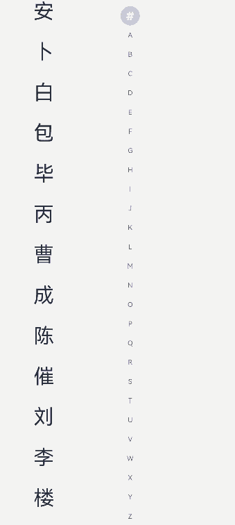
示例
示例1(设置提示弹窗显示文本内容)
通过onRequestPopupData事件自定义提示弹窗显示文本内容。
// xxx.ets
@Entry
@Component
struct AlphabetIndexerSample {
  private arrayA: string[] = ['安'];
  private arrayB: string[] = ['卜', '白', '包', '毕', '丙'];
  private arrayC: string[] = ['曹', '成', '陈', '催'];
  private arrayL: string[] = ['刘', '李', '楼', '梁', '雷', '吕', '柳', '卢'];
  private value: string[] = ['#', 'A', 'B', 'C', 'D', 'E', 'F', 'G',
    'H', 'I', 'J', 'K', 'L', 'M', 'N',
    'O', 'P', 'Q', 'R', 'S', 'T', 'U',
    'V', 'W', 'X', 'Y', 'Z'];

  build() {
    Stack({ alignContent: Alignment.Start }) {
      Row() {
        List({ space: 20, initialIndex: 0 }) {
          ForEach(this.arrayA, (item: string) => {
            ListItem() {
              Text(item)
                .width('80%')
                .height('5%')
                .fontSize(30)
                .textAlign(TextAlign.Center)
            }
          }, (item: string) => item)

          ForEach(this.arrayB, (item: string) => {
            ListItem() {
              Text(item)
                .width('80%')
                .height('5%')
                .fontSize(30)
                .textAlign(TextAlign.Center)
            }
          }, (item: string) => item)

          ForEach(this.arrayC, (item: string) => {
            ListItem() {
              Text(item)
                .width('80%')
                .height('5%')
                .fontSize(30)
                .textAlign(TextAlign.Center)
            }
          }, (item: string) => item)

          ForEach(this.arrayL, (item: string) => {
            ListItem() {
              Text(item)
                .width('80%')
                .height('5%')
                .fontSize(30)
                .textAlign(TextAlign.Center)
            }
          }, (item: string) => item)
        }
        .width('50%')
        .height('100%')

        AlphabetIndexer({ arrayValue: this.value, selected: 0 })
          .autoCollapse(false) // 关闭自适应折叠模式
          .enableHapticFeedback(false) // 关闭触控反馈
          .selectedColor(0xFFFFFF) // 选中项文本颜色
          .popupColor(0xFFFAF0) // 提示弹窗一级索引文本颜色
          .selectedBackgroundColor(0xCCCCCC) // 选中项背景颜色
          .popupBackground(0xD2B48C) // 提示弹窗背景颜色
          .usingPopup(true) // 索引项被选中时显示提示弹窗
          .selectedFont({ size: 16, weight: FontWeight.Bolder }) // 选中项文本样式
          .popupFont({ size: 30, weight: FontWeight.Bolder }) // 提示弹窗一级索引的文本样式
          .itemSize(28) // 索引项的尺寸大小
          .alignStyle(IndexerAlign.Left) // 提示弹窗在索引条右侧弹出
          .popupItemBorderRadius(24) // 设置提示弹窗索引项背板圆角半径
          .itemBorderRadius(14) // 设置索引项背板圆角半径
          .popupBackgroundBlurStyle(BlurStyle.NONE) // 设置提示弹窗的背景模糊材质
          .popupTitleBackground(0xCCCCCC) // 设置提示弹窗一级索引项背景颜色
          .popupSelectedColor(0x00FF00) // 提示弹窗二级索引未选中项文本颜色
          .popupUnselectedColor(0x0000FF) // 提示弹窗二级索引选中项文本颜色
          .popupItemFont({ size: 30, style: FontStyle.Normal }) // 提示弹窗二级索引项文本样式
          .popupItemBackgroundColor(0xCCCCCC) // 提示弹窗二级索引项背景颜色
          .onSelect((index: number) => {
            console.info(this.value[index] + ' Selected!');
          })
          .onRequestPopupData((index: number) => {
            // 当选中A时,提示弹窗里面的二级索引文本列表显示A对应的列表arrayA,选中B、C、L时也同样
            // 选中其余索引项时,提示弹窗二级索引文本列表为空,提示弹窗会只显示一级索引项
            if (this.value[index] == 'A') {
              return this.arrayA;
            } else if (this.value[index] == 'B') {
              return this.arrayB;
            } else if (this.value[index] == 'C') {
              return this.arrayC;
            } else if (this.value[index] == 'L') {
              return this.arrayL;
            } else {
              return [];
            }
          })
          .onPopupSelect((index: number) => {
            console.info('onPopupSelected:' + index);
          })
      }
      .width('100%')
      .height('100%')
    }
  }
}
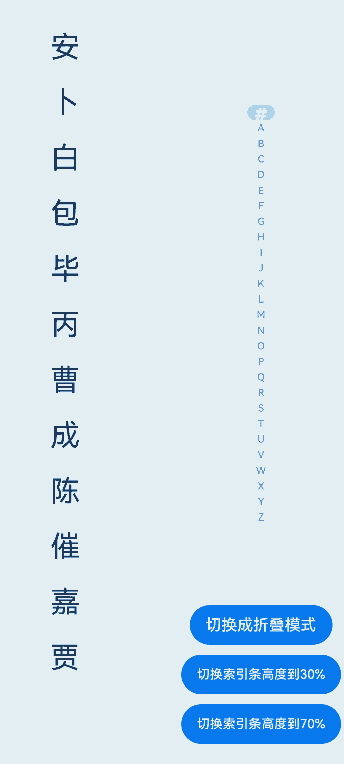
示例2(开启自适应折叠模式)
通过autoCollapse属性开启自适应折叠模式。
// xxx.ets
@Entry
@Component
struct AlphabetIndexerSample {
  private arrayA: string[] = ['安'];
  private arrayB: string[] = ['卜', '白', '包', '毕', '丙'];
  private arrayC: string[] = ['曹', '成', '陈', '催'];
  private arrayJ: string[] = ['嘉', '贾'];
  private value: string[] = ['#', 'A', 'B', 'C', 'D', 'E', 'F', 'G',
    'H', 'I', 'J', 'K', 'L', 'M', 'N',
    'O', 'P', 'Q', 'R', 'S', 'T', 'U',
    'V', 'W', 'X', 'Y', 'Z'];
  @State isNeedAutoCollapse: boolean = false;
  @State indexerHeight: string = '75%';

  build() {
    Stack({ alignContent: Alignment.Start }) {
      Row() {
        List({ space: 20, initialIndex: 0 }) {
          ForEach(this.arrayA, (item: string) => {
            ListItem() {
              Text(item)
                .width('80%')
                .height('5%')
                .fontSize(30)
                .textAlign(TextAlign.Center)
            }
          }, (item: string) => item)

          ForEach(this.arrayB, (item: string) => {
            ListItem() {
              Text(item)
                .width('80%')
                .height('5%')
                .fontSize(30)
                .textAlign(TextAlign.Center)
            }
          }, (item: string) => item)

          ForEach(this.arrayC, (item: string) => {
            ListItem() {
              Text(item)
                .width('80%')
                .height('5%')
                .fontSize(30)
                .textAlign(TextAlign.Center)
            }
          }, (item: string) => item)

          ForEach(this.arrayJ, (item: string) => {
            ListItem() {
              Text(item)
                .width('80%')
                .height('5%')
                .fontSize(30)
                .textAlign(TextAlign.Center)
            }
          }, (item: string) => item)
        }
        .width('50%')
        .height('100%')

        Column() {
          Column() {
            AlphabetIndexer({ arrayValue: this.value, selected: 0 })
              .autoCollapse(this.isNeedAutoCollapse) // 开启或关闭自适应折叠模式
              .height(this.indexerHeight) // 索引条高度
              .enableHapticFeedback(false) // 关闭触控反馈
              .selectedColor(0xFFFFFF) // 选中项文本颜色
              .popupColor(0xFFFAF0) // 提示弹窗一级索引文本颜色
              .selectedBackgroundColor(0xCCCCCC) // 选中项背景颜色
              .popupBackground(0xD2B48C) // 提示弹窗背景颜色
              .usingPopup(true) // 索引项被选中时显示提示弹窗
              .selectedFont({ size: 16, weight: FontWeight.Bolder }) // 选中项文本样式
              .popupFont({ size: 30, weight: FontWeight.Bolder }) // 提示弹窗内容的文本样式
              .itemSize(28) // 每一项的尺寸大小
              .alignStyle(IndexerAlign.Right) // 提示弹窗在索引条左侧弹出
              .popupTitleBackground("#D2B48C") // 设置提示弹窗一级索引项背景颜色
              .popupSelectedColor(0x00FF00) // 提示弹窗二级索引未选中项文本颜色
              .popupUnselectedColor(0x0000FF) // 提示弹窗二级索引选中项文本颜色
              .popupItemFont({ size: 30, style: FontStyle.Normal }) // 提示弹窗二级索引项文本样式
              .popupItemBackgroundColor(0xCCCCCC) // 提示弹窗二级索引项背景颜色
              .onSelect((index: number) => {
                console.info(this.value[index] + ' Selected!');
              })
              .onRequestPopupData((index: number) => {
                // 当选中A时,提示弹窗里面的二级索引文本列表显示A对应的列表arrayA,选中B、C、L时也同样
                // 选中其余索引项时,提示弹窗二级索引文本列表为空,提示弹窗会只显示一级索引项
                if (this.value[index] == 'A') {
                  return this.arrayA;
                } else if (this.value[index] == 'B') {
                  return this.arrayB;
                } else if (this.value[index] == 'C') {
                  return this.arrayC;
                } else if (this.value[index] == 'J') {
                  return this.arrayJ;
                } else {
                  return [];
                }
              })
              .onPopupSelect((index: number) => {
                console.info('onPopupSelected:' + index);
              })
          }
          .height('80%')
          .justifyContent(FlexAlign.Center)

          Column() {
            Button('切换成折叠模式')
              .margin('5vp')
              .onClick(() => {
                this.isNeedAutoCollapse = true;
              })
            Button('切换索引条高度到30%')
              .margin('5vp')
              .onClick(() => {
                this.indexerHeight = '30%';
              })
            Button('切换索引条高度到70%')
              .margin('5vp')
              .onClick(() => {
                this.indexerHeight = '70%';
              })
          }.height('20%')
        }
        .width('50%')
        .justifyContent(FlexAlign.Center)
      }
      .width('100%')
      .height(720)
    }
  }
}
示例3(设置提示弹窗背景模糊材质)
通过popupBackgroundBlurStyle属性实现提示弹窗的背景模糊效果。
// xxx.ets
@Entry
@Component
struct AlphabetIndexerSample {
  private arrayA: string[] = ['安'];
  private arrayB: string[] = ['卜', '白', '包', '毕', '丙'];
  private arrayC: string[] = ['曹', '成', '陈', '催'];
  private arrayL: string[] = ['刘', '李', '楼', '梁', '雷', '吕', '柳', '卢'];
  private value: string[] = ['#', 'A', 'B', 'C', 'D', 'E', 'F', 'G',
    'H', 'I', 'J', 'K', 'L', 'M', 'N',
    'O', 'P', 'Q', 'R', 'S', 'T', 'U',
    'V', 'W', 'X', 'Y', 'Z'];
  @State customBlurStyle: BlurStyle = BlurStyle.NONE;

  build() {
    Stack({ alignContent: Alignment.Start }) {
      Row() {
        List({ space: 20, initialIndex: 0 }) {
          ForEach(this.arrayA, (item: string) => {
            ListItem() {
              Text(item)
                .width('80%')
                .height('5%')
                .fontSize(30)
                .textAlign(TextAlign.Center)
            }
          }, (item: string) => item)

          ForEach(this.arrayB, (item: string) => {
            ListItem() {
              Text(item)
                .width('80%')
                .height('5%')
                .fontSize(30)
                .textAlign(TextAlign.Center)
            }
          }, (item: string) => item)

          ForEach(this.arrayC, (item: string) => {
            ListItem() {
              Text(item)
                .width('80%')
                .height('5%')
                .fontSize(30)
                .textAlign(TextAlign.Center)
            }
          }, (item: string) => item)

          ForEach(this.arrayL, (item: string) => {
            ListItem() {
              Text(item)
                .width('80%')
                .height('5%')
                .fontSize(30)
                .textAlign(TextAlign.Center)
            }
          }, (item: string) => item)
        }
        .width('30%')
        .height('100%')

        Column() {
          Column() {
            Text('切换模糊材质: ')
              .fontSize(24)
              .fontColor(0xcccccc)
              .width('100%')
            Button('COMPONENT_REGULAR')
              .margin('5vp')
              .width(200)
              .onClick(() => {
                this.customBlurStyle = BlurStyle.COMPONENT_REGULAR;
              })
            Button('BACKGROUND_THIN')
              .margin('5vp')
              .width(200)
              .onClick(() => {
                this.customBlurStyle = BlurStyle.BACKGROUND_THIN;
              })
          }.height('20%')

          Column() {
            AlphabetIndexer({ arrayValue: this.value, selected: 0 })
              .usingPopup(true) // 索引项被选中时显示提示弹窗
              .alignStyle(IndexerAlign.Left) // 提示弹窗在索引条右侧弹出
              .popupItemBorderRadius(24) // 设置提示弹窗索引项背板圆角半径
              .itemBorderRadius(14) // 设置索引项背板圆角半径
              .popupBackgroundBlurStyle(this.customBlurStyle) // 设置提示弹窗的背景模糊材质
              .popupTitleBackground(0xCCCCCC) // 设置提示弹窗一级索引项背景颜色
              .onSelect((index: number) => {
                console.info(this.value[index] + ' Selected!');
              })
              .onRequestPopupData((index: number) => {
                // 当选中A时,提示弹窗里面的二级索引文本列表显示A对应的列表arrayA,选中B、C、L时也同样
                // 选中其余索引项时,提示弹窗二级索引文本列表为空,提示弹窗会只显示一级索引项
                if (this.value[index] == 'A') {
                  return this.arrayA;
                } else if (this.value[index] == 'B') {
                  return this.arrayB;
                } else if (this.value[index] == 'C') {
                  return this.arrayC;
                } else if (this.value[index] == 'L') {
                  return this.arrayL;
                } else {
                  return [];
                }
              })
              .onPopupSelect((index: number) => {
                console.info('onPopupSelected:' + index);
              })
          }
          .height('80%')
        }
        .width('70%')
      }
      .width('100%')
      .height('100%')
      .backgroundImage($r("app.media.image"))
    }
  }
}

你可能感兴趣的鸿蒙文章
- 所属分类: 后端技术
- 本文标签:
热门推荐
-
2、 优质文章
-
3、 gt
-
7、 openharmony
-
9、 golang
-
10、 Vue中input框自动聚焦