harmony 鸿蒙AtomicServiceSearch
AtomicServiceSearch
AtomicServiceSearch为开发者提供满足定制化需求的功能,内容包括默认显示的搜索区、可自定义的选择区和功能区(最多两个)。
说明:
该组件从API version 18开始支持。后续版本如有新增内容,则采用上角标单独标记该内容的起始版本。
导入模块
import { AtomicServiceSearch } from '@kit.ArkUI';
AtomicServiceSearch
AtomicServiceSearch({
  value?: ResourceStr,
  placeholder?: ResourceStr,
  controller?: SearchController,
  select?: SelectParams,
  search?: SearchParams,
  operation?: OperationParams,
})
原子化服务API: 从API version 18开始,该接口支持在原子化服务中使用。
装饰器类型: @Component
系统能力: SystemCapability.ArkUI.ArkUI.Full
参数:
| 名称 | 类型 | 必填 | 装饰器类型 | 说明 |
|---|---|---|---|---|
| value | ResourceStr | 否 | @Prop | 设置当前显示的搜索文本内容。默认值为空字符串。 |
| placeholder | ResourceStr | 否 | @Prop | 搜索框内默认显示的提示文本。默认值为Search。 |
| controller | SearchController | 否 | - | 原生Search组件控制器,用于设置输入光标的位置、退出编辑态等操作。默认值为undefined。 |
| select | SelectParams | 否 | @Prop | select选择区的内容、事件及样式。默认值为undefined。 |
| search | SearchParams | 否 | @Prop | search搜索区可支持的事件及样式。默认值为undefined。 |
| operation | OperationParams | 否 | - | 选择区(右侧)的功能设置项。默认值为undefined。 |
SelectParams
AtomicServiceSearch中“选择区”的可选属性。
原子化服务API: 从API version 18开始,该接口支持在原子化服务中使用。
系统能力: SystemCapability.ArkUI.ArkUI.Full
| 名称 | 类型 | 必填 | 说明 |
|---|---|---|---|
| options | Array<SelectOption> | 否 | 下拉选项内容。默认值为undefined。 |
| selected | number | 否 | 设置下拉菜单初始选项的索引。第一项的索引为0。当不设置selected属性时,默认选择值为-1,菜单项不选中。 |
| selectValue | ResourceStr | 否 | 设置下拉按钮本身的文本内容。默认值为undefined。 |
| onSelect | OnSelectCallback | 否 | 下拉菜单选中某一项的回调。默认值为undefined。 |
| menuItemContentModifier | ContentModifier<MenuItemConfiguration> | 否 | 在Select组件上,定制下拉菜单项内容区的方法。在应用了该属性后,下拉菜单的内容将完全由开发者自定义,此时为选择区设置的下拉菜单分割线、背景色及字体样式等属性将不再生效。 modifier: 内容修改器,开发者需要自定义class实现ContentModifier接口。默认值为 undefined。 |
| divider | Optional<DividerOptions> |null | 否 | 1.设置DividerOptions,则按设置的样式显示分割线。默认值:{strokeWidth: '1px', color: '#33182431'}。2.设置为null时,不显示分割线。 3.strokeWidth设置过宽时,会覆盖文字。分割线会从每一个Item底部开始,同时向上向下画分割线。 4.startMargin和endMargin的默认值与不设置divider属性时的分割线样式保持一致。startMargin和endMargin的和与optionWidth的值相等时,不显示分割线。 startMargin和endMargin的和超过optionWidth的值时,按照默认样式显示分割线。 |
| font | Font | 否 | 下拉按钮本身的文本样式。默认值:{size: $r('sys.float.ohos_id_text_size_body1')}。 |
| fontColor | ResourceColor | 否 | 下拉菜单选中项的文本颜色。默认值:{fontColor: $r('sys.color.ohos_id_color_text_primary')}。 |
| selectedOptionBgColor | ResourceColor | 否 | 下拉菜单选中项的背景色。默认值:$r('sys.color.ohos_id_color_component_activated')混合$r('sys.color.ohos_id_alpha_highlight_bg')的透明度。 |
| selectedOptionFont | Font | 否 | 下拉菜单选中项的文本样式。默认值:{size: $r('sys.color.ohos_id_text_size_body1'), weight: FontWeight.Regular}。 |
| selectedOptionFontColor | ResourceColor | 否 | 下拉菜单选中项的文本颜色。默认值:$r('sys.color.ohos_id_color_text_primary_activated')。 |
| optionBgColor | ResourceColor | 否 | 下拉菜单项的背景色。默认值:Color.Transparent。 |
| optionFont | Font | 否 | 下拉菜单项的文本样式。默认值:{size: $r('sys.float.ohos_id_text_size_body1'), weight: FontWeight.Regular}。 |
| optionFontColor | ResourceColor | 否 | 下拉菜单项的文本颜色。默认值:$r('sys.color.ohos_id_color_text_primary')。 |
| optionWidth | Dimension |OptionWidthMode | 否 | 设置下拉菜单项的宽度,不支持设置百分比。OptionWidthMode类型为枚举类型,OptionWidthMode决定下拉菜单是否继承下拉按钮宽度。当设置为异常值或小于最小宽度56vp时,属性不生效,菜单项宽度设为默认值,即菜单默认宽度为2栅格。 |
| optionHeight | Dimension | 否 | 设置下拉菜单显示的最大高度,不支持设置百分比。下拉菜单的默认最大高度是屏幕可用高度的80%,设置的菜单最大高度不能超过默认最大高度。 |
| space | Length | 否 | 下拉菜单项的文本与箭头之间的间距。默认值:8。 |
| arrowPosition | ArrowPosition | 否 | 下拉菜单项的文本与箭头之间的对齐方式。默认值:ArrowPosition.END。 |
| menuAlign | MenuAlignParams | 否 | 设置下拉按钮与下拉菜单间的对齐方式。默认值:{alignType: MenuAlignType.START, offset: {dx: 0, dy: 0}}。 |
| menuBackgroundColor | ResourceColor | 否 | 下拉菜单的背景色。默认值:Color.Transparent。 |
| menuBackgroundBlurStyle | BlurStyle | 否 | 下拉菜单的背景模糊材质。默认值:BlurStyle.COMPONENT_ULTRA_THICK。 |
SearchParams
AtomicServiceSearch中“搜索区”的可选属性。
原子化服务API: 从API version 18开始,该接口支持在原子化服务中使用。
系统能力: SystemCapability.ArkUI.ArkUI.Full
| 名称 | 类型 | 必填 | 说明 |
|---|---|---|---|
| searchKey | ResourceStr | 否 | 用作找到一个唯一的search组件。默认值:undefined。 |
| componentBackgroundColor | ResourceColor | 否 | 设置组件的背景色。默认值:$r('sys.color.ohos_id_color_text_field_sub_bg')。 |
| pressedBackgroundColor | ResourceColor | 否 | 设置组件按压态的背景色。默认值:$r('sys.color.ohos_id_color_click_effect')。 |
| searchButton | SearchButtonParams | 否 | 设置搜索框末尾搜索按钮。点击搜索按钮,同时触发onSubmit与onClick回调。 -value:搜索框末尾搜索按钮文本内容。 -option: 配置搜索框文本样式。默认值: {fontSize: '16fp', fontColor: '#ff3f97e9'}。 |
| placeholderColor | ResourceColor | 否 | placeholder文本颜色。默认值:$r('sys.color.ohos_id_color_text_secondary')。 |
| placeholderFont | Font | 否 | 设置placeholder文本样式,包括字体大小,字体粗细,字体族,字体风格。默认值:{size: $r('sys_float.ohos_id_text_size_body1')}。 |
| textFont | Font | 否 | 设置搜索框内输入文本样式,包括字体大小,字体粗细,字体族,字体风格。目前仅支持默认字体族。默认值:{size: $r('sys_float.ohos_id_text_size_body1')}。 |
| textAlign | TextAlign | 否 | 文本在搜索框中的对齐方式。默认值:TextAlign.Start。 |
| copyOptions | CopyOptions | 否 | 输入的文本是否可复制。默认值:CopyOptions.LocalDevice,支持设备内复制。 |
| searchIcon | IconOptions |SymbolGlyphModifier | 否 | 左侧搜索图标样式。 浅色模式默认值: {size: '16vp', color: '#99182431', src: ' '}。深色模式默认值: {size: '16vp', color: '#99ffffff', src: ' '}。 |
| cancelIcon | IconOptions | 否 | 右侧清除按钮样式。默认值:{style: CancelButtonStyle.INPUT, icon: {size: '16vp', color: '#99ffffff', src: ' '}}。当style为CancelButtonStyle.CONSTANT时,默认显示清除样式。 |
| fontColor | ResourceColor | 否 | 输入文本的字体颜色。默认值:$r('sys.color.ohos_id_color_text_secondary')。 |
| caretStyle | CaretStyle | 否 | 光标样式。默认值:{width: '1.5vp', color: '#007DFF'}。 |
| enableKeyboardOnFocus | boolean | 否 | Search获焦时,是否主动拉起软键盘。默认值:true。 |
| hideSelectionMenu | boolean | 否 | 是否不弹出系统文本选择菜单。 设置为true时,单击输入框光标、长按输入框、双击输入框、三击输入框或者右键输入框,不弹出系统文本选择菜单。设置为false时,弹出系统文本选择菜单。默认值: false。 |
| type | SearchType | 否 | 输入框类型。默认值:SearchType.Normal。 |
| maxLength | number | 否 | 设置文本的最大输入字符数。默认不设置最大输入字符数限制。到达文本最大字符限制,将无法继续输入字符。默认值:-1。 |
| enterKeyType | EnterKeyType | 否 | 输入法回车键类型。默认值:EnterKeyType.Search。 |
| decoration | TextDecorationOptions | 否 | 文本装饰线对象。默认值:{type: TextDecorationType.None, color: Color.Black, style: TextDecorationStyle.SOLID}。 |
| letterSpacing | number | string | Resource | 否 | 设置文本字符间距。正数拉开字符距离,负数则拉近字符距离。浮点数默认值为0.0,单位为物理像素px。若输入类型非number且无法解析为数字,则使用默认值。 |
| fontFeature | ResourceStr | 否 | 设置文字特性效果,比如数字等宽的特性。 格式为:normal |<feature-tag-value> <feature-tag-value>的格式为:<string> [ <integer> |on |off ] <feature-tag-value>的个数可以有多个,中间用’,‘隔开。 例如,使用等宽数字的输入格式为:”ss01” on。默认值为 undefined。 |
| selectedBackgroundColor | ResourceColor | 否 | 文本选中底板颜色。默认为20%不透明度。 |
| inputFilter | InputFilterParams | 否 | 通过正则表达式设置输入过滤器。匹配表达式的输入允许显示,不匹配的输入将被过滤。仅支持单个字符匹配,不支持字符串匹配。默认值为undefined。-value: 正则表达式。 -error: 正则匹配失败时,返回被过滤的内容。 |
| textIndent | Dimension | 否 | 首行文本缩进。默认值:0。 |
| minFontSize | number | string | Resource | 否 | 设置文本最小显示字号。需要配合maxFontSize以及布局大小限制使用,单独设置不生效。默认值为undefined。 |
| maxFontSize | number | string | Resource | 否 | 设置文本最大显示字号。需要配合minFontSize以及布局大小限制使用,单独设置不生效。默认值为undefined。 |
| editMenuOptions | EditMenuOptions | 否 | 设置自定义菜单扩展项,允许用户设置扩展项的文本内容、图标、回调方法。默认值为undefined。 |
| enablePreviewText | boolean | 否 | 是否开启输入预上屏。默认值:true。 需要配合开启输入法的预上屏功能。预上屏内容定义为文字暂存态,目前不支持文字拦截功能,因此该值为true时不触发onWillInsert、onDidInsert回调。 |
| enableHapticFeedback | boolean | 否 | 是否开启触控反馈。默认值:true。 |
| onSubmit | Callback<string> |SearchSubmitCallback | 否 | 点击搜索图标、搜索按钮或者按下软键盘搜索按钮时触发该回调。默认值为undefined。 |
| onChange | EditableTextOnChangeCallback | 否 | 输入内容发生变化时,触发该回调。默认值为undefined。 |
| onCopy | Callback<string> | 否 | 进行复制操作时,触发该回调。默认值为undefined。 |
| onCut | Callback<string> | 否 | 进行剪切操作时,触发该回调。默认值为undefined。 |
| onPaste | OnPasteCallback | 否 | 进行粘贴操作时,触发该回调。默认值为undefined。 |
| onTextSelectionChange | OnTextSelectionChangeCallback | 否 | 文本选择的位置发生变化或编辑状态下光标位置发生变化时,触发该回调。默认值为undefined。 |
| onContentScroll | OnContentScrollCallback | 否 | 文本内容滚动时,触发该回调。默认值为undefined。 |
| onEditChange | Callback<boolean> | 否 | 输入状态变化时,触发该回调。有光标时为编辑态,无光标时为非编辑态。isEditing为true表示正在输入。默认值为undefined。 |
| onWillInsert | Callback<InsertValue, boolean> | 否 | 在将要输入时,触发该回调。默认值为undefined。 |
| onDidInsert | Callback<InsertValue> | 否 | 在输入完成时,触发该回调。默认值为undefined。 |
| onWillDelete | Callback<DeleteValue, boolean> | 否 | 在将要删除时,触发该回调。默认值为undefined。 |
| onDidDelete | Callback<DeleteValue> | 否 | 在删除完成时,触发该回调。默认值为undefined。 |
OperationParams
AtomicServiceSearch中“功能区”的初始化参数。
原子化服务API: 从API version 18开始,该接口支持在原子化服务中使用。
系统能力: SystemCapability.ArkUI.ArkUI.Full
| 名称 | 类型 | 必填 | 说明 |
|---|---|---|---|
| auxiliaryItem | OperationOption | 否 | 附属于搜索区(右侧)的功能位。默认值为undefined。 |
| independentItem | OperationOption | 否 | 独立于搜索区(右侧)的功能位。默认值为undefined。 |
InputFilterParams
搜索框过滤设置项。
原子化服务API: 从API version 18开始,该接口支持在原子化服务中使用。
系统能力: SystemCapability.ArkUI.ArkUI.Full
| 名称 | 类型 | 必填 | 说明 |
|---|---|---|---|
| inputFilterValue | ResourceStr | 是 | 正则表达式。 |
| error | Callback<string> | 否 | 正则匹配失败时,返回被过滤的内容。默认值为undefined。 |
SearchButtonParams
搜索框末尾搜索按钮设置项。
原子化服务API: 从API version 18开始,该接口支持在原子化服务中使用。
系统能力: SystemCapability.ArkUI.ArkUI.Full
| 名称 | 类型 | 必填 | 说明 |
|---|---|---|---|
| searchButtonValue | ResourceStr | 是 | 搜索框末尾搜索按钮文本内容。 |
| options | SearchButtonOptions | 否 | 配置搜索框文本样式。默认值:{fontSize: '16fp',fontColor: '#ff3f97e9'}。 |
MenuAlignParams
下拉按钮与下拉菜单间的对齐方式设置项。
原子化服务API: 从API version 18开始,该接口支持在原子化服务中使用。
系统能力: SystemCapability.ArkUI.ArkUI.Full
| 名称 | 类型 | 必填 | 说明 |
|---|---|---|---|
| alignType | MenuAlignType | 是 | 对齐方式类型。默认值:MenuAlignType.START。 |
| offset | Offset | 否 | 按照对齐类型对齐后,下拉菜单相对下拉按钮的偏移量。默认值:{dx: 0, dy: 0}。 |
OnSelectCallback
type OnSelectCallback = (index: number, selectValue: string) => void
下拉菜单选中某一项的回调。
原子化服务API: 从API version 18开始,该接口支持在原子化服务中使用。
系统能力: SystemCapability.ArkUI.ArkUI.Full
参数:
| 参数名 | 类型 | 必填 | 说明 |
|---|---|---|---|
| index | number | 是 | 选中项的索引,索引从0开始。 |
| selectValue | string | 是 | 选中项的值。 |
OnPasteCallback
type OnPasteCallback = (pasteValue: string, event: PasteEvent) => void
进行粘贴操作时,触发该回调。
原子化服务API: 从API version 18开始,该接口支持在原子化服务中使用。
系统能力: SystemCapability.ArkUI.ArkUI.Full
参数:
| 参数名 | 类型 | 必填 | 说明 |
|---|---|---|---|
| pasteValue | string | 是 | 要粘贴的文本内容。 |
| event | PasteEvent | 是 | 用户自定义粘贴事件。 |
OnTextSelectionChangeCallback
type OnTextSelectionChangeCallback = (selectionStart: number, selectionEnd: number) => void
文本选择的位置发生变化或编辑状态下光标位置发生变化时,触发该回调。
原子化服务API: 从API version 18开始,该接口支持在原子化服务中使用。
系统能力: SystemCapability.ArkUI.ArkUI.Full
参数:
| 参数名 | 类型 | 必填 | 说明 |
|---|---|---|---|
| selectionStart | number | 是 | 文本选择区域的起始位置。 |
| selectionEnd | number | 是 | 文本选择区域的结束位置。 |
OnContentScrollCallback
type OnContentScrollCallback = (totalOffsetX: number, totalOffsetY: number) => void
文本内容滚动时,触发该回调。
原子化服务API: 从API version 18开始,该接口支持在原子化服务中使用。
系统能力: SystemCapability.ArkUI.ArkUI.Full
参数:
| 参数名 | 类型 | 必填 | 说明 |
|---|---|---|---|
| totalOffsetX | number | 是 | 文本左上角横坐标相较于整个内容输入区左上角横坐标的偏移量。 |
| totalOffsetY | number | 是 | 文本左上角纵坐标相较于整个内容输入区左上角纵坐标的偏移量。 |
示例
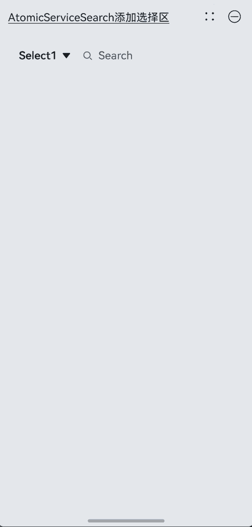
示例1(AtomicServiceSearch添加选择区)
该示例通过select参数为AtomicServiceSearch组件添加左侧选择区。
import { AtomicServiceSearch } from '@kit.ArkUI';

@Entry
@Component
struct Index {
  build() {
    Column({ space: 6 }) {
      Text('AtomicServiceSearch添加选择区').alignSelf(ItemAlign.Start).decoration({
        type: TextDecorationType.Underline,
        color: Color.Black,
        style: TextDecorationStyle.SOLID
      }).margin({ top: 20, bottom: 20 })

      AtomicServiceSearch({
        select: {
          options: [
            { value: 'Select1', icon: $r("app.media.sweep") }, // 自定义资源
            { value: 'Select2', icon: $r("app.media.sweep") }, // 自定义资源
            { value: 'Select3', icon: $r("app.media.sweep") }, // 自定义资源
            { value: 'Select4', icon: $r("app.media.sweep") } // 自定义资源
          ],
          selected: -1,
          selectValue: 'Select1',
          onSelect: (index: number, selectValue: string) => { // 自定义事件
            if (index === 0) {
              this.alert(`index: ${index}, selectValue: ${selectValue}`);
            } else if (index === 1) {
              this.alert(`index: ${index}, selectValue: ${selectValue}`);
            } else if (index === 2) {
              this.alert(`index: ${index}, selectValue: ${selectValue}`);
            } else if (index === 3) {
              this.alert(`index: ${index}, selectValue: ${selectValue}`);
            }
          },
        }
      })
    }.padding({ left: 16, right: 16 })
  }

  private alert(message: string): void {
    this.getUIContext().showAlertDialog({ message: message });
  }
}
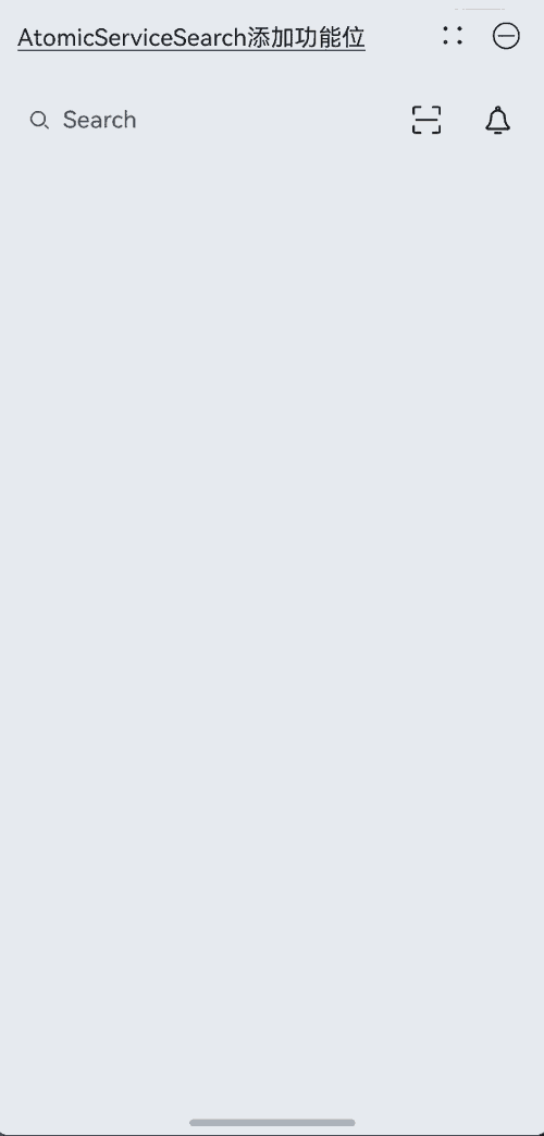
示例2(AtomicServiceSearch添加功能位)
该示例通过operation参数为AtomicServiceSearch组件添加右侧功能位。
import { AtomicServiceSearch } from '@kit.ArkUI';

@Entry
@Component
struct Index {
  build() {
    Column({ space: 6 }) {
      Text('AtomicServiceSearch添加功能位').alignSelf(ItemAlign.Start).decoration({
        type: TextDecorationType.Underline,
        color: Color.Black,
        style: TextDecorationStyle.SOLID
      }).margin({ top: 20, bottom: 20 })

      AtomicServiceSearch({
        operation: {
          // 附属于Search组件的功能位
          auxiliaryItem: {
            value: $r("app.media.sweep"), // 自定义资源
            action: () => {
              this.alert('扫一扫'); // 自定义事件
            }
          },
          // 独立于Search组件的功能位
          independentItem: {
            value: $r("app.media.dingding"), // 自定义资源
            action: () => {
              this.alert('通知'); // 自定义事件
            }
          }
        }
      })
    }.padding({ left: 16, right: 16 })
  }

  private alert(message: string): void {
    this.getUIContext().showAlertDialog({ message: message });
  }
}
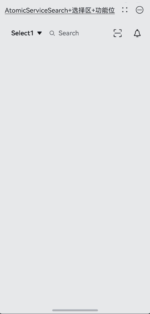
示例3(AtomicServiceSearch添加选择区及功能位)
该示例中为AtomicServiceSearch组件同时添加左侧选择区和右侧功能位。
import { AtomicServiceSearch } from '@kit.ArkUI';

@Entry
@Component
struct Index {
  build() {
    Column({ space: 6 }) {
      Text('AtomicServiceSearch+选择区+功能位').alignSelf(ItemAlign.Start).decoration({
        type: TextDecorationType.Underline,
        color: Color.Black,
        style: TextDecorationStyle.SOLID
      }).margin({ top: 20, bottom: 20 })

      AtomicServiceSearch({
        select: {
          options: [
            { value: 'Select1', icon: $r("app.media.sweep") }, // 自定义资源
            { value: 'Select2', icon: $r("app.media.sweep") }, // 自定义资源
            { value: 'Select3', icon: $r("app.media.sweep") }, // 自定义资源
            { value: 'Select4', icon: $r("app.media.sweep") } // 自定义资源
          ],
          selected: -1,
          selectValue: 'Select1',
          onSelect: (index: number, selectValue:string) => {
            if (index === 0) {
              this.alert(`index: ${index}, selectValue: ${selectValue}`);
            } else if (index === 1) {
              this.alert(`index: ${index}, selectValue: ${selectValue}`);
            } else if (index === 2) {
              this.alert(`index: ${index}, selectValue: ${selectValue}`);
            } else if (index === 3) {
              this.alert(`index: ${index}, selectValue: ${selectValue}`);
            }
          },
        },
        operation: {
          auxiliaryItem: {
            value: $r("app.media.sweep"), // 自定义资源
            action: () => {
              this.alert('扫一扫'); // 自定义事件
            }
          },
          independentItem: {
            value: $r("app.media.dingding"), // 自定义资源
            action: () => {
              this.alert('通知'); // 自定义事件
            }
          }
        }
      })
    }.padding({ left: 16, right: 16 })
  }

  private alert(message: string): void {
    this.getUIContext().showAlertDialog({ message: message });
  }
}
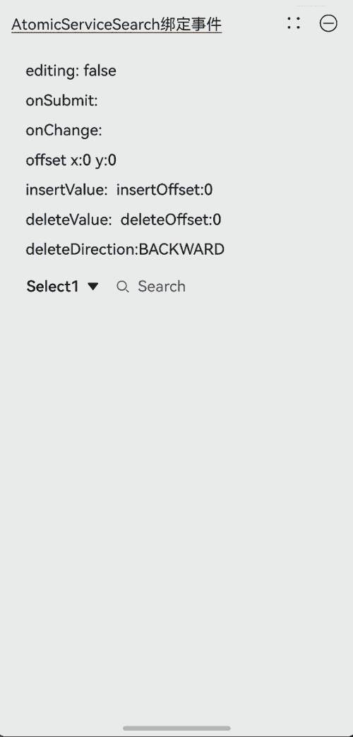
示例4(search回调事件)
该示例通过onWillInsert、onDidInsert、onWillDelete、onDidDelete接口实现了插入和删除的功能。 通过onSubmit接口实现了搜索区内容提交的功能。 通过onChange接口实现了监听搜索区内容变化的功能。
import { AtomicServiceSearch } from '@kit.ArkUI';

@Entry
@Component
struct Index {
  @State insertValue: string = "";
  @State deleteValue: string = "";
  @State insertOffset: number = 0;
  @State deleteOffset: number = 0;
  @State deleteDirection: number = 0;
  @State startIndex: number = 0;
  @State endIndex: number = 0;
  @State offsetX: number = 0;
  @State offsetY: number = 0;
  @State changeValue: string = '';
  @State value: string = 'false';
  @State submitValue: string = '';
  @State text: string = 'Search editMenuOptions';

  build() {
    Column({ space: 6 }) {
      Text('AtomicServiceSearch绑定事件').alignSelf(ItemAlign.Start).decoration({
        type: TextDecorationType.Underline,
        color: Color.Black,
        style: TextDecorationStyle.SOLID
      }).margin({ top: 20, bottom: 20 })

      Column({ space: 6 }) {
        Text('editing: ' + this.value).width('100%').height(25).borderRadius(15).padding({ left: 15 })
          .backgroundColor('rgba(0, 0, 0, 0.1)').maxLines(1).textOverflow({ overflow: TextOverflow.MARQUEE });
        Text('onSubmit:' + this.submitValue).width('100%').height(25).borderRadius(15).padding({ left: 15 })
          .backgroundColor('rgba(0, 0, 0, 0.1)').maxLines(1).textOverflow({ overflow: TextOverflow.MARQUEE });
        Text('onChange:' + this.changeValue).width('100%').height(25).borderRadius(15).padding({ left: 15 })
          .backgroundColor('rgba(0, 0, 0, 0.1)').maxLines(1).textOverflow({ overflow: TextOverflow.MARQUEE });
        Text('offset x:' + this.offsetX + ' y:' + this.offsetY).width('100%').height(25).borderRadius(15).padding({ left: 15 })
          .backgroundColor('rgba(0, 0, 0, 0.1)').maxLines(1).textOverflow({ overflow: TextOverflow.MARQUEE });
        Text("insertValue:" + this.insertValue + "  insertOffset:" + this.insertOffset).width('100%').height(25)
          .borderRadius(15).padding({ left: 15 }).backgroundColor('rgba(0, 0, 0, 0.1)').maxLines(1)
          .textOverflow({ overflow: TextOverflow.MARQUEE });
        Text("deleteValue:" + this.deleteValue + "  deleteOffset:" + this.deleteOffset).width('100%').height(25)
          .borderRadius(15).padding({ left: 15 }).backgroundColor('rgba(0, 0, 0, 0.1)').maxLines(1)
          .textOverflow({ overflow: TextOverflow.MARQUEE });
        Text("deleteDirection:" + (this.deleteDirection == 0 ? "BACKWARD" : "FORWARD")).width('100%').height(25)
          .borderRadius(15).padding({ left: 15 }).backgroundColor('rgba(0, 0, 0, 0.1)').maxLines(1)
          .textOverflow({ overflow: TextOverflow.MARQUEE });
        AtomicServiceSearch({
          select: {
            options: [
              { value: 'Select1', icon: $r("app.media.sweep") },
              { value: 'Select2', icon: $r("app.media.sweep") },
              { value: 'Select3', icon: $r("app.media.sweep") },
              { value: 'Select4', icon: $r("app.media.sweep") }
            ],
            selected: -1,
            selectValue: 'Select1',
            onSelect: (index: number) => {
              if (index === 0) {
                this.alert('Select1');
              } else if (index === 1) {
                this.alert('Select2');
              } else if (index === 2) {
                this.alert('Select3');
              } else if (index === 3) {
                this.alert('Select4');
              }
            },
          },
          search: {
            onSubmit: (value: string) => {
              this.submitValue = value
            },
            onChange: (value: string) => {
              this.changeValue = value
            },
            onCopy: () => {
              this.alert('onCopy');
            },
            onCut: () => {
              this.alert('onCut');
            },
            onPaste: () => {
              this.alert('onPaste');
            },
            onTextSelectionChange: (selectionStart: number, selectionEnd: number) => {
              this.startIndex = selectionStart
              this.endIndex = selectionEnd
            },
            onContentScroll: (totalOffsetX: number, totalOffsetY: number) => {
              this.offsetX = totalOffsetX
              this.offsetY = totalOffsetY
            },
            onEditChange: (data: boolean) => {
              this.value = data ? 'true' : 'false'
            },
            onWillInsert: (info: InsertValue) => {
              this.insertValue = info.insertValue
              return true;
            },
            onDidInsert: (info: InsertValue) => {
              this.insertOffset = info.insertOffset
            },
            onWillDelete: (info: DeleteValue) => {
              this.deleteValue = info.deleteValue
              info.direction
              return true;
            },
            onDidDelete: (info: DeleteValue) => {
              this.deleteOffset = info.deleteOffset
              this.deleteDirection = info.direction
            }
          }
        })
      }
    }.padding({ left: 16, right: 16 })
  }

  private alert(message: string): void {
    this.getUIContext().showAlertDialog({ message: message });
  }
}
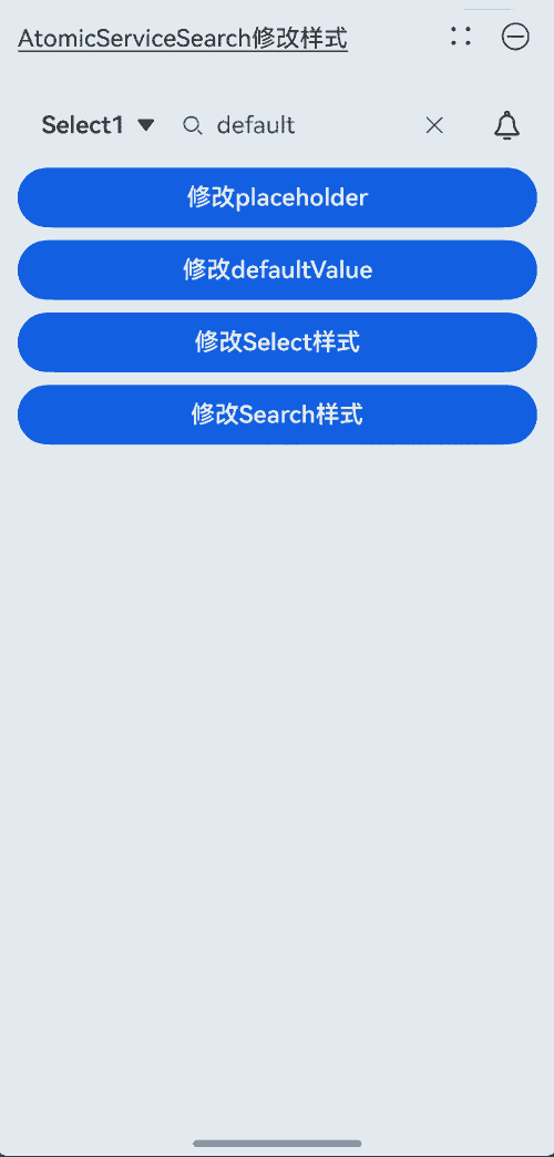
示例5(AtomicServiceSearch修改样式)
该示例通过search、select、value、placeholder参数实现了AtomicServiceSearch组件样式的自定义。
import { AtomicServiceSearch, SearchParams, SelectParams } from '@kit.ArkUI';

@Entry
@Component
struct Index {
  @State private placeholder: string = 'Type to Search...';
  @State private defaultValue: string = 'default';
  @State private search?: SearchParams = {};
  @State private select?: SelectParams = {
    options: [
      { value: 'Select1', icon: $r("app.media.sweep") },
      { value: 'Select2', icon: $r("app.media.sweep") },
      { value: 'Select3', icon: $r("app.media.sweep") },
      { value: 'Select4', icon: $r("app.media.sweep") }
    ],
    selected: -1,
    selectValue: 'Select1',
    onSelect: (index: number) => {
      if (index === 0) {
        this.alert('Select1');
      } else if (index === 1) {
        this.alert('Select2');
      } else if (index === 2) {
        this.alert('Select3');
      } else if (index === 3) {
        this.alert('Select4');
      }
    }
  };

  build() {
    Column({ space: 8 }) {
      Text('AtomicServiceSearch修改样式').alignSelf(ItemAlign.Start).decoration({
        type: TextDecorationType.Underline,
        color: Color.Black,
        style: TextDecorationStyle.SOLID
      }).margin({ top: 20, bottom: 20 })

      AtomicServiceSearch({
        value: this.defaultValue,
        placeholder: this.placeholder,
        select: this.select,
        search: this.search,
        operation: {
          independentItem: {
            value: $r(`app.media.dingding`),
            action: () => {
              this.alert('通知');
            }
          }
        }
      })
      Button("修改placeholder")
        .width('100%')
        .type(ButtonType.Normal)
        .borderRadius(20)
        .onClick(() => {
          if (this.placeholder === 'Search...') {
            this.placeholder = 'Type to Search...';
          } else {
            this.placeholder = 'Search...';
          }
        });
      Button("修改defaultValue")
        .width('100%')
        .type(ButtonType.Normal)
        .borderRadius(20)
        .onClick(() => {
          if (this.defaultValue === 'value') {
            this.defaultValue = 'defaultValue';
          } else {
            this.defaultValue = 'value';
          }
        });
      Button("修改Select样式")
        .width('100%')
        .type(ButtonType.Normal)
        .borderRadius(20)
        .onClick(() => {
          this.select = {
            options: [
              { value: '选项1', icon: $r("app.media.dingding") },
              { value: '选项2', icon: $r("app.media.dingding") },
            ],
            selected: -1,
            selectValue: '选项1',
            onSelect: (index: number) => {
              if (index === 0) {
                this.alert('选项1');
              } else if (index === 1) {
                this.alert('选项2');
              }
            }
          };
        });

      Button("修改Search样式")
        .width('100%')
        .type(ButtonType.Normal)
        .borderRadius(20)
        .onClick(() => {
          this.search = {
            componentBackgroundColor: '#e0eee8'
          }
        });
    }.padding({ left: 16, right: 16 })
  }

  private alert(message: string): void {
    this.getUIContext().showAlertDialog({ message: message });
  }
}
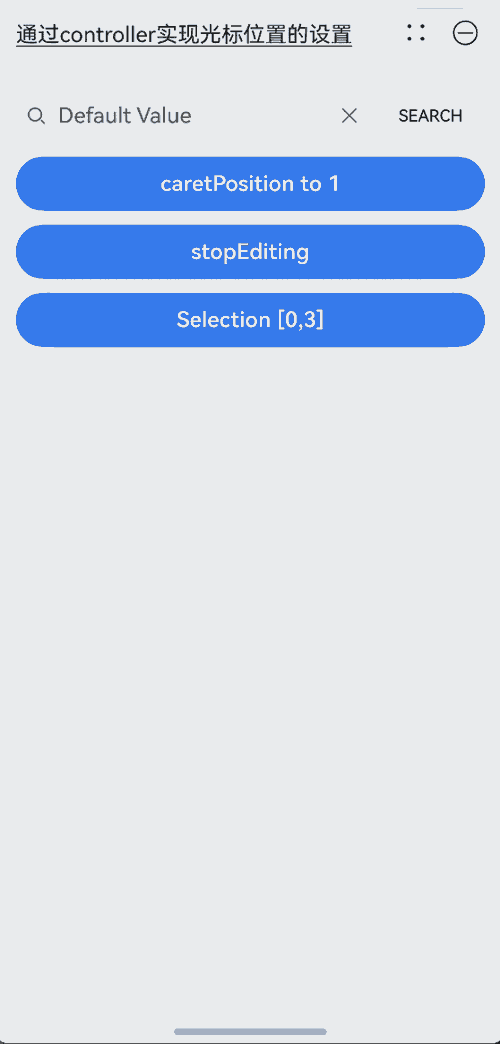
示例6(通过controller实现光标位置的设置)
该示例通过controller参数实现了光标位置的设置、选择指定区域中的内容及关闭编辑状态的功能。
import { AtomicServiceSearch } from '@kit.ArkUI';

@Entry
@Component
struct Index {
  controller: SearchController = new SearchController();

  build() {
    Column({ space : 10 }) {
      Text('通过controller实现光标位置的设置').alignSelf(ItemAlign.Start).decoration({
        type: TextDecorationType.Underline,
        color: Color.Black,
        style: TextDecorationStyle.SOLID
      }).margin({ top: 20, bottom: 20 })

      AtomicServiceSearch(
        {
          value: 'Default Value',
          placeholder: 'Type to Search...',
          controller: this.controller,
          search: {
            searchButton: {
              searchButtonValue: 'SEARCH',
              options: { fontSize: '12fp', fontColor: '#ff0e1216' }
            }
          }
        },
      );
      Button('caretPosition to 1').onClick(() => {
        this.controller.caretPosition(1);
      }).width('100%')
      Button('stopEditing').onClick(() => {
        this.controller.stopEditing();
      }).width('100%')
      Button('Selection [0,3]').onClick(() => {
        this.controller.setTextSelection(0, 3)
      }).width('100%')
    }.padding({ left: 16, right: 16 })
  }

  public alert(message: string): void {
    this.getUIContext().showAlertDialog({ message: message });
  }
}
示例7(设置输入法回车键类型)
该示例通过enterKeyType属性实现了动态切换输入法回车键的效果。
import { AtomicServiceSearch } from '@kit.ArkUI';

@Entry
@Component
struct Index {
  @State enterTypes: Array<EnterKeyType> = [EnterKeyType.Go, EnterKeyType.Search, EnterKeyType.Send, EnterKeyType.Done, EnterKeyType.Next, EnterKeyType.PREVIOUS, EnterKeyType.NEW_LINE]
  @State index: number = 0

  build() {
    Column({ space : 10 }) {
      Text('输入法回车键类型为搜索').alignSelf(ItemAlign.Start).decoration({
        type: TextDecorationType.Underline,
        color: Color.Black,
        style: TextDecorationStyle.SOLID
      }).margin({ top: 20, bottom: 20 })

      AtomicServiceSearch({
        placeholder: '输入法回车键类型为搜索',
        search: {
          enterKeyType: this.enterTypes[this.index]
        }
      })

      Button('改变EnterKeyType').onClick(() => {
        this.index = (this.index + 1) % this.enterTypes.length;
      }).width('100%')

    }.padding({ left: 16, right: 16 })
  }

  public alert(message: string): void {
    this.getUIContext().showAlertDialog({ message: message });
  }
}

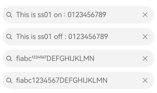
示例8(设置文字特性效果)
该示例通过fontFeature属性实现了文本在不同文字特性下的展示效果。
import { AtomicServiceSearch } from '@kit.ArkUI';
@Entry
@Component
struct Index {
build() {
Column({ space : 10 }) {
Text('设置文字特性效果').alignSelf(ItemAlign.Start).decoration({
type: TextDecorationType.Underline,
color: Color.Black,
style: TextDecorationStyle.SOLID
}).margin({ top: 20, bottom: 20 })
AtomicServiceSearch({
value: 'This is ss01 on : 0123456789',
search: {
fontFeature: "\"ss01\" on"
}
});
AtomicServiceSearch({
value: 'This is ss01 off : 0123456789',
search: {
fontFeature: "\"ss01\" off"
}
});
AtomicServiceSearch({
value: 'fiabc1234567DEFGHIJKLMN',
search: {
fontFeature: "\"frac\" on"
}
});
AtomicServiceSearch({
value: 'fiabc1234567DEFGHIJKLMN',
search: {
fontFeature: "\"frac\" off"
}
});
}.padding({ left: 16, right: 16 })
}
public alert(message: string): void {
this.getUIContext().showAlertDialog({ message: message });
}
}
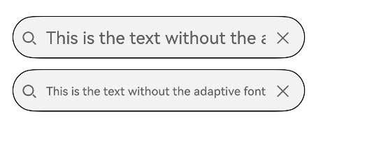
示例9(设置文本自适应)
该示例通过minFontSize、maxFontSize属性展示了文本自适应字号的效果。
import { AtomicServiceSearch } from '@kit.ArkUI';

@Entry
@Component
struct Index {
  build() {
    Column({ space : 10 }) {
      Text('设置文本自适应').alignSelf(ItemAlign.Start).decoration({
        type: TextDecorationType.Underline,
        color: Color.Black,
        style: TextDecorationStyle.SOLID
      }).margin({ top: 20, bottom: 20 })

      AtomicServiceSearch({
        value: 'This is the text without the adaptive font',
      }).width('80%').height(40).borderWidth(1).borderRadius(20)

      AtomicServiceSearch({
        value: 'This is the text without the adaptive font',
        search: {
          minFontSize: 4,
          maxFontSize: 40
        }
      }).width('80%').height(40).borderWidth(1).borderRadius(20)
    }.padding({ left: 16, right: 16 })
  }

  public alert(message: string): void {
    this.getUIContext().showAlertDialog({ message: message });
  }
}
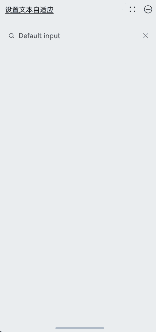
示例10(文本扩展自定义菜单)
该示例通过editMenuOptions接口实现了文本设置自定义菜单扩展项的文本内容、图标以及回调的功能。
import { AtomicServiceSearch } from '@kit.ArkUI';

@Entry
@Component
struct Index {
  onCreateMenu = (menuItems: Array<TextMenuItem>) => {
    let item1: TextMenuItem = {
      content: 'custom1',
      icon: $r('app.media.startIcon'),
      id: TextMenuItemId.of('custom1'),
    }
    let item2: TextMenuItem = {
      content: 'custom2',
      id: TextMenuItemId.of('custom2'),
      icon: $r('app.media.startIcon'),
    }
    menuItems.push(item1)
    menuItems.unshift(item2)
    return menuItems
  }

  onMenuItemClick = (menuItem: TextMenuItem, textRange: TextRange) => {
    if (menuItem.id.equals(TextMenuItemId.of("custom2"))) {
      console.log("拦截 id: custom2 start:" + textRange.start + "; end:" + textRange.end)
      return true
    }
    if (menuItem.id.equals(TextMenuItemId.COPY)) {
      console.log("拦截 COPY start:" + textRange.start + "; end:" + textRange.end)
      return true
    }
    if (menuItem.id.equals(TextMenuItemId.SELECT_ALL)) {
      console.log("不拦截 SELECT_ALL start:" + textRange.start + "; end:" + textRange.end)
      return false
    }
    return false
  }

  @State editMenuOptions: EditMenuOptions = {
    onCreateMenu: this.onCreateMenu, onMenuItemClick: this.onMenuItemClick
  }

  build() {
    Column({ space : 10 }) {
      Text('文本扩展自定义菜单').alignSelf(ItemAlign.Start).decoration({
        type: TextDecorationType.Underline,
        color: Color.Black,
        style: TextDecorationStyle.SOLID
      }).margin({ top: 20, bottom: 20 })

      AtomicServiceSearch({
        value:'Default input',
        search: {
          editMenuOptions : this.editMenuOptions
        }
      })
    }.padding({ left: 16, right: 16 })
  }

  public alert(message: string): void {
    this.getUIContext().showAlertDialog({ message: message });
  }
}
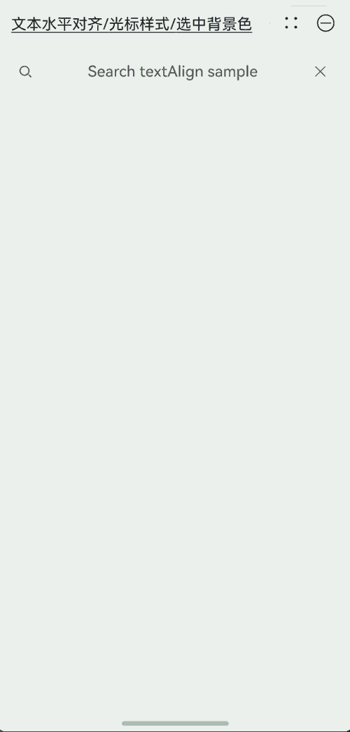
示例11(设置文本水平对齐/光标样式/选中背景色)
该示例通过textAlign、caretStyle、selectedBackgroundColor属性展示如何设置文本的水平对齐、光标样式和选中背景色。
import { AtomicServiceSearch } from '@kit.ArkUI';

@Entry
@Component
struct Index {
  build() {
    Column() {
      Text('设置文本水平对齐/光标样式/选中背景色').alignSelf(ItemAlign.Start).decoration({
        type: TextDecorationType.Underline,
        color: Color.Black,
        style: TextDecorationStyle.SOLID
      }).margin({ top: 20, bottom: 20 })

      AtomicServiceSearch({
        value: 'Search textAlign sample',
        search: {
          textAlign: TextAlign.Center,
          caretStyle: { width: 3, color: Color.Green },
          selectedBackgroundColor: Color.Gray
        }
      })
    }.padding({ left: 16, right: 16 })
  }

  public alert(message: string): void {
    this.getUIContext().showAlertDialog({ message: message });
  }
}
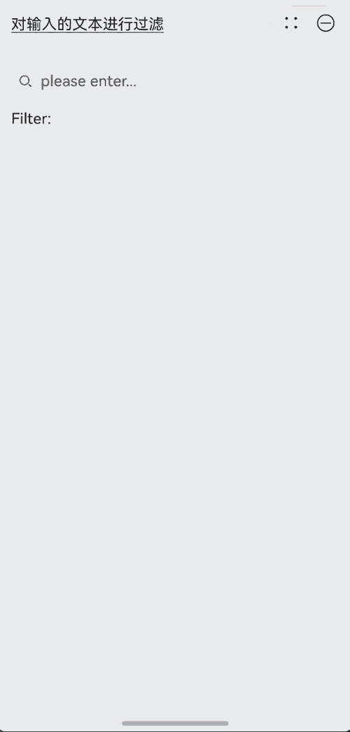
示例12(对输入的文本进行过滤)
该示例通过inputFilter属性展示如何对输入的文本进行内容的过滤,以限制输入内容。
import { AtomicServiceSearch } from '@kit.ArkUI';

@Entry
@Component
struct Index {
  @State filterValue: string = '';

  build() {
    Column() {
      Column({ space: 10 }) {
        Text('对输入的文本进行过滤').alignSelf(ItemAlign.Start).decoration({
          type: TextDecorationType.Underline,
          color: Color.Black,
          style: TextDecorationStyle.SOLID
        }).margin({ top: 20, bottom: 20 })
        AtomicServiceSearch({
          placeholder: 'please enter...',
          search: {
            inputFilter: {
              inputFilterValue : '[a-z]',
              error: (filterValue: string) => {this.filterValue = filterValue}
            }
          }
        })
        Text('Filter:' + this.filterValue).alignSelf(ItemAlign.Start)

      }
    }.padding({ left: 16, right: 16 })
  }

  public alert(message: string): void {
    this.getUIContext().showAlertDialog({ message: message });
  }
}
你可能感兴趣的鸿蒙文章
- 所属分类: 后端技术
- 本文标签:
热门推荐
-
2、 优质文章
-
3、 gt
-
7、 openharmony
-
9、 golang
-
10、 Vue中input框自动聚焦