harmony 鸿蒙Creating a Swiper (Swiper)
Creating a Swiper (Swiper)
The Swiper component is a container that is able to display child components in looping mode. It is typically used in scenarios such as display of recommended content on the home page.
The Swiper component provides a preloading mechanism, which you can use to improve the swipe experience in complex scenarios. This mechanism allows for prebuilding and prerendering components when the main thread is idle. For details, see High-Performance Swiper Development.
Layout and Constraints
The Swiper component follows its own size settings if they are configured. If the component does not have its own size settings configured, it follows the size of its parent component when the prevMargin or nextMargin attribute is set, or adapts its size to its child components otherwise.
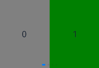
Loop Playback
The loop attribute sets whether to enable loop playback. Its default value is true.
When loop is set to true, the user can switch to the previous or next page when they are on the first or last page.
- Example of setting loop to true:
Swiper() {
  Text('0')
    .width('90%')
    .height('100%')
    .backgroundColor(Color.Gray)
    .textAlign(TextAlign.Center)
    .fontSize(30)

  Text('1')
    .width('90%')
    .height('100%')
    .backgroundColor(Color.Green)
    .textAlign(TextAlign.Center)
    .fontSize(30)

  Text('2')
    .width('90%')
    .height('100%')
    .backgroundColor(Color.Pink)
    .textAlign(TextAlign.Center)
    .fontSize(30)
}
.loop(true)

- Example of setting loop to false:
Swiper() {
  // ...
}
.loop(false)
Automatic Playback
The autoPlay attribute sets whether to enable automatic playback for child component switching. Its default value is false.
When autoPlay is set to true, automatic playback is enabled for child component switching. The playback interval is specified by the interval attribute, which is 3000 by default, in milliseconds.
Swiper() {
  // ...
}
.loop(true)
.autoPlay(true)
.interval(1000)

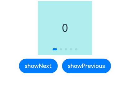
Navigation Indicator
The Swiper component comes with default indicator and arrow styles, with the indicators centered at the bottom and arrows hidden.
With the indicator attribute, you can set the position of the indicator relative to the edges of the Swiper component, in addition to the size, color, and mask of each indicator as well as the color of the selected indicator.
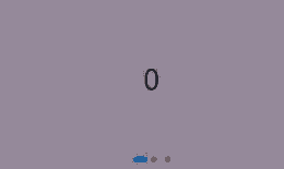
- Example of using the navigation indicator in its default style:
Swiper() {
  Text('0')
    .width('90%')
    .height('100%')
    .backgroundColor(Color.Gray)
    .textAlign(TextAlign.Center)
    .fontSize(30)

  Text('1')
    .width('90%')
    .height('100%')
    .backgroundColor(Color.Green)
    .textAlign(TextAlign.Center)
    .fontSize(30)

  Text('2')
    .width('90%')
    .height('100%')
    .backgroundColor(Color.Pink)
    .textAlign(TextAlign.Center)
    .fontSize(30)
}

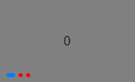
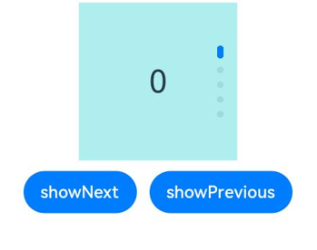
- Example of customizing the style of the navigation indicator, with the diameter of 30 vp, left margin of 0, and color of red:
Swiper() {
  // ...
}
.indicator(
  Indicator.dot()
    .left(0)
    .itemWidth(15)
    .itemHeight(15)
    .selectedItemWidth(30)
    .selectedItemHeight(15)
    .color(Color.Red)
    .selectedColor(Color.Blue)
)
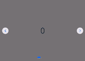
You can set the displayArrow attribute of Swiper to control the size, position, color, and background of navigation point arrows, and whether to display arrows on mouse hover.
- Example of using the navigation point arrows in the default style:
Swiper() {
  // ...
}
.displayArrow(true, false)
- Example of customizing the style of navigation point arrows:
In this example, the arrows are displayed on both sides of the component, with a size of 18 vp and a color of blue.
Swiper() {
  // ...
}
.displayArrow({
  showBackground: true,
  isSidebarMiddle: true,
  backgroundSize: 24,
  backgroundColor: Color.White,
  arrowSize: 18,
  arrowColor: Color.Blue
  }, false)
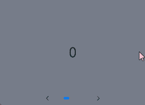
Page Switching Mode
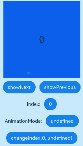
The Swiper component supports three page switching modes: swiping with fingers, touching navigation points, and using a controller. The following example shows how to switch between pages using a controller.
@Entry
@Component
struct SwiperDemo {
  private swiperBackgroundColors: Color[] = [Color.Blue, Color.Brown, Color.Gray, Color.Green, Color.Orange,
    Color.Pink, Color.Red, Color.Yellow];
  private swiperAnimationMode: (SwiperAnimationMode|boolean|undefined)[] = [undefined, true, false,
    SwiperAnimationMode.NO_ANIMATION, SwiperAnimationMode.DEFAULT_ANIMATION, SwiperAnimationMode.FAST_ANIMATION];
  private swiperController: SwiperController = new SwiperController();
  private animationModeIndex: number = 0;
  private animationMode: (SwiperAnimationMode|boolean|undefined) = undefined;
  @State animationModeStr: string = 'undefined';
  @State targetIndex: number = 0;

  aboutToAppear(): void {
    this.toSwiperAnimationModeStr();
  }

  build() {
    Column({ space: 5 }) {
      Swiper(this.swiperController) {
        ForEach(this.swiperBackgroundColors, (backgroundColor: Color, index: number) => {
          Text(index.toString())
            .width(250)
            .height(250)
            .backgroundColor(backgroundColor)
            .textAlign(TextAlign.Center)
            .fontSize(30)
        })
      }
      .indicator(true)

      Row({ space: 12 }) {
        Button('showNext')
          .onClick(() => {
            this.swiperController.showNext(); // Switch to the next page using the controller.
          })
        Button('showPrevious')
          .onClick(() => {
            this.swiperController.showPrevious(); // Switch to the previous page using the controller.
          })
      }.margin(5)

      Row({ space: 12 }) {
        Text('Index:')
        Button(this.targetIndex.toString())
          .onClick(() => {
            this.targetIndex = (this.targetIndex + 1) % this.swiperBackgroundColors.length;
          })
      }.margin(5)
      Row({ space: 12 }) {
        Text('AnimationMode:')
        Button(this.animationModeStr)
          .onClick(() => {
            this.animationModeIndex = (this.animationModeIndex + 1) % this.swiperAnimationMode.length;
            this.toSwiperAnimationModeStr();
          })
      }.margin(5)

      Row({ space: 12 }) {
        Button('changeIndex(' + this.targetIndex + ', ' + this.animationModeStr + ')')
          .onClick(() => {
            this.swiperController.changeIndex(this.targetIndex, this.animationMode); // Switch to the specified page using the controller.
          })
      }.margin(5)
    }.width('100%')
    .margin({ top: 5 })
  }

  private toSwiperAnimationModeStr() {
    this.animationMode = this.swiperAnimationMode[this.animationModeIndex];
    if ((this.animationMode === true)||(this.animationMode === false)) {
      this.animationModeStr = '' + this.animationMode;
    } else if ((this.animationMode === SwiperAnimationMode.NO_ANIMATION)||
      (this.animationMode === SwiperAnimationMode.DEFAULT_ANIMATION)||
      (this.animationMode === SwiperAnimationMode.FAST_ANIMATION)) {
      this.animationModeStr = SwiperAnimationMode[this.animationMode];
    } else {
      this.animationModeStr = 'undefined';
    }
  }
}
Playback Direction
You can set the playback direction for the Swiper component through its vertical attribute.
When vertical is set to true, vertical swiping is used. The default value of vertical is false.
- Example of using horizontal swiping:
Swiper() {
  // ...
}
.indicator(true)
.vertical(false)
- Example of using vertical swiping:
Swiper() {
  // ...
}
.indicator(true)
.vertical(true)
Child Components Per Page
You can set the number of child components per page for the Swiper component through its displayCount attribute.
Swiper() {
  Text('0')
    .width(250)
    .height(250)
    .backgroundColor(Color.Gray)
    .textAlign(TextAlign.Center)
    .fontSize(30)
  Text('1')
    .width(250)
    .height(250)
    .backgroundColor(Color.Green)
    .textAlign(TextAlign.Center)
    .fontSize(30)
  Text('2')
    .width(250)
    .height(250)
    .backgroundColor(Color.Pink)
    .textAlign(TextAlign.Center)
    .fontSize(30)
  Text('3')
    .width(250)
    .height(250)
    .backgroundColor(Color.Blue)
    .textAlign(TextAlign.Center)
    .fontSize(30)
}
.indicator(true)
.displayCount(2)
Customizing Transition Animation
Use the customContentTransition attribute to set a custom transition animation for Swiper. Define the animation by adjusting opacity, scale, translation, and rendering layer for all pages within the viewport frame by frame in the callback.
@Entry
@Component
struct SwiperCustomAnimationExample {
  private DISPLAY_COUNT: number = 2
  private MIN_SCALE: number = 0.75

  @State backgroundColors: Color[] = [Color.Green, Color.Blue, Color.Yellow, Color.Pink, Color.Gray, Color.Orange]
  @State opacityList: number[] = []
  @State scaleList: number[] = []
  @State translateList: number[] = []
  @State zIndexList: number[] = []

  aboutToAppear(): void {
    for (let i = 0; i < this.backgroundColors.length; i++) {
      this.opacityList.push(1.0)
      this.scaleList.push(1.0)
      this.translateList.push(0.0)
      this.zIndexList.push(0)
    }
  }

  build() {
    Column() {
      Swiper() {
        ForEach(this.backgroundColors, (backgroundColor: Color, index: number) => {
          Text(index.toString()).width('100%').height('100%').fontSize(50).textAlign(TextAlign.Center)
            .backgroundColor(backgroundColor)
            .opacity(this.opacityList[index])
            .scale({ x: this.scaleList[index], y: this.scaleList[index] })
            .translate({ x: this.translateList[index] })
            .zIndex(this.zIndexList[index])
        })
      }
      .height(300)
      .indicator(false)
      .displayCount(this.DISPLAY_COUNT, true)
      .customContentTransition({
        timeout: 1000,
        transition: (proxy: SwiperContentTransitionProxy) => {
          if (proxy.position <= proxy.index % this.DISPLAY_COUNT||proxy.position >= this.DISPLAY_COUNT + proxy.index % this.DISPLAY_COUNT) {
            // When a group of pages is completely scrolled out of the viewport, reset the attribute values.
            this.opacityList[proxy.index] = 1.0
            this.scaleList[proxy.index] = 1.0
            this.translateList[proxy.index] = 0.0
            this.zIndexList[proxy.index] = 0
          } else {
            // When a group of pages is not scrolled out of the viewport, adjust the attribute values frame by frame for the left and right pages in the group based on the position.
            if (proxy.index % this.DISPLAY_COUNT === 0) {
              this.opacityList[proxy.index] = 1 - proxy.position / this.DISPLAY_COUNT
              this.scaleList[proxy.index] = this.MIN_SCALE + (1 - this.MIN_SCALE) * (1 - proxy.position / this.DISPLAY_COUNT)
              this.translateList[proxy.index] = - proxy.position * proxy.mainAxisLength + (1 - this.scaleList[proxy.index]) * proxy.mainAxisLength / 2.0
            } else {
              this.opacityList[proxy.index] = 1 - (proxy.position - 1) / this.DISPLAY_COUNT
              this.scaleList[proxy.index] = this.MIN_SCALE + (1 - this.MIN_SCALE) * (1 - (proxy.position - 1) / this.DISPLAY_COUNT)
              this.translateList[proxy.index] = - (proxy.position - 1) * proxy.mainAxisLength - (1 - this.scaleList[proxy.index]) * proxy.mainAxisLength / 2.0
            }
            this.zIndexList[proxy.index] = -1
          }
        }
      })
    }.width('100%')
  }
}
你可能感兴趣的鸿蒙文章
harmony 鸿蒙Atomic Service Full Screen Launch Component (FullScreenLaunchComponent)
harmony 鸿蒙Arc Button (ArcButton)
harmony 鸿蒙Frame Animation (ohos.animator)
harmony 鸿蒙Implementing Property Animation
- 所属分类: 后端技术
- 本文标签:
热门推荐
-
2、 优质文章
-
3、 gt
-
7、 openharmony
-
9、 golang
-
10、 Vue中input框自动聚焦