harmony 鸿蒙Creating a Grid (Grid/GridItem)
Creating a Grid (Grid/GridItem)
Overview
The grid layout consists of cells formed by rows and columns. You can specify the cells where items are located to create various layouts. The grid layout excels at dividing a page into regions and defining the proportion of child components. It is a key adaptive layout and applies to scenarios such as photo gallery, calendar, and calculator.
ArkUI provides the Grid and GridItem components for building grid layouts. Grid is a container for defining the grid layout, while GridItem is a child component in the container. The Grid component allows creation of child components using methods such as if/else, ForEach, and LazyForEach.
Layout and Constraints
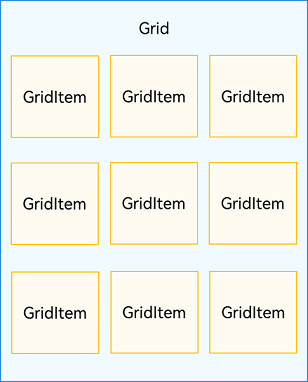
Each item in the Grid container corresponds to a GridItem component, as shown below.
Figure 1 Relationship between Grid and GridItem components
NOTE
The Grid component accepts only GridItem as its child.
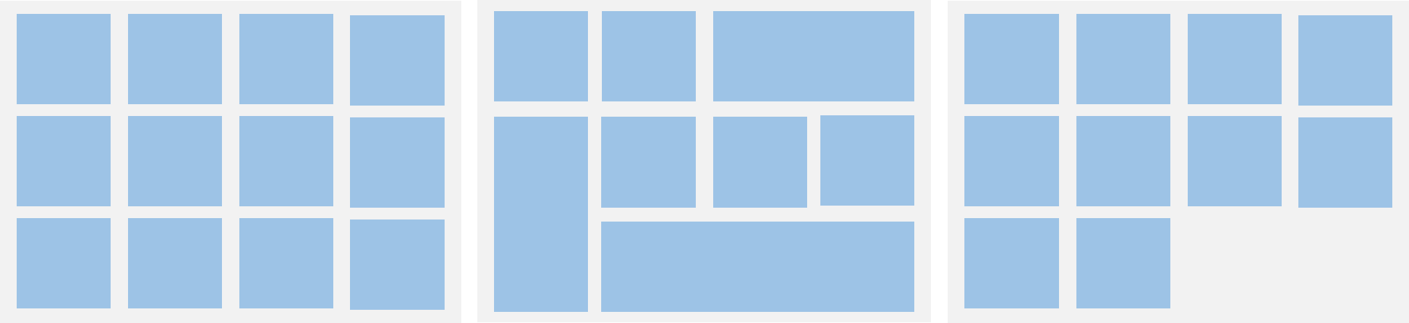
The grid layout is a two-dimensional layout. The Grid component allows you to define the number of rows and columns, proportion of each row and column, number of rows or columns that child components span, and the horizontal and vertical alignment. When it has its size changed, its child components and spacing are adjusted proportionally. By leveraging these layout capabilities, you can build grid layouts of different styles, as shown below.
Figure 2 Grid layout
The size of the Grid component follows its width and height settings (if configured) or adapts to the size of its parent component.
Depending on the settings of the quantity and proportion of rows and columns, the Grid component behaves as follows:
If both the quantity and proportion are set for rows or columns, the Grid component displays elements only in the set number of rows or columns, and it cannot be scrolled. (This layout mode is recommended.)
If only the quantity or proportion is set for rows or columns, the Grid component lays out elements in the specified direction, and it can be scrolled to display excess elements.
If neither the quantity nor the proportion is set for rows or columns, the Grid component lays out elements in the layout direction. The number of rows and columns is determined by the layout direction and the width and height of the grid. Elements that exceed the range of rows and columns are not displayed, and the Grid component cannot be scrolled.
Setting the Arrangement Mode
Setting the Number and Proportion of Rows and Columns
You can set the number and proportion of rows and columns to determine the overall arrangement mode of the grid layout. To do so, use the rowsTemplate and columnsTemplate attributes of the Grid component.
The values of rowsTemplate and columnsTemplate are a string consisting of ‘number+fr’ segments, separated by spaces. Wherein fr indicates the number of rows or columns in the grid layout, and the number in front of fr is used to calculate the proportion of the row or column in the grid width, thereby determining the width of the row or column.
Figure 3 Example of the proportion of rows and columns
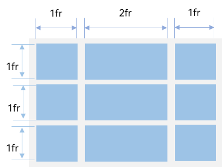
The preceding figure shows a grid layout with three rows and three columns. The grid layout is divided into three parts in the vertical direction with each row taking up 1⁄3, and four parts in the horizontal direction with the first column taking up 1⁄4, the second column 2⁄4, and the third column 1⁄4.
This layout can be implemented by setting rowsTemplate to ‘1fr 1fr 1fr’ and columnsTemplate to ‘1fr 2fr 1fr’.
Grid() {
  // ...
}
.rowsTemplate('1fr 1fr 1fr')
.columnsTemplate('1fr 2fr 1fr')
NOTE
When rowsTemplate or columnsTemplate is set for the Grid component, its layoutDirection, maxCount, minCount, and cellLength attributes do not take effect. For details about the attributes, see Grid Attributes.
Setting the Number of Rows and Columns Occupied by a Child Component
In real-world applications, an uneven grid layout, where grid cells span a varying number of cells and rows, is as common as its even counterpart. To allow a single grid cell in a grid to span multiple rows or columns, passing appropriate GridLayoutOptions when creating the grid. Use irregularIndexes and onGetIrregularSizeByIndex for grids with only rowsTemplate or columnsTemplate, and onGetRectByIndex for grids with both.
Figure 4 Uneven grid layout
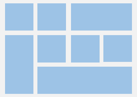
A common application with an uneven grid layout is the calculator. As shown in the following figure, the 0 key spans the first and second columns, and the = key spans the fifth and sixth rows. For a grid layout created using the Grid component, the row and column numbers start from 0 and increase incrementally.
Figure 5 Calculator
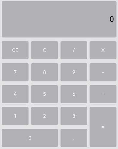
In the grid, use the onGetRectByIndex callback to return the array [rowStart, columnStart, rowSpan, columnSpan] to achieve a layout that spans rows and columns, wherein rowStart and rowEnd indicate the start and end row numbers of the current element, and columnStart and columnEnd indicate the start and end column numbers of the current element.
To make the 0 key span across the first and second columns, and the = key span across the fifth and sixth rows, set onGetRectByIndex for 0 and = as follows: for 0, set rowStart and columnStart at 6 and 0, and rowSpan and columnSpan at 1 and 2; for =, set rowStart and columnStart at 5 and 3, and rowSpan and columnSpan at 2 and 1.
layoutOptions: GridLayoutOptions = {
  regularSize: [1, 1],
  onGetRectByIndex: (index: number) => {
    if (index = = key1) { // key1 is the index of the 0 key.
      return [6, 0, 1, 2];
    } else if (index == key2) { // key2 is the index of the = key.
      return [5, 3, 2, 1];
    }
    // ...
    // Here, you need to return the positions of other items based on the specific layout.
  }
}

Grid(undefined, this.layoutOptions) {
  // ...
}
.columnsTemplate('1fr 1fr 1fr 1fr')
.rowsTemplate('1fr 1fr 1fr 1fr 1fr 1fr 1fr')
Setting the Main Axis Direction
When neither the number nor proportion is set for rows and columns in a grid layout, you can use the layoutDirection attribute to set the main axis direction and thereby specify the arrangement mode of child components. In addition, you can use the minCount and maxCount attributes to restrict the number of grid cells along the main axis.
Figure 6 Main axis direction
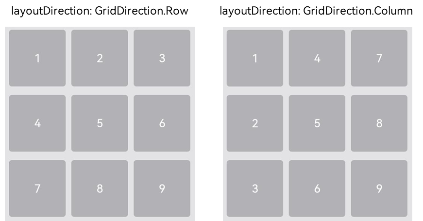
When layoutDirection is set to Row, child components are arranged from left to right. When a row is full, a new row is added. When layoutDirection is set to Column, child components are arranged from top to bottom. When a column is full, a new column is added. In this example, the maxCount attribute is set to 3, indicating that the maximum number of grid cells displayed along the main axis is 3.
Grid() {
  // ...
}
.maxCount(3)
.layoutDirection(GridDirection.Row)
NOTE
- The layoutDirection attribute takes effect only when rowsTemplate and columnsTemplate are not set. In this case, child components are arranged in the direction set by layoutDirection.
- When only rowsTemplate is set, the main axis of the grid runs in the horizontal direction, and the cross axis runs in the vertical direction.
- When only columnsTemplate is set, the main axis of the grid runs in the vertical direction, and the cross axis runs in the horizontal direction.
Displaying Data in a Grid Layout
The grid layout organizes its internal elements in two-dimensional layout mode, as shown in the following figure.
Figure 7 General office services
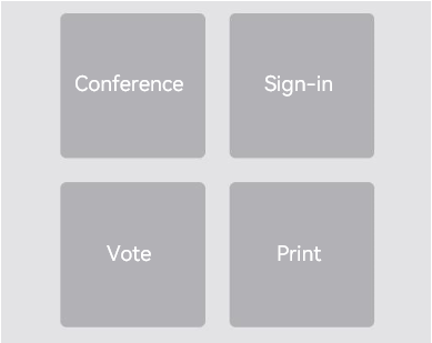
The Grid component can display a group of GridItem child components in two-dimensional layout mode.
Grid() {
  GridItem() {
    Text('Conference')
      // ...
  }

  GridItem() {
    Text('Sign-in')
      // ...
  }

  GridItem() {
    Text('Vote')
      // ...
  }

  GridItem() {
    Text('Print')
      // ...
  }
}
.rowsTemplate('1fr 1fr')
.columnsTemplate('1fr 1fr')
For multiple GridItem components with similar content structures, you are advised to nest them in ForEach statements to reduce repeated code.
@Entry
@Component
struct OfficeService {
  @State services: Array<string> = ['Conference', 'Vote','Sign-in', 'Print']

  build() {
    Column() {
      Grid() {
        ForEach(this.services, (service:string) => {
          GridItem() {
            Text(service)
          }
        }, (service:string):string => service)
      }
      .rowsTemplate(('1fr 1fr') as string)
      .columnsTemplate(('1fr 1fr') as string)
    }
  }
}
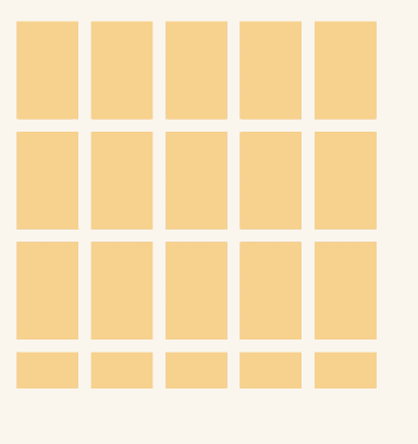
Setting the Gap Between Rows and Columns
The horizontal spacing between two grid cells is called row spacing, and the vertical spacing is called column spacing, as shown in the following figure.
Figure 8 Row spacing and column spacing
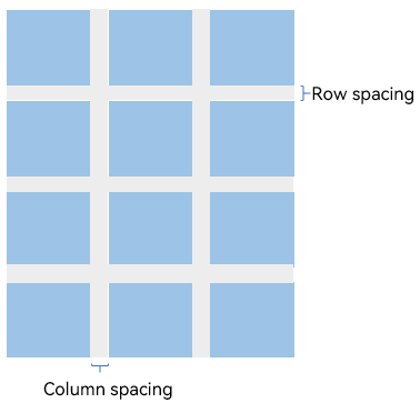
You can use rowsGap and columnsGap to set the row spacing and column spacing of the grid layout. In the calculator shown in Figure 5, the row spacing is 15 vp, and the column spacing is 10vp.
Grid() {
  // ...
}
.columnsGap(10)
.rowsGap(15)
Building a Scrollable Grid Layout
The scrollable grid layout is often used on the file list, product list, video list, and similar pages, as shown in the following figure. When only the number or proportion is set for rows and columns, that is, only the rowsTemplate or columnsTemplate attribute is set, the elements in the grid are arranged in the configured direction. When the content goes beyond the display area, the grid can be scrolled.
Figure 9 Horizontal scrollable grid layout
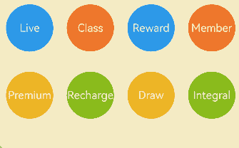
If columnsTemplate is set, the grid scrolls vertically. If rowsTemplate is set, the grid scrolls horizontally.
In the horizontal scrollable grid layout shown in the preceding figure, rowsTemplate is set but columnsTemplate is not. When the content exceeds the width of the grid, the grid can scroll horizontally to display the content outside of the display area.
@Entry
@Component
struct Shopping {
  @State services: Array<string> = ['Live', 'Premium']

  build() {
    Column({ space: 5 }) {
      Grid() {
        ForEach(this.services, (service: string, index) => {
          GridItem() {
          }
          .width('25%')
        }, (service:string):string => service)
      }
      .rowsTemplate('1fr 1fr') // Set only the rowsTemplate attribute. When the content exceeds the display area of the grid, the grid can be scrolled horizontally.
      .rowsGap(15)
    }
  }
}
Controlling the Scrolling Position
Similar to the Back to top button in a list layout, the feature of controlling the scrolling position is commonly used in the grid layout, for example, page turning in the calendar application, as shown below.
Figure 10 Page turning in the calendar application
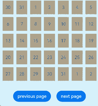
When the Grid component is initialized, it can be bound to a Scroller object for scrolling control. In this example, the scrollPage API of the Scroller object is used to turn pages.
private scroller: Scroller = new Scroller()
On the calendar page, when a user clicks the Next button, the application responds to the click event by setting the next parameter in the scrollPage API to true to scroll to the next page.
Column({ space: 5 }) {
  Grid(this.scroller) {
  }
  .columnsTemplate('1fr 1fr 1fr 1fr 1fr 1fr 1fr')

  Row({space: 20}) {
    Button('Previous')
      .onClick(() => {
        this.scroller.scrollPage({
          next: false
        })
      })

    Button('Next')
      .onClick(() => {
        this.scroller.scrollPage({
          next: true
        })
      })
  }
}
Adding an External Scrollbar
To add an external scrollbar to a Grid component, you can use the ScrollBar component. By binding both the Grid and ScrollBar components to the same Scroller object, you can ensure they stay synchronized.
- Create a Scroller object named gridScroller.
private gridScroller: Scroller = new Scroller();
- Bind the gridScroller object to the Grid component using the scroller parameter.
   // Use gridScroller to initialize the scroller parameter to bind it with the Grid component.
   Grid({ scroller: this.gridScroller }) {
   // ...
   }
- Bind the gridScroller object to the ScrollBar component using the scroller parameter.
   // Use gridScroller to initialize the scroller parameter to bind it with the ScrollBar component.
   ScrollBar({ scroller: this.gridScroller })
Figure 11 External scrollbar of the Grid component
NOTE - The ScrollBar component can also be used with other scrollable components such as ArcList, List, Scroll, and WaterFlow. - On devices with circular screens, you can use the Grid component with the ArcScrollBar component to add an arc scrollbar to your grid layout. For details, see Adding an External Scrollbar: ArcScrollBar.
Performance Optimization
Just as LazyForEach is recommended for handling a long list, it is also recommended for a scrolling grid layout when a large number of grid items is involved.
For details about the implementation, see the example in LazyForEach: Lazy Data Loading.
When the grid is rendered in lazy loading mode, to improve the grid scrolling experience and minimize white blocks during grid scrolling, you can use the cachedCount parameter of the Grid component. This parameter sets the number of grid items preloaded outside of the screen and is valid only in LazyForEach.
Specifically, the number of the grid items to cache before and after the currently displayed one equals the value of cachedCount multiplied by the number of columns. Grid items that exceed the display and cache range are released.
Grid() {
  LazyForEach(this.dataSource, () => {
    GridItem() {
    }
  })
}
.cachedCount(3)
NOTE
A greater cachedCount value may result in higher CPU and memory overhead of the UI. Adjust the value by taking into account both the comprehensive performance and user experience.
你可能感兴趣的鸿蒙文章
harmony 鸿蒙Atomic Service Full Screen Launch Component (FullScreenLaunchComponent)
harmony 鸿蒙Arc Button (ArcButton)
harmony 鸿蒙Frame Animation (ohos.animator)
harmony 鸿蒙Implementing Property Animation
- 所属分类: 后端技术
- 本文标签:
热门推荐
-
2、 优质文章
-
3、 gt
-
7、 openharmony
-
9、 golang
-
10、 Vue中input框自动聚焦