harmony 鸿蒙转场动画的使用(ArkTs)
转场动画的使用(ArkTs)
场景介绍
日常在应用时,经常需要衔接两个场景,或者两个镜头画面之间进行切换,切换时需要呈现一种平滑过渡效果。
本例将为大家介绍下如何通过转场动画实现上述过渡效果。
效果呈现
本例最终效果如下:
| 场景 | 效果图 |
|---|---|
| 页面间转场–底部滑入转场 |  |
| 页面间转场–自定义1:缩放动画转场 |  |
| 页面间转场—自定义2:旋转动画转场 |  |
| 组件内转场 |  |
| 共享元素转场 |  |
运行环境
本例基于以下环境开发,开发者也可以基于其他适配的版本进行开发: - IDE: DevEco Studio 4.0 Beta1 - SDK: Ohos_sdk_public 4.0.7.5 (API Version 10 Beta1)
实现思路
构建应用首页,主要由5个相同样式的功能菜单组成,通过添加路由实现主页面与对应功能页面的链接跳转。
功能页面的实现
页面间转场
底部滑入转场
通过给pageTransition()方法定义入场效果PageTransitionEnter以及出场效果PageTransitionExit,同时通过设置slide属性为SlideEffect.Bottom来实现从底部滑入动效。
- 缩放动画转场
通过设置pageTransition方法,配置进行配置转场参数。
- 旋转动画转场
在FullCustomTransition.ets的Column组件中添加TransitionElement组件,并且定义pageTransition方法。给Clomn组件添加opacity、scale、rotate属性,定义变量animValue用来控制Clomn组件的动效,在PageTransitionEnter和PageTransitionExit组件中动态改变myProgress的值,从而控制动画效果。
组件间转场
通过Image、Column、Text、Button等组件构建ComponentTransition.ets页面。
新建一个Image组件,并且添加两个transition属性,分别用于定义组件的插入动效和移除动效,从而实现组件间的转场。
设置变量isShow,用来控制上述步骤中Image组件的添加和移除,同时向Button组件的onClick添加animateTo方法,来使ComponentItem子组件动效生效。
isShow默认状态为false,删除隐藏Image组件,同时删除动效生效。
当isShow状态更新为true时,插入Image组件,同时插入动效生效。
共享转场
通过给两个页面“SharedItem”和“SharePage” 的Image组件设置sharedTransition属性来实现,两个页面的组件配置为同一个id,则转场过程中会执行共享元素转场效果。
开发步骤
创建主界面。
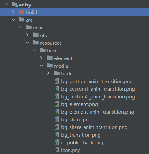
添加媒体资源至resources > base > media目录下。
首页Index.ets引入首页列表常量数据:INDEX_ANIMATION_MODE(imgRes:设置按钮的背景图片,url:设置页面路由的地址),通过ForEach方法循环渲染列表常量数据。 具体代码如下:
// entry/src/main/ets/pages/Index.ets


// 引入列表常量数据INDEX_ANIMATION_MODE
export const INDEX_ANIMATION_MODE = [
  { imgRes: $r('app.media.bg_bottom_anim_transition'), url: 'pages/BottomTransition' },
  { imgRes: $r('app.media.bg_custom1_anim_transition'), url: 'pages/CustomTransition' },
  { imgRes: $r('app.media.bg_custom2_anim_transition'), url: 'pages/FullCustomTransition' },
  { imgRes: $r('app.media.bg_element_anim_transition'), url: 'pages/ComponentTransition' },
  { imgRes: $r('app.media.bg_share_anim_transition'), url: 'pages/ShareItem' }
];


...
Column() {
  // ForEach循环渲染
  ForEach(INDEX_ANIMATION_MODE, ({ imgRes , url }) => {
    Row()
      .backgroundImage(imgRes)
      .backgroundImageSize(ImageSize.Cover)
      .backgroundColor('#00000000')
      .height(130)
      .margin({ bottom: 30 })
      .width('100%')
      .borderRadius(32)
      .onClick(() => {
        router.pushUrl({ url: url })
      })
  }, item => JSON.stringify(item))
}
添加其它组件,以及样式,完成UI构建。
具体代码如下:
// entry/src/main/ets/pages/Index.ets
import router from '@ohos.router';
import hilog from '@ohos.hilog';
@Entry
@Component
struct Index {
  build() {
    Column() {
      Text($r('app.string.main_page_title'))
        .fontSize(30)
        .fontWeight(FontWeight.Regular)
        .width('100%')
        .margin({ top: 13, bottom: 27,left: 24})


      Scroll() {
        Column() {
          ForEach(INDEX_ANIMATION_MODE, ({ imgRes , url }) => {
            Row()
              .backgroundImage(imgRes)
              .backgroundImageSize(ImageSize.Cover)
              .backgroundColor('#00000000')
              .height(130)
              .margin({ bottom: 30 })
              .width('100%')
              .borderRadius(32)
              .onClick(() => {
                router.pushUrl({ url: url })
                  .catch(err => {
                    hilog.error(0xff00, '[ReadingRecorder]', `%{public}s, %{public}s`, err);
                  });
              })
          }, item => JSON.stringify(item))
        }
      }
      .align(Alignment.Top)
      .layoutWeight(1)
      .scrollBar(BarState.Off)
    }
    .height('100%')
    .backgroundColor('#F1F3F5')
    .padding({left:12 , right:12})
  }
}
实现页面间转场。
- 效果1:底部滑入。
该效果的实现,主要是通过在BottomTransition.ets中设置全局pageTransition()方法,该方法中自定义入场效果PageTransitionEnter以及出场效果PageTransitionExit,同时通过设置slide属性为SlideEffect.Bottom来实现从底部滑入动效。
具体代码如下:
// entry/src/main/ets/pages/BottomTransition.ets


@Entry
@Component
struct BottomTransition {
  private imgRes: string|Resource = $r('app.media.bg_transition');
  private imgFit: ImageFit = ImageFit.Fill;


  build() {
    Column() {
      Image(this.imgRes)
        .objectFit(this.imgFit)
        .width('100%')
        .height('100%')
    }


  }


  // 页面转场通过全局pageTransition方法进行配置转场参数
  pageTransition() {
    // PageTransitionEnter自定义入场效果:设置slide属性为SlideEffect.Bottom 表示入场时从屏幕下方滑入。
    PageTransitionEnter({ duration: 600, curve: Curve.Smooth }).slide(SlideEffect.Bottom);
    // PageTransitionExit自定义出场效果:设置slide属性为SlideEffect.Bottom 退场时从屏幕下方滑出。
    PageTransitionExit({ duration: 600, curve: Curve.Smooth }).slide(SlideEffect.Bottom);
  }
}
效果2:页面入场时淡入和放大,退场时从右下角滑出。
在CustomTransition.ets中设置全局pageTransition()方法。
pageTransition方法中自定义入场效果PageTransitionEnter:透明度设置从0.2到1;x、y轴缩放从0变化到1。
pageTransition方法中自定义出场效果PageTransitionExit: x、y轴的偏移量为500。
具体代码如下:
// entry/src/main/ets/pages/CustomTransition.ets


@Entry
@Component
struct CustomTransition {
  private imgRes: string|Resource = $r('app.media.bg_transition');
  private imgFit: ImageFit = ImageFit.Fill;


  build() {
    Column() {
      Image(this.imgRes)
        .objectFit(this.imgFit)
        .width('100%')
        .height('100%')
    }
  }


  // 页面转场通过全局pageTransition方法进行配置转场参数
  pageTransition() {
    // 进场时透明度设置从0.2到1;x、y轴缩放从0变化到1
    PageTransitionEnter({ duration: 600, curve: Curve.Smooth }).opacity(0.2).scale({ x: 0, y: 0 })
    // 退场时x、y轴的偏移量为500
    PageTransitionExit({ duration: 600, curve: Curve.Smooth }).translate({ x: 500, y: 500 })
  }
}
效果3:页面入场时淡入和放大,同时顺时针旋转;退场时淡出和缩小,同时逆时针旋转。
在FullCustomTransition.ets中添加Column组件。
向Column组件添加属性:opacity、scale、rotate,来控制动效的淡入淡出、缩放以及旋转效果。
定义变量animValue用来,通过animValue值得变化来控制Column组件的动效。
在FullCustomTransition.ets中定义全局pageTransition()方法。
pageTransition方法中自定义入场效果PageTransitionEnter。
animValue值实时变化,0 –> 1,从而渲染 入场时淡入、放大以及顺时针旋转效果。 * pageTransition方法中自定义出场效果PageTransitionExit。
animValue值实时变化,1 –> 0,从而渲染 出场时淡出、缩小以及逆时针旋转效果。
具体代码如下:
// entry/src/main/ets/pages/FullCustomTransition.ets


@Entry
@Component
struct FullCustomTransition {
    @State animValue: number = 1;
    private imgRes: string|Resource = $r('app.media.bg_transition');
    private imgFit: ImageFit = ImageFit.Fill;


    build() {
    Column() {
        Image(this.imgRes)
        .objectFit(this.imgFit)
        .width('100%')
        .height('100%')
    }
    // 设置淡入、淡出效果
    .opacity(this.animValue)
    // 设置缩放
    .scale({ x: this.animValue, y: this.animValue })
    // 设置旋转角度
    .rotate({
        z: 1,
        angle: 360 * this.animValue
    })
    }


    // 页面转场通过全局pageTransition方法进行配置转场参数
    pageTransition() {
    PageTransitionEnter({ duration: 600, curve: Curve.Smooth })
        // 进场过程中会逐帧触发onEnter回调,入参为动效的归一化进度(0 - 1)
        .onEnter((type: RouteType, progress: number) => {
        // 入场动效过程中,实时更新this.animValue的值
        this.animValue = progress
        });
    PageTransitionExit({ duration: 600, curve: Curve.Smooth })
        // 出场过程中会逐帧触发onExit回调,入参为动效的归一化进度(0 - 1)
        .onExit((type: RouteType, progress: number) => {
        // 入场动效过程中,实时更新this.animValue的值
        this.animValue = 1 - progress
        });
    }
}
实现组件内转场。
- 通过Image、Column、Text、Button等组件构建ComponentTransition.ets页面。
具体代码如下:
// entry/src/main/ets/pages/ComponentTransition.ets @Entry @Component struct ComponentTransition { build() { Column() { Row() { Image($r('app.media.ic_public_back')) .width(20) .height(20) .responseRegion({width:'100%',height: '100%'}) .onClick(() => { this.getUIContext().getRouter().back(); }) Text($r('app.string.Component_transition_header')) .fontColor(Color.Black) .fontWeight(FontWeight.Regular) .fontSize(25) .margin({left:18,right:18}) } .height(30) .width('100%') .margin({ top: 20, bottom: 27,left: 24}) Image($r('app.media.bg_element')) .objectFit(ImageFit.Fill) .borderRadius(20) .margin({ bottom: 20 }) .width('100%') .height(300) Button($r('app.string.Component_transition_toggle')) .height(40) .width(120) .fontColor(Color.White) .backgroundColor($r('app.color.light_blue')) } .padding({left:20,right:20}) .height('100%') .width('100%') } }- 新建一个Image组件,并且添加两个transition属性,分别用于定义组件的插入动效和移除动效,来实现组件转场间。
具体代码如下:
 //  entry/src/main/ets/pages/ComponentTransition.ets
 ...
 Image($r('app.media.bg_share'))
           .objectFit(ImageFit.Fill)
           .borderRadius(20)
           .margin({ bottom: 20 })
           .height(300)
           .width('100%')
            // 插入动效
           .transition({
             type: TransitionType.Insert,
             scale: { x: 0.5, y: 0.5 },
             opacity: 0
           })
            // 删除隐藏动效
           .transition({
             type: TransitionType.Delete,
             rotate: { x: 0, y: 1, z: 0, angle: 360 },
             opacity: 0
           })
设置变量isShow,用来控制上述步骤中Image组件的添加和移除,同时向Button组件的onClick添加animateTo方法,来使ComponentItem子组件动效生效。
isShow默认状态为false,删除隐藏Image组件,同时删除动效生效。
当isShow状态更新为true时,插入Image组件,同时插入动效生效。
具体代码如下:
  //  entry/src/main/ets/pages/ComponentTransition.ets


  ...
  @State isShow: boolean = false;
      ...
      // isShow为True,插入Image组件,同时插入动效生效;isShow为False,删除隐藏Image组件,同时删除动效生效
      if (this.isShow) {
          Image($r('app.media.bg_share'))
          .objectFit(ImageFit.Fill)
          .borderRadius(20)
          .margin({ bottom: 20 })
          .height(300)
          .width('100%')
              // 插入动效
          .transition({
              type: TransitionType.Insert,
              scale: { x: 0.5, y: 0.5 },
              opacity: 0
          })
              // 删除隐藏动效
          .transition({
              type: TransitionType.Delete,
              rotate: { x: 0, y: 1, z: 0, angle: 360 },
              opacity: 0
          })
      }
  	...
  		Button($r('app.string.Component_transition_toggle'))
      	...
          .onClick(() => {
          	animateTo({ duration: 600 }, () => {
              this.isShow = !this.isShow;
          	})
          })
ComponentTransition.ets的完整代码如下:
//  entry/src/main/ets/pages/ComponentTransition.ets
@Entry
@Component
struct ComponentTransition {
  @State isShow: boolean = false;


  build() {
    Column() {
      // 页面title区域,含返回功能以及title显示
      Row() {
        Image($r('app.media.ic_public_back'))
          .width(20)
          .height(20)
          .responseRegion({
            width:'100%',
            height: '100%'
          })
          .onClick(() => {
            this.getUIContext().getRouter().back();
          })


        Text($r('app.string.Component_transition_header'))
          .fontColor(Color.Black)
          .fontWeight(FontWeight.Regular)
          .fontSize(25)
          .height(300)
          .margin({ left:18, right:18 })
      }
      .height(30)
      .width('100%')
      .margin({ top: 20, bottom: 27,left: 24})


      // 页面内容区域
      // isShow为True,插入Image组件,同时插入动效生效;isShow为False,删除隐藏Image组件,同时删除动效生效
      if (this.isShow) {
        Image($r('app.media.bg_share'))
          .objectFit(ImageFit.Fill)
          .borderRadius(20)
          .margin({ bottom: 20 })
          .height(300)
          .width('100%')
            // 插入动效
          .transition({
            type: TransitionType.Insert,
            scale: { x: 0.5, y: 0.5 },
            opacity: 0
          })
            // 删除隐藏动效
          .transition({
            type: TransitionType.Delete,
            rotate: { x: 0, y: 1, z: 0, angle: 360 },
            opacity: 0
          })
      }


      Image($r('app.media.bg_element'))
        .objectFit(ImageFit.Fill)
        .borderRadius(20)
        .margin({ bottom: 20 })
        .width('100%')
        .height(300)
      Button($r('app.string.Component_transition_toggle'))
        .height(40)
        .width(120)
        .fontColor(Color.White)
        .backgroundColor($r('app.color.light_blue'))
        .onClick(() => {
          animateTo({ duration: 600 }, () => {
            console.log('console-- ' +this.isShow)
            this.isShow = !this.isShow;
          })
        })
    }
    .padding({
      left:(20),
      right:(20)
    })
    .height('100%')
    .width('100%')
  }
}
实现元素共享转场。
共享元素转场通过给组件设置sharedTransition属性来实现,两个页面的组件配置为同一个id,则转场过程中会执行共享元素转场效果。
通过Image、Column、Text等组件构建ShareItem.ets页面,给内容区域的Image组件设置sharedTransition属性标记该元素为共享元素,组件转场id设置为“shareID”, 同时设置共享元素转场效果。
具体代码如下:
 // entry/src/main/ets/pages/ShareItem.ets


 import hilog from '@ohos.hilog';


 @Entry
 @Component
 struct ShareItem {
   // 自定义页面内容区域
   @Builder PreviewArea() {
     Column() {
       Image($r('app.media.bg_transition'))
         .width('100%')
         .height(300)
         .borderRadius(24)
         .margin({ bottom: 12 })
         // 设置sharedTransition属性标记该元素为共享元素,转场id为“shareId”
         .sharedTransition('shareId', {
           duration: 600,
           curve: Curve.Smooth,
           delay: 100
         })


         .onClick(() => {
           // 路由切换
           router.pushUrl({ url: 'pages/SharePage' })
             .catch(err => {
               hilog.error(0xFF00, '[ReadingRecorder]', `%{public}s, %{public}s`, err);
             });
         })
       Text($r('app.string.Share_Item_hint'))
         .width('100%')
         .textAlign(TextAlign.Center)
         .fontSize(20)
         .fontWeight(FontWeight.Regular)
         .fontColor($r('app.color.share_item_content_font'))
     }
     .borderRadius(24)
     .backgroundColor(Color.White)
     .width('100%')
     .padding({ top: 13, left: 12, right: 12,bottom:12})
   }


   build() {
     Column() {
       // 页面title区域,含返回功能以及title显示
       Row() {
         Image($r('app.media.ic_public_back'))
           .width(20)
           .height(20)
           .responseRegion({
             width:'100%',
             height: '100%'
           })
           .onClick(() => {
             this.getUIContext().getRouter().back();
           })


         Text($r('app.string.Share_Item_header'))
           .fontColor(Color.Black)
           .fontWeight(FontWeight.Regular)
           .fontSize(25)
           .margin({ left:18, right:18 })
       }
       .height(30)
       .width('100%')
       .margin({ top: 20, bottom: 27,left: 24})
       this.PreviewArea()
     }
     .width('100%')
     .height('100%')
     .backgroundColor($r('app.color.grey_light'))
     .padding({left:12,right:12})
   }
 }
pages/SharePage.ets页面中,给Image组件设置sharedTransition属性,同时组件转场id设置为“shareID”,从而可以共享上述步骤的转场动效。
具体代码如下:
```ts
// entry/src/main/ets/pages/SharePage.ets
@Entry
@Component
struct SharePage {
    build() {
        Column() {
            Image($r('app.media.bg_transition'))
                .objectFit(ImageFit.Fill)
                .width('100%')
                .height('100%')
                .sharedTransition('shareId', {
                    duration: 600,
                    curve: Curve.Smooth,
                    delay: 100
                })
        }
    }
}
```
完整代码
本例完整代码如下:
应用首页: /entry/src/main/ets/pages/Index.ets。
// entry/src/main/ets/pages/Index.ets
import router from '@ohos.router';
import hilog from '@ohos.hilog';

@Entry
@Component
struct Index {
  build() {
    Column() {
      Text($r('app.string.main_page_title'))
      .fontSize(30)
        .fontWeight(FontWeight.Regular)
        .width('100%')
        .margin({ top: 13, bottom: 27,left: 24})

      Scroll() {
      	Column() {
          ForEach(INDEX_ANIMATION_MODE, ({ imgRes , url }) => {
            Row()
              .backgroundImage(imgRes)
              .backgroundImageSize(ImageSize.Cover)
              .backgroundColor('#00000000')
              .height(130)
              .margin({ bottom: 30 })
              .width('100%')
              .borderRadius(32)
              .onClick(() => {
                router.pushUrl({ url: url })
                  .catch(err => {
                    hilog.error(0xff00, '[ReadingRecorder]', `%{public}s, %{public}s`, err);
                  });
              })
          }, item => JSON.stringify(item))
        }
      }
      .align(Alignment.Top)
      .layoutWeight(1)
      .scrollBar(BarState.Off)
    }
    .height('100%')
    .backgroundColor('#F1F3F5')
    .padding({left:12 , right:12})
  }
}
底部滑出页面:/entry/src/main/ets/pages/BottomTransition.ets。
// entry/src/main/ets/pages/BottomTransition.ets

@Entry
@Component
struct BottomTransition {
  private imgRes: string|Resource = $r('app.media.bg_transition');
  private imgFit: ImageFit = ImageFit.Fill;

  build() {
    Column() {
      Image(this.imgRes)
        .objectFit(this.imgFit)
        .width('100%')
        .height('100%')
    }

  }

  // 页面转场通过全局pageTransition方法进行配置转场参数
  pageTransition() {
    // PageTransitionEnter自定义入场效果:设置slide属性为SlideEffect.Bottom 表示入场时从屏幕下方滑入。
    PageTransitionEnter({ duration: 600, curve: Curve.Smooth }).slide(SlideEffect.Bottom);
    // PageTransitionExit自定义出场效果:设置slide属性为SlideEffect.Bottom 退场时从屏幕下方滑出。
    PageTransitionExit({ duration: 600, curve: Curve.Smooth }).slide(SlideEffect.Bottom);
  }
}
自定义1 缩放动画转场页面:/entry/src/main/ets/pages/CustomTransition.ets。
// entry/src/main/ets/pages/CustomTransition.ets
@Entry
@Component
struct CustomTransition {
  private imgRes: string|Resource = $r('app.media.bg_transition');
  private imgFit: ImageFit = ImageFit.Fill;
  build() {
    Column() {
      Image(this.imgRes)
        .objectFit(this.imgFit)
        .width('100%')
        .height('100%')
    }
  }
  // 页面转场通过全局pageTransition方法进行配置转场参数
  pageTransition() {
    // 进场时透明度设置从0.2到1;x、y轴缩放从0变化到1
    PageTransitionEnter({ duration: 600, curve: Curve.Smooth }).opacity(0.2).scale({ x: 0, y: 0 })
    // 退场时x、y轴的偏移量为500
    PageTransitionExit({ duration: 600, curve: Curve.Smooth }).translate({ x: 500, y: 500 })
  }
}
自定义2 旋转动画转场: /entry/src/main/ets/pages/FullCustomTransition.ets。
@Entry
@Component
struct FullCustomTransition {
  @State animValue: number = 1;
  private imgRes: string|Resource = $r('app.media.bg_transition');
  private imgFit: ImageFit = ImageFit.Fill;
  build() {
    Column() {
      Image(this.imgRes)
        .objectFit(this.imgFit)
        .width('100%')
        .height('100%')
    }
    // 设置淡入、淡出效果
    .opacity(this.animValue)
    // 设置缩放
    .scale({ x: this.animValue, y: this.animValue })
    // 设置旋转角度
    .rotate({
      z: 1,
      angle: 360 * this.animValue
    	})
   }
  // 页面转场通过全局pageTransition方法进行配置转场参数
  pageTransition() {
    PageTransitionEnter({ duration: 600, curve: Curve.Smooth })
      // 进场过程中会逐帧触发onEnter回调,入参为动效的归一化进度(0 - 1)
      .onEnter((type: RouteType, progress: number) => {
        // 入场动效过程中,实时更新this.animValue的值
        this.animValue = progress
      });
    PageTransitionExit({ duration: 600, curve: Curve.Smooth })
      // 出场过程中会逐帧触发onExit回调,入参为动效的归一化进度(0 - 1)
      .onExit((type: RouteType, progress: number) => {
        // 入场动效过程中,实时更新this.animValue的值
         this.animValue = 1 - progress
      });
   }
}
组件内转场页面: /entry/src/main/ets/pages/ComponentTransition.ets。
 @Entry
 @Component
 struct ComponentTransition {
      @State isShow: boolean = false;
      build() {
        Column() {
          // 页面title区域,含返回功能以及title显示
          Row() {
            Image($r('app.media.ic_public_back'))
              .width(20)
              .height(20)
              .responseRegion({
                width:'100%',
                height: '100%'
              })
              .onClick(() => {
                this.getUIContext().getRouter().back();
           })
            Text($r('app.string.Component_transition_header'))
              .fontColor(Color.Black)
              .fontWeight(FontWeight.Regular)
              .fontSize(25)
              .margin({left:18, right:18})
          }
          .height(30)
          .width('100%')
          .margin({ top: 20, bottom: 27,left: 24})

          // 页面内容区域
          // isShow为True,插入Image组件,同时插入动效生效;isShow为False,删除隐藏Image组件,同时删除动效生效
          if (this.isShow) {
            Image($r('app.media.bg_share'))
              .objectFit(ImageFit.Fill)
              .borderRadius(20)
           	  .margin({ bottom: 20 })
              .height(300)
              .width('100%')
                // 插入动效
              .transition({
                type: TransitionType.Insert,
                scale: { x: 0.5, y: 0.5 },
                opacity: 0
              })
                // 删除隐藏动效
              .transition({
                type: TransitionType.Delete,
                rotate: { x: 0, y: 1, z: 0, angle: 360 },
                opacity: 0
              })
          }


            Image($r('app.media.bg_element'))
              .objectFit(ImageFit.Fill)
              .borderRadius(20)
              .margin({ bottom: 20 })
              .width('100%')
              .height(300)

             Button($r('app.string.Component_transition_toggle'))
               .height(40)
               .width(120)
               .fontColor(Color.White)
               .backgroundColor($r('app.color.light_blue'))
               .onClick(() => {
                 animateTo({ duration: 600 }, () => {
                   this.isShow = !this.isShow;
                 })
               })
           }
           .padding({left:20,right:20})
           .height('100%')
           .width('100%')
         }
  }
共享元素转场部件:/entry/src/main/ets/pages/ShareItem.ets。
import hilog from '@ohos.hilog';

@Entry
@Component
struct ShareItem {
  // 自定义页面内容区域
  @Builder PreviewArea() {
    Column() {
      Image($r('app.media.bg_transition'))
        .width('100%')
        .height(300)
        .borderRadius(24)
        .margin({ bottom: 12 })
        // 设置sharedTransition属性标记该元素为共享元素,转场id为“shareId”
        .sharedTransition('shareId', {
          duration: 600,
          curve: Curve.Smooth,
          delay: 100
        })

        .onClick(() => {
          // 路由切换
          router.pushUrl({ url: 'pages/SharePage' })
            .catch(err => {
              hilog.error(0xFF00, '[ReadingRecorder]', `%{public}s, %{public}s`, err);
            });
        })
      Text($r('app.string.Share_Item_hint'))
        .width('100%')
        .textAlign(TextAlign.Center)
        .fontSize(20)
        .fontWeight(FontWeight.Regular)
        .fontColor($r('app.color.share_item_content_font'))
    }
    .borderRadius(24)
    .backgroundColor(Color.White)
    .width('100%')
    .padding({ top: 13, left: 12, right: 12,bottom:12})
  }

  build() {
    Column() {
      // 页面title区域,含返回功能以及title显示
      Row() {
        Image($r('app.media.ic_public_back'))
          .width(20)
          .height(20)
          .responseRegion({
            width:'100%',
            height: '100%'
          })
          .onClick(() => {
            this.getUIContext().getRouter().back();
          })

        Text($r('app.string.Share_Item_header'))
          .fontColor(Color.Black)
          .fontWeight(FontWeight.Regular)
          .fontSize(25)
          .margin({ left:18, right:18 })
      }
      .height(30)
      .width('100%')
      .margin({ top: 20, bottom: 27,left: 24})
      this.PreviewArea()
    }
    .width('100%')
    .height('100%')
    .backgroundColor($r('app.color.grey_light'))
    .padding({left:12,right:12})
  }
}
共享元素转场页面:/entry/src/main/ets/pages/SharePage.ets。
@Entry
@Component
struct SharePage {
  build() {
    Column() {
      Image($r('app.media.bg_transition'))
        .objectFit(ImageFit.Fill)
        .width('100%')
        .height('100%')
        .sharedTransition('shareId', {
          duration: 600,
          curve: Curve.Smooth,
          delay: 100
        })
    }
  }
}
## 参考
你可能感兴趣的鸿蒙文章
harmony 鸿蒙使用Badge组件完成聊天未读消息数量显示功能
- 所属分类: 后端技术
- 本文标签:
热门推荐
-
2、 优质文章
-
3、 gt
-
7、 openharmony
-
9、 golang
-
10、 Vue中input框自动聚焦