harmony 鸿蒙动画
动画
静态动画
静态动画的核心是transform样式,主要可以实现以下三种变换类型,一次样式设置只能实现一种类型变换。
translate:沿水平或垂直方向将指定组件移动所需距离。
scale:横向或纵向将指定组件缩小或放大到所需比例。
rotate:将指定组件沿横轴或纵轴或中心点旋转指定的角度。
具体的使用示例如下,更多信息请参考组件方法。
<!-- xxx.hml -->
<div class="container">
  <text class="translate">hello</text>
  <text class="rotate">hello</text>
  <text class="scale">hello</text>
</div>
/* xxx.css */
.container {
  width: 100%;
  flex-direction: column;
  align-items: center;
}
.translate {
  height: 150px;
  width: 300px;
  margin: 50px;
  font-size: 50px;
  background-color: #008000;
  transform: translate(200px);
}
.rotate {
  height: 150px;
  width: 300px;
  margin: 50px;
  font-size: 50px;
  background-color: #008000;
  transform-origin: 200px 100px;
  transform: rotate(45deg);
}
.scale {
  height: 150px;
  width: 300px;
  margin: 50px;
  font-size: 50px;
  background-color: #008000;
  transform: scaleX(1.5);
}
图1 静态动画效果图

连续动画
静态动画只有开始状态和结束状态,没有中间状态,如果需要设置中间的过渡状态和转换效果,需要使用连续动画实现。
连续动画的核心是animation样式,它定义了动画的开始状态、结束状态以及时间和速度的变化曲线。通过animation样式可以实现的效果有:
animation-name:设置动画执行后应用到组件上的背景颜色、透明度、宽高和变换类型。
animation-delay和animation-duration:分别设置动画执行后元素延迟和持续的时间。
animation-timing-function:描述动画执行的速度曲线,使动画更加平滑。
animation-iteration-count:定义动画播放的次数。
animation-fill-mode:指定动画执行结束后是否恢复初始状态。
animation样式需要在css文件中先定义keyframe,在keyframe中设置动画的过渡效果,并通过一个样式类型在hml文件中调用。animation-name的使用示例如下:
<!-- xxx.hml -->
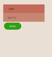
<div class="item-container">
<div class="item {{colorParam}}">
<text class="txt">color</text>
</div>
<div class="item {{opacityParam}}">
<text class="txt">opacity</text>
</div>
<input class="button" type="button" name="" value="show" onclick="showAnimation"/>
</div>
/* xxx.css */
.item-container {
  margin: 60px;
  flex-direction: column;
}
.item {
  width: 80%;
  background-color: #f76160;
}
.txt {
  text-align: center;
  width: 200px;
  height: 100px;
}
.button {
  width: 200px;
  margin: 10px;
  font-size: 30px;
  background-color: #09ba07;
}
.color {
  animation-name: Color;
  animation-duration: 8000ms;
}
.opacity {
  animation-name: Opacity;
  animation-duration: 8000ms;
}
@keyframes Color {
  from {
    background-color: #f76160;
  }
  to {
    background-color: #09ba07;
  }
}
@keyframes Opacity {
  from {
    opacity: 0.9;
  }
  to {
    opacity: 0.1;
  }
}
// xxx.js
export default {
  data: {
    colorParam: '',
    opacityParam: '',
  },
  showAnimation: function () {
    this.colorParam = '';
    this.opacityParam = '';
    this.colorParam = 'color';
    this.opacityParam = 'opacity';
  }
}
图2 连续动画效果图
你可能感兴趣的鸿蒙文章
0
赞
热门推荐
-
2、 优质文章
-
3、 gt
-
7、 openharmony
-
9、 golang
-
10、 Vue中input框自动聚焦