harmony 鸿蒙Picker
Picker
A picker allows users to select a single option or a combination of options from one or more dimensions.
How to Use
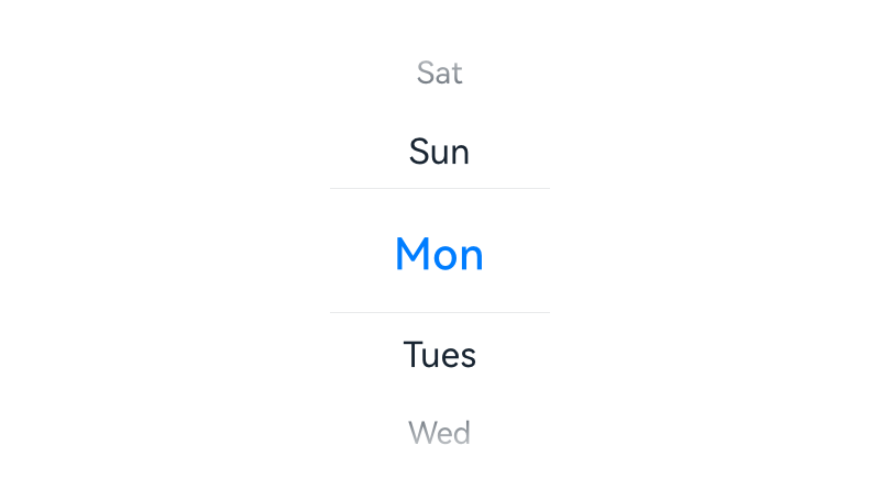
Use a picker for users to select the year, month, date, weekday, hour, or minute, or any of their combinations.
Use a picker for users to select a specific time.
Use a dialog box or embedded component to show a time picker for users to select a time (in the format of hour:minute:second) on a mobile device. Users can set the time format, for example, 12-hour or 24-hour time format.
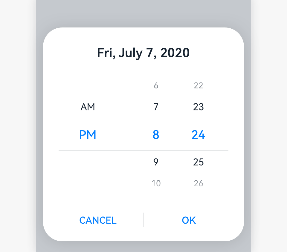
Time Picker
Content area: The hour and minute are displayed. Time is displayed in 12-hour or 24-hour time format, depending on user settings.
Operation area: CANCEL and OK buttons || |——–| |
 |
|
For the software implementation of the time picker, see Time Picker.
Date Selector
Title: The year, month, date, and weekday can be displayed, depending on actual scenarios.
Content area: This area can display all the years, or only this year and earlier years. Two hyphens (–) indicate no year is specified. The year is optional if users are setting birthdays. The lunar calendar switch is optional. If a picker has the switch and the switch is turned on, the lunar calendar date is displayed. If the switch is turned off, the Gregorian calendar date is displayed. If a picker does not have the lunar calendar switch, you can define whether the picker displays the Gregorian calendar or lunar calendar.
Operation area: CANCEL and OK buttons
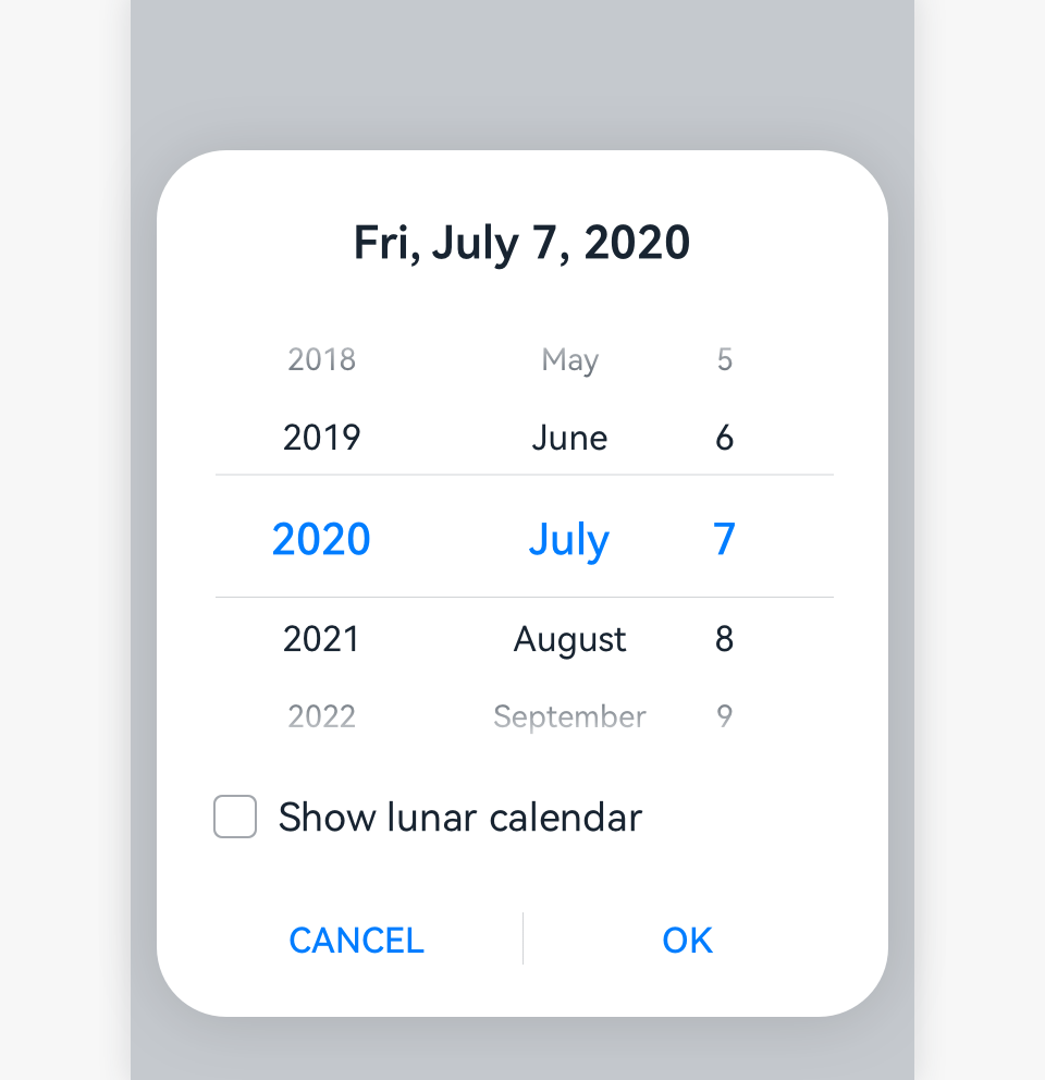
For the software implementation of the date picker, see Date Picker.
Resources
For details about the development guide related to the picker, see TextPicker, TimePicker, and DatePicker.
你可能感兴趣的鸿蒙文章
harmony 鸿蒙OpenHarmony Application UX Design Specifications
harmony 鸿蒙Animation Attributes
harmony 鸿蒙Animation Design Principles
harmony 鸿蒙Application Navigation Structure Design
harmony 鸿蒙Application Page Structure Design
- 所属分类: 后端技术
- 本文标签:
热门推荐
-
2、 优质文章
-
3、 gt
-
7、 openharmony
-
9、 golang
-
10、 Vue中input框自动聚焦