harmony 鸿蒙Grid
Grid
The <Grid> component consists of cells formed by rows and columns. You can specify the cells where items are located to form various layouts.
NOTE
This component is supported since API version 7. Updates will be marked with a superscript to indicate their earliest API version.
Child Components
The <Grid> component accepts only <GridItem> as its child components.
NOTE
Below are the rules for calculating the indexes of the child components of <Grid>:
The index increases in ascending order of child components.
In the if/else statement, only the child components in the branch where the condition is met participate in the index calculation.
In the ForEach or LazyForEach statement, the indexes of all expanded subnodes are calculated.
If the values of if/else, ForEach, and LazyForEach change, the indexes of subnodes are updated.
The child component that has the visibility attribute set to Hidden or None is included in the index calculation.
The child component that has the visibility attribute set to None is not displayed, but still takes up the corresponding cell.
The child component that has the position attribute set takes up the corresponding cell, and is offset by the distance specified by position relative to the upper left corner of the grid. This child component does not scroll with the corresponding cell and is not displayed after the corresponding cell extends beyond the display range of the grid.
APIs
Grid(scroller?: Scroller, layoutOptions?: GridLayoutOptions)
Parameters
| Name | Type | Mandatory | Description |
|---|---|---|---|
| scroller | Scroller | No | Controller, which can be bound to scrollable components. NOTE The scroller cannot be bound to other scrollable components. |
| layoutOptions10+ | GridLayoutOptions | No | Layout options of a scrolling grid. |
GridLayoutOptions10+
Defines grid layout options. This API can be used for the grid for which either rowsTemplate or columnsTemplate is set, and can take place of the combination of columnStart and columnEnd or of rowStart and rowEnd in setting columns or rows occupied by a grid item.
Parameters |Name |Type |Mandatory|Description | |—–|——-|—-|———————| |regularSize|[number, number]|Yes |Number of rows and columns occupied by a grid item with regular size. The only supported value is [1, 1], meaning that the grid item occupies one row and one column.| |irregularIndexes|number[]|No |Indexes of a grid item with irregular size in all subnodes of the grid. When onGetIrregularSizeByIndex is not set, the grid item specified in this parameter occupies an entire row of the grid that scrolls vertically or an entire column of the grid that scrolls horizontally.| |onGetIrregularSizeByIndex|(index: number) => [number, number]|No |Callback used to obtain the number of rows and columns occupied by the grid item with irregular size. Its input parameter is the indexes of the grid item specified in irregularIndexes. A grid item cannot occupy multiple rows in vertical scrolling mode, or multiple columns in horizontal scrolling mode.|
Attributes
In addition to the universal attributes, the following attributes are supported.
| Name | Type | Description |
|---|---|---|
| columnsTemplate | string | Number of columns or minimum column width in the grid. If this attribute is not set, one column will be used. For example, ‘1fr 1fr 2fr’ indicates three columns, with the first column taking up 1⁄4 of the parent component’s full width, the second column 1⁄4, and the third column 2⁄4. ‘repeat(auto-fit, 90px)’ means to automatically work out the number of columns and the actual column width, with the minimum column width of 90. NOTE If this attribute is set to ‘0fr’, the column width is 0, and grid item in the column is not displayed. If this attribute is set to any other invalid value, the grid item is displayed as one column. |
| rowsTemplate | string | Number of rows or minimum row height in the grid. If this attribute is not set, one row will be used. For example, ‘1fr 1fr 2fr’ indicates three rows, with the first row taking up 1⁄4 of the parent component’s full height, the second row 1⁄4, and the third row 2⁄4. ‘repeat(auto-fit, 90px)’ means to automatically work out the number of rows and the actual v, with the minimum row height of 90. NOTE If this attribute is set to ‘0fr’, the row width is 0, and grid item in the row is not displayed. If this attribute is set to any other invalid value, the grid item is displayed as one row. |
| columnsGap | Length | Gap between columns. Default value: 0 NOTE A value less than 0 evaluates to the default value. |
| rowsGap | Length | Gap between rows. Default value: 0 NOTE A value less than 0 evaluates to the default value. |
| scrollBar | BarState | Scrollbar status. Default value: BarState.Off NOTE In API version 9 and earlier versions, the default value is BarState.Off. In API version 10, the default value is BarState.Auto. |
| scrollBarColor | string |number |Color | Color of the scrollbar. |
| scrollBarWidth | string |number | Width of the scrollbar. After the width is set, the scrollbar is displayed with the set width in normal state and pressed state. Default value: 4 Unit: vp |
| cachedCount | number | Number of grid items to be preloaded (cached). It works only in LazyForEach. For details, see Minimizing White Blocks During Swiping. Default value: 1 NOTE The number of the grid items to be cached before and after the currently displayed one equals the value of cachedCount multiplied by the number of columns. Grid items that exceed the display and cache range are released. A value less than 0 evaluates to the default value. |
| editMode 8+ | boolean | Whether to enter editing mode. In editing mode, the user can drag the <GridItem> in the <Grid> component. Default value: false |
| layoutDirection8+ | GridDirection | Main axis direction of the grid. Default value: GridDirection.Row |
| maxCount8+ | number | When layoutDirection is Row or RowReverse: maximum number of columns that can be displayed. When layoutDirection is Column or ColumnReverse: maximum number of rows that can be displayed. Default value: Infinity NOTE If the value of maxCount is smaller than that of minCount, the default values of maxCount and minCount are used. A value less than 1 evaluates to the default value. |
| minCount8+ | number | When layoutDirection is Row or RowReverse: minimum number of columns that can be displayed. When layoutDirection is Column or ColumnReverse: minimum number of rows that can be displayed. Default value: 1 NOTE A value less than 1 evaluates to the default value. |
| cellLength8+ | number | When layoutDirection is Row or RowReverse: fixed height per row. When layoutDirection is Column or ColumnReverse: fixed width per column. Default value: size of the first element |
| multiSelectable8+ | boolean | Whether to enable mouse frame selection. Default value: false - false: The mouse frame selection is disabled. - true: The mouse frame selection is enabled. NOTE When mouse frame selection is enabled, you can use the selected attribute and the onSelect event of the <Griditem> component to obtain the selection status of the component; you can also set the style of the component in the selected state (by default, no style is set for the selected state). |
| supportAnimation8+ | boolean | Whether to enable animation. Currently, the grid item drag animation is supported. Default value: false |
| edgeEffect10+ | EdgeEffect | Scroll effect. The spring effect and shadow effect are supported. Default value: EdgeEffect.None |
| enableScrollInteraction10+ | boolean | Whether to support scroll gestures. When this attribute is set to false, scrolling by finger or mouse is not supported, but the scrolling controller API is not affected. Default value: true |
| nestedScroll10+ | NestedScrollOptions | Nested scrolling options. You can set the nested scrolling mode in the forward and backward directions to implement scrolling linkage with the parent component. |
| friction10+ | number |Resource | Friction coefficient. It applies only to gestures in the scrolling area, and it affects only indirectly the scroll chaining during the inertial scrolling process. Default value: 0.9 for wearable devices and 0.6 for non-wearable devices NOTE A value less than or equal to 0 evaluates to the default value. |
Depending on the settings of the rowsTemplate and columnsTemplate attributes, the <Grid> component supports the following layout modes:
rowsTemplate and columnsTemplate are both set
The <Grid> component displays only elements in a fixed number of rows and columns and cannot be scrolled.
In this mode, the following attributes do not take effect: layoutDirection, maxCount, minCount, and cellLength.
If the width and height of a grid are not set, the grid adapts to the size of its parent component by default.
The size of the grid rows and columns is the size of the grid content area minus the gap between rows and columns. It is allocated based on the proportion of each row and column.
By default, the grid items fill the entire grid.
Either rowsTemplate or columnsTemplate is set
The <Grid> component arranges elements in the specified direction and allows for scrolling to display excess elements.
If columnsTemplate is set, the component scrolls vertically, the main axis runs vertically, and the cross axis runs horizontally.
If rowsTemplate is set, the component scrolls horizontally, the main axis runs horizontally, and the cross axis runs vertically.
In this mode, the following attributes do not take effect: layoutDirection, maxCount, minCount, and cellLength.
The cross axis size of the grid is the cross axis size of the grid content area minus the gaps along the cross axis. It is allocated based on the proportion of each row and column.
The main axis size of the grid is the maximum height of all grid items in the cross axis direction of the current grid.
Neither rowsTemplate nor columnsTemplate is set
The <Grid> component arranges elements in the direction specified by layoutDirection. The number of columns is jointly determined by the grid width, width of the first element, minCount, maxCount, and columnsGap.
The number of rows is jointly determined by the grid height, height of the first element, cellLength, and rowsGap. Elements outside the determined range of rows and columns are not displayed and cannot be viewed through scrolling.
In this mode, only the following attributes take effect: layoutDirection, maxCount, minCount, cellLength, editMode, columnsGap, and rowsGap.
When layoutDirection is set to Row, elements are arranged row by row from left to right. If the remaining height is insufficient, no more elements will be laid out, and the whole content is centered at the top.
When layoutDirection is set to Column, elements are arranged column by column from top to bottom. If the remaining height is insufficient, no more elements will be laid out, and the whole content is centered at the top.
GridDirection8+
| Name | Description |
|---|---|
| Row | Horizontal layout, where the child components are arranged from left to right as the main axis runs along the rows. |
| Column | Vertical layout, where the child components are arranged from top to bottom as the main axis runs down the columns. |
| RowReverse | Reverse horizontal layout, where the child components are arranged from right to left as the main axis runs along the rows. |
| ColumnReverse | Reverse vertical layout, where the child components are arranged from bottom up as the main axis runs down the columns. |
NOTE
The default value of the universal attribute clip is true for the <Grid> component.
Events
In addition to the universal events, the following events are supported.
| Name | Description |
|---|---|
| onScrollIndex(event: (first: number, last10+: number) => void) | Triggered when the first or last item displayed in the grid changes. It is triggered once when the grid is initialized. - first: index of the first item of the grid. - last: index of the last item of the grid. This event is triggered when either of the preceding indexes changes. |
| onItemDragStart(event: (event: ItemDragInfo, itemIndex: number) => (() => any) |void) | Triggered when a grid item starts to be dragged. - event: See ItemDragInfo. - itemIndex: index of the dragged item. NOTE If void is returned, the drag operation cannot be performed. This event is triggered when the user long presses a grid item. Drag detection also requires long press, and the event processing mechanism preferentially triggers child component events. Therefore, when LongPressGesture is bound to the grid item, the drag operation cannot be performed. In light of this, if both long press and drag operations are required, you can use universal drag events. |
| onItemDragEnter(event: (event: ItemDragInfo) => void) | Triggered when the dragged item enters the drop target of the grid. - event: See ItemDragInfo. |
| onItemDragMove(event: (event: ItemDragInfo, itemIndex: number, insertIndex: number) => void) | Triggered when the dragged item moves over the drop target of the grid. - event: See ItemDragInfo. - itemIndex: initial position of the dragged item. - insertIndex: index of the position to which the dragged item will be dropped. |
| onItemDragLeave(event: (event: ItemDragInfo, itemIndex: number) => void) | Triggered when the dragged item leaves the drop target of the grid. - event: See ItemDragInfo. - itemIndex: index of the dragged item. |
| onItemDrop(event: (event: ItemDragInfo, itemIndex: number, insertIndex: number, isSuccess: boolean) => void) | Triggered when the dragged item is dropped on the drop target of the grid. - event: See ItemDragInfo. - itemIndex: initial position of the dragged item. - insertIndex: index of the position to which the dragged item will be dropped. - isSuccess: whether the dragged item is successfully dropped. |
| onScrollBarUpdate(event: (index: number, offset: number) => ComputedBarAttribute) | Triggered when the first item displayed in the grid changes. You can use this callback to set the position and length of the scrollbar. - index: index of the first item displayed in the grid. - offset: offset of the displayed first item relative to the start position of the grid. - ComputedBarAttribute: See ComputedBarAttribute. |
| onScroll10+(event: (scrollOffset: number, scrollState: ScrollState) => void) | Triggered when the grid scrolls. - scrollOffset: scroll offset of each frame. The offset is positive when the grid is scrolled up and negative when the list is scrolled down. - scrollState: current scroll state. |
| onReachStart10+(event: () => void) | Triggered when the grid reaches the start position. NOTE This event is triggered once when initialIndex is 0 during grid initialization and once when the grid scrolls to the start position. When the grid edge scrolling effect is the spring effect, this event is triggered once when the grid passes the start position and is triggered again when the grid returns to the start position. |
| onReachEnd10+(event: () => void) | Triggered when the grid reaches the end position. NOTE When the grid edge effect is the spring effect, this event is triggered once when the grid passes the end position and is triggered again when the grid returns to the end position. |
| onScrollFrameBegin10+(event: (offset: number, state: ScrollState) => { offsetRemain }) | Triggered when the grid starts to scroll. The input parameters indicate the amount by which the grid will scroll. The event handler then works out the amount by which the grid needs to scroll based on the real-world situation and returns the result. - offset: amount to scroll by, in vp. - state: current scrolling state. - offsetRemain: actual amount by which the grid scrolls, in vp. This event is triggered when the user starts dragging the grid or the grid starts inertial scrolling. This event is not triggered when the grid rebounds or the scrolling controller is used. NOTE If gridDirection is set to Axis.Vertical, the return value is the amount by which the grid needs to scroll in the vertical direction. If gridDirection is set to Axis.Horizontal, the return value is the amount by which the grid needs to scroll in the horizontal direction. |
| onScrollStart10+(event: () => void) | Triggered when the grid starts scrolling initiated by the user’s finger dragging the grid or its scrollbar. This event is also triggered when the animation contained in the scrolling triggered by Scroller starts. |
| onScrollStop10+(event: () => void) | Triggered when the grid stops scrolling after the user’s finger leaves the screen. This event is also triggered when the animation contained in the scrolling triggered by Scroller stops. |
ItemDragInfo
| Name | Type | Description |
|---|---|---|
| x | number | X coordinate of the dragged item. |
| y | number | Y coordinate of the dragged item. |
ComputedBarAttribute
| Name | Type | Description |
|---|---|---|
| totalOffset | number | Total offset of the grid content relative to the display area. |
| totalLength | number | Total length of the grid content. |
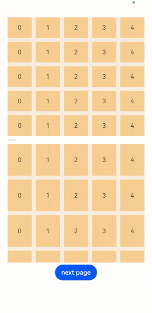
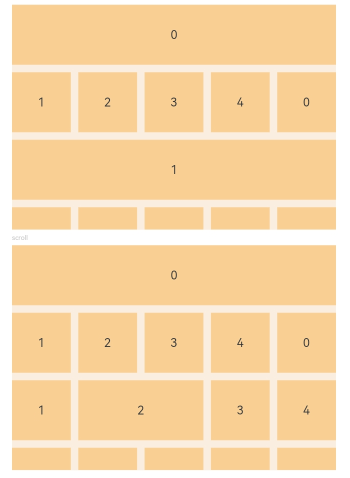
Example
Example 1
// xxx.ets
@Entry
@Component
struct GridExample {
  @State Number: String[] = ['0', '1', '2', '3', '4']
  scroller: Scroller = new Scroller()

  build() {
    Column({ space: 5 }) {
      Grid() {
        ForEach(this.Number, (day: string) => {
          ForEach(this.Number, (day: string) => {
            GridItem() {
              Text(day)
                .fontSize(16)
                .backgroundColor(0xF9CF93)
                .width('100%')
                .height('100%')
                .textAlign(TextAlign.Center)
            }
          }, (day: string) => day)
        }, (day: string) => day)
      }
      .columnsTemplate('1fr 1fr 1fr 1fr 1fr')
      .rowsTemplate('1fr 1fr 1fr 1fr 1fr')
      .columnsGap(10)
      .rowsGap(10)
      .width('90%')
      .backgroundColor(0xFAEEE0)
      .height(300)

      Text('scroll').fontColor(0xCCCCCC).fontSize(9).width('90%')
      Grid(this.scroller) {
        ForEach(this.Number, (day: string) => {
          ForEach(this.Number, (day: string) => {
            GridItem() {
              Text(day)
                .fontSize(16)
                .backgroundColor(0xF9CF93)
                .width('100%')
                .height(80)
                .textAlign(TextAlign.Center)
            }
          }, (day: string) => day)
        }, (day: string) => day)
      }
      .columnsTemplate('1fr 1fr 1fr 1fr 1fr')
      .columnsGap(10)
      .rowsGap(10)
      .friction(0.6)
      .edgeEffect(EdgeEffect.Spring)
      .scrollBar(BarState.On)
      .onScrollIndex((first: number) => {
        console.info(first.toString())
      })
      .onScrollBarUpdate((index: number, offset: number) => {
        return {totalOffset: (index / 5) * (80 + 10) - offset, totalLength: 80 * 5 + 10 * 4}
      })
      .width('90%')
      .backgroundColor(0xFAEEE0)
      .height(300)
      Button('next page')
        .onClick(() => {// Click to go to the next page.
          this.scroller.scrollPage({ next: true })
        })
    }.width('100%').margin({ top: 5 })
  }
}
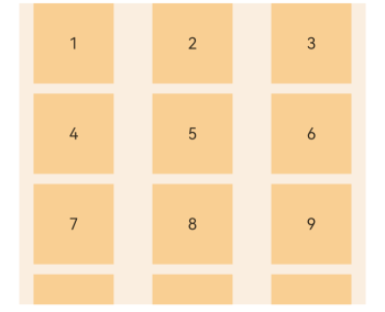
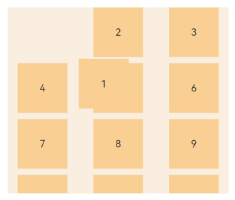
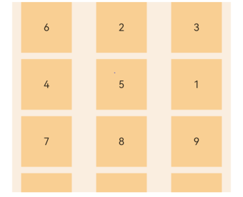
Example 2
Set editMode(true) to enable the grid to enter editing mode, where the user can drag the grid items.
Through onItemDragStart, set the image to be displayed during dragging.
Through onItemDrop, obtain the initial position of the dragged item and the position to which the dragged item will be dropped. Through onDrag, complete the array position exchange logic.
@Entry
@Component
struct GridExample {
  @State numbers: string[] = []
  scroller: Scroller = new Scroller()
  @State text: string = 'drag'

  @Builder pixelMapBuilder () { // Style for the drag event.
    Column() {
      Text(this.text)
        .fontSize(16)
        .backgroundColor(0xF9CF93)
        .width(80)
        .height(80)
        .textAlign(TextAlign.Center)
    }
  }

  aboutToAppear() {
    for (let i = 1;i <= 15; i++) {
      this.numbers.push(i + '')
    }
  }

  changeIndex(index1: number, index2: number) { // Exchange the array position.
    let temp: string;
    temp = this.numbers[index1];
    this.numbers[index1] = this.numbers[index2];
    this.numbers[index2] = temp;
  }

  build() {
    Column({ space: 5 }) {
      Grid(this.scroller) {
        ForEach(this.numbers, (day: string) => {
          GridItem() {
            Text(day)
              .fontSize(16)
              .backgroundColor(0xF9CF93)
              .width(80)
              .height(80)
              .textAlign(TextAlign.Center)
          }
        })
      }
      .columnsTemplate('1fr 1fr 1fr')
      .columnsGap(10)
      .rowsGap(10)
      .onScrollIndex((first: number) => {
        console.info(first.toString())
      })
      .width('90%')
      .backgroundColor(0xFAEEE0)
      .height(300)
      .editMode(true) // Enable the grid to enter editing mode, where the user can drag the grid items.
      .onItemDragStart((event: ItemDragInfo, itemIndex: number) => { // Triggered when a grid item starts to be dragged.
        this.text = this.numbers[itemIndex]
        return this.pixelMapBuilder() // Set the image to be displayed during dragging.
      })
      .onItemDrop((event: ItemDragInfo, itemIndex: number, insertIndex: number, isSuccess: boolean) => { // Triggered when the dragged item is dropped on the drop target of the grid.
        // If isSuccess is set to false, the item is dropped outside of the grid. If the value of insertIndex is greater than that of length, an item adding event occurs.
        if (!isSuccess||insertIndex >= this.numbers.length) {
          return
        }
        console.info('beixiang' + itemIndex + '', insertIndex + '') // itemIndex indicates the initial position of the dragged item. insertIndex indicates the position to which the dragged item will be dropped.
        this.changeIndex(itemIndex, insertIndex)
      })
    }.width('100%').margin({ top: 5 })
  }
}
Below are some examples.
Below shows how the grid looks when dragging of grid items starts.
Below shows how the grid looks when dragging of grid items is in progress.
Below shows how the grid looks after grid item 1 and grid item 6 swap their positions.
Example 3
This example shows how GridLayoutOptions works.
// xxx.ets
@Entry
@Component
struct GridExample {
  @State Number: String[] = ['0', '1', '2', '3', '4']
  scroller: Scroller = new Scroller()
  layoutOptions1: GridLayoutOptions = {
    regularSize: [1, 1],        // Only [1, 1] is supported.
    irregularIndexes: [0, 6], // The grid item whose indexes are 0 and 6 occupies one row.
  }

  layoutOptions2: GridLayoutOptions = {
    regularSize: [1, 1],
    irregularIndexes: [0, 7], // The number of columns occupied by the grid item whose indexes are 0 and 7 is specified by onGetIrregularSizeByIndex.
    onGetIrregularSizeByIndex: (index: number) => {
      if (index === 0) {
        return [1, 5]
      }
      return [1, index % 6 + 1]
    }
  }

  build() {
    Column({ space: 5 }) {
      Grid(this.scroller, this.layoutOptions1) {
        ForEach(this.Number, (day: string) => {
          ForEach(this.Number, (day: string) => {
            GridItem() {
              Text(day)
                .fontSize(16)
                .backgroundColor(0xF9CF93)
                .width('100%')
                .height(80)
                .textAlign(TextAlign.Center)
            }
          }, (day: string) => day)
        }, (day: string) => day)
      }
      .columnsTemplate('1fr 1fr 1fr 1fr 1fr')
      .columnsGap(10)
      .rowsGap(10)
      .scrollBar(BarState.Off)
      .width('90%')
      .backgroundColor(0xFAEEE0)
      .height(300)

      Text('scroll').fontColor(0xCCCCCC).fontSize(9).width('90%')
      // The grid does not scroll, and undefined is used to reserve space.
      Grid(undefined, this.layoutOptions2) {
        ForEach(this.Number, (day: string) => {
          ForEach(this.Number, (day: string) => {
            GridItem() {
              Text(day)
                .fontSize(16)
                .backgroundColor(0xF9CF93)
                .width('100%')
                .height(80)
                .textAlign(TextAlign.Center)
            }
          }, (day: string) => day)
        }, (day: string) => day)
      }
      .columnsTemplate('1fr 1fr 1fr 1fr 1fr')
      .columnsGap(10)
      .rowsGap(10)
      .scrollBar(BarState.Off)
      .width('90%')
      .backgroundColor(0xFAEEE0)
      .height(300)
    }.width('100%').margin({ top: 5 })
  }
}
你可能感兴趣的鸿蒙文章
harmony 鸿蒙ArkTS-based Declarative Development Paradigm
- 所属分类: 后端技术
- 本文标签:
热门推荐
-
2、 优质文章
-
3、 gt
-
7、 openharmony
-
9、 golang
-
10、 Vue中input框自动聚焦