Button
Button是按钮组件,通常用于响应用户的点击操作,如提交表单,其类型包括胶囊按钮、圆形按钮、普通按钮。具体用法请参考Button。
创建按钮
Button通过调用接口来创建,接口调用有以下两种形式:
-
创建包含子组件的按钮
Button(options?: {type?: ButtonType, stateEffect?: boolean}),该接口用于创建包含子组件的按钮,其中type用于设置Button类型,stateEffect属性设置Button是否开启点击效果。Button({ type: ButtonType.Normal, stateEffect: true }) { Row() { Image($r('app.media.loading')).width(20).height(20).margin({ left: 12 }) Text('loading').fontSize(12).fontColor(0xffffff).margin({ left: 5, right: 12 }) }.alignItems(VerticalAlign.Center) }.borderRadius(8).backgroundColor(0x317aff).width(90)
-
创建不包含子组件的按钮
Button(label?: string, options?: { type?: ButtonType, stateEffect?: boolean }),该接口用于创建不包含子组件的按钮,其中label确定所创建的Button是否包含子组件。Button('Ok', { type: ButtonType.Normal, stateEffect: true }) .borderRadius(8) .backgroundColor(0x317aff) .width(90)
设置按钮类型
Button有三种可选类型,分别为Capsule(胶囊类型)、Circle(圆形按钮)和Normal(普通按钮),通过type进行设置。
-
胶囊按钮(默认类型)
Button('Disable', { type: ButtonType.Capsule, stateEffect: false })
  .backgroundColor(0x317aff)
  .width(90)
-
圆形按钮
Button('Circle', { type: ButtonType.Circle, stateEffect: false })
  .backgroundColor(0x317aff)
  .width(90)
  .height(90)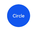
自定义样式
-
设置边框弧度 一般使用通用属性来自定义按钮样式。例如通过borderRadius属性设置按钮的边框弧度。
Button('circle border', { type: ButtonType.Normal })
  .borderRadius(20)
-
设置文本样式 通过添加文本样式设置按钮文本的展示样式。
Button('font style', { type: ButtonType.Normal })
  .fontSize(20)
  .fontColor(Color.Red)
  .fontWeight(800)
-
设置背景颜色 添加backgroundColor属性设置按钮的背景颜色。
Button('background color').backgroundColor(0xF55A42)
-
用作功能型按钮 为删除操作创建一个按钮。
Button({ type: ButtonType.Circle, stateEffect: true }) {
  Image($r('app.media.ic_public_delete_filled')).width(30).height(30)
}.width(55).height(55).margin({ left: 20 }).backgroundColor(0xF55A42)
添加事件
Button组件通常用于触发某些操作,可以在绑定onClick事件来响应点击操作后的自定义行为。
Button('Ok', { type: ButtonType.Normal, stateEffect: true })
  .onClick(()=>{
    console.info('Button onClick')
  })
场景示例
-
用于启动操作
可以将按钮用于启动操作的任何用户界面元素。按钮会根据用户的操作触发相应的事件。如,在List容器里边通过点击按钮进行页面跳转:
// xxx.js
import router from '@ohos.router'

@Entry
@Component
struct ButtonCase1 {
  build() {
    List({ space: 4 }) {
      ListItem() {
        Button("First").onClick(() => {
          router.push({ url: 'xxx' })
        })
      }

      ListItem() {
        Button("Second").onClick(() => {
          router.push({ url: 'yyy' })
        })
      }

      ListItem() {
        Button("Third").onClick(() => {
          router.push({ url: 'zzz' })
        })
      }
    }
    .listDirection(Axis.Vertical)
    .backgroundColor(0xDCDCDC).padding(20)
  }
}
-
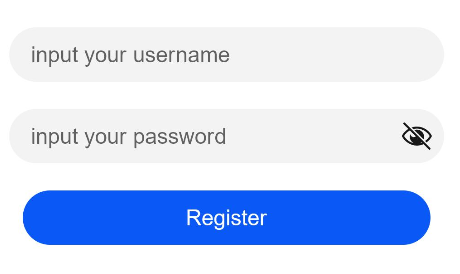
用于表单的提交 在用户登录/注册页面,用户的登录或注册的提交操作会用按钮。
// xxx.js
@Entry
@Component
struct ButtonCase2 {
build() {
Column() {
TextInput({ placeholder: 'input your username' }).margin({ top: 20 })
TextInput({ placeholder: 'input your password' }).type(InputType.Password).margin({ top: 20 })
Button('Register').width(300).margin({ top: 20 })
}.padding(20)
}
}
## 你可能感兴趣的文章
[开源鸿蒙 UI开发](http://www.seaxiang.com/blog/e95b821e1ad6445781051b8db54e4e58)
[开源鸿蒙 方舟开发框架概述](http://www.seaxiang.com/blog/c195db1fd2aa477288f34f0774015fd8)
[开源鸿蒙 文件组织](http://www.seaxiang.com/blog/61284c37e2a34e09b2f3758d35338bbb)
[开源鸿蒙 app.js](http://www.seaxiang.com/blog/79cc941a7eda4ddda06b32a0949166ef)
[开源鸿蒙 js标签配置](http://www.seaxiang.com/blog/cab7b6d9957548e99f828c43aed522c6)
[开源鸿蒙 生命周期](http://www.seaxiang.com/blog/81e804cbfa4243b78825ac49216e1be9)
[开源鸿蒙 多语言支持](http://www.seaxiang.com/blog/a53b5af460e147a4815fc1b07bed463e)
[开源鸿蒙 资源限定与访问](http://www.seaxiang.com/blog/9523edf4db7e4a56ab6ae32b0c7027e7)
[开源鸿蒙 CSS语法参考](http://www.seaxiang.com/blog/ed0dc8a4beaa4bd1b489c98f8bc49541)
[开源鸿蒙 HML语法参考](http://www.seaxiang.com/blog/39e458781b0a49d0ab73fbd0aef503b0)