harmony 鸿蒙ArkUI Subsystem Changelog
ArkUI Subsystem Changelog
cl.arkui.1 Change in the Default Scrollbar State of <List> and <Gird> Components
Changed the default state of the scrollbar in the <List> and <Gird> components from BarState.Off to BarState.Auto.
Change Impact
In the scenario where the scrollbar status is not set in the <List> and <Gird> components:
Before change:
The scrollbar is not displayed.
After change:
The scrollbar is displayed during scrolling and is hidden 2 seconds after the scrolling stops.
Key API/Component Changes
scrollBar attribute of the <List> and <Gird> components: - List - Grid
Adaptation Guide
In scenarios where the scrollbar is not required, set the scrollBar attribute of the <List> and <Gird> components to BarState.Off.
The code snippet is as follows:
// xxx.ets
@Entry
@Component
struct ListItemExample {
  private arr: number[] = [0, 1, 2, 3, 4, 5, 6, 7, 8, 9]

  build() {
    Column() {
      List({ space: 20, initialIndex: 0 }) {
        ForEach(this.arr, (item) => {
          ListItem() {
            Text('' + item)
              .width('100%').height(100).fontSize(16)
              .textAlign(TextAlign.Center).borderRadius(10).backgroundColor(0xFFFFFF)
          }
        }, item => item)
      }
      .width('90%')
      .scrollBar(BarState.Off)
    }.width('100%').height('100%').backgroundColor(0xDCDCDC).padding({ top: 5 })
  }
}
cl.arkui.2 Fixing of the Stack Layout Issue
Fixed the issue where child components in the <Stack> container does not follow the alignContent settings when the child components stretch beyond the container. Example:
@Entry
@Component
struct StackExample {
  build() {
    Stack({alignContent:Alignment.TopEnd}){
      Text('First child, show in bottom')
        .width(200).height(200).backgroundColor(0xd2cab3).margin(10)
    }.width(150).height(150).backgroundColor(Color.Pink).margin(100)
  }
}
Before: Child components are not arranged based on alignContent:Alignment.TopEnd.
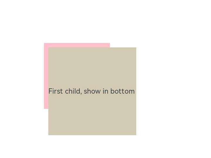
After: Child components are arranged based on alignContent:Alignment.TopEnd.

Change Impact
- When the <Stack> component contains a child component larger than itself, adaptation to the application is required.
- The previous workaround – Offset and translate settings for the child component – must be removed.
Adaptation Guide
Remove the Offset and translate settings for the child component.
cl.arkui.3 Change in the <Button> Component Hover Effect
Changed the hover effect of the <Button> component from scale-up by 100% to 105% to overlay of 0% to 5% opacity. Changed the pressed effect of the component to overlay of 5% to 10% opacity.
Change Impact
The visual effect of the <Button> is affected.
你可能感兴趣的鸿蒙文章
harmony 鸿蒙Ability Framework Changelog
harmony 鸿蒙Multi-language Runtime Subsystem Changelog
harmony 鸿蒙Bundle Management Subsystem Changelog
harmony 鸿蒙Common Capability Changelog
harmony 鸿蒙Globalization Subsystem Changelog
- 所属分类: 后端技术
- 本文标签:
热门推荐
-
2、 优质文章
-
3、 gt
-
7、 openharmony
-
9、 golang
-
10、 Vue中input框自动聚焦