harmony 鸿蒙Background
Background
You can set the background for a component.
NOTE
The APIs of this module are supported since API version 7. Updates will be marked with a superscript to indicate their earliest API version.
Attributes
| Name | Type | Description |
|---|---|---|
| background10+ | builder: CustomBuilder, options?: {align?:Alignment} |
Background color of the component. builder: custom background. align: alignment mode between the custom background and the component. If background, backgroundColor, and backgroundImage are set at the same time, they will all take effect, with background at the top layer. NOTE The custom background takes some time to render, during which it cannot respond to events, or be dynamically updated. This attribute cannot be nested or be previewed in the previewer. |
| backgroundColor | ResourceColor | Background color of the component. Since API version 9, this API is supported in ArkTS widgets. |
| backgroundImage | src: ResourceStr, repeat?: ImageRepeat |
src: image address, which can be the address of an Internet or a local image or a Base64 encoded image. SVG images are not supported. repeat: whether the background image is repeated. By default, the background image is not repeated. If the set image has a transparent background and backgroundColor is set, the image is overlaid on the background color. Since API version 9, this API is supported in ArkTS widgets. |
| backgroundImageSize | { width?: Length, height?: Length } |ImageSize |
Width and height of the background image. If the input is a {width: Length, height: Length} object and only one attribute is set, the other attribute is the set value multiplied by the original aspect ratio of the image. By default, the original image aspect ratio remains unchanged. The value range of width and height is [0, +∞). Default value: ImageSize.Auto Since API version 9, this API is supported in ArkTS widgets. NOTE A value less than 0 evaluates to the value 0. If height is set but width is not, the image width is adjusted based on the original aspect ratio of the image. |
| backgroundImagePosition | Position |Alignment | Position of the background image in the component, that is, the coordinates relative to the upper left corner of the component. Default value: { x: 0, y: 0 } When x and y are set in percentage, the offset is calculated based on the width and height of the component. Since API version 9, this API is supported in ArkTS widgets. |
| backgroundBlurStyle9+ | value:BlurStyle, options10+?:BackgroundBlurStyleOptions |
Background blur style applied between the content and the background. value: settings of the background blur style, including the blur radius, mask color, mask opacity, saturation, and brightness. options: background blur options. Optional. This API is supported in ArkTS widgets. |
BackgroundBlurStyleOptions10+
| Name | Type | Mandatory | Description |
|---|---|---|---|
| colorMode | ThemeColorMode | No | Color mode used for the background blur. Default value: ThemeColorMode.System |
| adaptiveColor | AdaptiveColor | No | Adaptive color mode. Default value: AdaptiveColor.Default |
| scale | number | No | Blurredness of the background material. This API is a system API. Default value: 1.0 Value range: [0.0, 1.0] |
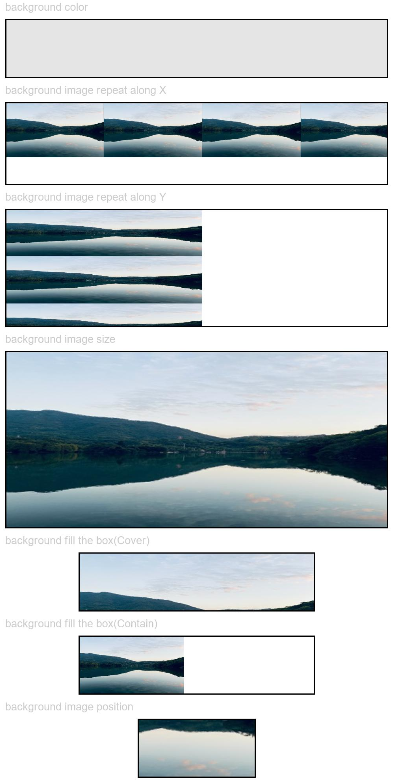
Example
Example 1
// xxx.ets
@Entry
@Component
struct BackgroundExample {

  build() {
    Column({ space: 5 }) {
      Text('background color').fontSize(9).width('90%').fontColor(0xCCCCCC)
      Row().width('90%').height(50).backgroundColor(0xE5E5E5).border({ width: 1 })

      Text('background image repeat along X').fontSize(9).width('90%').fontColor(0xCCCCCC)
      Row()
        .backgroundImage('/comment/bg.jpg', ImageRepeat.X)
        .backgroundImageSize({ width: '250px', height: '140px' })
        .width('90%')
        .height(70)
        .border({ width: 1 })

      Text('background image repeat along Y').fontSize(9).width('90%').fontColor(0xCCCCCC)
      Row()
        .backgroundImage('/comment/bg.jpg', ImageRepeat.Y)
        .backgroundImageSize({ width: '500px', height: '120px' })
        .width('90%')
        .height(100)
        .border({ width: 1 })

      Text('background image size').fontSize(9).width('90%').fontColor(0xCCCCCC)
      Row()
        .width('90%').height(150)
        .backgroundImage('/comment/bg.jpg', ImageRepeat.NoRepeat)
        .backgroundImageSize({ width: 1000, height: 500 })
        .border({ width: 1 })

      Text('background fill the box(Cover)').fontSize(9).width('90%').fontColor(0xCCCCCC)
      // Occupy all the space of the container, without ensuring that the image is completely displayed.
      Row()
        .width(200)
        .height(50)
        .backgroundImage('/comment/bg.jpg', ImageRepeat.NoRepeat)
        .backgroundImageSize(ImageSize.Cover)
        .border({ width: 1 })

      Text('background fill the box(Contain)').fontSize(9).width('90%').fontColor(0xCCCCCC)
      // Maximize the image while ensuring that it can be completely displayed.
      Row()
        .width(200)
        .height(50)
        .backgroundImage('/comment/bg.jpg', ImageRepeat.NoRepeat)
        .backgroundImageSize(ImageSize.Contain)
        .border({ width: 1 })

      Text('background image position').fontSize(9).width('90%').fontColor(0xCCCCCC)
      Row()
        .width(100)
        .height(50)
        .backgroundImage('/comment/bg.jpg', ImageRepeat.NoRepeat)
        .backgroundImageSize({ width: 1000, height: 560 })
        .backgroundImagePosition({ x: -500, y: -300 })
        .border({ width: 1 })
    }
    .width('100%').height('100%').padding({ top: 5 })
  }
}
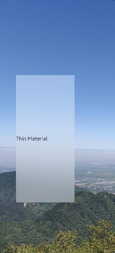
Example 2
// xxx.ets
@Entry
@Component
struct BackgroundBlurStyleDemo {
  build() {
    Column() {
      Row() {
        Text("Thin Material")
      }
      .width('50%')
      .height('50%')
      .backgroundBlurStyle(BlurStyle.Thin, { colorMode: ThemeColorMode.LIGHT, adaptiveColor: AdaptiveColor.DEFAULT, scale: 1.0 })
      .position({ x: '15%', y: '30%' })
    }
    .height('100%')
    .width('100%')
    .backgroundImage($r('app.media.bg'))
    .backgroundImageSize(ImageSize.Cover)
  }
}
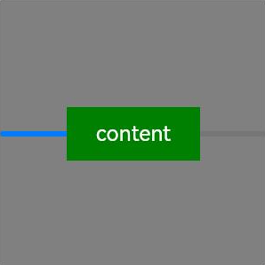
Example 3
// xxx.ets
@Entry
@Component
struct BackgroundExample {
  @Builder renderBackground() {
    Column() {
      Progress({value : 50})
    }
  }

  build() {
    Column() {
      Text("content")
        .width(100)
        .height(40)
        .fontColor("#FFF")
        .position({x:50, y:80})
        .textAlign(TextAlign.Center)
        .backgroundColor(Color.Green)
    }
    .width(200).height(200)
    .background(this.renderBackground)
    .backgroundColor(Color.Gray)
  }
}
你可能感兴趣的鸿蒙文章
harmony 鸿蒙ArkTS-based Declarative Development Paradigm
0
赞
- 所属分类: 后端技术
- 本文标签:
热门推荐
-
2、 优质文章
-
3、 gt
-
7、 openharmony
-
9、 golang
-
10、 Vue中input框自动聚焦