harmony 鸿蒙input
input
交互式组件,提供单选框功能。
说明:
从API Version 8 开始支持。后续版本如有新增内容,则采用上角标单独标记该内容的起始版本。
属性
除支持通用属性外,还支持如下属性:
| 名称 | 类型 | 默认值 | 必填 | 描述 |
|---|---|---|---|---|
| type | string | radio | 是 | input组件类型,当前仅支持radio类型: - “radio”:定义单选按钮,允许在多个拥有相同name值的选项中选中其中一个; |
| checked | boolean | false | 否 | 当前组件是否选中。 |
| name | string | - | 否 | input组件的名称。 |
| value | string | - | 否 | input组件的value值,类型为radio时必填且相同name值的选项该值唯一。 |
样式
支持通用样式。
事件
| 名称 | 参数 | 描述 |
|---|---|---|
| change | $event.checkedItem | radio单选框的checked状态发生变化时触发该事件,返回选中的组件value值。 |
| click | - | 点击动作触发该事件。 |
示例
<!-- xxx.hml -->
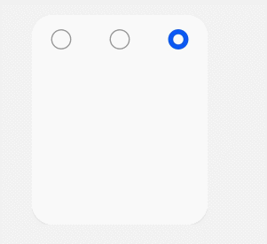
<div class="content">
<input type="radio" checked='true' name="radioSample" value="radio1" onchange="onRadioChange"></input>
<input type="radio" checked='false' name="radioSample" value="radio2" onchange="onRadioChange"></input>
<input type="radio" checked='false' name="radioSample" value="radio3" onchange="onRadioChange"></input>
</div>
/* xxx.css */
.content{
  width: 100%;
  height: 200px;
  justify-content: center;
  align-items: center;
}
{
  "actions": {
    "onRadioChange":{
      "action": "message",
      "params": {
        "checkedRadio": "$event.checkedItem"
      }
    }
  }
}
4*4卡片
你可能感兴趣的鸿蒙文章
0
赞
- 所属分类: 后端技术
- 本文标签:
热门推荐
-
2、 优质文章
-
3、 gt
-
7、 openharmony
-
9、 golang
-
10、 Vue中input框自动聚焦