harmony 鸿蒙Select
Select
The
NOTE
This component is supported since API version 8. Updates will be marked with a superscript to indicate their earliest API version.
Child Components
Not supported
APIs
Select(options: Array<SelectOption>)
SelectOption
| Name | Type | Mandatory | Description |
|---|---|---|---|
| value | ResourceStr | Yes | Value of an option in the drop-down list box. |
| icon | ResourceStr | No | Icon of an option in the drop-down list box. |
Attributes
In addition to the universal attributes, the following attributes are supported.
| Name | Type | Description |
|---|---|---|
| selected | number | Index of the initial selected option in the drop-down list box. The index of the first option is 0. If this attribute is not set, the default value -1 will be used, indicating that no option is selected. If this attribute is set to undefined or null, the first option is selected. Since API version 10, this attribute supports $$ for two-way binding of variables. |
| value | string | Text of the drop-down button. By default, it will be replaced by the content of the selected option. Since API version 10, this attribute supports $$ for two-way binding of variables. |
| font | Font | Text font of the drop-down button. Default value: { size: ‘16fp’, weight: FontWeight.Medium } |
| fontColor | ResourceColor | Text color of the drop-down button. Default value: ‘#E6FFFFFF’ |
| selectedOptionBgColor | ResourceColor | Background color of the selected option in the drop-down list box. Default value: ‘#33007DFF’ |
| selectedOptionFont | Font | Text font of the selected option in the drop-down list box. Default value: { size: ‘16fp’, weight: FontWeight.Regular } |
| selectedOptionFontColor | ResourceColor | Text color of the selected option in the drop-down list box. Default value: ‘#ff007dff’ |
| optionBgColor | ResourceColor | Background color of an option in the drop-down list box. Default value: ‘#ffffffff’ |
| optionFont | Font | Text font of an option in the drop-down list box. Default value: { size: ‘16fp’, weight: FontWeight.Regular } |
| optionFontColor | ResourceColor | Text color of an option in the drop-down list box. Default value: ‘#ff182431’ |
| space10+ | Length | Spacing between the text and arrow of an option. NOTE This attribute cannot be set in percentage. |
| arrowPosition10+ | ArrowPosition | Alignment between the text and arrow of an option. Default value: ArrowPosition.END |
| menuAlign10+ | alignType: MenuAlignType, offset?: Offset |
Alignment between the drop-down button and the drop-down menu. - alignType: alignment type. Mandatory. - offset: offset of the drop-down menu relative to the drop-down button after alignment based on the specified alignment type. Default value: {dx: 0, dy: 0} |
ArrowPosition10+
| Name | Description |
|---|---|
| END10+ | The text is in front of the arrow. |
| START10+ | The arrow is in front of the text. |
MenuAlignType10+
| Name | Description |
|---|---|
| START | Aligned with the start edge in the same direction as the language in use. |
| CENTER | Aligned with the center. |
| END | Aligned with the end edge in the same direction as the language in use. |
Events
| Name | Description |
|---|---|
| onSelect(callback: (index: number, value?: string) => void) | Invoked when an option in the drop-down list box is selected. index: index of the selected option. value: value of the selected option. |
Example
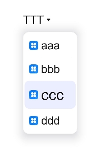
// xxx.ets
@Entry
@Component
struct SelectExample {
  @State text: string = "TTTTT"
  @State index: number = 2
  @State space: number = 8
  @State arrowPosition: ArrowPosition = ArrowPosition.END
  build() {
    Column() {
      Select([{ value: 'aaa', icon: "/common/public_icon.svg" },
        { value: 'bbb', icon: "/common/public_icon.svg" },
        { value: 'ccc', icon: "/common/public_icon.svg" },
        { value: 'ddd', icon: "/common/public_icon.svg" }])
        .selected(this.index)
        .value(this.text)
        .font({ size: 16, weight: 500 })
        .fontColor('#182431')
        .selectedOptionFont({ size: 16, weight: 400 })
        .optionFont({ size: 16, weight: 400 })
        .space(this.space)
        .arrowPosition(this.arrowPosition)
        .menuAlign(MenuAlignType.START, {dx:0, dy:0})
        .onSelect((index:number, text?: string|undefined)=>{
          console.info('Select:' + index)
          this.index = index;
          if(text){
            this.text = text;
          }
        })
    }.width('100%')
  }
}
你可能感兴趣的鸿蒙文章
harmony 鸿蒙ArkTS-based Declarative Development Paradigm
0
赞
- 所属分类: 后端技术
- 本文标签:
热门推荐
-
2、 优质文章
-
3、 gt
-
7、 openharmony
-
9、 golang
-
10、 Vue中input框自动聚焦