Navigation
The <Navigation> component typically functions as the root container of a page and displays the title bar, toolbar, and navigation bar based on the attribute settings.
NOTE
This component is supported since API version 8. Updates will be marked with a superscript to indicate their earliest API version.
Child Components
Supported
Since API version 9, it is recommended that this component be used together with the <NavRouter> component.
APIs
Navigation
Navigation()
Navigation10+
Navigation(pathInfos: NavPathStack)
Binds a navigation stack to the <Navigation> component.
Parameters
| Name | Type | Mandatory | Description |
|---|---|---|---|
| pathInfos | NavPathStack | No | Information about the navigation stack. |
Attributes
In addition to the universal attributes, the following attributes are supported.
| Name | Type | Description |
|---|---|---|
| title | ResourceStr10+ |CustomBuilder8+ |NavigationCommonTitle9+ |NavigationCustomTitle9+ | Page title. NOTE When the NavigationCustomTitle type is used to set the height, the titleMode attribute does not take effect. When the title string is too long: (1) If no subtitle is set, the string is scaled down, wrapped in two lines, and then clipped with an ellipsis (...); (2) If a subtitle is set, the subtitle is scaled down and then clipped with an ellipsis (...). |
| subTitle(deprecated) | string | Subtitle of the page. If this attribute is not set, no subtitle is displayed. This attribute is deprecated since API version 9. You are advised to use title instead. |
| menus | Array<NavigationMenuItem> |CustomBuilder8+ | Menu items in the upper right corner of the page. If this attribute is not set, no menu item is displayed. When the value type is Array<NavigationMenuItem>, the menu shows a maximum of three icons in portrait mode and a maximum of five icons in landscape mode, with excess icons (if any) placed under the automatically generated More icon. |
| titleMode | NavigationTitleMode | Display mode of the page title bar. Default value: NavigationTitleMode.Free |
| toolBar(deprecated) | object |CustomBuilder8+ | Content of the toolbar. If this attribute is not set, no toolbar is displayed. items: all items on the toolbar. NOTE Items are evenly distributed on the toolbar at the bottom. Text and icons are evenly distributed in each content area. If the text is too long, it is scaled down level by level, wrapped in two lines, and then clipped with an ellipsis (...). This API is deprecated since API version 10. You are advised to use toolbarConfiguration instead. |
| toolbarConfiguration10+ | Array<ToolbarItem10+> |CustomBuilder8+ | Content of the toolbar. If this attribute is not set, no toolbar is displayed. NOTE When the value type is Array<[ToolbarItem](#ToolbarItem>, the toolbar exhibits the following features: Items are evenly distributed on the toolbar at the bottom. Text and icons are evenly distributed in each content area. If any item contains overlong text and there are fewer than five items, the following measures are taken: 1. Increase the item's width to accommodate the text until it is as large as the screen width; 2. Scale down the text level by level; 3. Wrap the text in two lines; 4. Clip the text with an ellipsis (...). The toolbar shows a maximum of five icons in portrait mode, with excess icons (if any) placed under the automatically generated More icon. In landscape mode, this attribute must be used together with Array<NavigationMenuItem> of the menus attribute; the toolbar at the bottom is automatically hidden, and all items on the toolbar are moved to the menu in the upper right corner of the screen. When the value type is CustomBuilder, and the toolbar does not exhibit the preceding features except that items are evenly distributed on the toolbar at the bottom. |
| hideToolBar | boolean | Whether to hide the toolbar. Default value: false true: Hide the toolbar. false: Show the toolbar. |
| hideTitleBar | boolean | Whether to hide the title bar. Default value: false true: Hide the title bar. false: Show the title bar. |
| hideBackButton | boolean | Whether to hide the back button. Default value: false true: Hide the back button. false: Show the back button. The back button in the title bar of the <NavDestination> component cannot be hidden. NOTE The back button works only when titleMode is set to NavigationTitleMode.Mini. |
| navBarWidth9+ | Length | Width of the navigation bar. Default value: 240 Unit: vp NOTE This attribute is valid only when the <Navigation> component is split. |
| navBarPosition9+ | NavBarPosition | Position of the navigation bar. Default value: NavBarPosition.Start NOTE This attribute is valid only when the <Navigation> component is split. |
| mode9+ | NavigationMode | Display mode of the navigation bar. Default value: NavigationMode.Auto At the default settings, the component adapts to a single column or two columns based on the component width. NOTE Available options are Stack, Split, and Auto. |
| backButtonIcon9+ | string |PixelMap |Resource | Back button icon on the navigation bar. The back button in the title bar of the <NavDestination> component cannot be hidden. |
| hideNavBar9+ | boolean | Whether to hide the navigation bar. |
| navDestination10+ | builder: (name: string, param: unknown) => void | Creates a <NavDestination> component. NOTE The builder function is used, with the name and param parameters passed in. In the builder, a layer of custom components can be included outside the <NavDestination> component. However, no attributes or events can be set for the custom components. Otherwise, only blank components are displayed. |
| navBarWidthRange10+ | [Dimension, Dimension] | Minimum and maximum widths of the navigation bar (valid in dual-column mode). Default value: 240 for the minimum value; 40% of the component width (not greater than 432) for the maximum value Unit: vp Priority rules: Custom value > Default value Minimum value > Maximum value navBar > content If values conflict, the global value takes precedence, and the local minimum value depends on the container size. |
| minContentWidth10+ | Dimension | Minimum width of the navigation bar content area (valid in dual-column mode). Default value: 360 Unit: vp Priority rules: Custom value > Default value Minimum value > Maximum value navBar > content If values conflict, the global value takes precedence, and the local minimum value depends on the container size. Breakpoint calculation in Auto mode: default 600 vp = minNavBarWidth (240 vp) + minContentWidth (360 vp) |
Events
| Name | Description |
|---|---|
| onTitleModeChange(callback: (titleMode: NavigationTitleMode) => void) | Called when titleMode is set to NavigationTitleMode.Free and the title bar mode changes as content scrolls. |
| onNavBarStateChange(callback: (isVisible: boolean) => void) | Called when the navigation bar visibility status changes. The value true means that the navigation bar is displayed, and false means the opposite. |
NavPathStack10+
Implements a navigation stack.
pushPath10+
pushPath(info: NavPathInfo): void
Pushes the navigation destination page specified by info to the navigation stack.
Parameters
| Name | Type | Mandatory | Description |
|---|---|---|---|
| info | NavPathInfo | Yes | Information about the navigation destination page. |
pushPathByName10+
pushPathByName(name: string, param: unknown): void
Pushes the navigation destination page specified by name to the navigation stack.
Parameters
| Name | Type | Mandatory | Description |
|---|---|---|---|
| name | string | Yes | Name of the navigation destination page. |
| param | unknown | Yes | Parameter information of the navigation destination page. |
pop10+
pop(): NavPathInfo|undefined
Pops the top element out of the navigation stack.
Return value
| Type | Description |
|---|---|
| NavPathInfo | Returns the information about the navigation destination page at the top of the stack. |
| undefined | Returns undefined if the navigation stack is empty. |
popToName10+
popToName(name: string): number
Returns the navigation stack to the first navigation destination page that matches the value of name.
Parameters
| Name | Type | Mandatory | Description |
|---|---|---|---|
| name | string | Yes | Name of the navigation destination page. |
Return value
| Type | Description |
|---|---|
| number | Returns the index of the first navigation destination page that matches the value of name if it exists in the navigation stack; returns -1 otherwise. |
popToIndex10+
popToIndex(index: number): void
Returns the navigation stack to the navigation destination page that matches the value of index.
Parameters
| Name | Type | Mandatory | Description |
|---|---|---|---|
| index | number | Yes | Index of the navigation destination page. |
moveToTop10+
moveToTop(name: string): number
Moves to the top of the navigation stack the first navigation destination page that matches the value of name.
Parameters
| Name | Type | Mandatory | Description |
|---|---|---|---|
| name | string | Yes | Name of the navigation destination page. |
Return value
| Type | Description |
|---|---|
| number | Returns the index of the first navigation destination page that matches the value of name if it exists in the navigation stack; returns -1 otherwise. |
moveIndexToTop10+
moveIndexToTop(index: number): void
Moves to the top of the navigation stack the navigation destination page that matches the value of index.
Parameters
| Name | Type | Mandatory | Description |
|---|---|---|---|
| index | number | Yes | Index of the navigation destination page. |
clear10+
clear(): void
Clears the navigation stack.
getAllPathName10+
getAllPathName(): Array<string>
Obtains the names of all navigation destination pages in the navigation stack.
Return value
| Type | Description |
|---|---|
| Array<string> | Names of all navigation destination pages in the navigation stack. |
getParamByIndex10+
getParamByIndex(index: number): unknown|undefined
Obtains the parameter information of the navigation destination page that matches the value of index.
Parameters
| Name | Type | Mandatory | Description |
|---|---|---|---|
| index | number | Yes | Index of the navigation destination page. |
Return value
| Type | Description |
|---|---|
| unknown | Returns the parameter information of the matching navigation destination page. |
| undefined | Returns undefined if the passed index is invalid. |
getParamByName10+
getParamByName(name: string): Array<unknown>
Obtains the parameter information of all the navigation destination pages that match the value of name.
Parameters
| Name | Type | Mandatory | Description |
|---|---|---|---|
| name | string | Yes | Name of the navigation destination page. |
Return value
| Type | Description |
|---|---|
| Array<unknown> | Parameter information of all the matching navigation destination pages. |
getIndexByName10+
getIndexByName(name: string): Array<number>
Obtains the indexes of all the navigation destination pages that match the value of name.
Parameters
| Name | Type | Mandatory | Description |
|---|---|---|---|
| name | string | Yes | Name of the navigation destination page. |
Return value
| Type | Description |
|---|---|
| Array<number> | Indexes of all the matching navigation destination pages. |
size10+
size(): number
Obtains the stack size.
Return value
| Type | Description |
|---|---|
| number | Stack size. |
NavPathInfo10+
Describes the navigation page information.
constructor
constructor(name: string, param: unknown)
Parameters
| Name | Type | Mandatory | Description |
|---|---|---|---|
| name | string | Yes | Name of the navigation destination page. |
| param | unknown | No | Parameter information of the navigation destination page. |
NavigationMenuItem
| Name | Type | Mandatory | Description |
|---|---|---|---|
| value | string | Yes | Text of a menu item. |
| icon | string | No | Icon path of a menu item. |
| action | () => void | No | Callback invoked when a menu item is selected. |
object
| Name | Type | Mandatory | Description |
|---|---|---|---|
| value | string | Yes | Text of a toolbar item. |
| icon | string | No | Icon path of a toolbar item. |
| action | () => void | No | Callback invoked when a toolbar item is selected. |
ToolbarItem10+
| Name | Type | Mandatory | Description |
|---|---|---|---|
| value | ResourceStr | Yes | Text of a toolbar item. |
| icon | ResourceStr | No | Icon path of a toolbar item. |
| action | () => void | No | Callback invoked when a toolbar item is selected. |
| status | ToolbarItemStatus | No | Status of a toolbar item. Default value: ToolbarItemStatus.NORMAL |
| activeIcon | ResourceStr | No | Icon path of the toolbar item in the active state. |
ToolbarItemStatus10+
| Name | Description |
|---|---|
| NORMAL | Normal state. In this state, the toolbar item takes on the default style and can switch to another state-specific style by responding to the hover, press, and focus events. |
| DISABLED | Disabled state. In this state, the toolbar item is disabled and does not allow for user interactions. |
| ACTIVE | Active state. In this state, the toolbar item can update its icon to the one specified by activeIcon by responding to a click event. |
NavigationTitleMode
| Name | Description |
|---|---|
| Free | When the content is a scrollable component, the main title shrinks as the content scrolls down (the subtitle fades out with its size remaining unchanged) and restores as the content scrolls up to the top. NOTE The size linkage effect works only when title is set to ResourceStr or NavigationCommonTitle. If title is set to any other value type, the main title changes in mere location when pulled down. |
| Mini | The title is fixed at mini mode. |
| Full | The title is fixed at full mode. |
NavigationCommonTitle
| Name | Type | Mandatory | Description |
|---|---|---|---|
| main | string | Yes | Main title. |
| sub | string | Yes | Subtitle. |
NavigationCustomTitle
| Name | Type | Mandatory | Description |
|---|---|---|---|
| builder | CustomBuilder | Yes | Content of the title bar. |
| height | TitleHeight |Length | Yes | Height of the title bar. |
NavBarPosition
| Name | Description |
|---|---|
| Start | When two columns are displayed, the main column is at the start of the main axis. |
| End | When two columns are displayed, the main column is at the end of the main axis. |
NavigationMode
| Name | Description |
|---|---|
| Stack | The navigation bar and content area are displayed independently of each other, which are equivalent to two pages. |
| Split | The navigation bar and content area are displayed in different columns. The values of navBarWidthRange are represented by [minNavBarWidth,maxNavBarWidth]. 1. When the value of navBarWidth is beyond the value range specified by navBarWidthRange, navBarWidth is set according to the following rules: Value of navBarWidth < Value of minNavBarWidth: The value of navBarWidth is changed to that of minNavBarWidth. Value of navBarWidth > Value of maxNavBarWidth and Component width - Value of minContentWidth - Divider width (1 vp) > Value of maxNavBarWidth: The value of navBarWidth is changed to that of maxNavBarWidth. Value of navBarWidth > Value of maxNavBarWidth and Component width - Value of minContentWidth - Divider width (1 vp) < Value of minNavBarWidth: The value of navBarWidth is changed to that of minNavBarWidth. Value of navBarWidth > Value of maxNavBarWidth and Component width - Value of minContentWidth - Divider width (1 vp) is within the value range specified by navBarWidthRange: The value of navBarWidth is changed to Component width - Value of minContentWidth - Divider width (1 vp). 2. When the value of navBarWidth is within the value range specified by navBarWidthRange, navBarWidth is set according to the following rules: Value of minNavBarWidth + Value of minContentWidth + Divider width (1 vp) > = Component width: The value of navBarWidth is changed to that of minNavBarWidth. Value of minNavBarWidth + Value of minContentWidth + Divider width (1 vp) < Component width and Value of navBarWidth + Value of minContentWidth + Divider width (1 vp) > = Component width: The value of navBarWidth is changed to Component width - Value of minContentWidth - Divider width (1 vp). Value of minNavBarWidth + Value of minContentWidth + Divider width (1 vp) < Component width and Value of navBarWidth + Value of minContentWidth + Divider width (1 vp) < Component width: The value of navBarWidth is the set value. 3. When the component size is decreased, the content area is shrunk until its width reaches the value defined by minContentWidth, and then the navigation bar is shrunk until its width reaches the value defined by minNavBarWidth; if the component size is further decreased, the content area is further shrunk until it disappears, and then navigation bar is shrunk. 4. When the navigation bar is set to a fixed size and the component size is continuously decreased, the navigation bar is shrunk. 5. If only navBarWidth is set, the width of the navigation bar is fixed at the value of navBarWidth, and the divider cannot be dragged. |
| Auto | In API version 9 and earlier versions: When the window width is greater than or equal to 520 vp, the Split mode is used. In other cases, the Stack mode is used. In API version 10 and later versions: When the window width is greater than or equal to 600 vp, the Split mode is used. In other cases, the Stack mode is used. 600 vp = minNavBarWidth (240 vp) + minContentWidth (360 vp). |
TitleHeight
| Name | Description |
|---|---|
| MainOnly | Recommended height (56 vp) of the title bar when only the main title is available. |
| MainWithSub | Recommended height (82 vp) of the title bar when both the main title and subtitle exist. |
NOTE
Among the scrollable components, only <List> is supported.
Example
Example 1
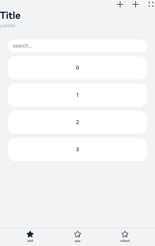
// xxx.ets
class A {
  text: string = ''
  num: number = 0
}

@Entry
@Component
struct NavigationExample {
  private arr: number[] = [0, 1, 2, 3, 4, 5, 6, 7, 8, 9]
  @State currentIndex: number = 0

  @Builder NavigationTitle() {
    Column() {
      Text('Title')
        .fontColor('#182431')
        .fontSize(30)
        .lineHeight(41)
        .fontWeight(700)
      Text('subtitle')
        .fontColor('#182431')
        .fontSize(14)
        .lineHeight(19)
        .opacity(0.4)
        .margin({ top: 2, bottom: 20 })
    }.alignItems(HorizontalAlign.Start)
  }

  @Builder NavigationMenus() {
    Row() {
      Image('common/ic_public_add.svg')
        .width(24)
        .height(24)
      Image('common/ic_public_add.svg')
        .width(24)
        .height(24)
        .margin({ left: 24 })
      Image('common/ic_public_more.svg')
        .width(24)
        .height(24)
        .margin({ left: 24 })
    }
  }

  build() {
    Column() {
      Navigation() {
        TextInput({ placeholder: 'search...' })
          .width('90%')
          .height(40)
          .backgroundColor('#FFFFFF')
          .margin({ top: 8 })

        List({ space: 12, initialIndex: 0 }) {
          ForEach(this.arr, (item: number) => {
            ListItem() {
              Text('' + item)
                .width('90%')
                .height(72)
                .backgroundColor('#FFFFFF')
                .borderRadius(24)
                .fontSize(16)
                .fontWeight(500)
                .textAlign(TextAlign.Center)
            }.editable(true)
          }, (item: number) => item.toString())
        }
        .height(324)
        .width('100%')
        .margin({ top: 12, left: '10%' })
      }
      .title(this.NavigationTitle)
      .menus(this.NavigationMenus)
      .titleMode(NavigationTitleMode.Full)
      .toolbarConfiguration([
        {
          value: $r("app.string.navigation_toolbar_add"),
          icon: $r("app.media.ic_public_highlightsed")
        },
        {
          value: $r("app.string.navigation_toolbar_app"),
          icon: $r("app.media.ic_public_highlights")
        },
        {
          value: $r("app.string.navigation_toolbar_collect"),
          icon: $r("app.media.ic_public_highlights")
        }
      ])
      .hideTitleBar(false)
      .hideToolBar(false)
      .onTitleModeChange((titleModel: NavigationTitleMode) => {
        console.info('titleMode' + titleModel)
      })
    }.width('100%').height('100%').backgroundColor('#F1F3F5')
  }
}
Example 2
// Index.ets
import { pageOneTmp } from './pageOne'
import { pageTwoTmp } from './pageTwo'
import { pages }  from './pageTwo'

@Entry
@Component
struct NavigationExample {
  @Provide('pageInfos') pageInfos: NavPathStack = new NavPathStack()

  @Builder
  PageMap(name: string) {
    if (name === 'pageOne') {
      pageOneTmp()
    } else if (name === 'pageTwo') {
      pageTwoTmp({ names: name, values: this.pageInfos } as pages)
    }
  }

  build() {
    Navigation(this.pageInfos) {
      Column() {
        Button('pushPath', { stateEffect: true, type: ButtonType.Capsule })
          .width('80%')
          .height(40)
          .margin(20)
          .onClick(() => {
            this.pageInfos.pushPath({ name:'pageOne'}) // Push the navigation destination page specified by name to the navigation stack.
          })
      }
    }.title('NavIndex').navDestination(this.PageMap)
  }
}
// pageOne.ets
class tmpClass{
  count:number=10
}
@Component
export struct pageOneTmp {
  @Consume('pageInfos') pageInfos: NavPathStack;

  build() {
    NavDestination() {
      Column() {
        Button('pushPathByName', { stateEffect: true, type: ButtonType.Capsule })
          .width('80%')
          .height(40)
          .margin(20)
          .onClick(() => {
            let tmp = new tmpClass()
            this.pageInfos.pushPathByName('pageTwo', tmp) // Push the navigation destination page specified by name to the navigation stack, with the data specified by param passed in.
          })
        Button('popToname', { stateEffect: true, type: ButtonType.Capsule })
          .width('80%')
          .height(40)
          .margin(20)
          .onClick(() => {
            this.pageInfos.popToName('pageTwo') // Return the navigation stack to the first navigation destination page that matches the value of name.
            console.log('popToName' + JSON.stringify(this.pageInfos), 'Return value' + JSON.stringify(this.pageInfos.popToName('pageTwo')))
          })
        Button('popToIndex', { stateEffect: true, type: ButtonType.Capsule })
          .width('80%')
          .height(40)
          .margin(20)
          .onClick(() => {
            this.pageInfos.popToIndex(1) // Return the navigation stack to the navigation destination page that matches the value of index.
            console.log('popToIndex' + JSON.stringify(this.pageInfos))
          })
        Button('moveToTop', { stateEffect: true, type: ButtonType.Capsule })
          .width('80%')
          .height(40)
          .margin(20)
          .onClick(() => {
            this.pageInfos.moveToTop('pageTwo') // Move to the top of the navigation stack the first navigation destination page that matches the value of name.
            console.log('moveToTop' + JSON.stringify(this.pageInfos), 'Return value' + JSON.stringify(this.pageInfos.moveToTop('pageTwo')))
          })
        Button('moveIndexToTop', { stateEffect: true, type: ButtonType.Capsule })
          .width('80%')
          .height(40)
          .margin(20)
          .onClick(() => {
            this.pageInfos.moveIndexToTop(1) // Move to the top of the navigation stack the navigation destination page that matches the value of index.
            console.log('moveIndexToTop' + JSON.stringify(this.pageInfos))
          })
        Button('clear', { stateEffect: true, type: ButtonType.Capsule })
          .width('80%')
          .height(40)
          .margin(20)
          .onClick(() => {
            this.pageInfos.clear() // Clear the navigation stack.
          })
        Button('get', { stateEffect: true, type: ButtonType.Capsule })
          .width('80%')
          .height(40)
          .margin(20)
          .onClick(() => {
            console.log('-------------------')
            console.log('Obtained the names of all pages in the navigation stack', JSON.stringify(this.pageInfos.getAllPathName()))
            console.log('Obtained parameter information of the navigation destination page specified by index', JSON.stringify(this.pageInfos.getParamByIndex(1)))
            console.log('Obtained parameter information of all the navigation destination pages specified by name', JSON.stringify(this.pageInfos.getParamByName('pageTwo')))
            console.log('Obtained the index information of all the navigation destination pages specified by name', JSON.stringify(this.pageInfos.getIndexByName('pageOne'))))
            console.log ('Obtained the stack size', JSON.stringify (this.pageInfos.size ()))
          })
      }.width('100%').height('100%')
    }.title('pageOne')
    .onBackPressed(() => {
      this.pageInfos.pop() // Pop the top element out of the navigation stack.
      console.log ('pop' + 'Return value' + JSON.stringify (this.pageInfos.pop ()))
      return true
    })
  }
}
// pageTwo.ets

export class pages {
  names: string = ""
  values: NavPathStack|null = null
}

@Builder
export function pageTwoTmp(info: pages) {
  NavDestination() {
    Column() {
      Button('pushPathByName', { stateEffect: true, type: ButtonType.Capsule })
        .width('80%')
        .height(40)
        .margin(20)
        .onClick(() => {
          (info.values as NavPathStack).pushPathByName('pageOne', null)
        })
    }.width('100%').height('100%')
  }.title('pageTwo')
  .onBackPressed(() => {
    (info.values as NavPathStack).pop()
    return true
  })
}

你可能感兴趣的鸿蒙文章
harmony 鸿蒙ArkTS-based Declarative Development Paradigm